Colorful Playroom Decor
Psssst… this post *might* contain affiliate links: see my disclosure here.
Bright and Cheerful Playroom Decor
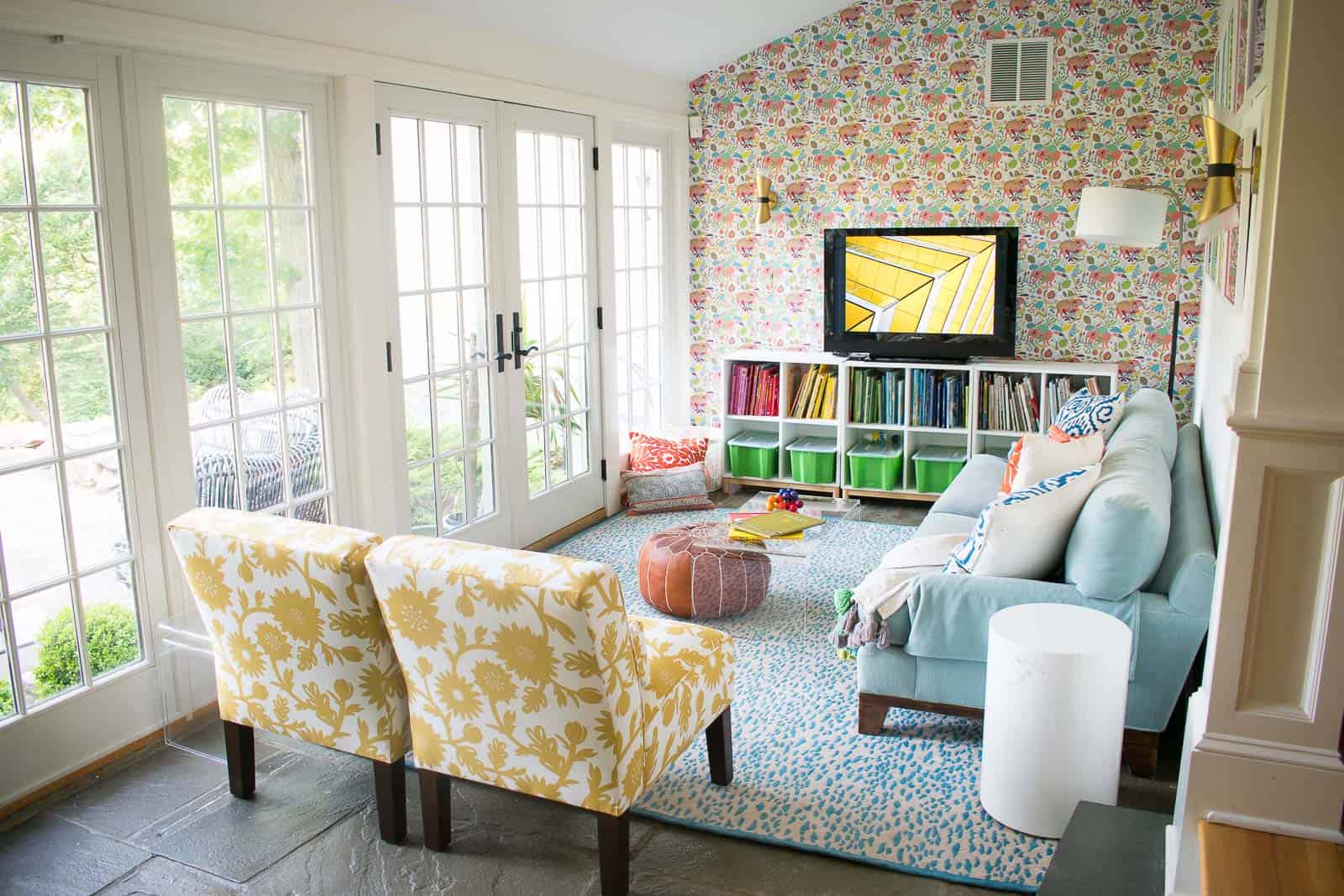
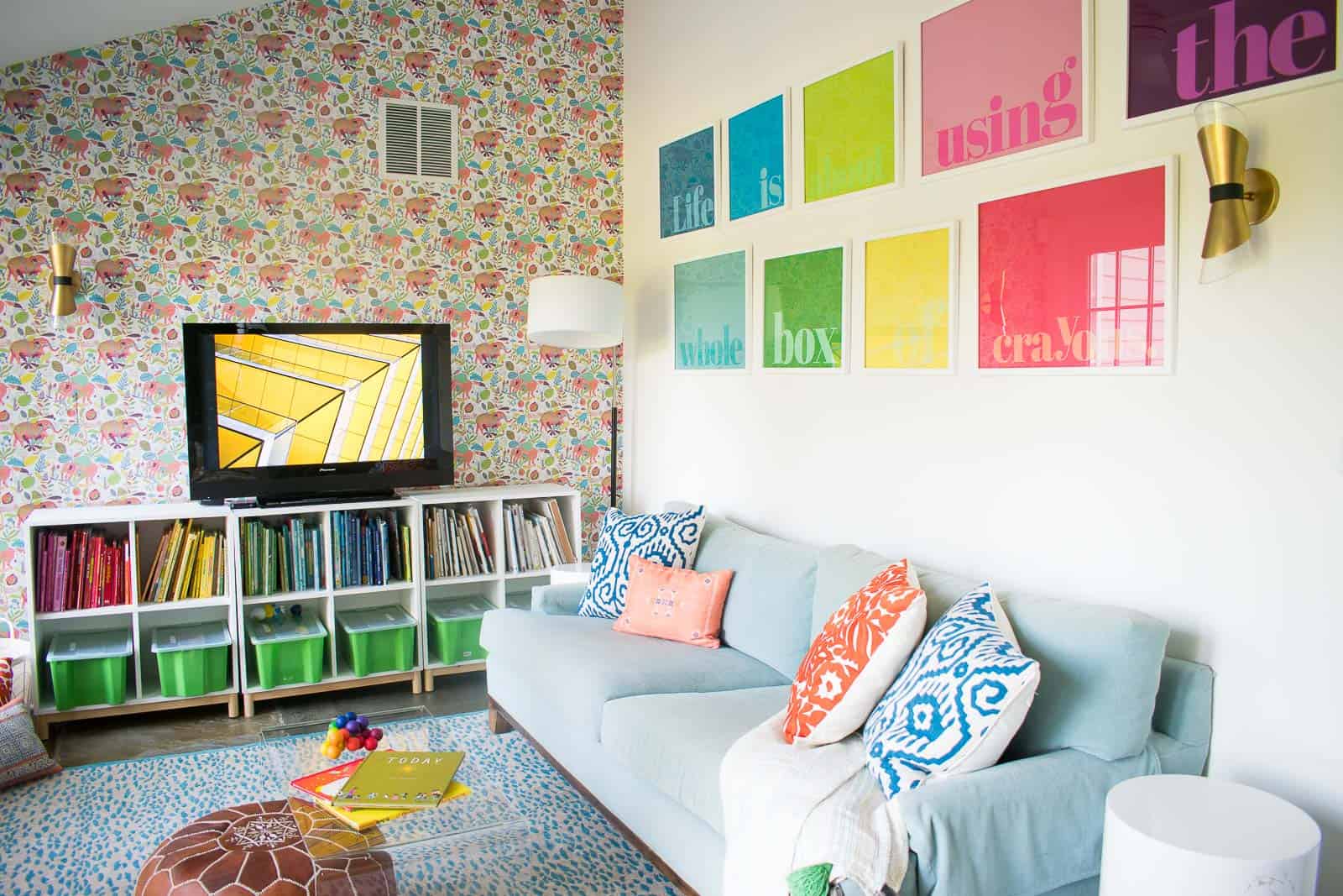
I’m sharing a reveal of the colorful playroom decor in our rental home.
Disclosure: I partnered with Overstock.com on our playroom and I could NOT be happier with the new design!
Shop my favorites!
Guys.
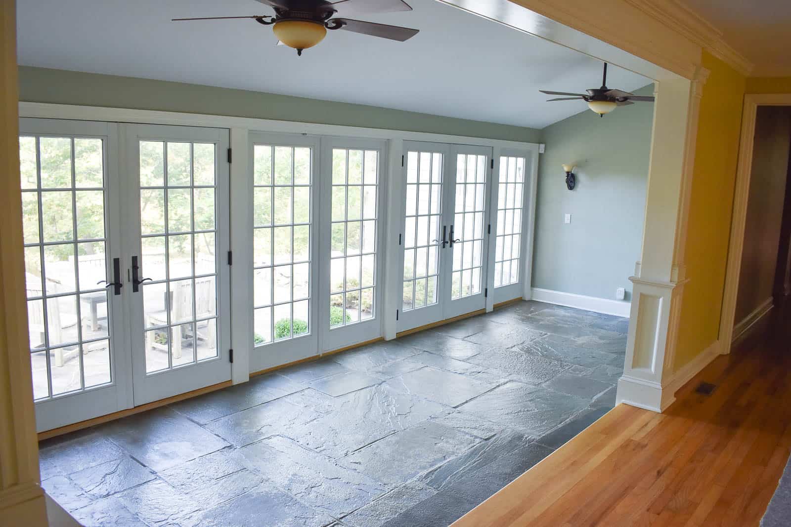
I’ve been slowly but surely plugging away at this playroom/ sunroom and it’s finally FINISHED. The beginning of any good room makeover is the BEFORE picture so here’s what we were dealing with. The room itself was lovely. Bright and sunny with an interesting stone floor. Obviously it would be a perfect sunroom/ solarium, but we decided to make this a playroom for the kids.
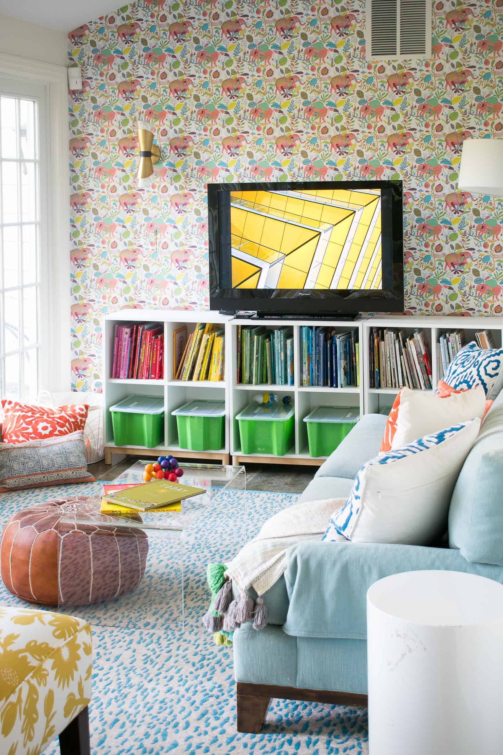
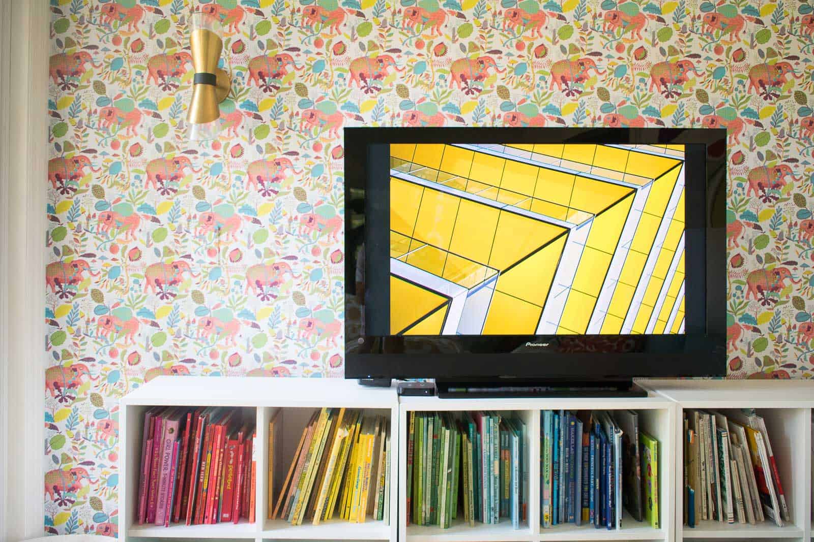
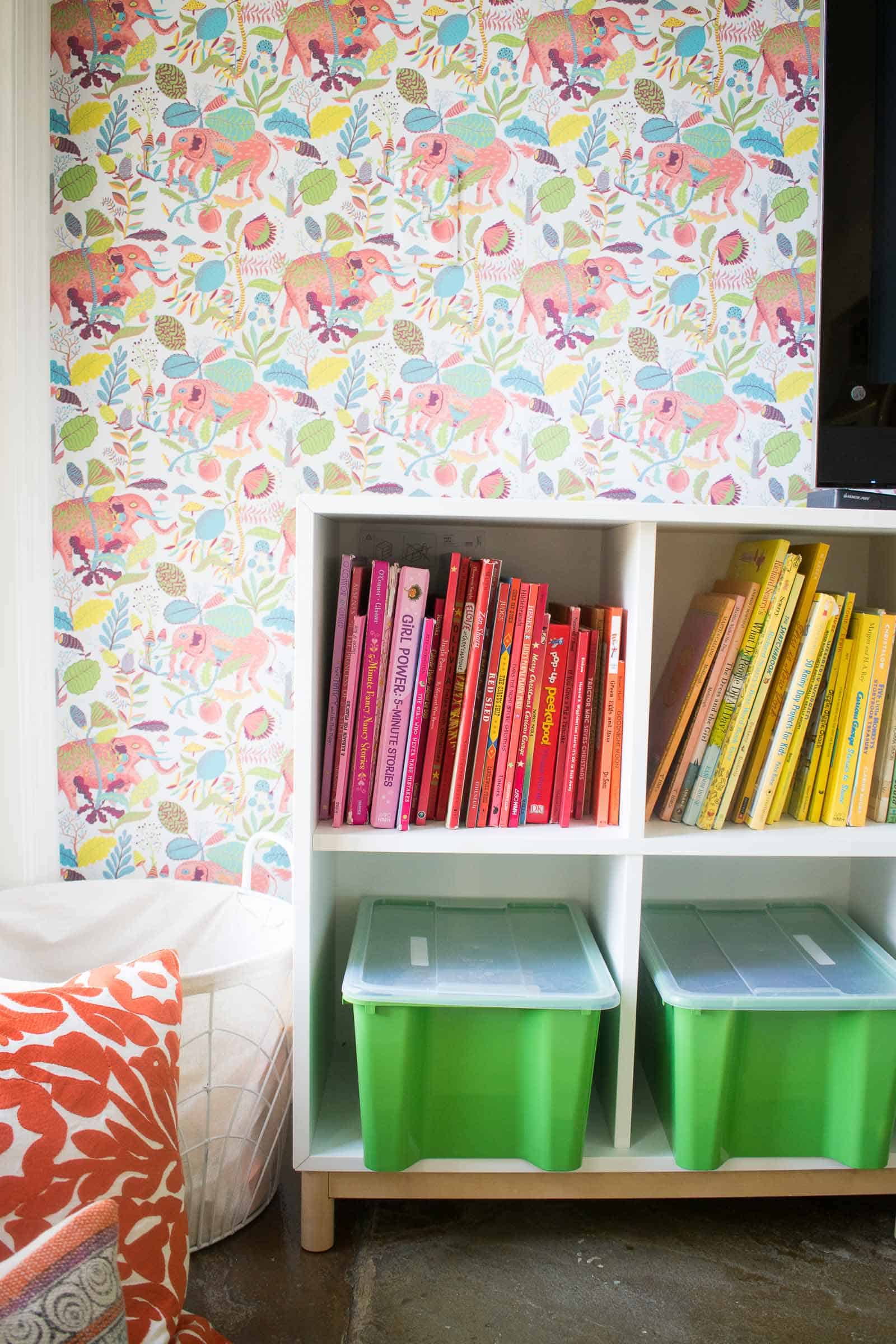
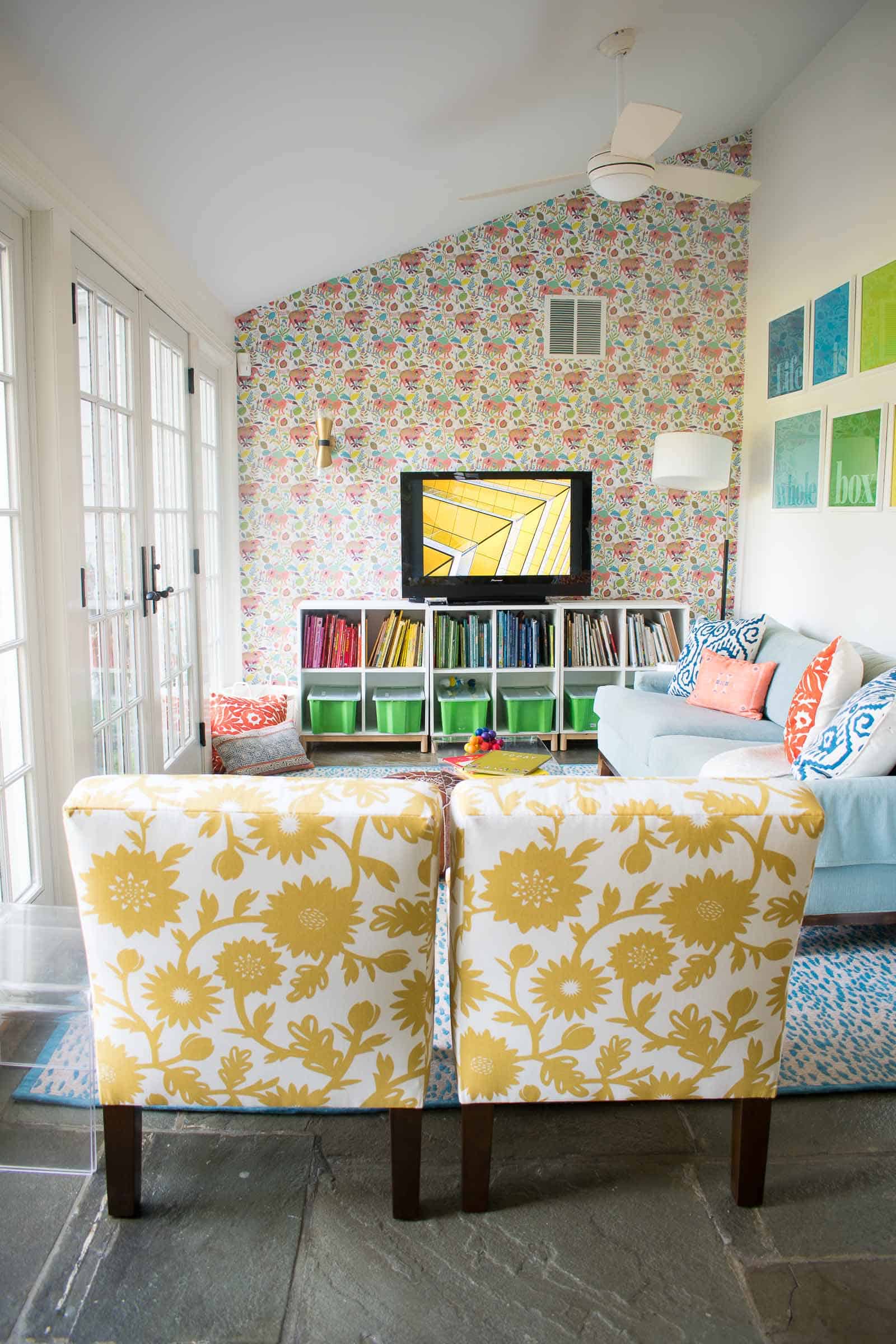
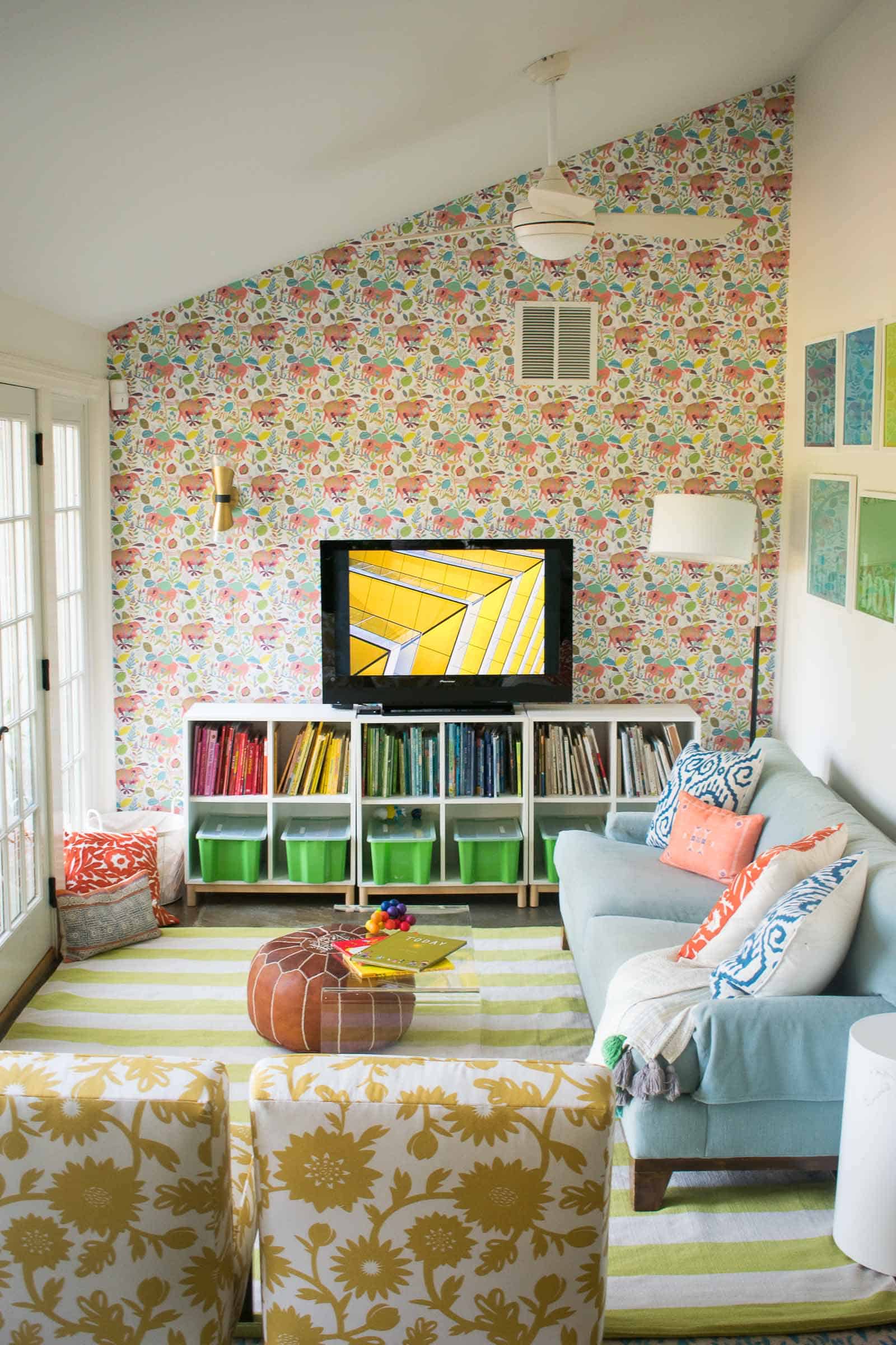
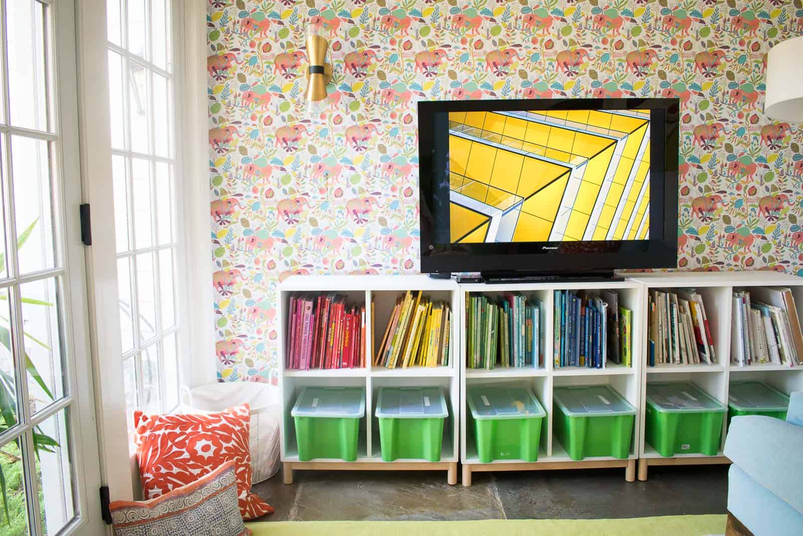
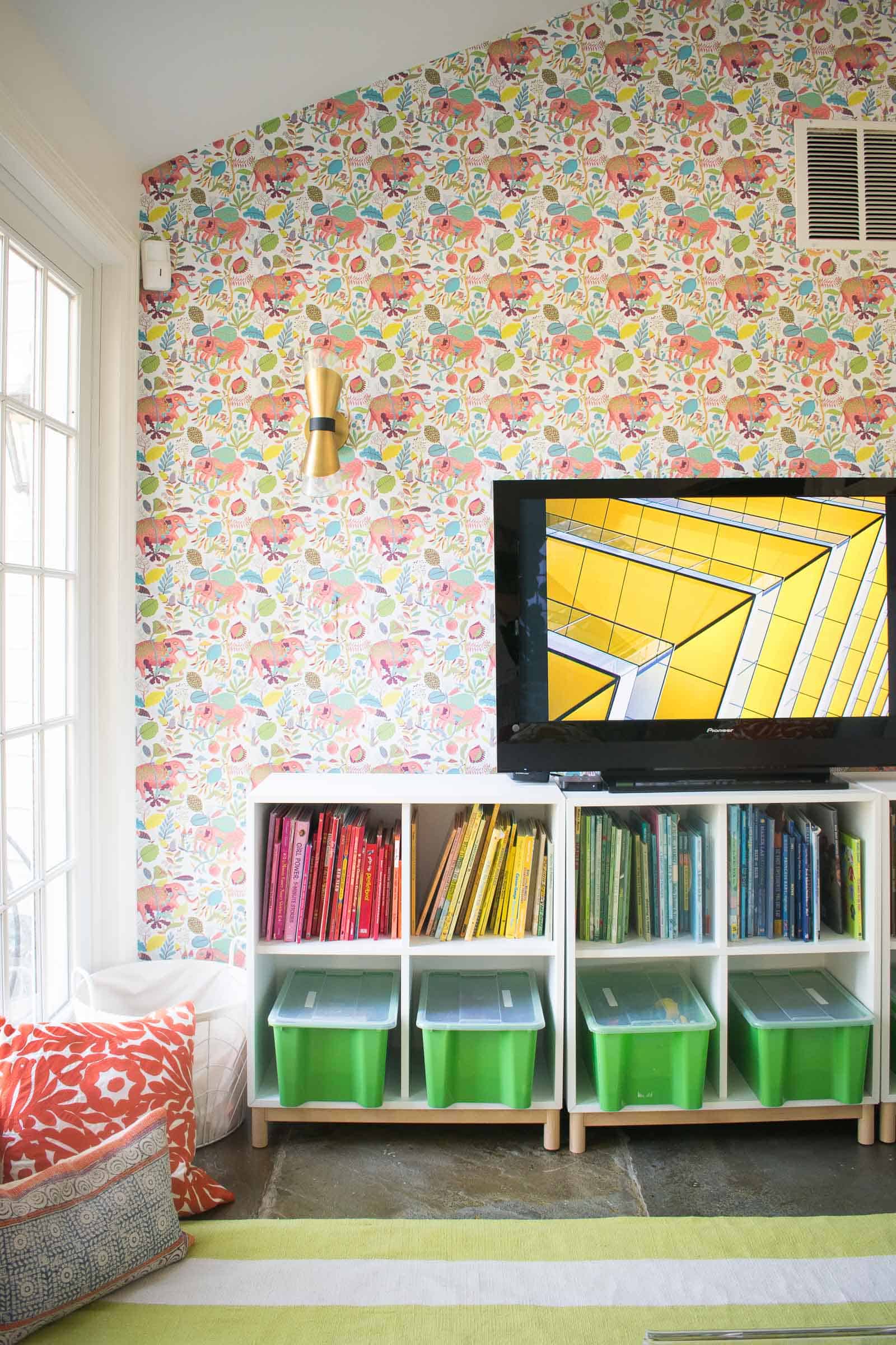
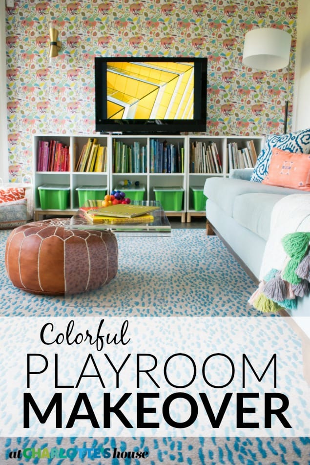
When I first saw the empty room, the paint color seemed like a gray that wouldn’t be too bad, but after a couple of months, it was clear that not only was the color too dark but it also had a green undertone that made the rest of my decor feel… dreary. So step #1 was a neutral coat of white paint. Next on my design board was a big bold colorful accent wall. Enter Milton King with their removable wallpaper. So easy to install and such an amazing impact. I was able to pull from all the colors in the wallpaper for the space and I couldn’t love it more.
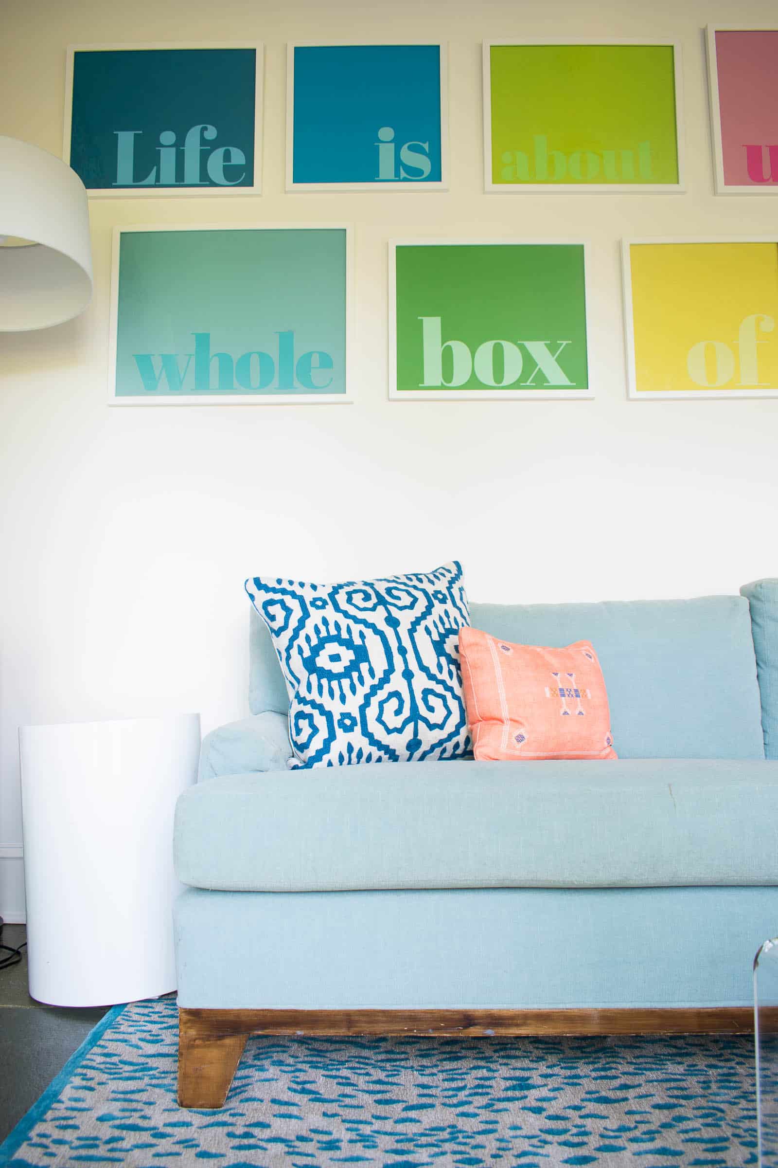
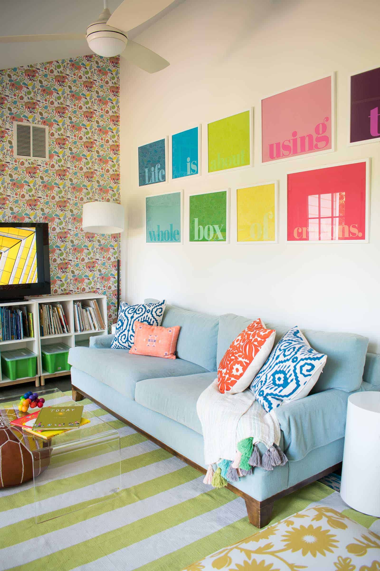
We already had that blue couch and it wasn’t offensive, but it’s not the perfect color for the wallpaper. It’s just fine, not great. Also… I love the couch and don’t have a place to store it so… #reallife. What really helped with the couch was adding some of those fun textural throw pillows to not only break up the solid blue of the big couch, but also tie into the colors of the wallpaper.
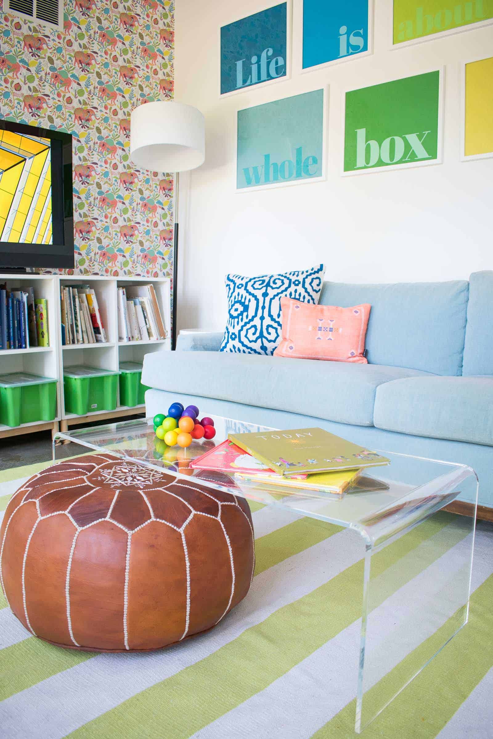
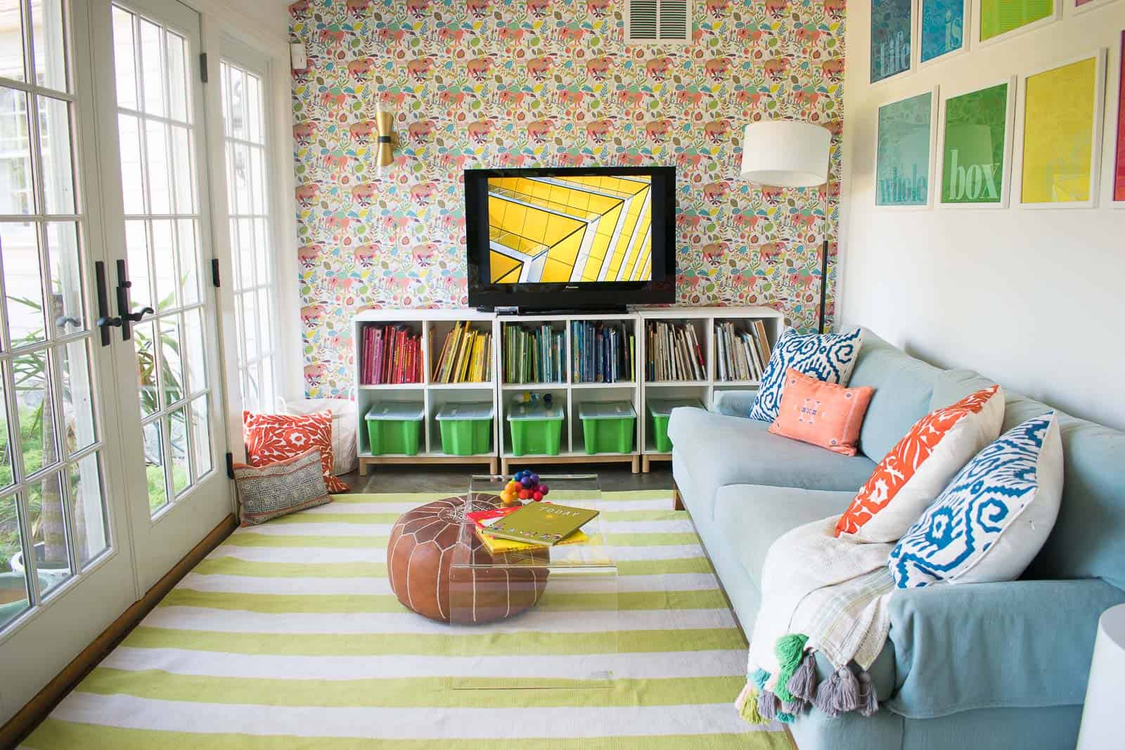
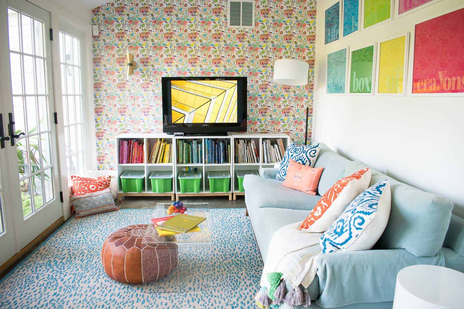
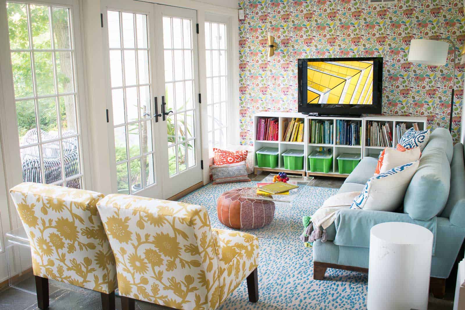
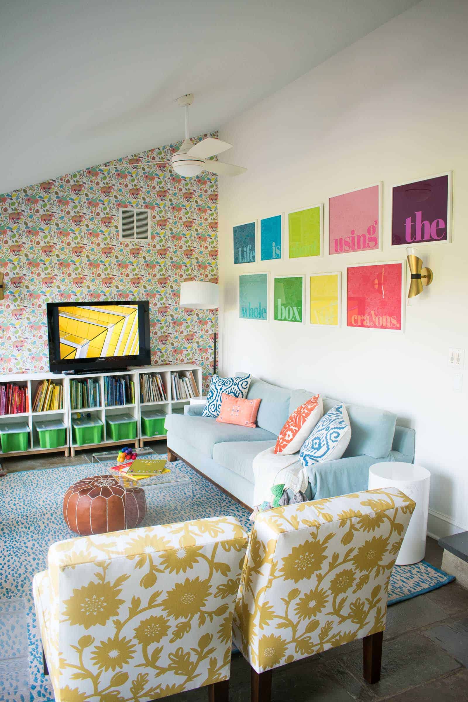
Another big change for the space was that rug. I was sent two to try, and I was surprised that the teal one worked best. Here’s why I wasn’t sure about the teal: the pattern. Even though totally different from the wallpaper, the rug has the same scale pattern. In other words, it feels like a busy small pattern and the wallpaper is also a busy small pattern. Before I set up the room, I would have said the lime stripes would have worked the best. I love the juxtaposition of the stripes with the pattern of the wallpaper. BUT… ultimately I liked the contrast of the teal against the yellow slipper chairs so the lime stripes moved under the dining room table.
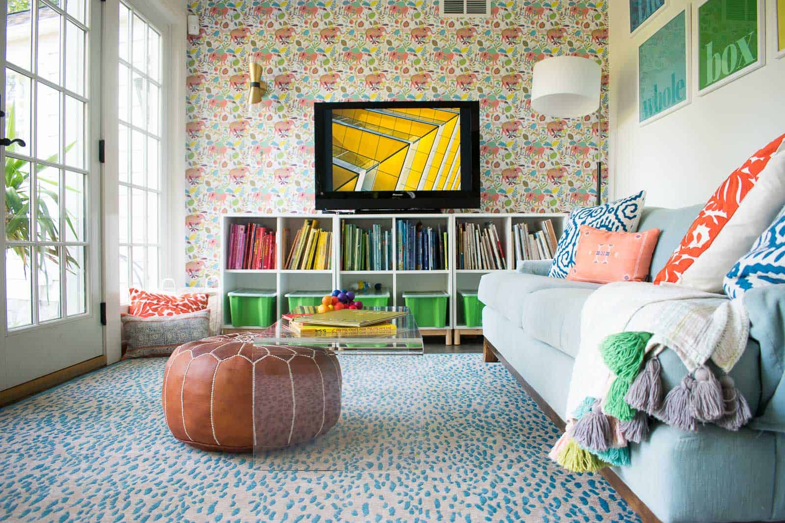
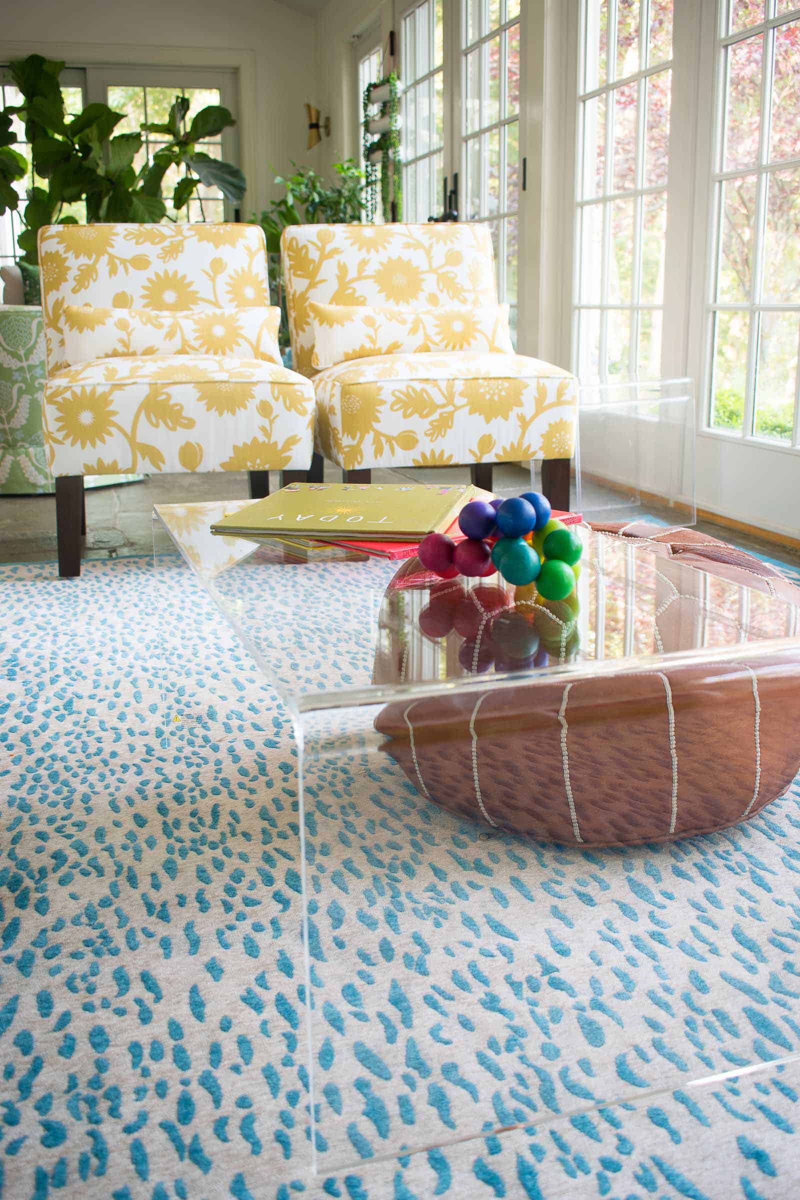
You may not even notice it, but another piece of furniture I brought into the space was a lean mean clear acrylic coffee table. It’s not the best choice for photographs, but I love that it provides a place for the kids to play and do puzzles, but… literally disappears into the narrow room to keep the space feeling open and airy.
Those slipper chairs. I adore the barrel chairs that were there. But they weren’t right for the space. They were a little big, and the wrong color. They’re stacked in the garage and will find new life one day. Those slipper chairs are not only a fun bit of yellow pattern, but they’re also a bit more diminutive for the space. The playroom is long and narrow and there’s a door to the patio that can’t be blocked, so they tuck in really well on that end of the rug.
Finding chairs with arms would have been a little bit more comfortable for the kids as they’re watching movies, but the lower profile of the slipper chairs are a much better proportion for the room so form trumped function a bit in this space.
Something you might not have noticed is higher in the playroom: those fans! When we moved in, the sconces and matching fans were dark and clunky and took up a LOT of visual space. I replaced the sconces a while ago with these ones from My Mitzi, but adding those white ceiling fans really opened up the space. The ceilings are obviously higher than the rest of the house, and having the white ceiling fans just makes the room feel roomier and more open. Reminder that we are renting, so whenever we leave I can replace the old lights or… perhaps the landlord will want to buy these fixtures from us. I’ll cross that bridge.
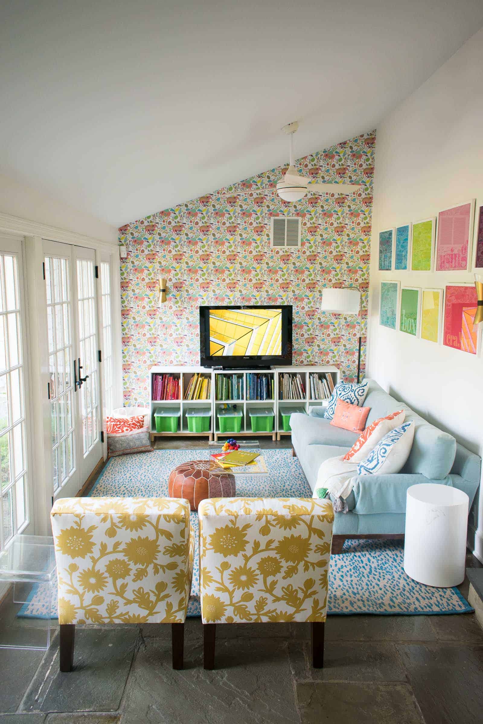
That gallery wall was a project I recently finished for JOANN and it’s one of the easiest most fun crafts I’ve ever done. When you see how simple it was to pull together, you’re going to run your little booty over to craft store.
I’m also super grateful to Vera Stevens for letting me use her stunning photo as the screen saver in these photos. That big black television was hard to work around, but now it’s such a cheerful part of the images!



You really brought life to that space! The wallpaper is so much fun and really brings everything together. Thanks for sharing!
Thank you my friend! From one wallpaper lover to the next! 🙂 xx
Can you provide details on the couch? I think it would be perfect for our living room. Thanks!
Hi Amy! This couch is actually a consignment purchase from 10 years ago or so! Sorry!!
should have the manufacture name somewhere? I was curious too:)