Faculty Room Makeover
Psssst… this post *might* contain affiliate links: see my disclosure here.
Disclosure: I am eternally grateful to the following companies who provided product for this project! I partnered with Raymour & Flanigan, GE, The Home Depot, Rings End and The Becker Companies, LLC. All brands provided product for this space, but ALL expressed opinions are 100% my own.
I have never been so eager to share a post as I am today! (Hence the late afternoon publish time!) A couple of months ago, an email went out to our elementary school community from the PTA. As part of teacher appreciation week, they were hoping to give the teacher’s lounge a little pick-me-up. Like any good DIYer, I replied to the email and said I’d be happy to help!
Shop my favorites!
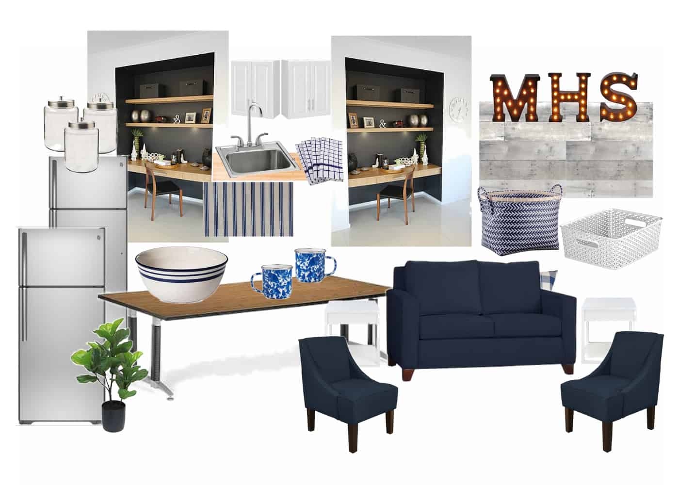
Redesigned Faculty Room
Fast forward to last Thursday, and we had the amazing opportunity to share our work with the deserving teachers and I’ve never been so excited about a room reveal! (See video of the whole process at the end of the post!) Before I go one step further, I need to give a CAPITAL LETTER FILLED SHOUT OUT to a handful of brands who stepped forward to help make this makeover possible. We have two GORGEOUS new refrigerators thanks to GE. My friends at Raymour and Flanigan are always SO generous and they donated new upholstered furniture and more. The local Fairfield Home Depot chipped in a pair of new microwaves. The local Fairfield Rings End donated our paint. And The Becker Companies, LLC donated two new toaster ovens. And last but not least, the entire school community chipped in to purchase items off a Target gift registry which allowed for the room to have all new coordinating accessories and kitchenware. It takes a village! Literally!
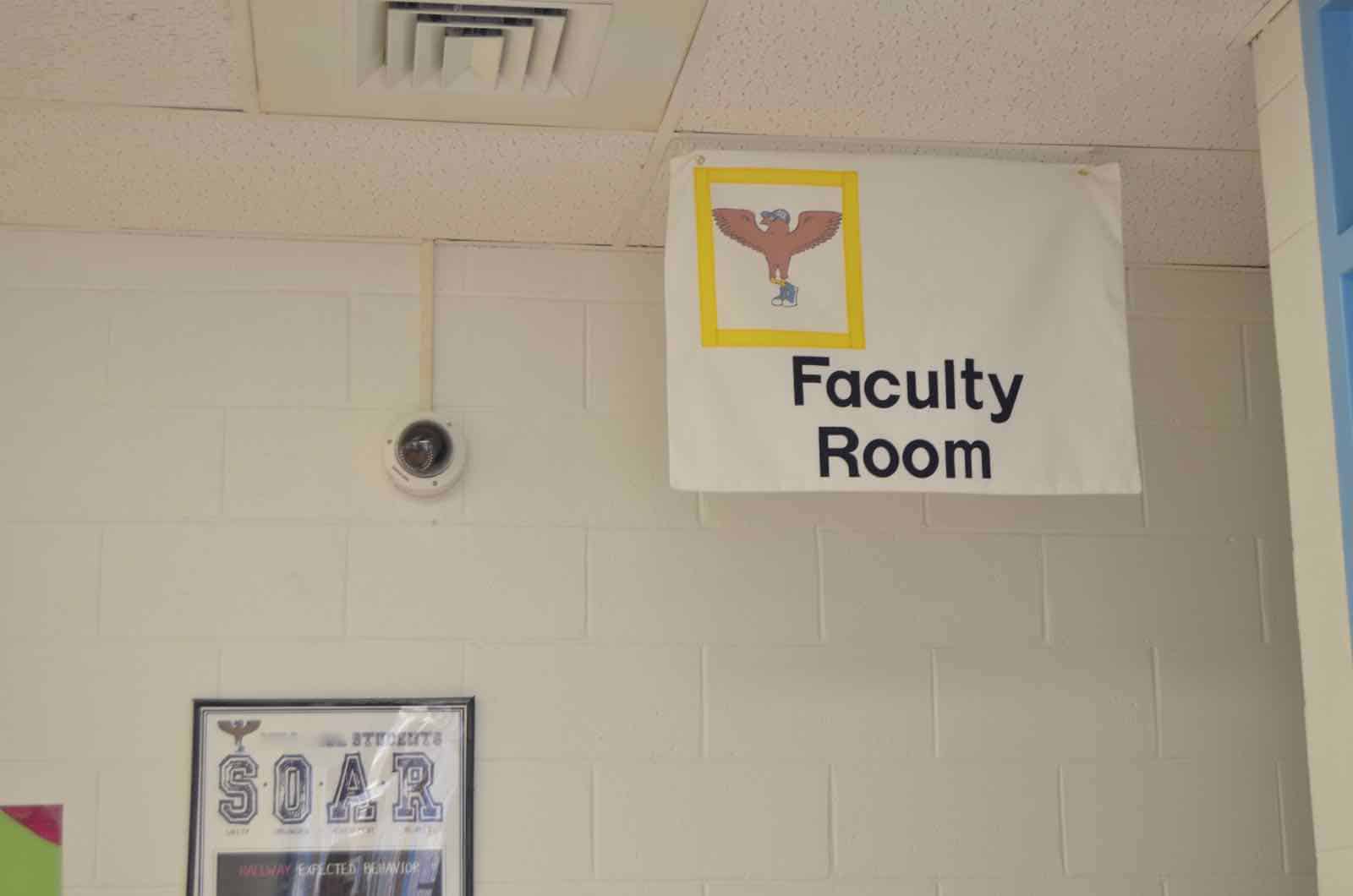
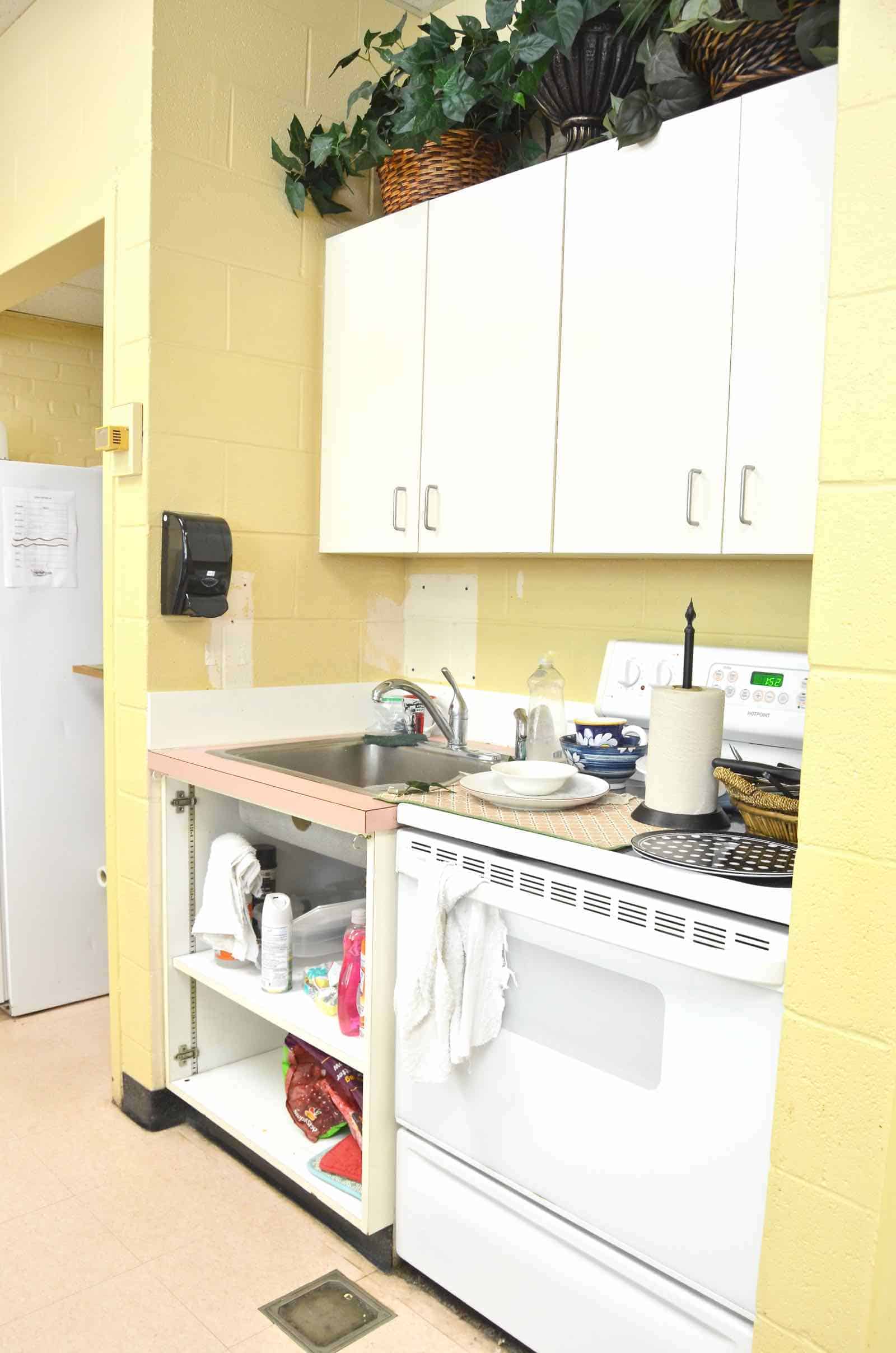
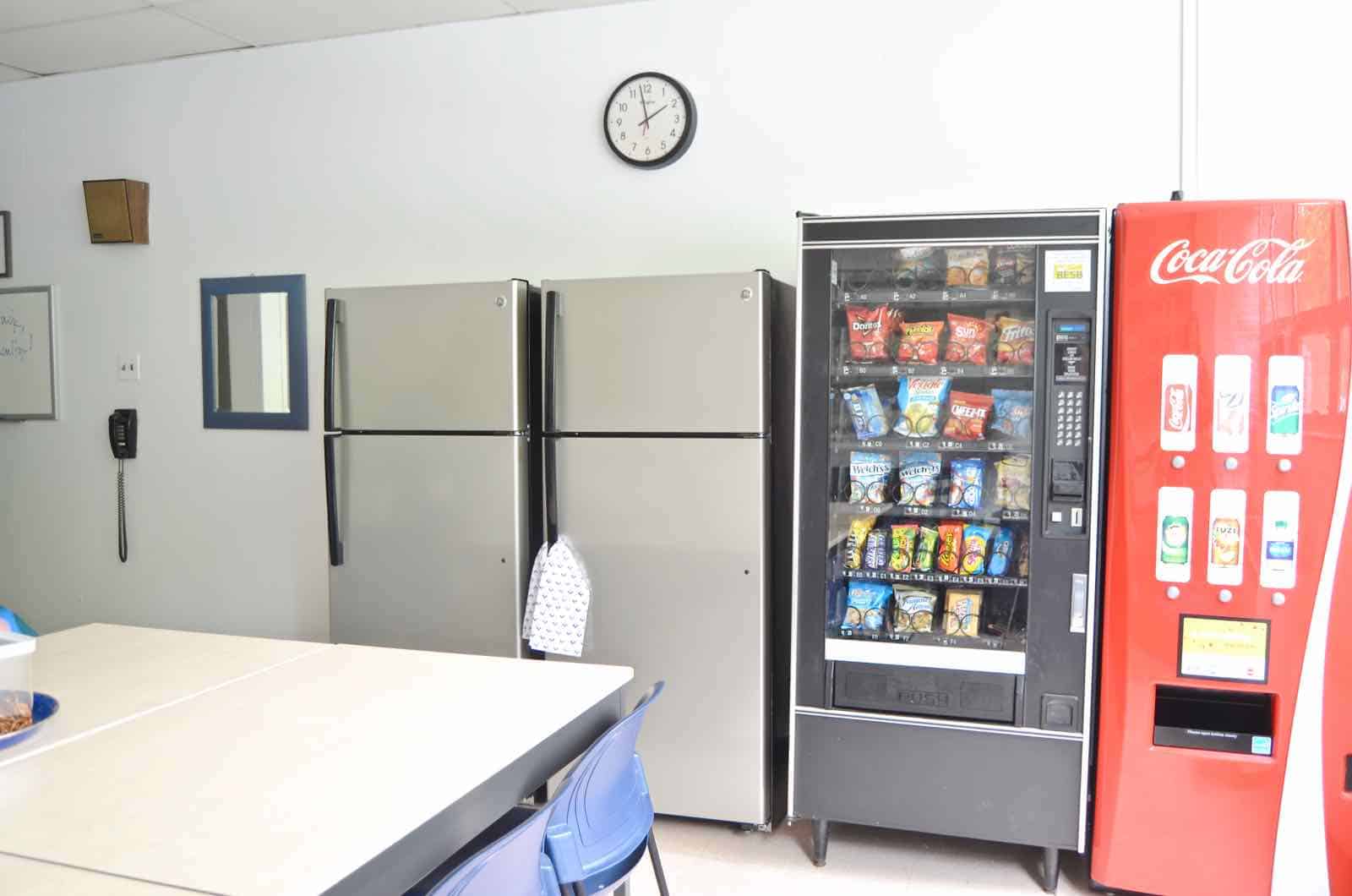
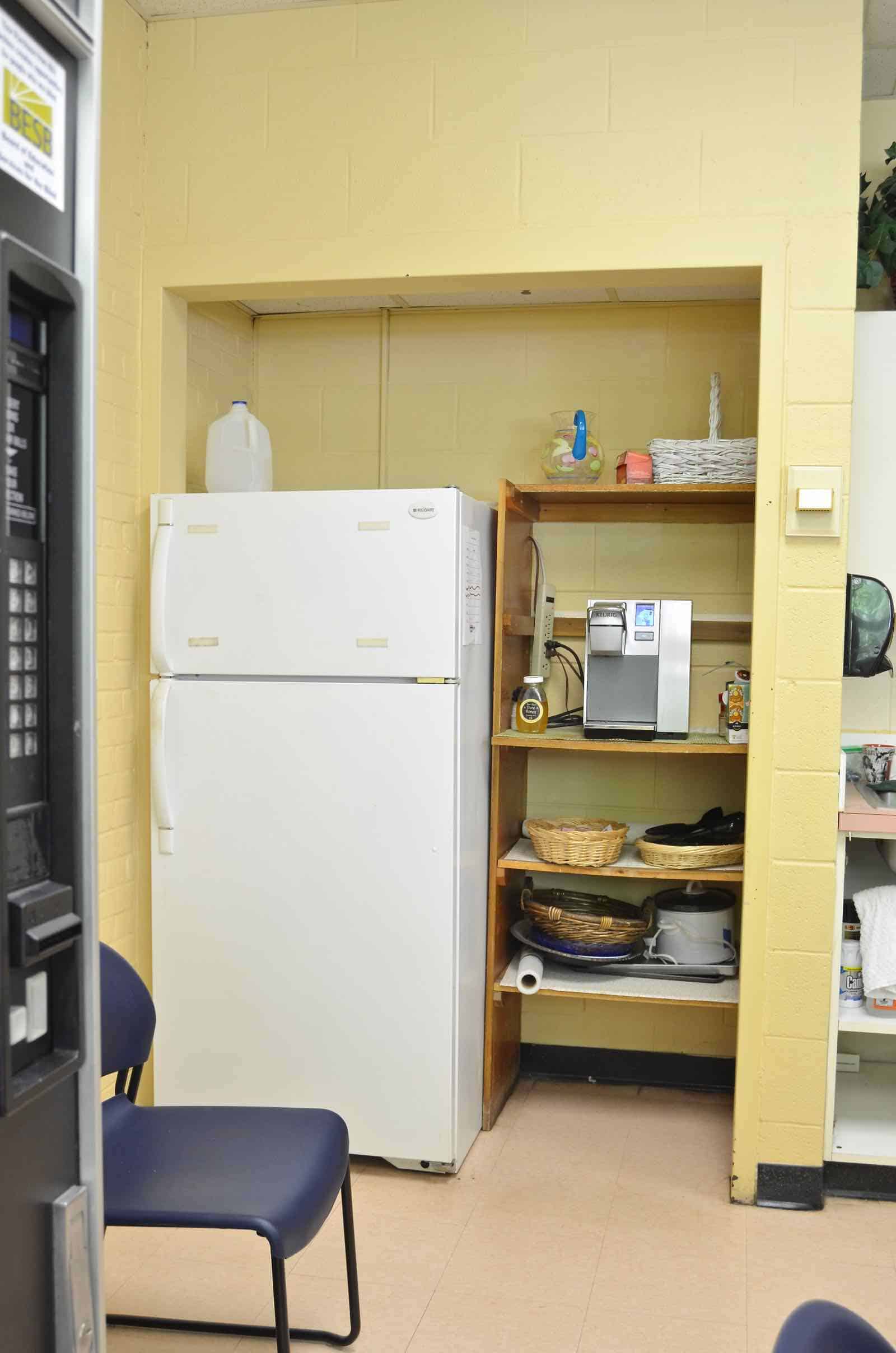
Back to the faculty room. Close your eyes and imagine what an elementary school faculty room might look like… cinder block walls? Check. Dingy wall color? Yep. Mismatched furniture? Definitely. Platters and dishes and kitchenware from 1980? Probably!
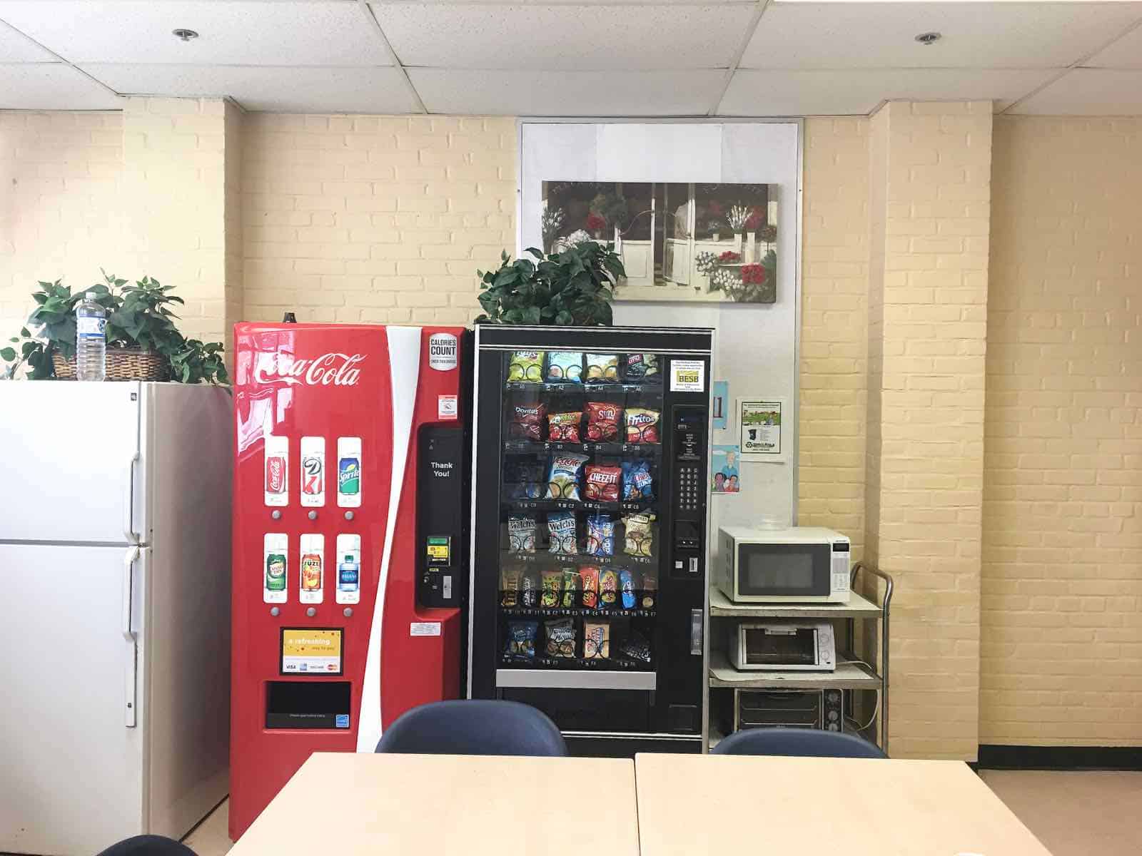
Our plan for the room was to paint, paint, and paint some more. We also wanted to reimagine the furniture layout a bit and try to create a little more space in which the teachers could manuever. There were two useful shelf areas, but the existing shelves were…. bad; so we planned to replace those. Last but not least, there was SO. MUCH. CLUTTER. We were hoping to get rid of the junk and bring in better, more coordinated, accessories and kitchen items.
A fellow parent and I were ‘in charge’… I came up with the loose vision, and Rich designed and executed the new shelving layout. Volunteers came in to help paint so the teachers were without a faculty room for 10 days while we demo’d and redecorated!
And this is how it looks NOW!
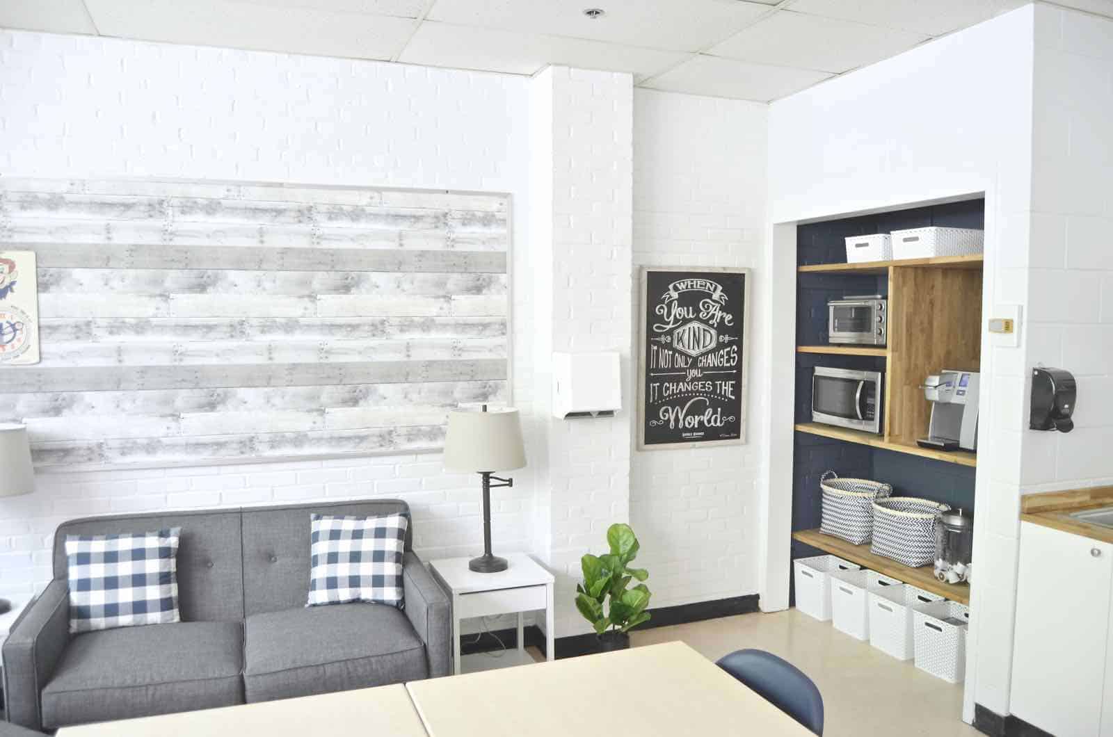
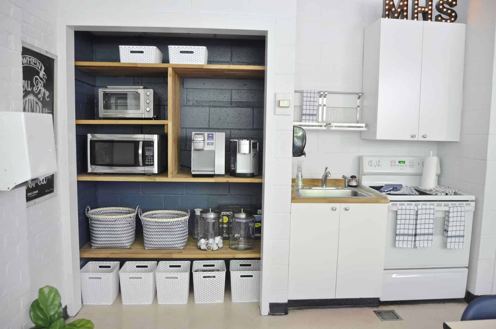
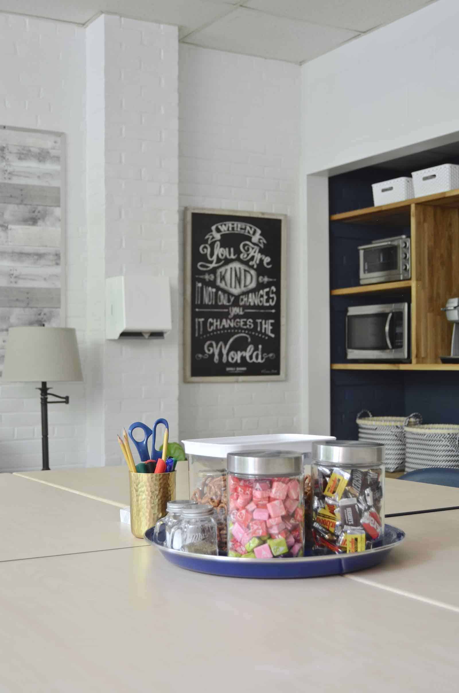
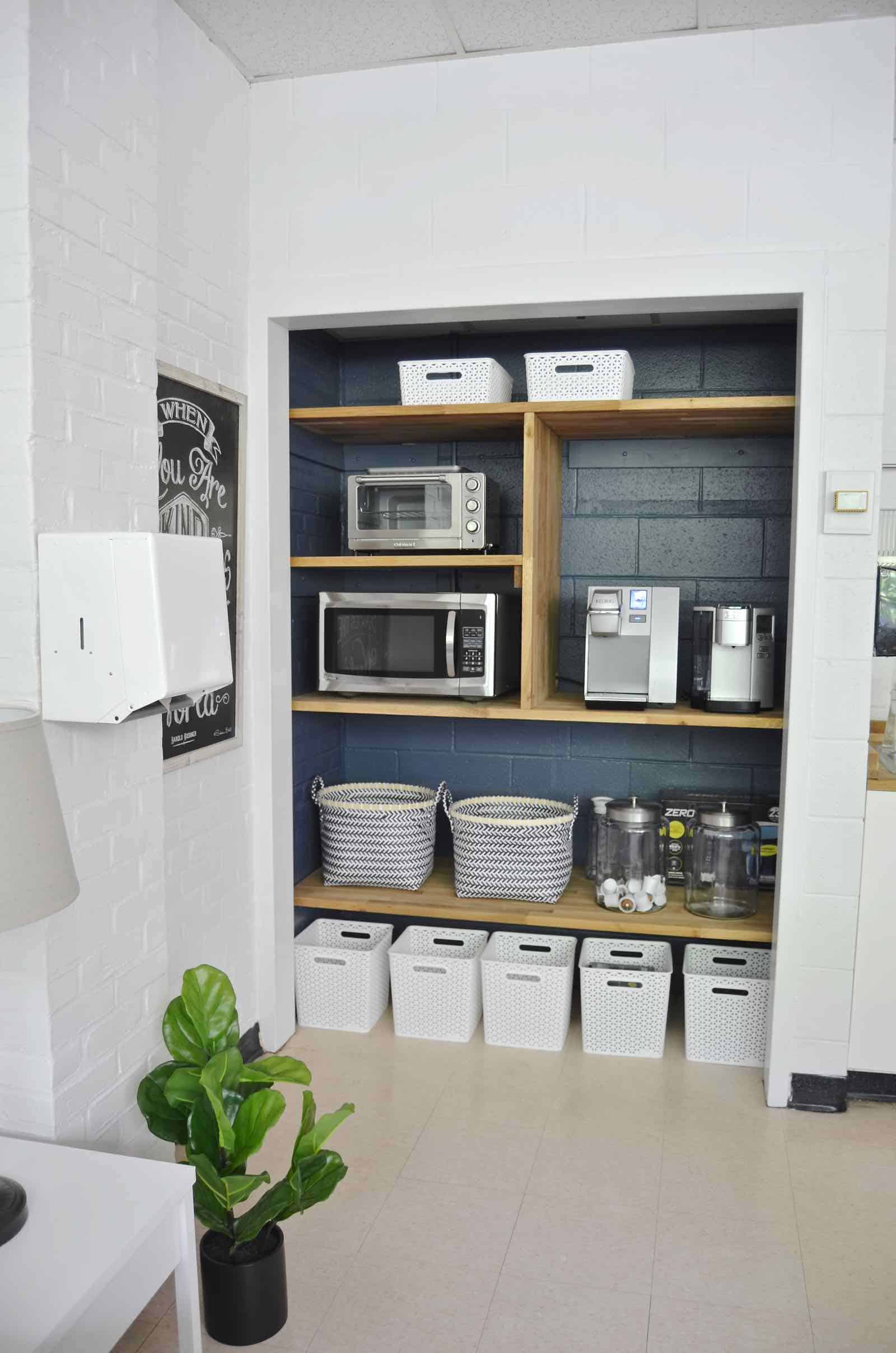
Like I say after just about every room redesign. Paint works MIRACLES. We painted the walls BM Decorator’s White and the navy behind the shelves is BM Kensington Blue. But the new butcher block shelves are genius. Rich picked up butcher block at Ikea and then we cut it down to size. It’s such a sturdy piece of wood that we didn’t need the additional support in the middle of the shelf which made the whole layout look that much more clean and crisp.
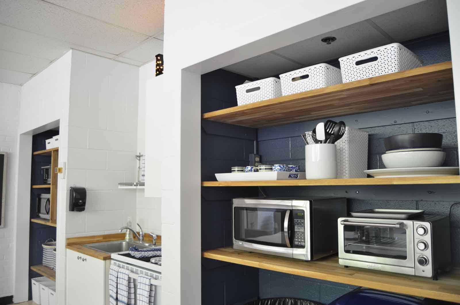
Painting the back of the shelves navy elevates the space in my opinion and makes it feel SO much more sophisticated and fresh. Obviously no one’s going to forget they’re in a faculty room, but at least they can feel a little more at home!
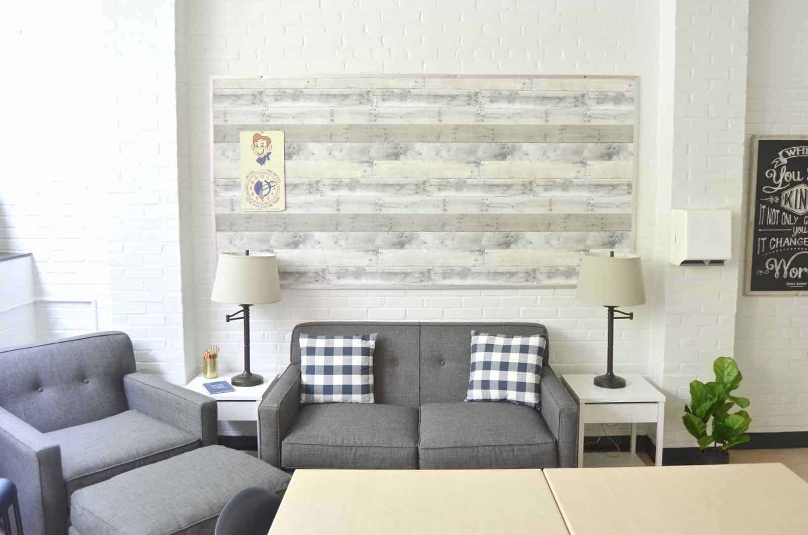
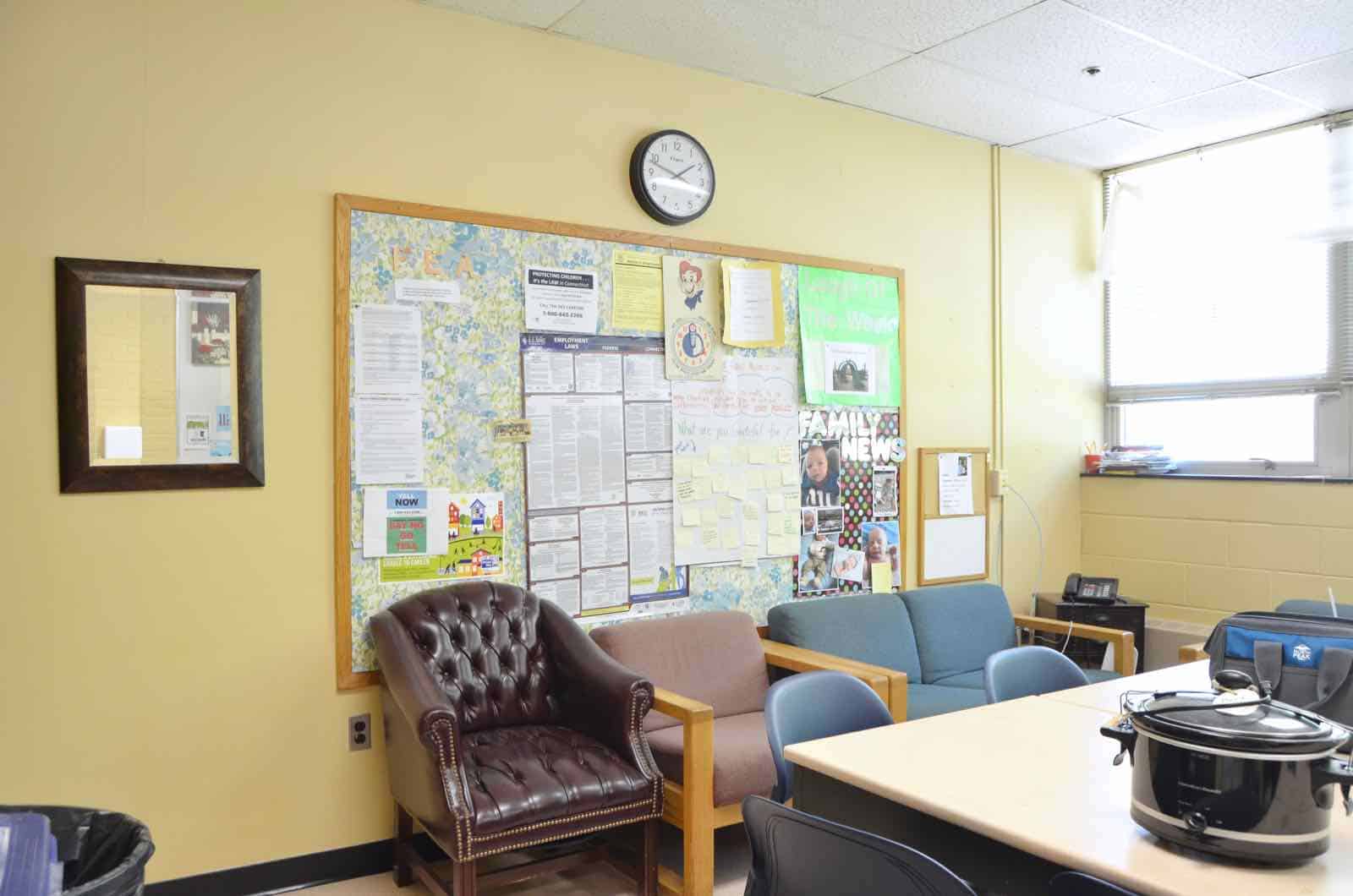
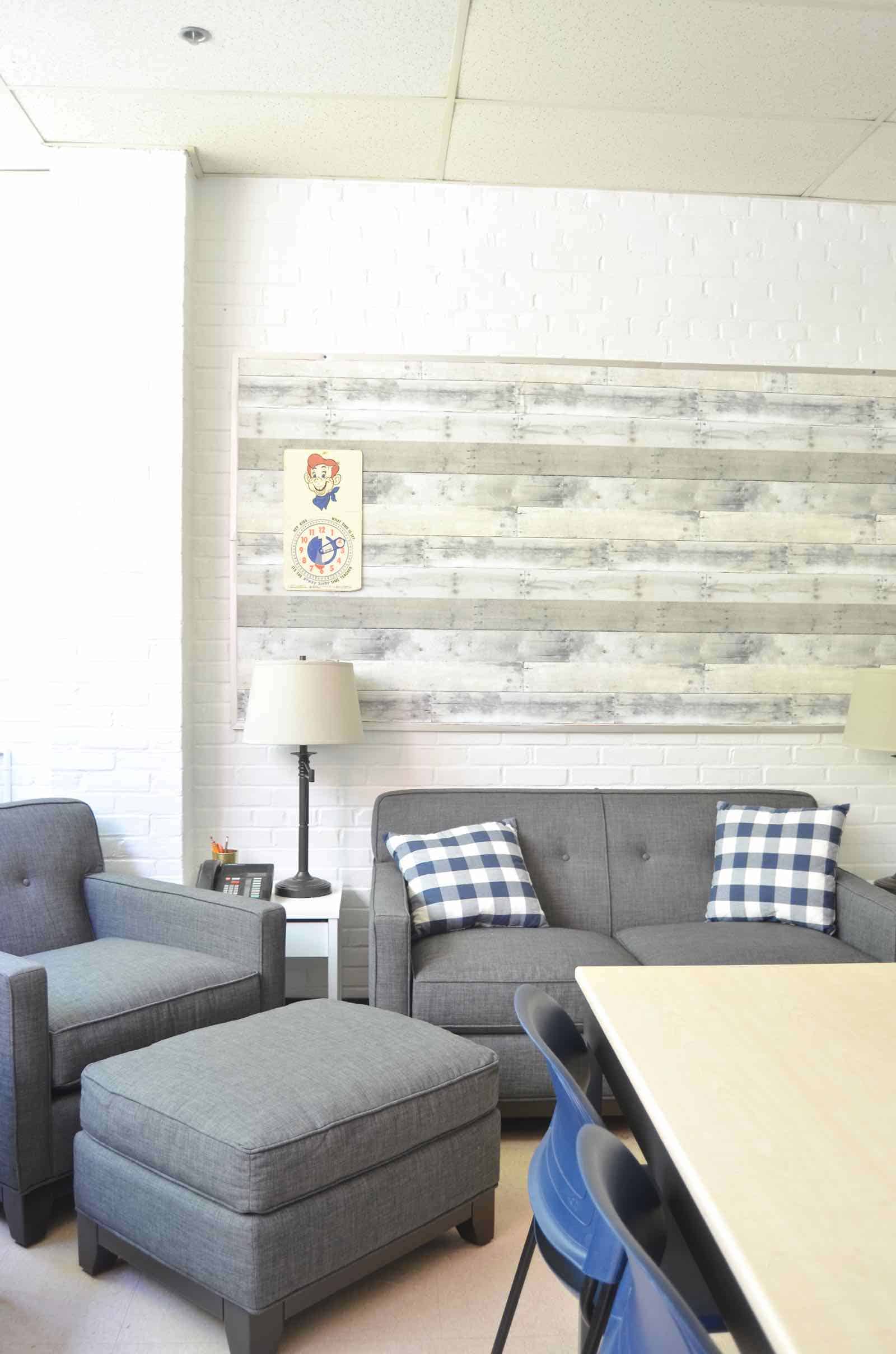
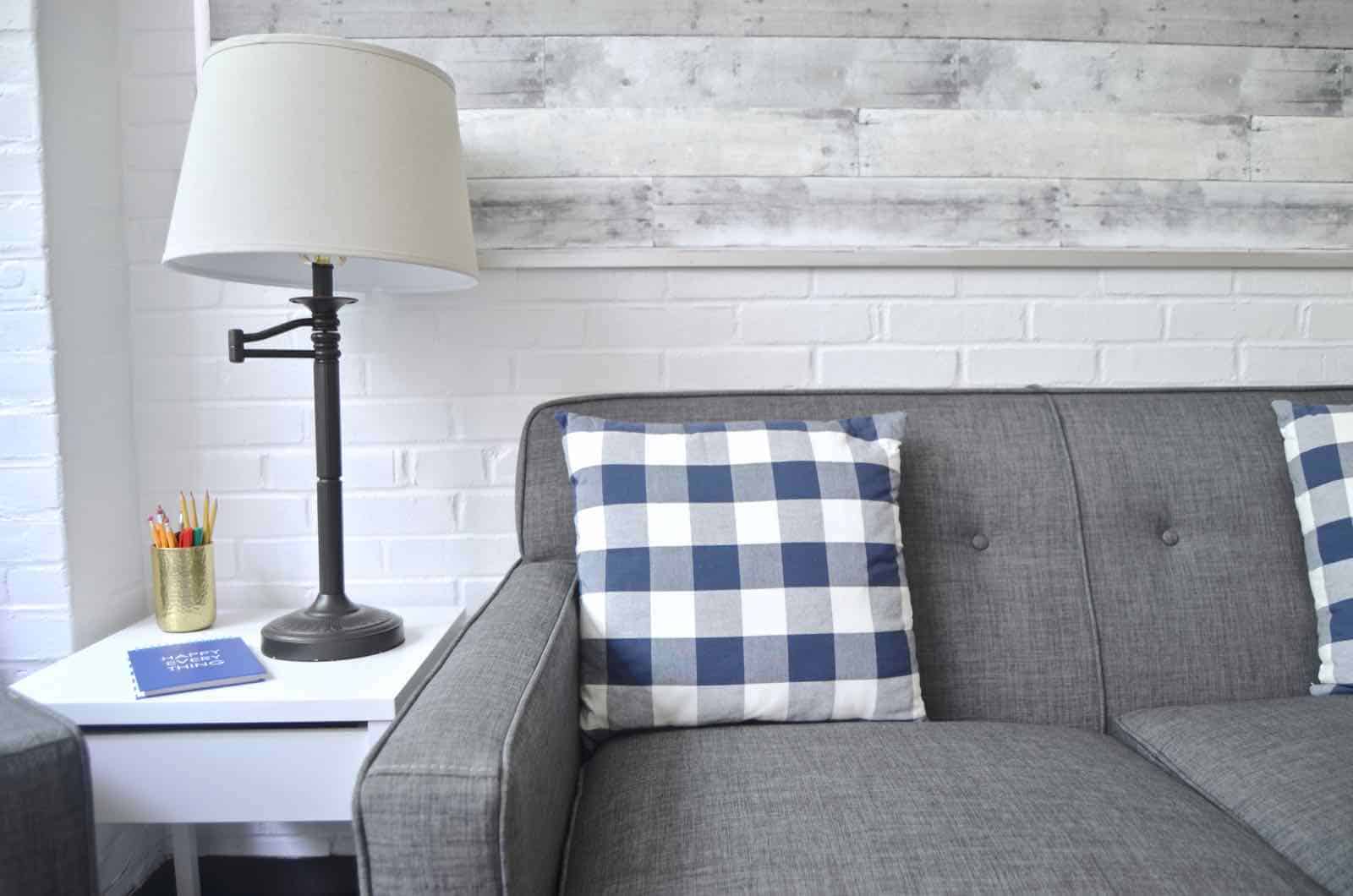
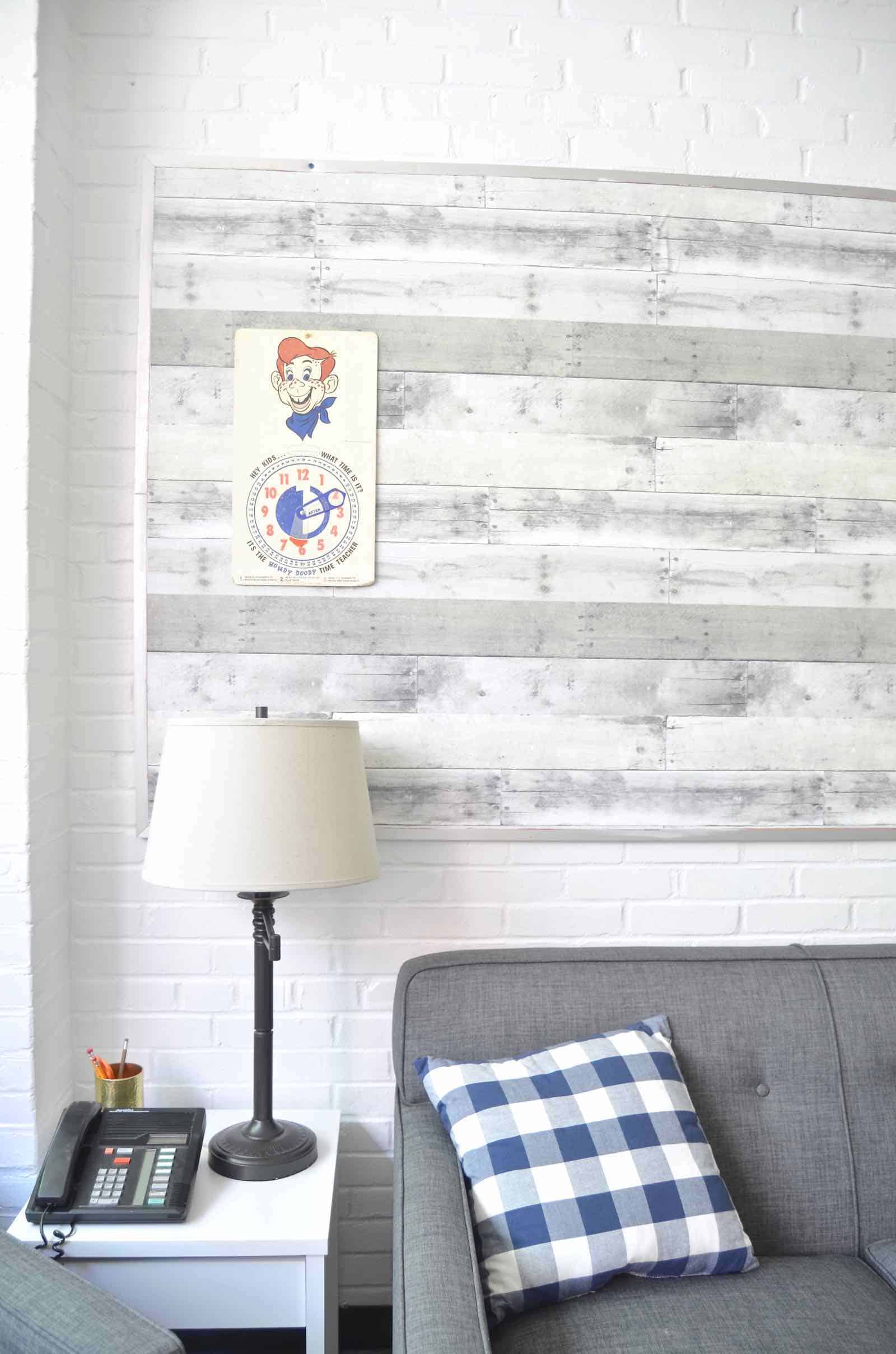
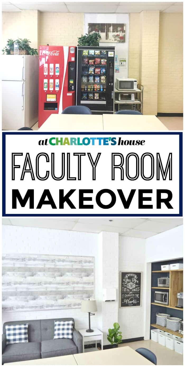
Moving the refrigerators and vending machines to the opposite wall meant that brick wall was the perfect backdrop for that luxe furniture from Raymour and Flanigan. The matching loveseat and armchair creates a much more serene space than the mismatched chunky seating that was in there before!
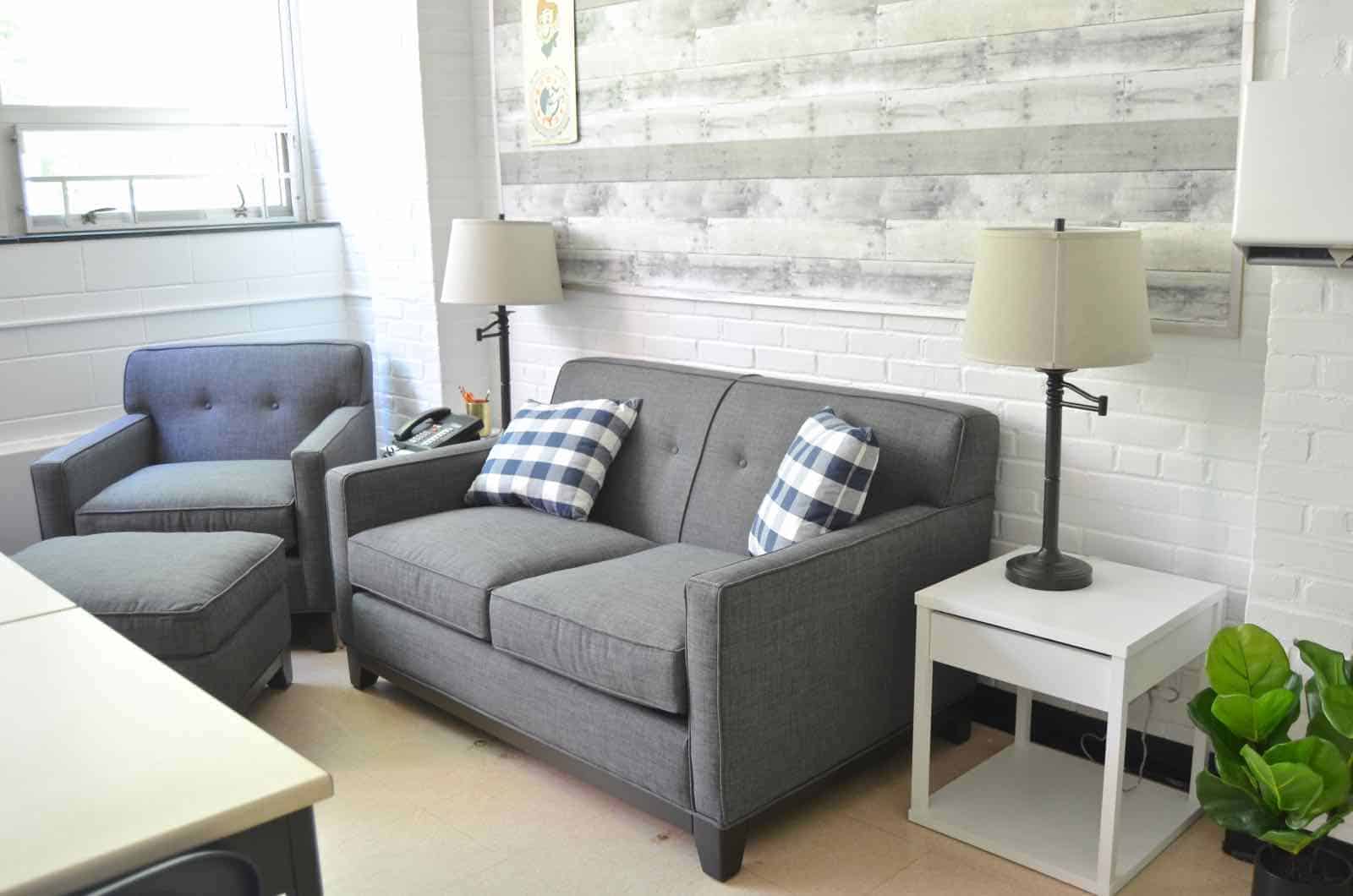
We rehung the existing bulletin board over the loveseat and covered it with reclaimed wood wall paper from Target (affiliate link).
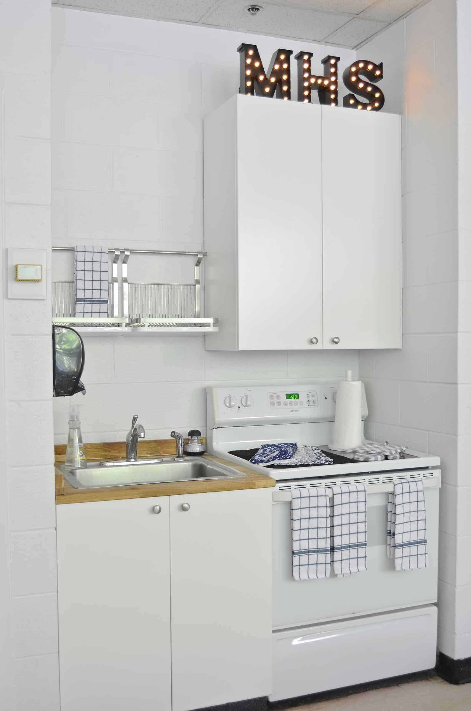
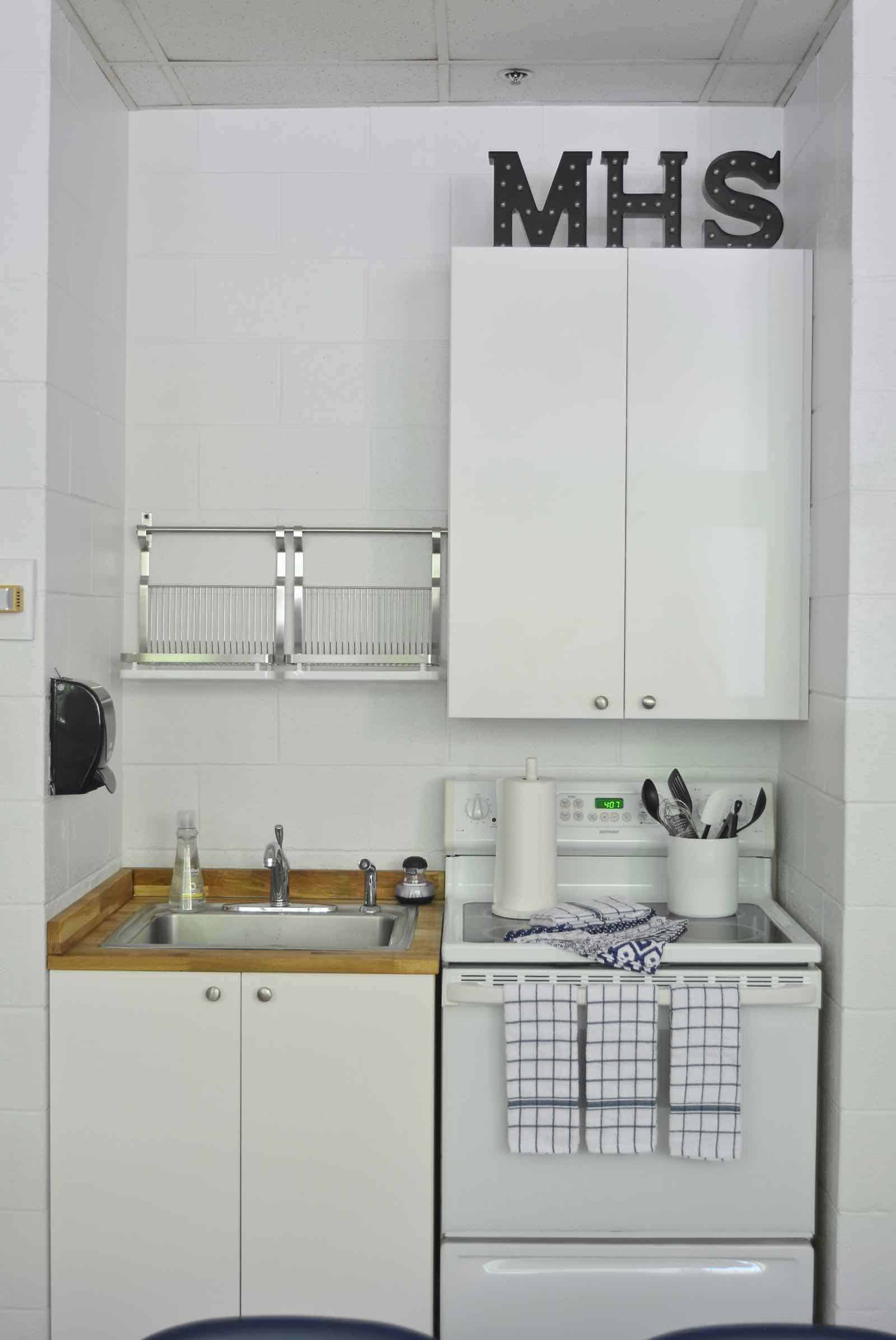
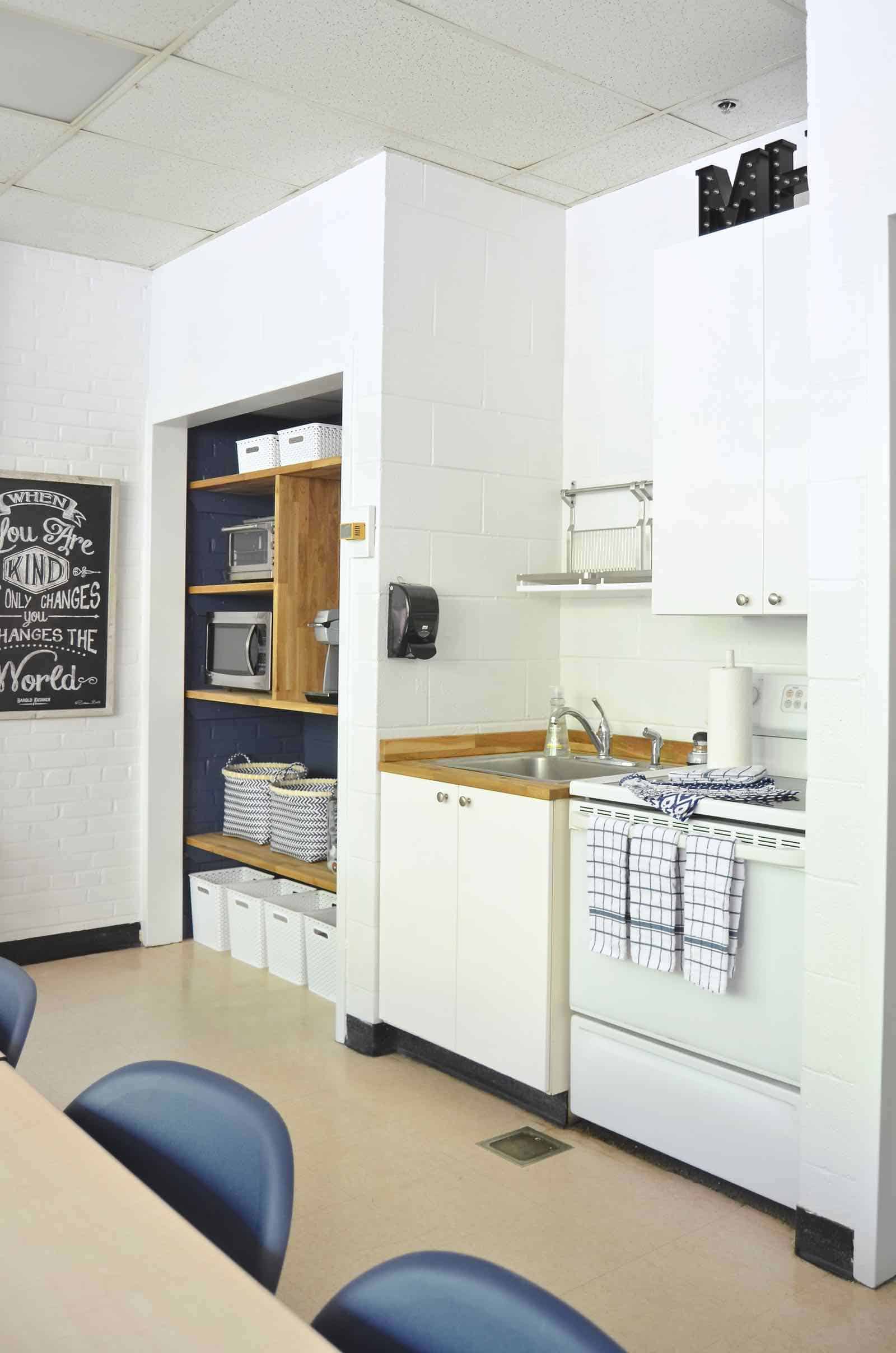
The kitchenette area got new upper cabinets and new cabinet doors below the sink (both from Ikea). Rich found those hanging drying racks at Ikea too and we hung those in lieu of the second upper cabinet. There’s PLENTY of room for storage in here and the previous solution was to dry all the dishes on top of the stove which felt a little sloppy to us.
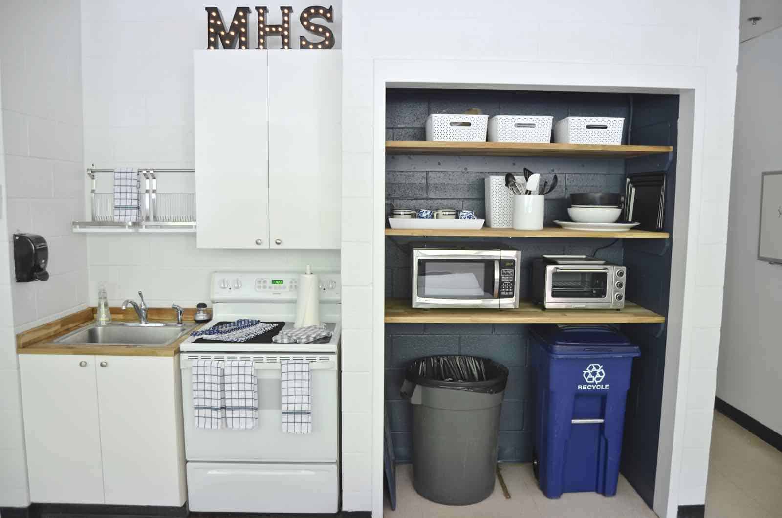
The large table and stacking chairs were already in the space and actually work perfectly for the teachers. The new color scheme makes these feel a little more deliberate and intentional.
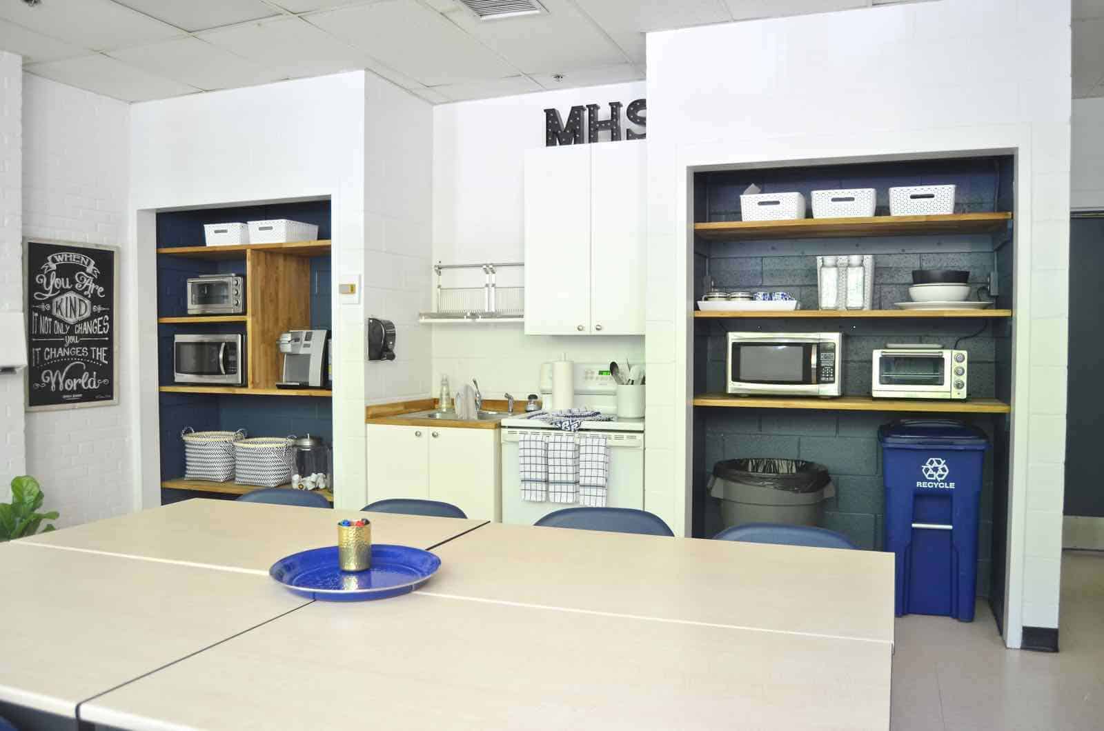
I keep coming back to the before and afters and am in shock that it really is the same room!
BEFORE
AFTER
BEFORE

AFTER
BEFORE
AFTER
I said it in the video below, but it deserves repeating… making my own space pretty and designed is one thing. But getting the opportunity to create a relaxing and useful space for a community as deserving as our elementary school faculty was a true joy. My heart is full!
Leave me a comment and let me know what you think!



what a wonderful way to give back! way to go charlotte! You turned it into such a happy space, Bravo!
Thanks, Kate! It was truly a rewarding project! The best type of room makeover!
It’s awesome Charlotte! So proud of you 🙂 🙂 You are making the world a better, prettier place my friend.
THanks, friend! Back atcha! xx
OMG!!! Charlotte this is incredible! It is not the same room at all. It looks so much better and coordinated now. Your eyes can actually rest. Is there anything you cannot do?
I KNOW! I keep saying the same thing… we had no idea how bad the old space was until we fixed it up and look back at the “before” pictures! 🙂
This looks amazing! We are About to makeover The teachers lounge aT my daughter’s school. How did you go about askIng ge for the refrigerator donation? Is there a process for donation requests or did you just call? Thank you!
Oh yay! It was such a rewarding makeover! I have a contact with GE because of my blog so I was able to promote them via my site and YouTube channel in exchange for their donation.
ILOVE THIS MAKEOVER AND AM USING IT FOR INSPIRATION WITH MY OWN STAFF LOUNGE. dO YOU HAPPEN TO HAVE THE PAINT NAMES YOU USED?
It’s mentioned right in the post: “BM Decorator’s White and the navy behind the shelves is BM Kensington Blue”