Philly Home Show Pink Backyard Space
Psssst… this post *might* contain affiliate links: see my disclosure here.
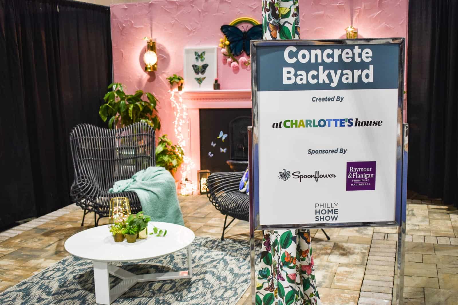
Concrete Backyard Design for the Philadelphia Home Show
Disclosure: I partnered with Raymour & Flanigan and Spoonflower for this project and am so excited to share the final design with you.
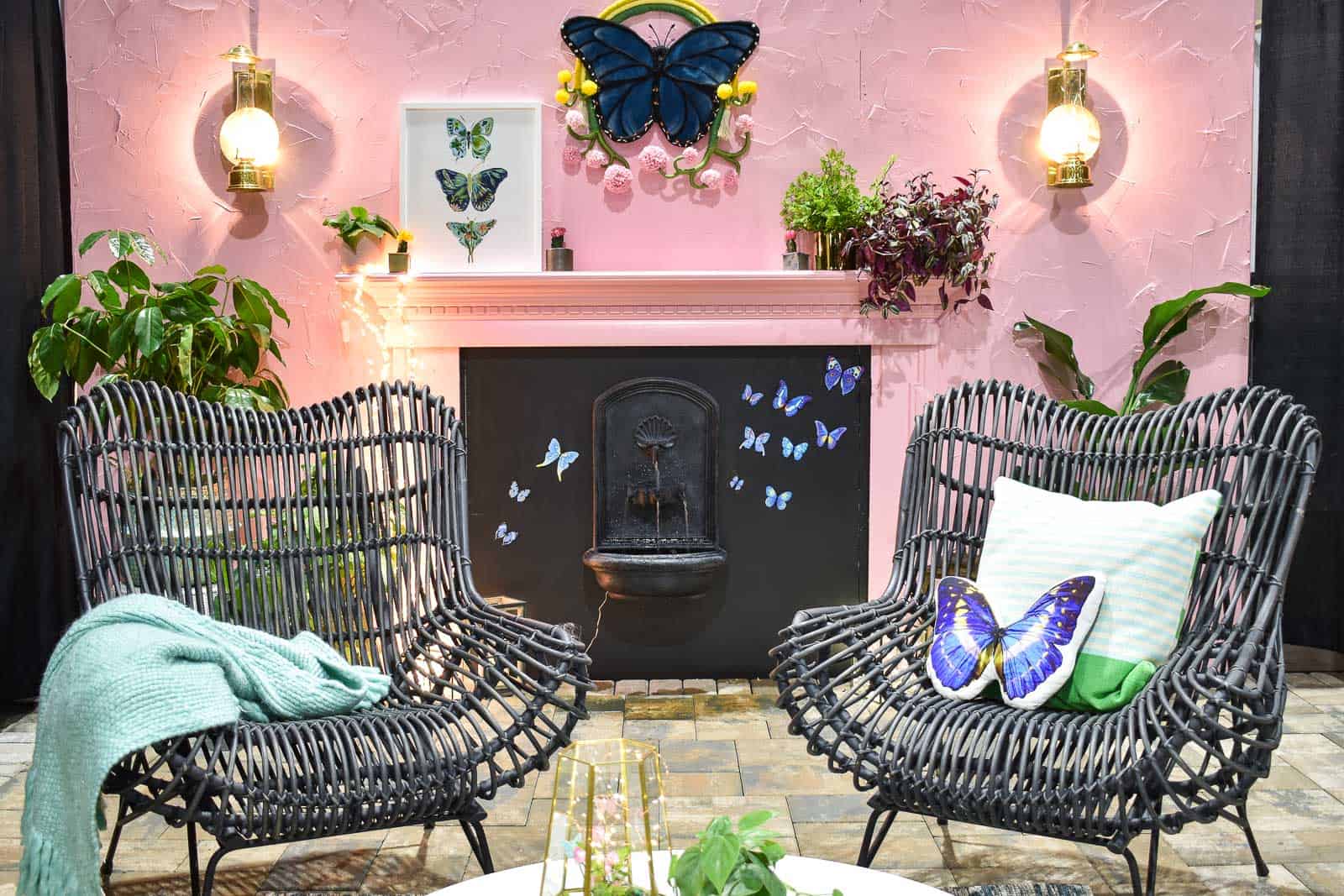
After months plotting and planning, I finally headed down to Philadelphia last weekend to install my colorful backyard space for the Philly Home Show! Thanks to all of you who following along on social media… here’s the full post with some behind the scenes details. Quick back story… I was invited to be one of the featured designers for the Concrete Backyard feature by my friend Denise with The Painted Home. I’ve never attended the home show, but have always been curious so of course I said, ‘yes’. Note: I was NOT aware that we would be moving a week later so admittedly the timing wasn’t ideal.
Shop my favorites!
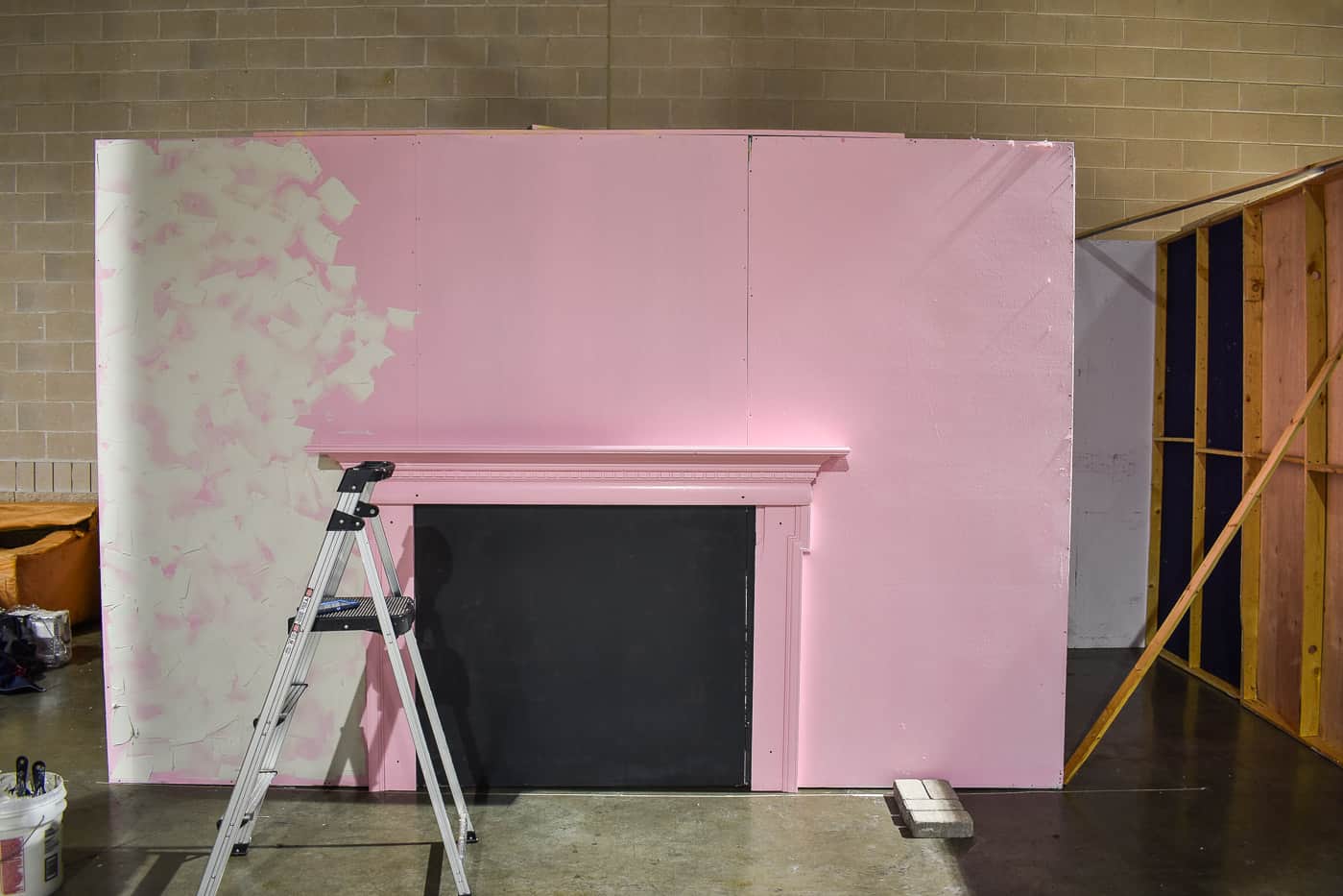
Before the show, I’d had the chance to chat with the event managers to choose where I wanted the wall of my space and what color. Also 95 other questions from me because it was hard to really visualize the space having never been. Our guidelines were to create a backyard space that might inspire and inform folks who only have a small (city) backyard/ patio. I reached out to both Raymour & Flanigan as well as Spoonflower to help me pull the space together and I am THRILLED they both agreed.
I arrived to set up the space a few days before the show and initially thought I’d driven into a parking garage. The home show takes place in the Philadelphia Convention Center which when 1/2 lit and empty… is *very* parking lot-ish… it feels 100% more official once carpets are down and all the other vendors have set up. Our design rooms were 4 temporary walls when I arrived, but a few days later… magic. Denise had an outdoor movie night set up in the middle and my friends Jen (Tiny Anchor Studios) and Rebekah (B Design Co) designed an amazing outdoor dining space in the 3rd room.
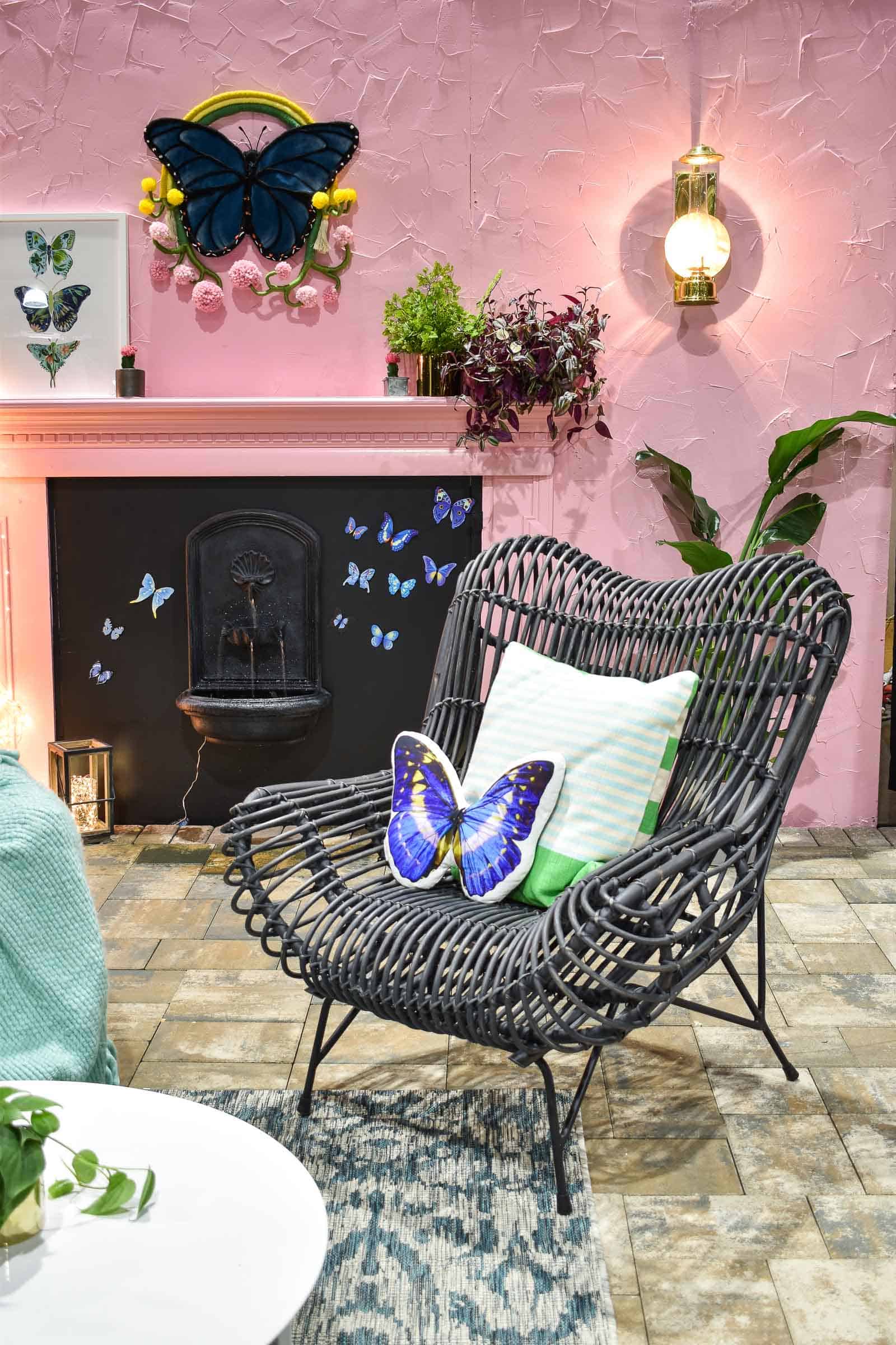
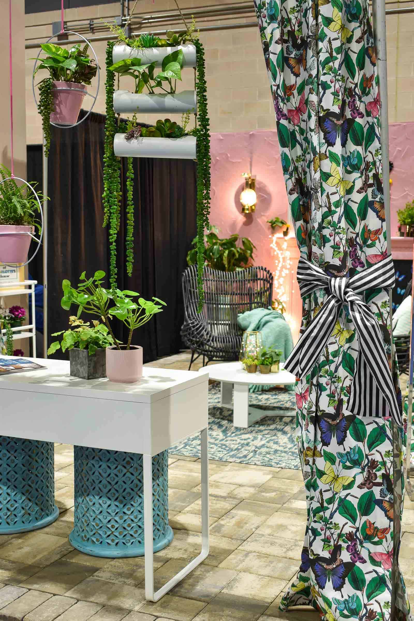
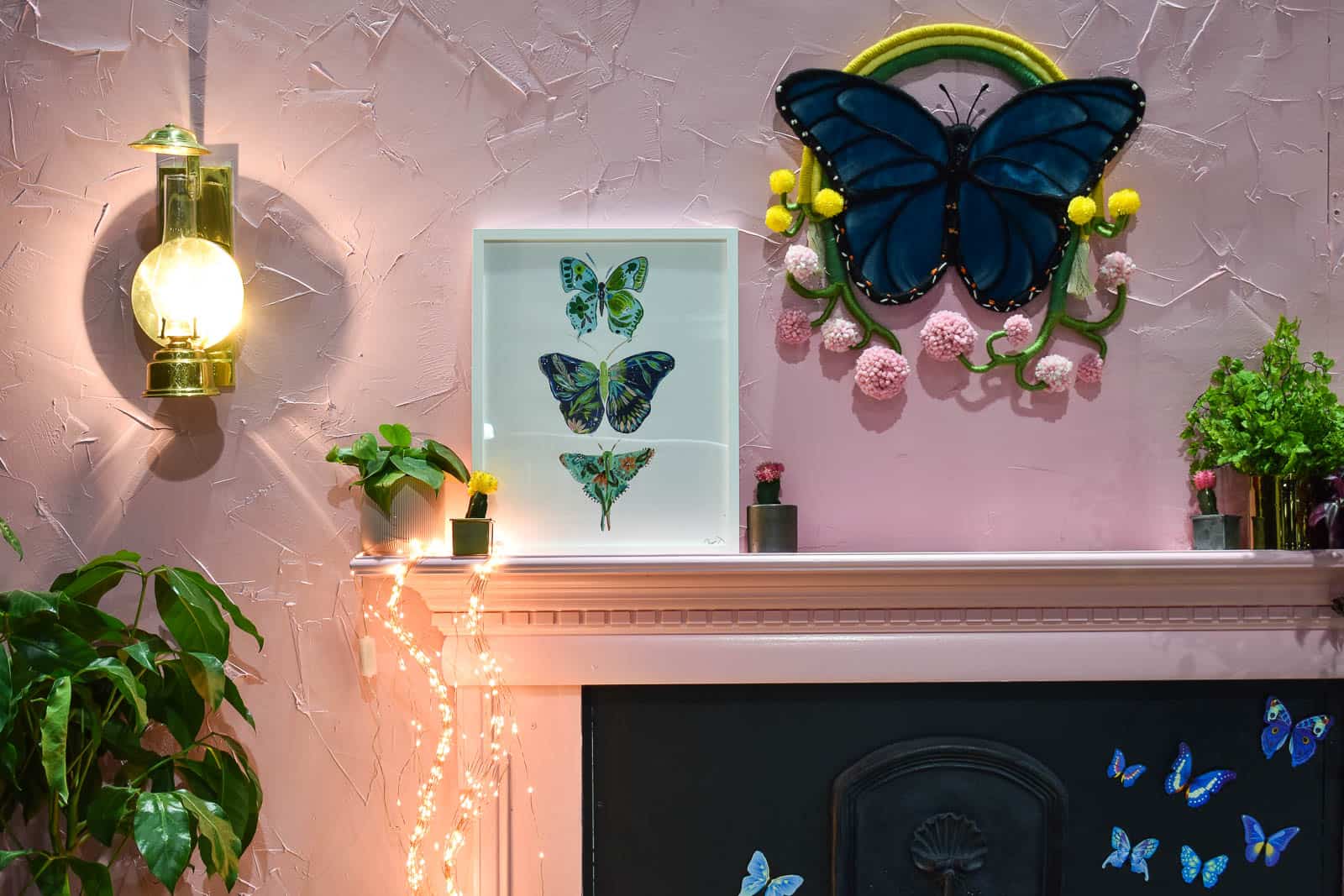
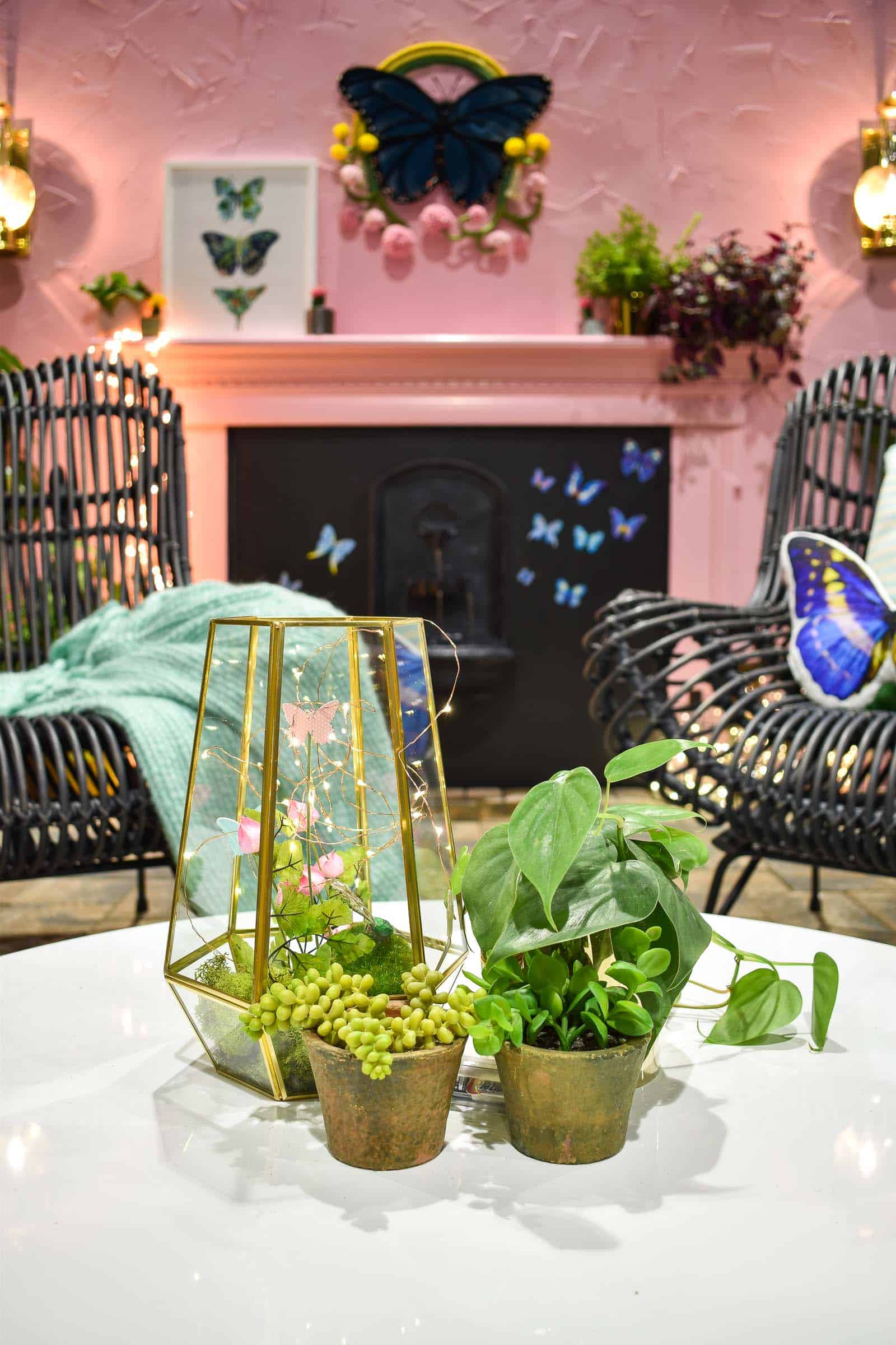
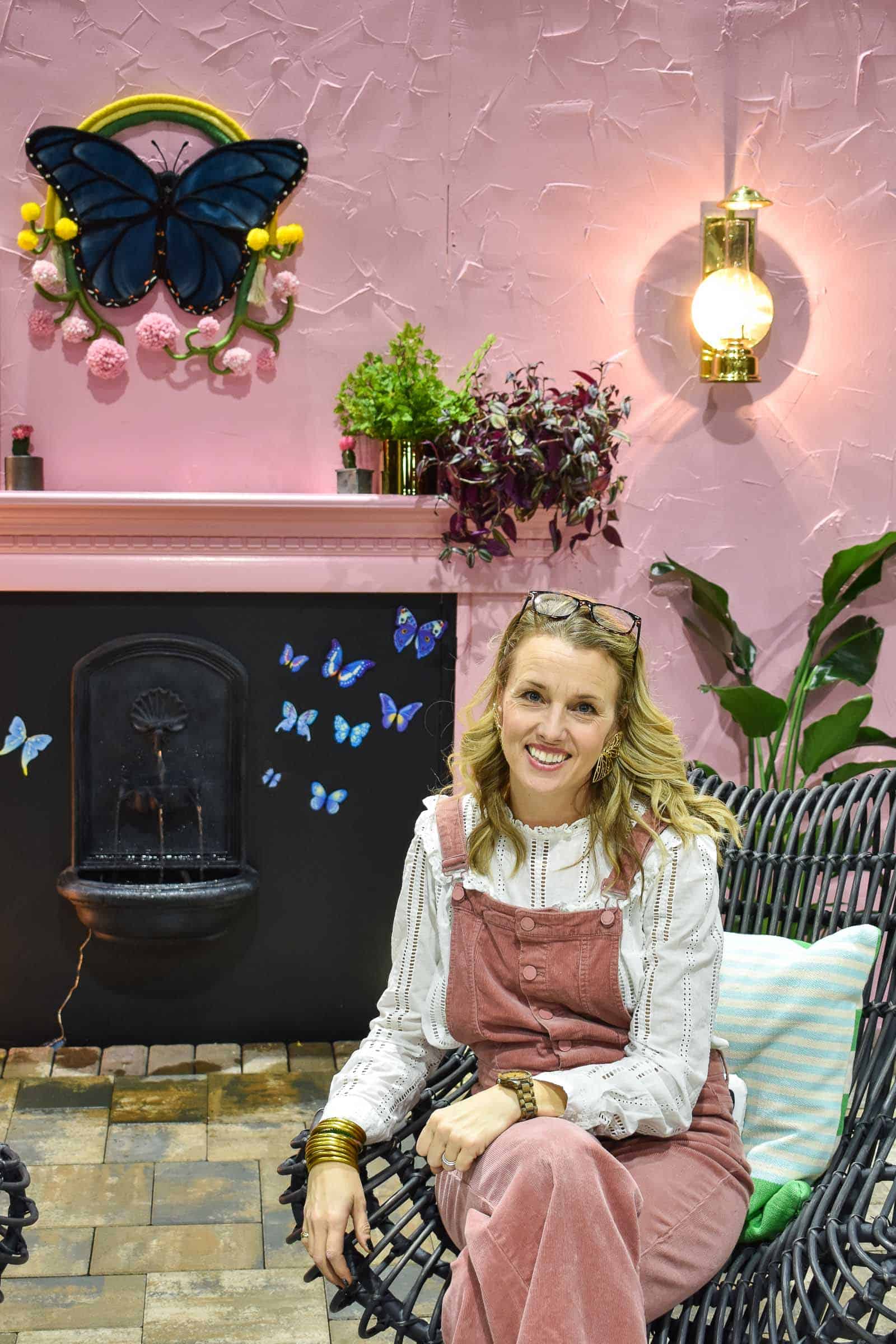
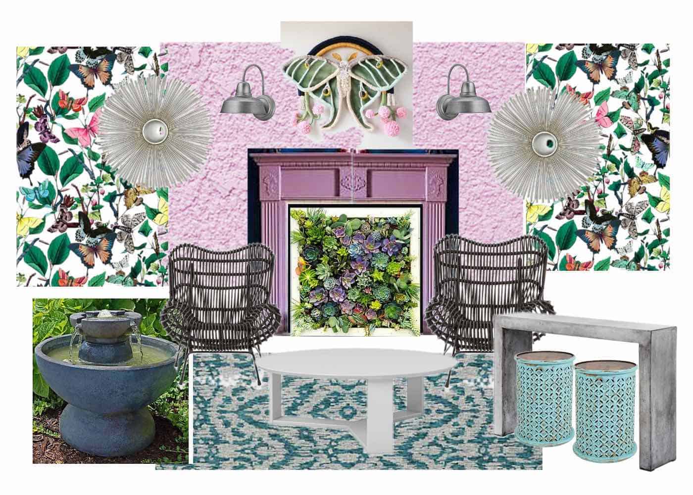
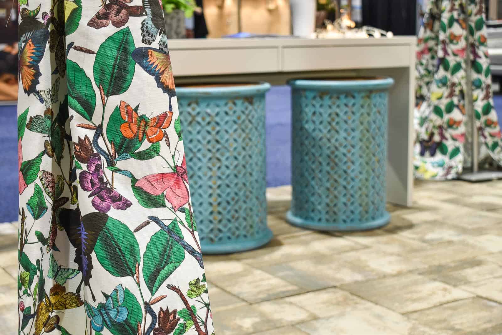
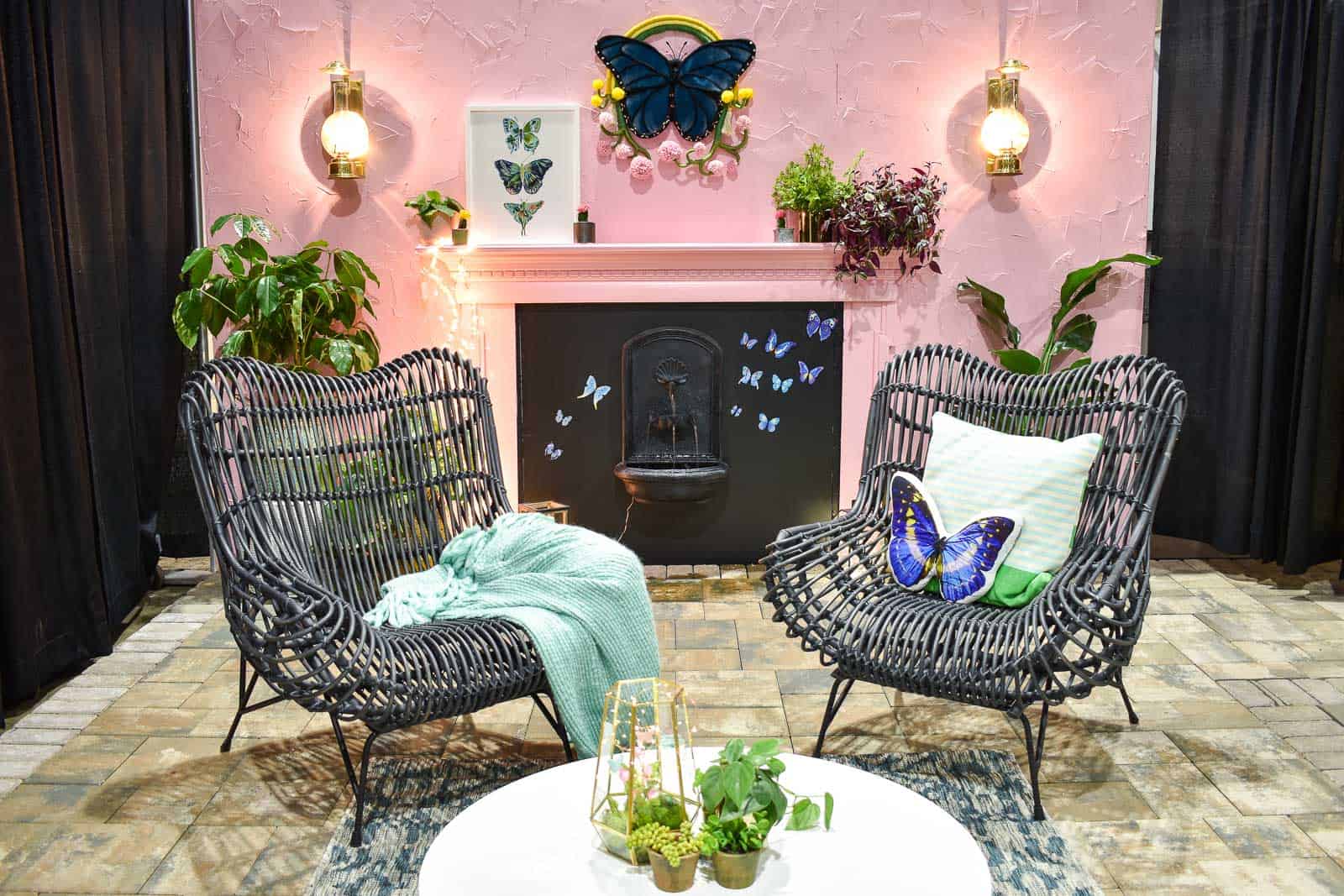
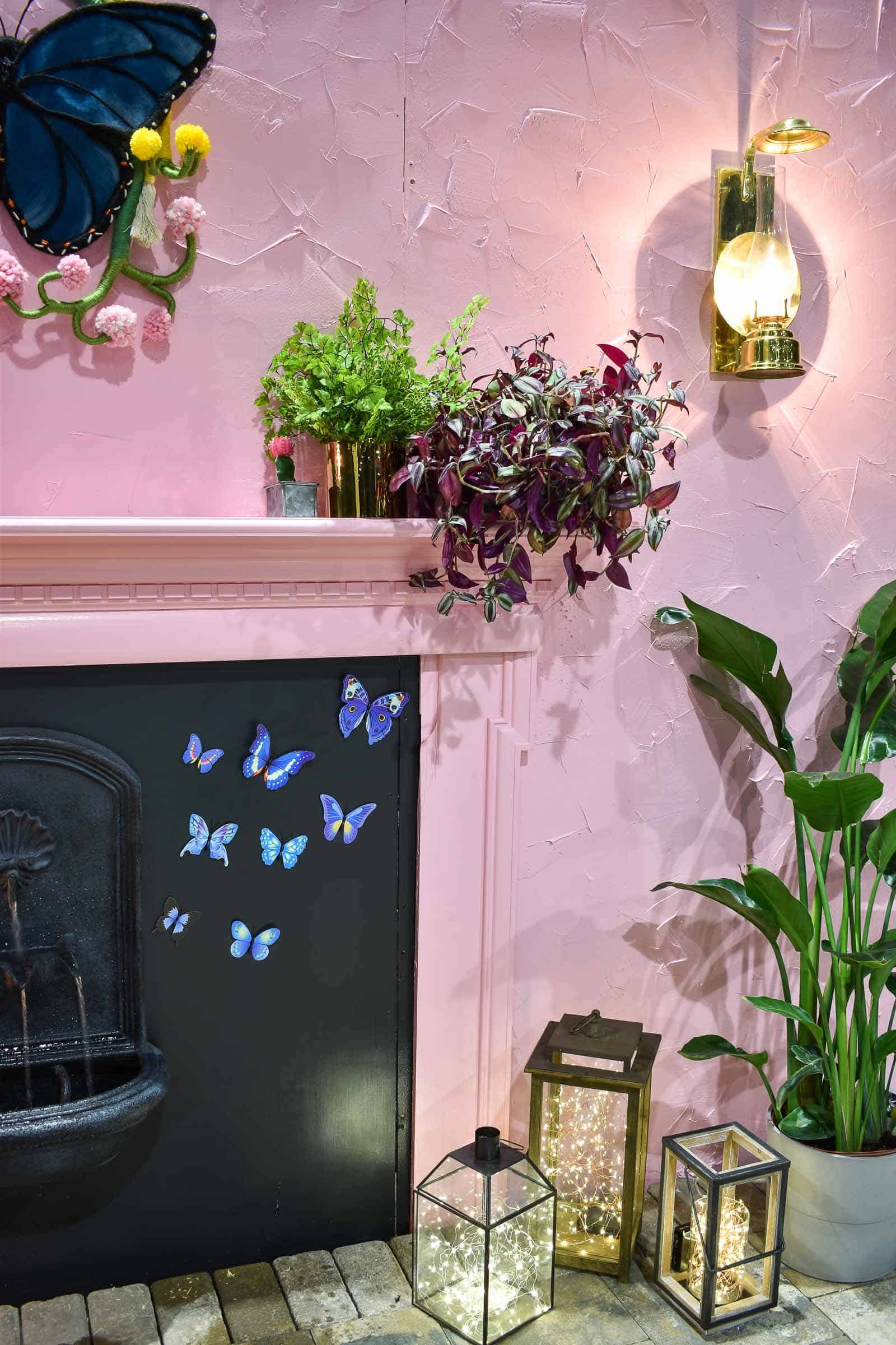
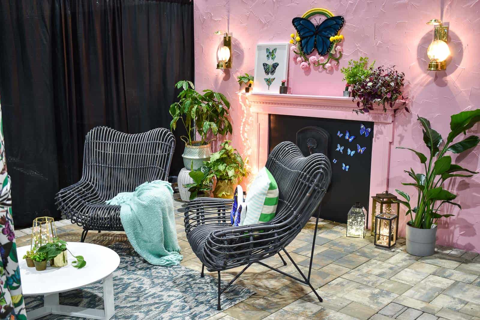
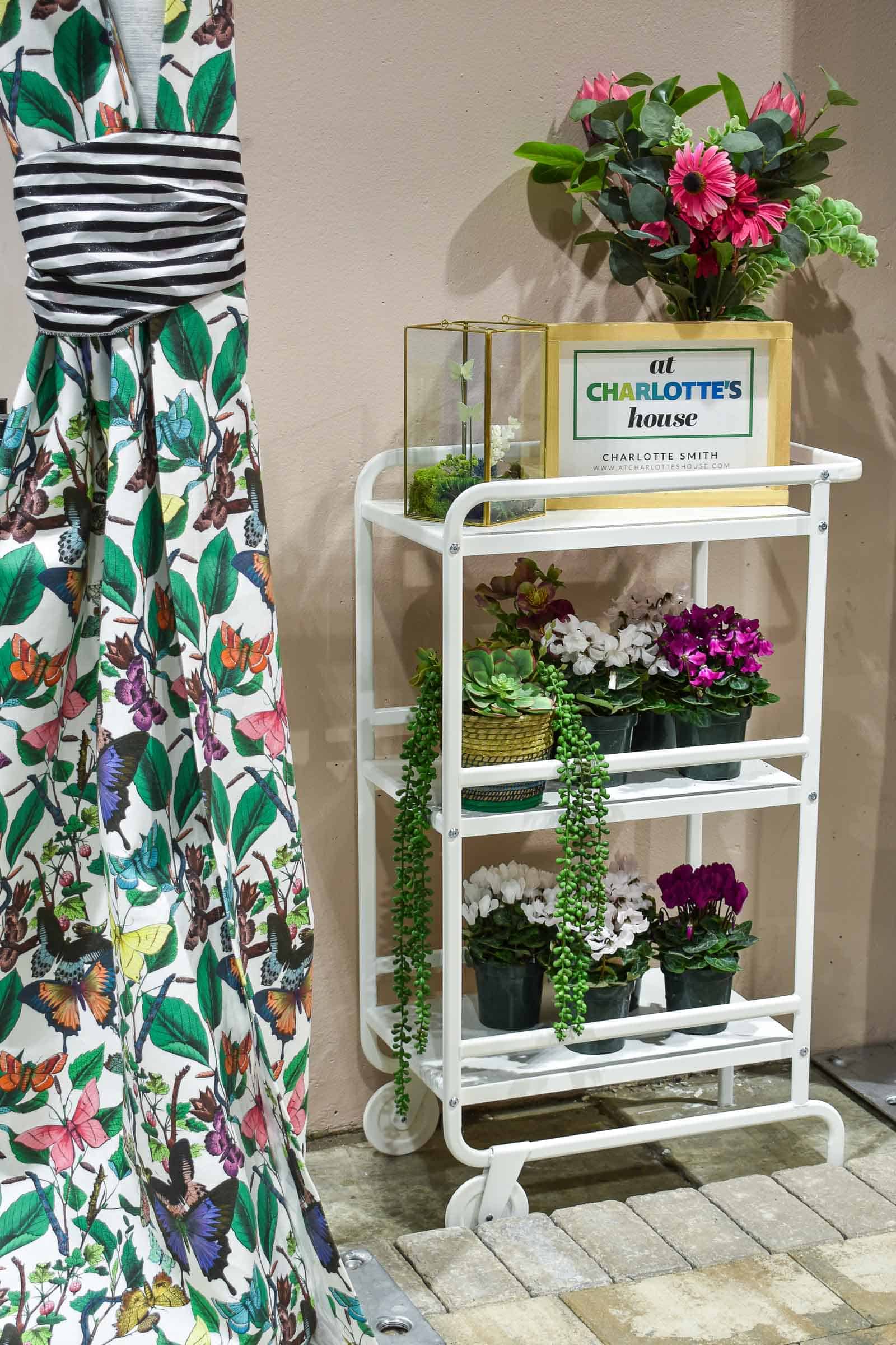
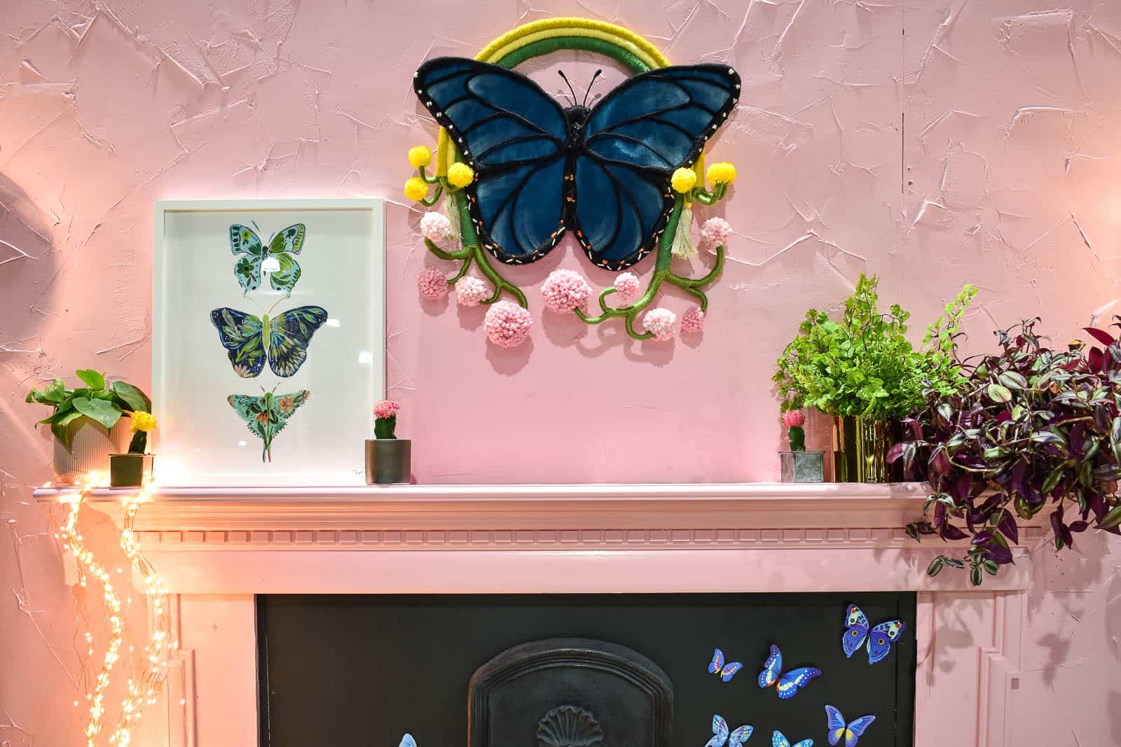
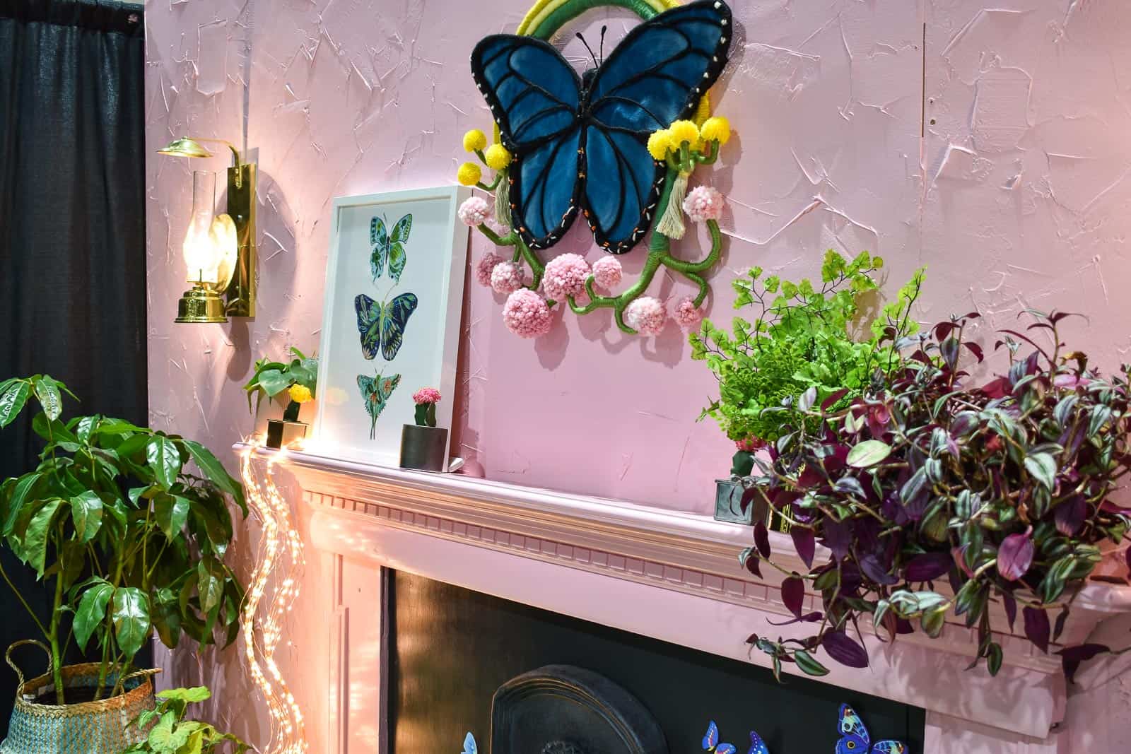
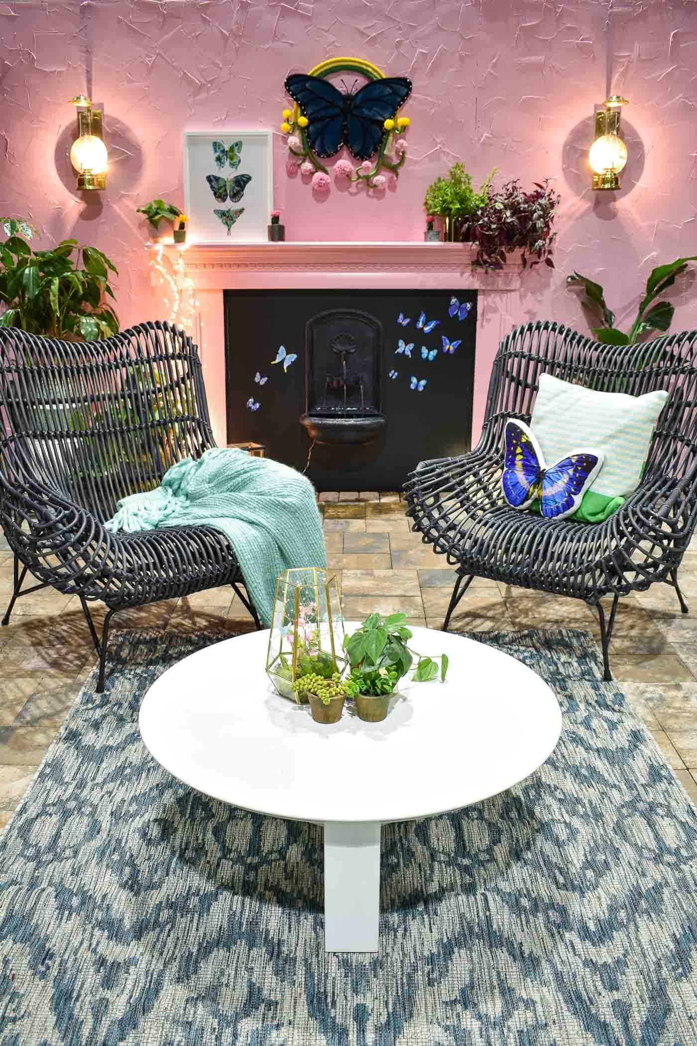
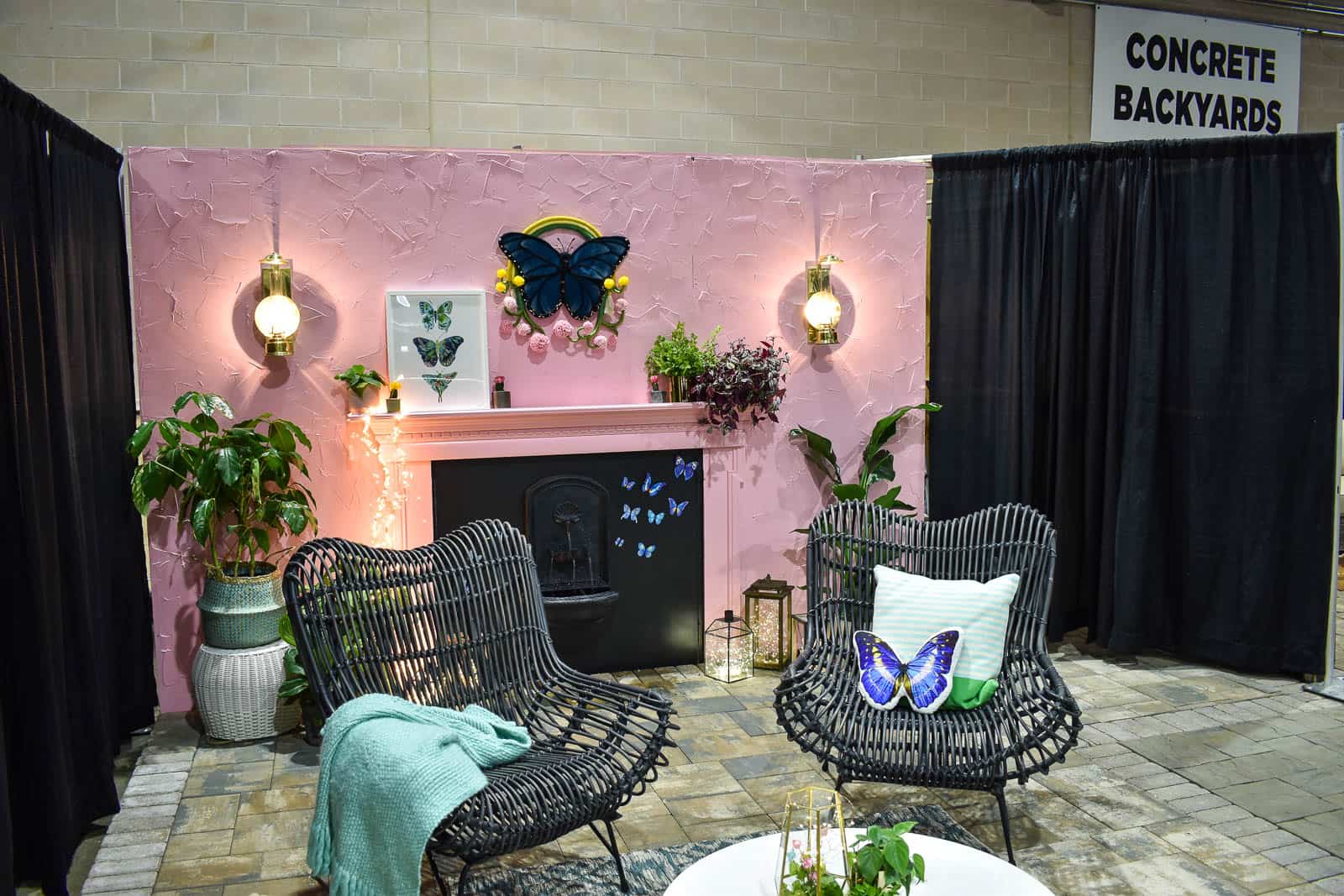
This butterfly fabric was the springboard for the space. Once I found that, the rest fell into place. Color is obviously the easiest way to freshen up a space so why not go big! I also wanted to include a focal point on my wall so a salvaged mantel and some faux joint compound spackle did the trick. I picked up those sweet brass sconces on Facebook and love how they look against the pink wall.
I fell in LOVE with those amazing black chairs from Raymour & Flanigan. They’re a modern take on the classic wicker outdoor chair and they kept the pink space from feeling too frilly in my opinion. They also happen to be super comfortable so that’s a major bonus!
Whenever you’re designing a small space, it’s important to keep your eye out for dual purpose items… which is where these cute blue garden stools come in handy. They can serve as not only seating but also side tables so easy flexible pieces for a small backyard.
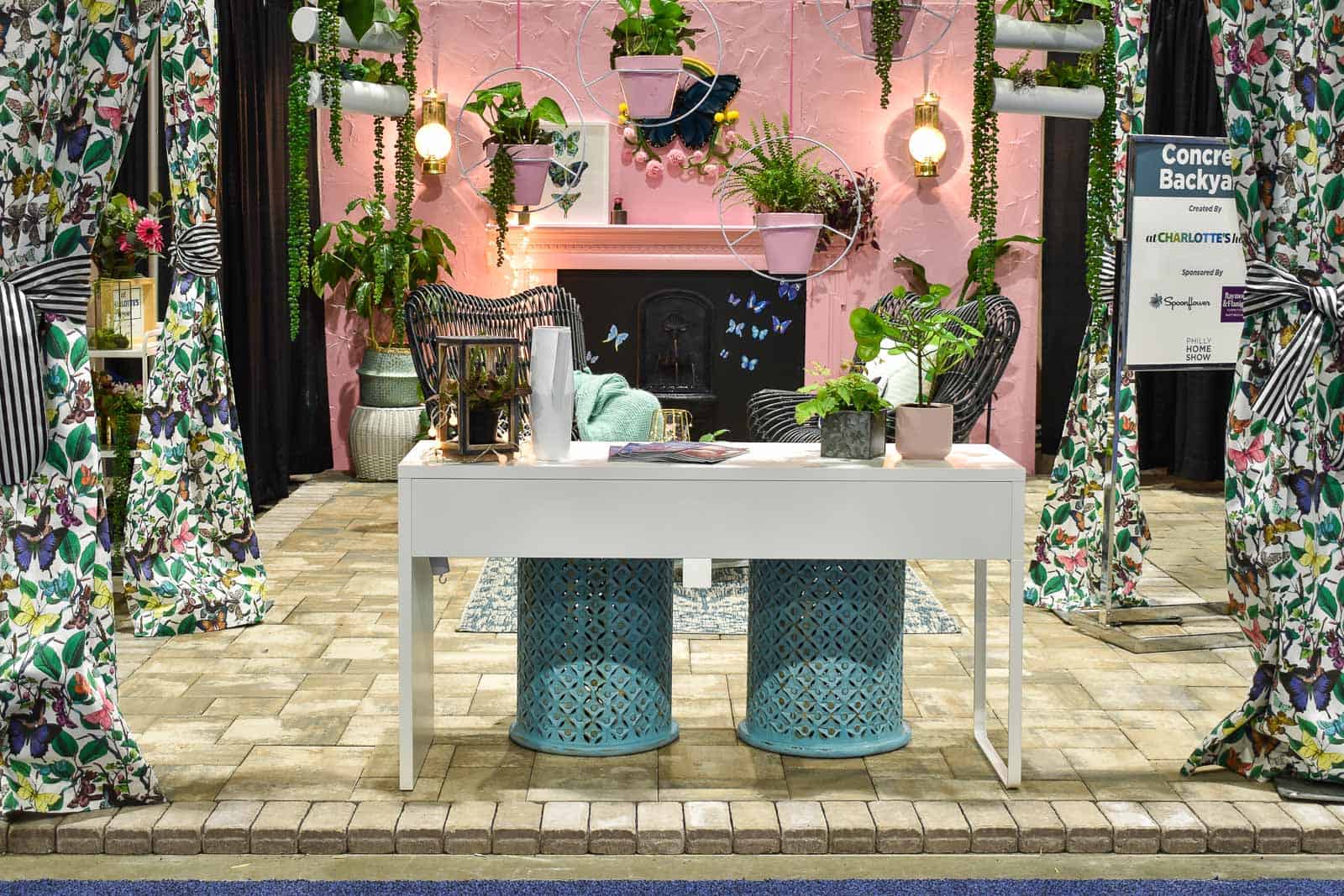
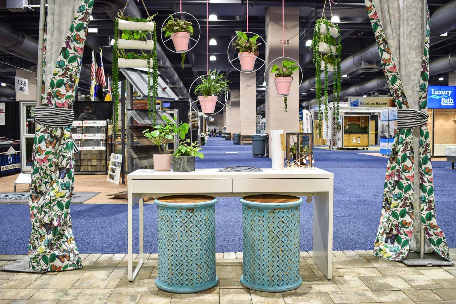
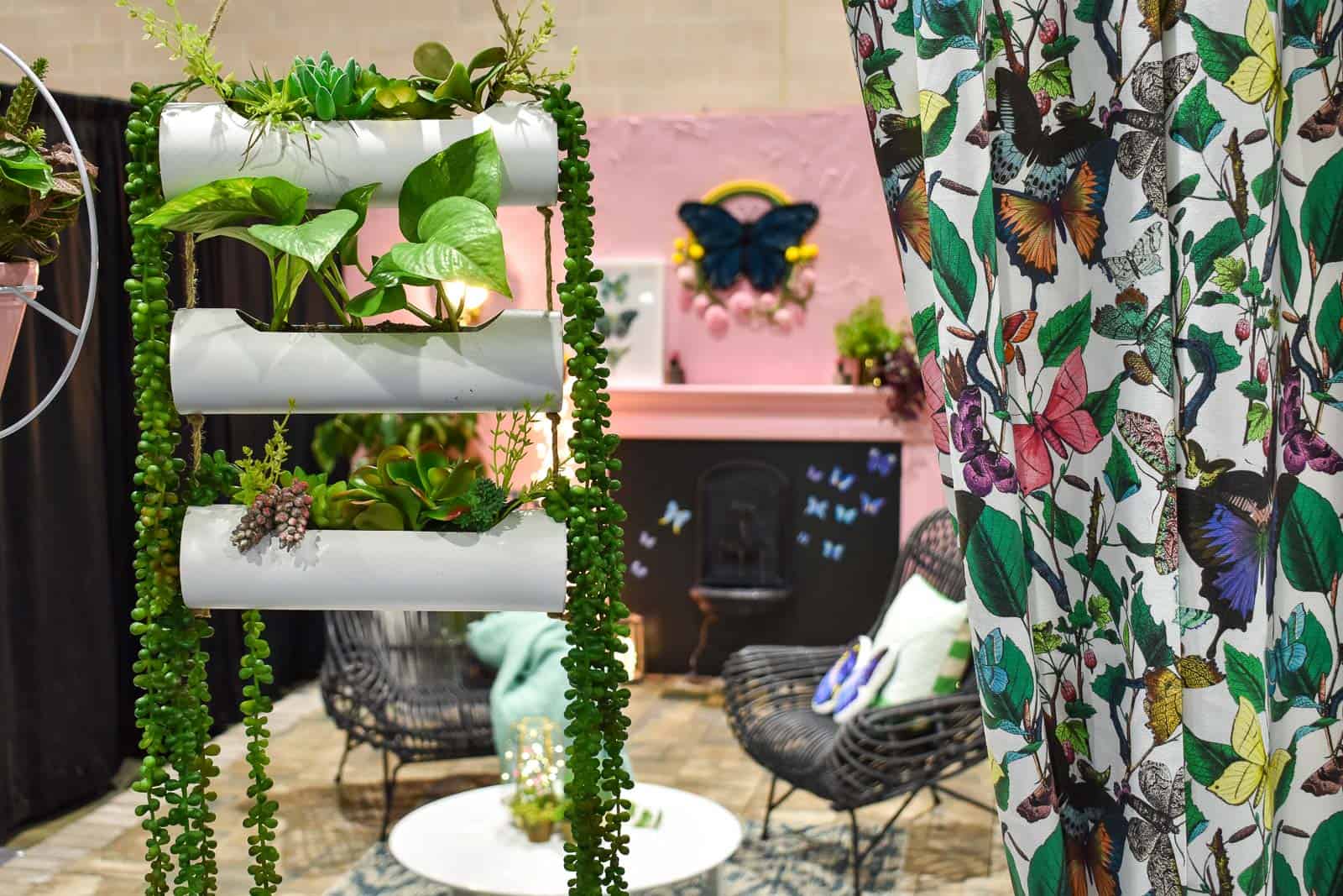
The outdoor curtains were originally hanging on the corner of the room, but then I decided to separate them to better conceal the metal poles. (The curtain rings I brought with me were a tad too small so if you look carefully you can see the zip ties I used to attach the curtains to the poles.)
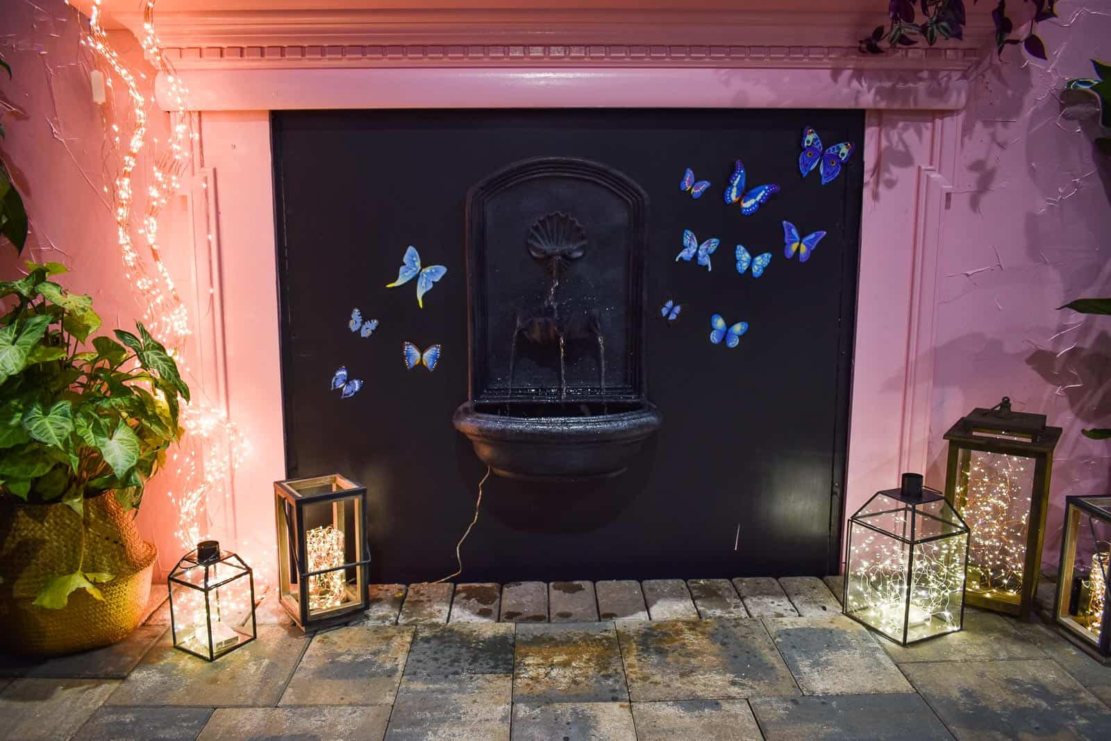
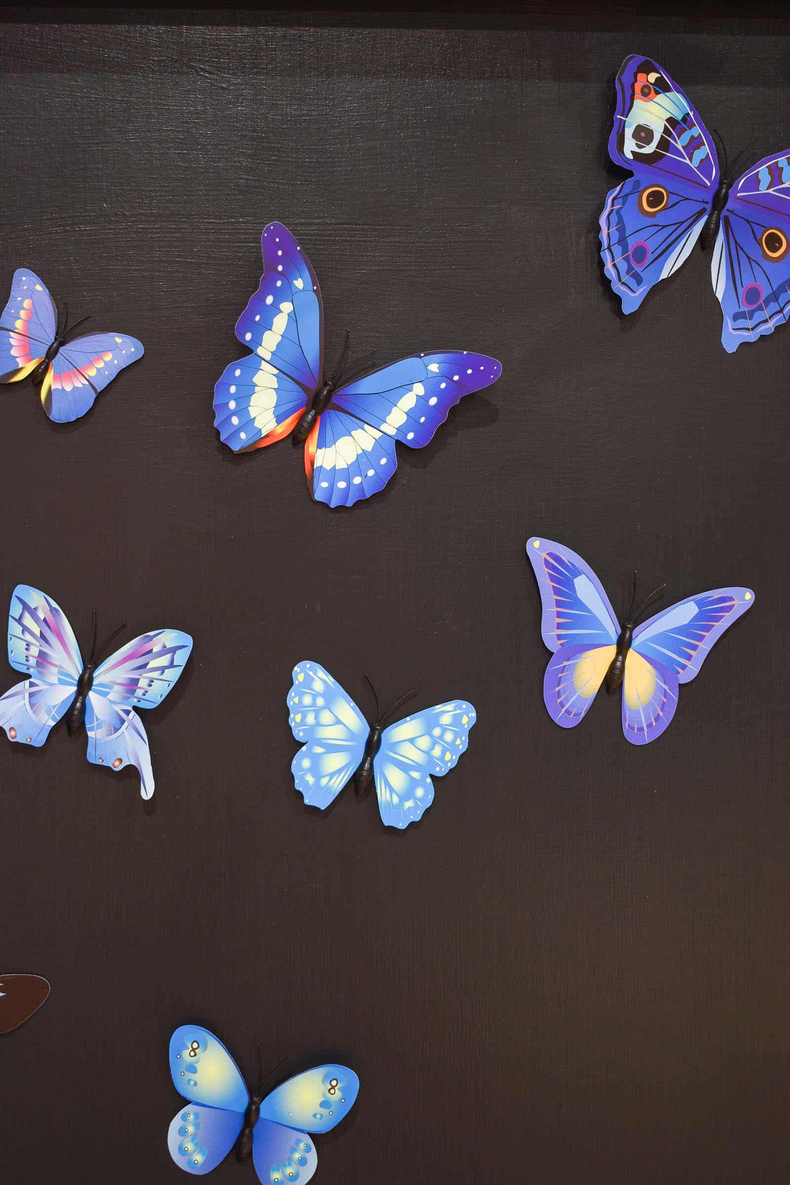
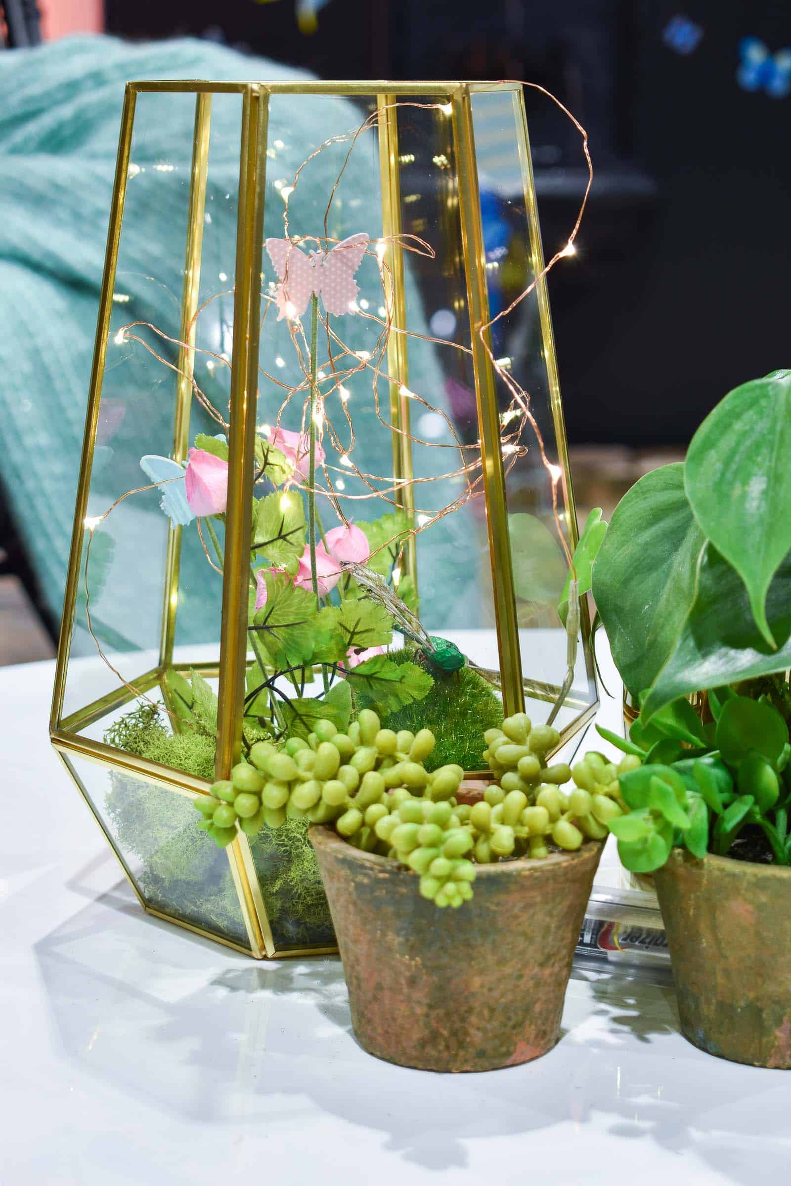
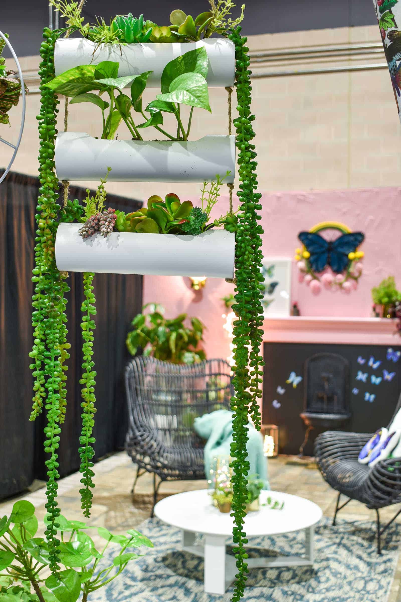
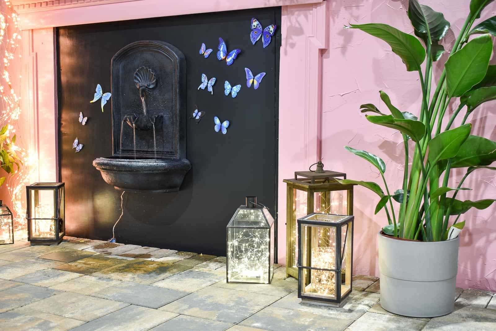
Originally I was thinking a succulent feature would have looked nice inside the mantel, but at the last minute I added that wall mounted fountain. Lots of LED filled lanterns and plants also help to make the space feel more lush and cozy. (LED lights linked here too.)The patio stone was laid by a contractor and it makes the space feel more complete also.
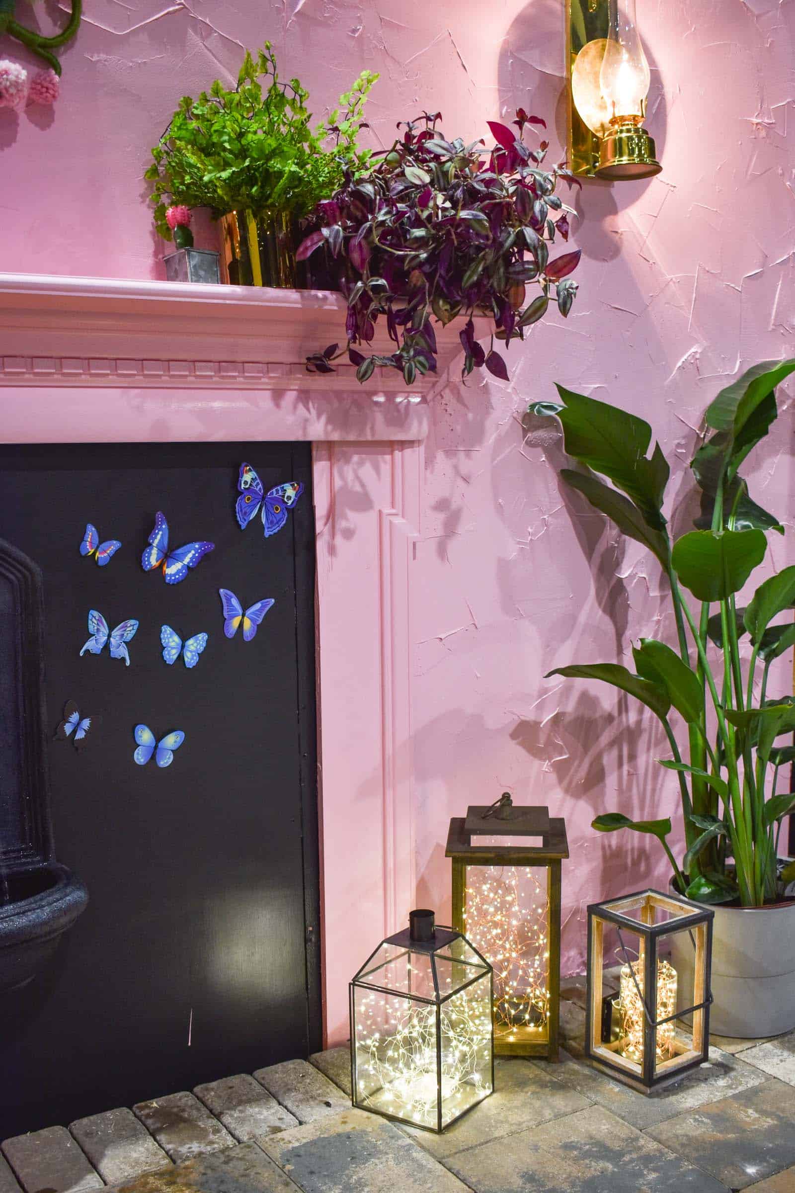
Other details that make the space: that fiber art butterfly hanging above the mantel and the butterfly print leaning agains the mantel. I fell in LOVE with the work of Mandi Smethells when I saw her on Instagram; I reached out to see whether she’d be interested in creating a custom piece for the home show and when she said yes I may or may not have shrieked!
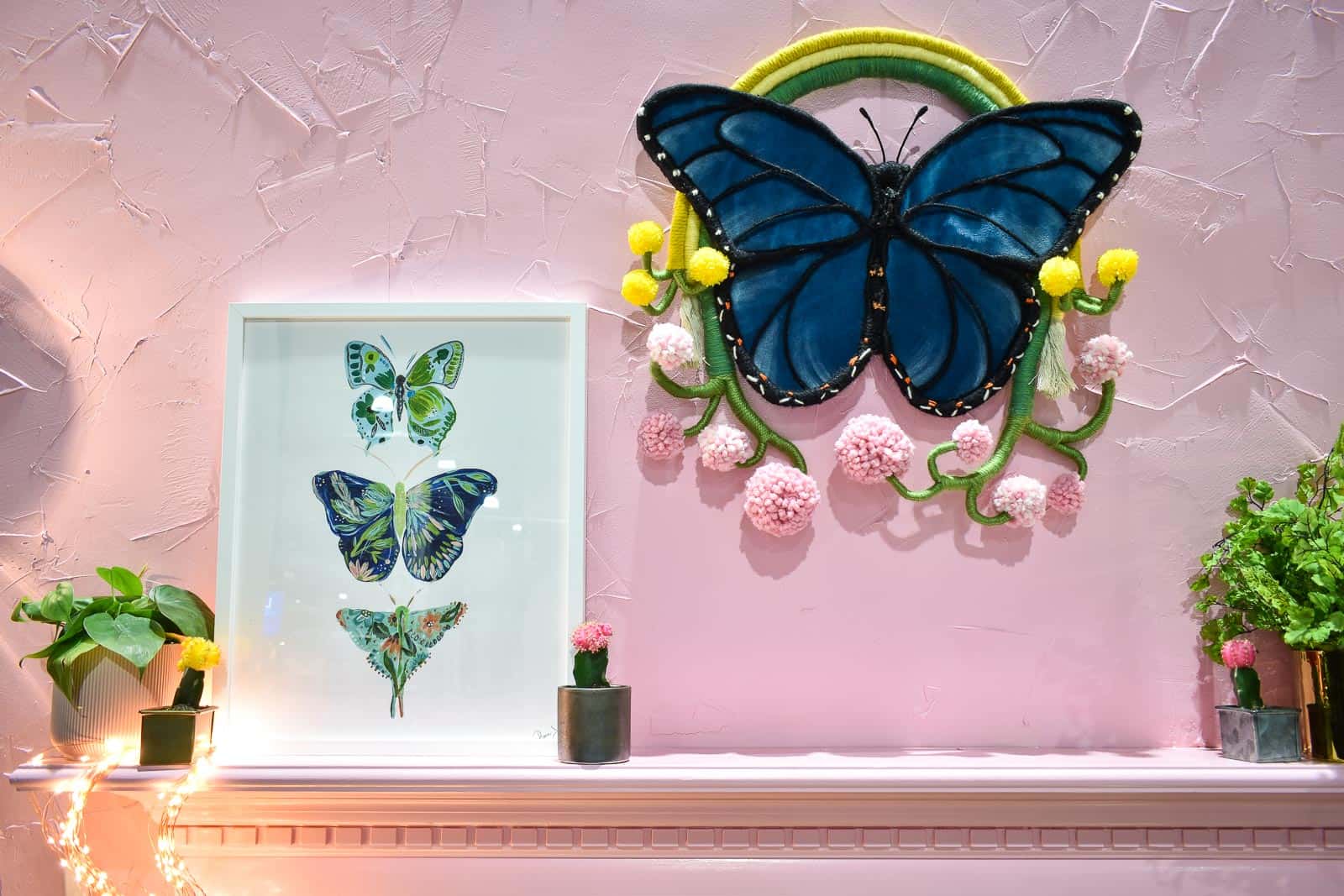
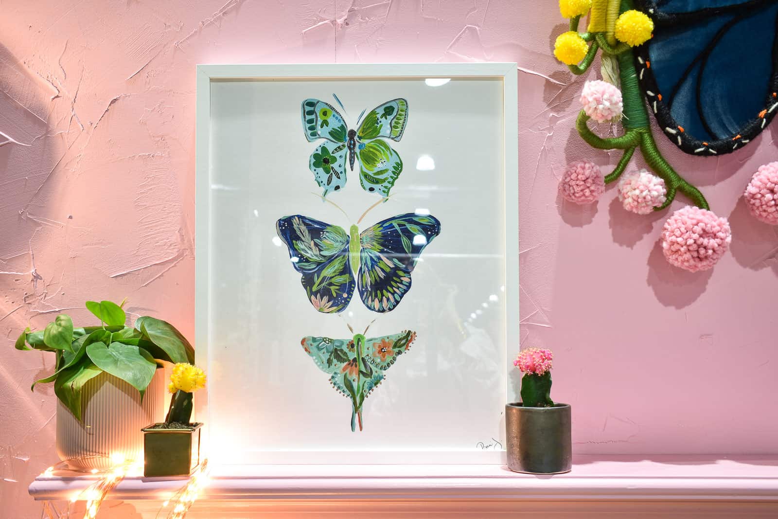
Finally, my friend Bari J. is the queen of all things floral and her work can be seen on fabric and posters and rugs and wallpaper and more. She showed this butterfly print on Instagram one day and, well, I begged.
If this were an actual outdoor space, I’d bring some of these decorative items inside when not in use, but for the most part, these ideas would translate perfectly to a small, dull outdoor city space… add some color. Bring in architectural details. Mood lighting will serve you well. And have FUN!
The first weekend of the show came with lots of publicity and media events. See our news appearances from the show here. I also partnered with Joann to teach a couple of Make and Take classes… stay tuned for a tutorial outlining that craft project in the next week or so!


Looks fun and inviting! Thanks for sharing, Urban backyards are tough – small spaces needing to pack a punch. Definitely some inspirations in there!
Thanks so much! Urban backyards are SO tough. We had one in Brooklyn and forget about it. 🙂
Charlotte – could you please remove my last name on the comment. I didn’t mean to leave it in there. Prefer to keep it private. Thanks.
I luv the ideas, a bit too much pink for me, where can I find the fairy lights?
Hi Maggie! All the materials are linked in my Amazon shop. I mentioned it and linked to it if you read the post. Thanks!
There’s a lot of creativity here! I loved what you did with the plants and those dual purpose stools/side tables. I think this could definitely work in an urban small backyard!
Thanks, Velvet! I would have loved to have this much color in my old city backyard!