DIY Graphic Art
Psssst… this post *might* contain affiliate links: see my disclosure here.
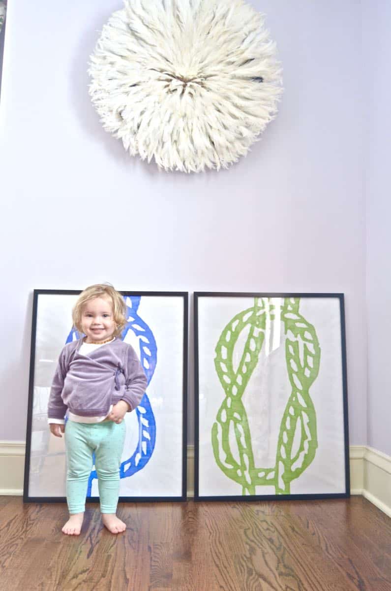
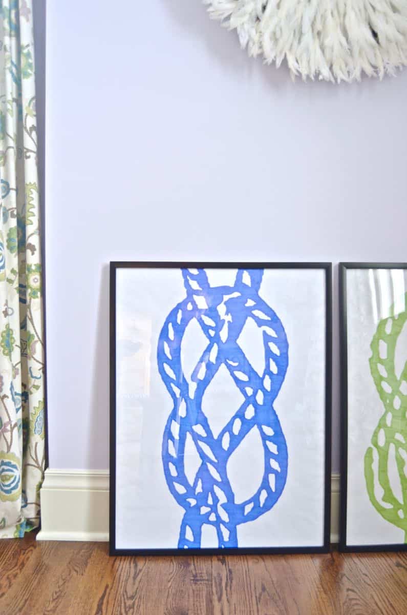
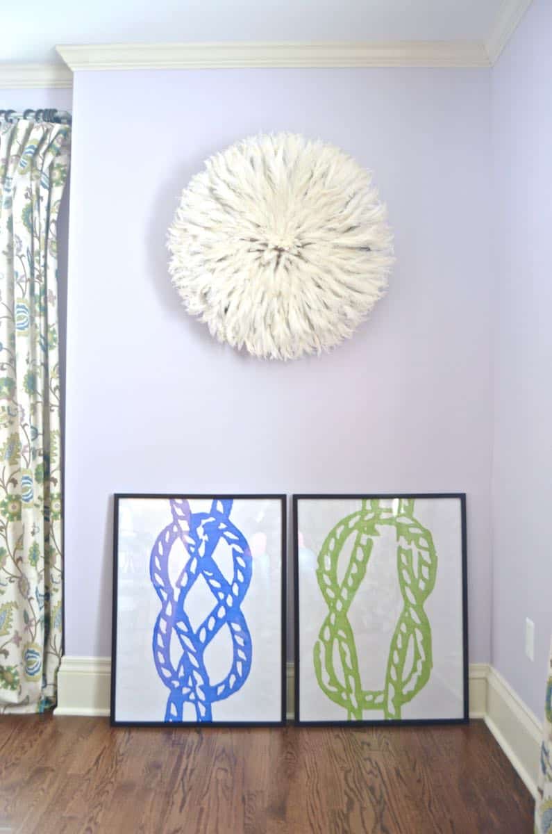
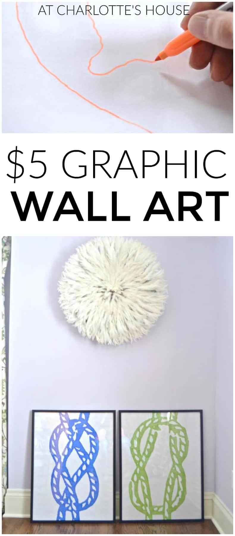
For the restaurant redesign, we had a budget of like $300 for artwork. Yep… alllllll the artwork. I wanted to give you a fun tutorial on how I made these graphic and colorful prints. Spoiler alert: it was stupid simple.
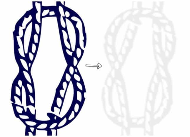
I started by finding some basic graphics online of nautical knots. Obviously, you can find whatever graphic your heart desires here… Using PicMonkey or some other photo editing software, I blew these up enormous and changed the color to be the lightest gray I could print. (I suspect you could accomplish the same thing just manipulating a photocopier in case the idea of photo editing makes your eyes cross.)
Shop my favorites!
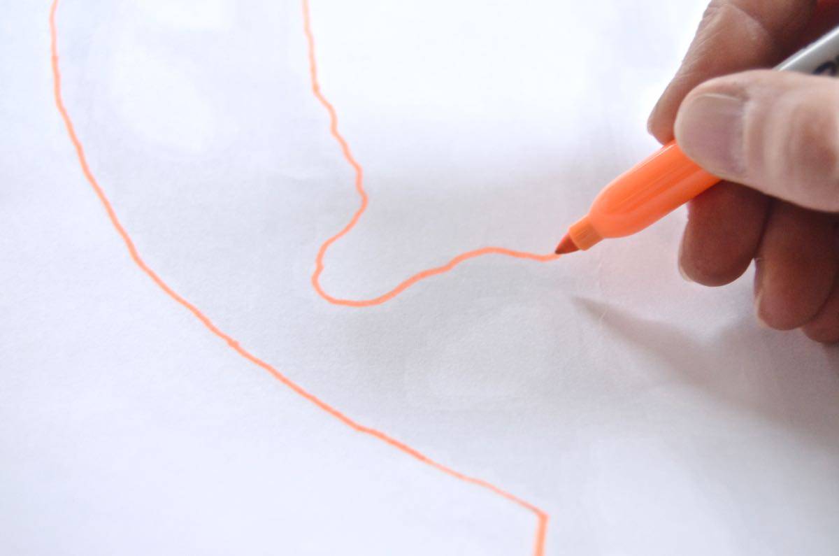
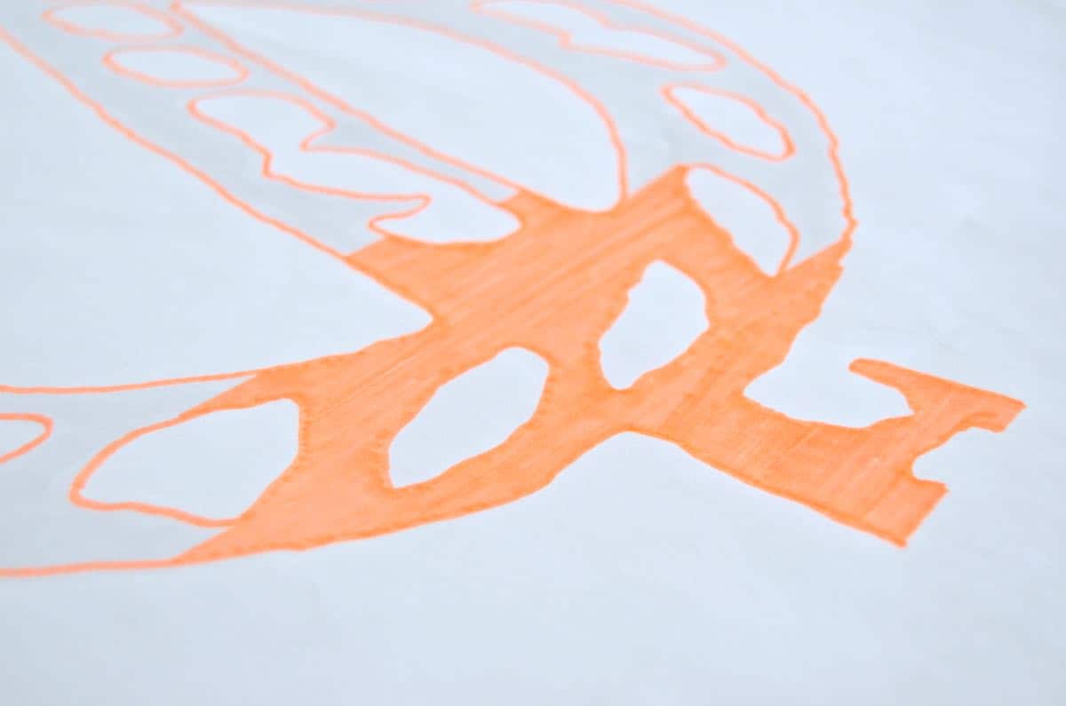
These files were sent off to Staples for engineer prints. Cheap and big. I toyed with just photocopying the graphics and then transferring them onto a large piece of paper, but… this pale gray is the perfect outline to work with. We loved the idea of contemporary pops of color for the restaurant art, so I used blue and green and then a neon orange to color over each knot. The frames were on sale at JoAnn and are a clean and simple black. I outlined the image and then went back being neat about how I colored it in!
This was actually a fun mindless coloring project, but I love the impact of the bold print. It looks much cooler than a $15 frame and a $3 photocopy doesn’t it?



That is so stinking smart! I thought you were going to take me through a complicated photoshop tutorial. Thank you for being easy!
HAHA. If you have ANY photoshop insight, PM me… I can ‘barely’ accomplish the simplest things still. I’m excited to try this with a different image for one of the kids rooms!! 🙂 xx