Primary Bedroom Reveal
Psssst… this post *might* contain affiliate links: see my disclosure here.
Sophisticated Bedroom Makeover
I added color, fabric and a few key furniture pieces to turn our primary bedroom into the perfect space to unwind.
HOLY SMOKES this space has been a long time coming together but all the little details and projects have been worth it because I walk in here every night and smile a big ol’ goofy grin! What used to be a big dated cavernous space now feels cozy and cohesive and so much more dynamic. Over the last few months I’ve done the following in here (full product list at the end of the post):
Shop my favorites!
- painted
- layered in fabric
- replaced the ceiling fan
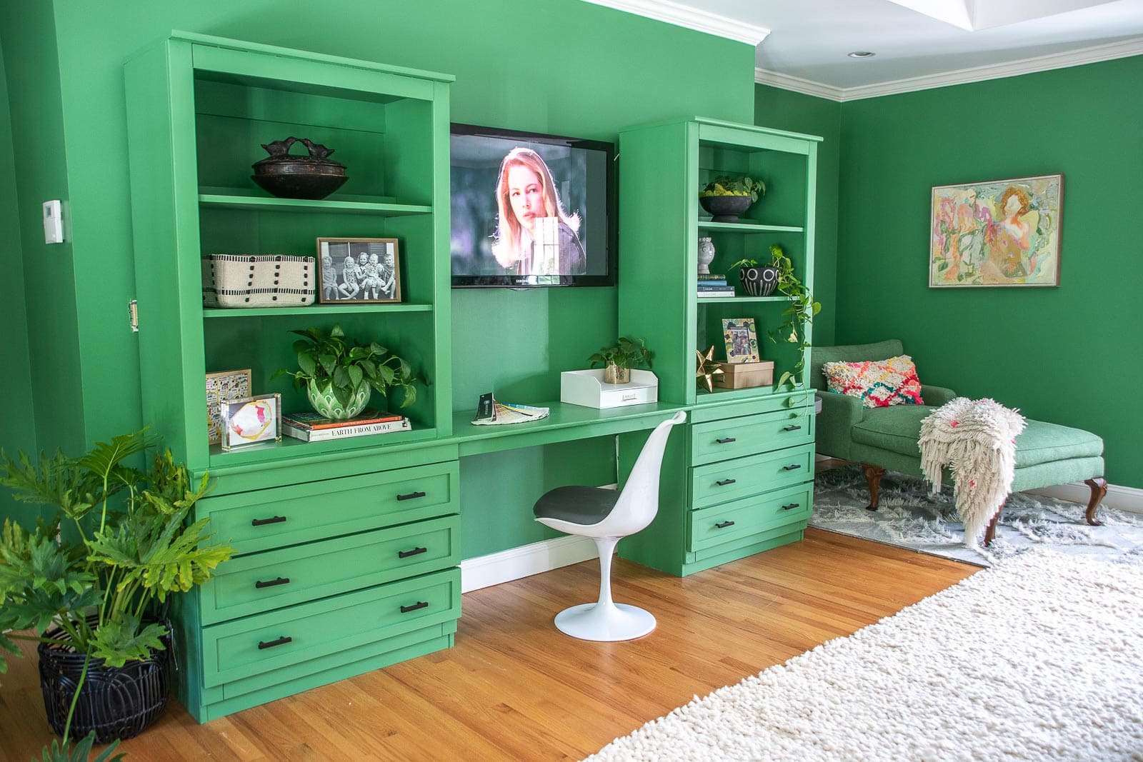
- made and installed bookshelves and desk area
- replaced the bench
- built a table
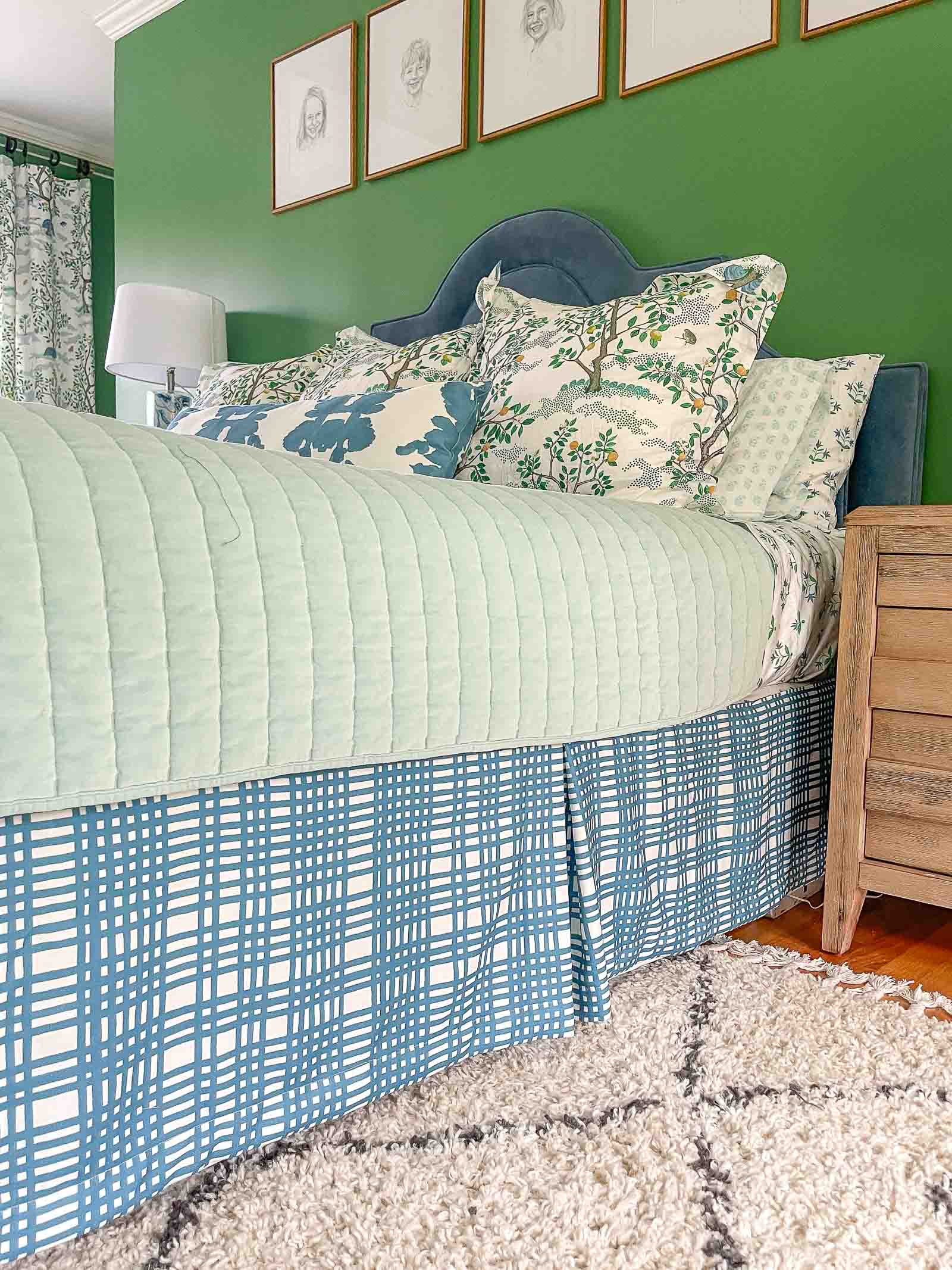
- sewed a bedskirt
Painting the Bedroom
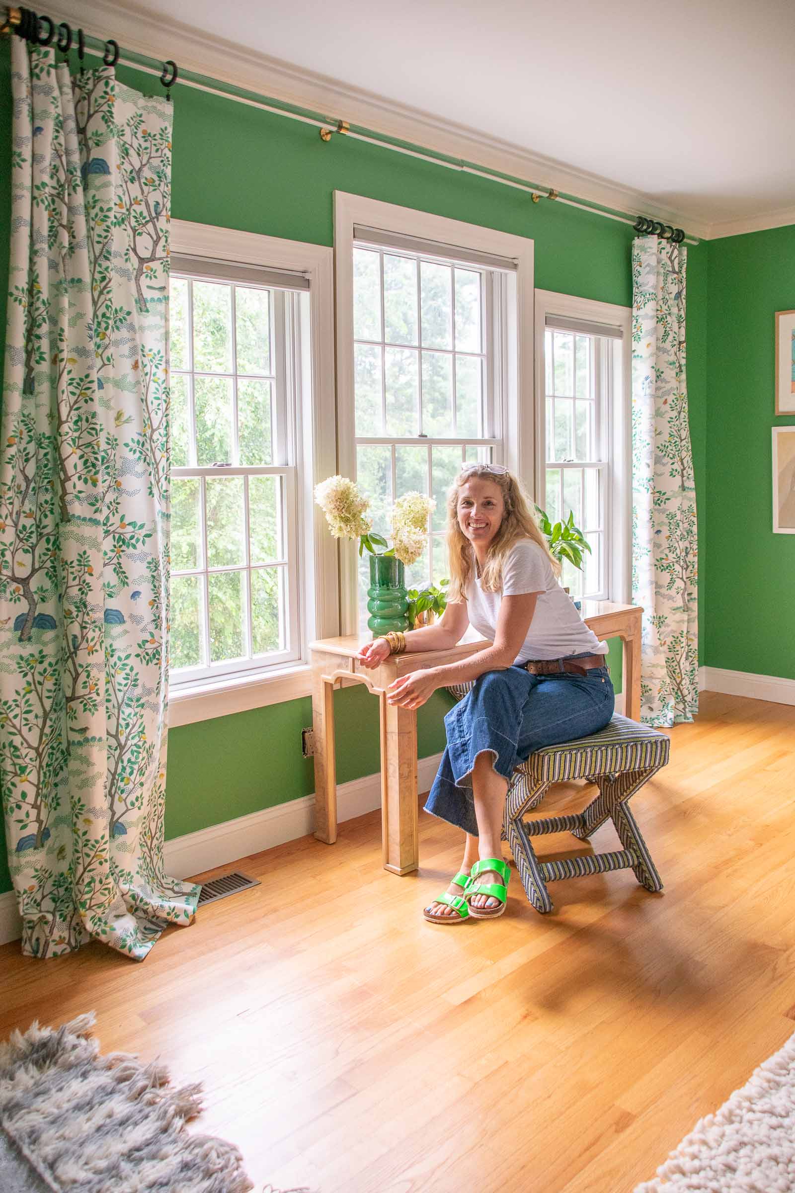
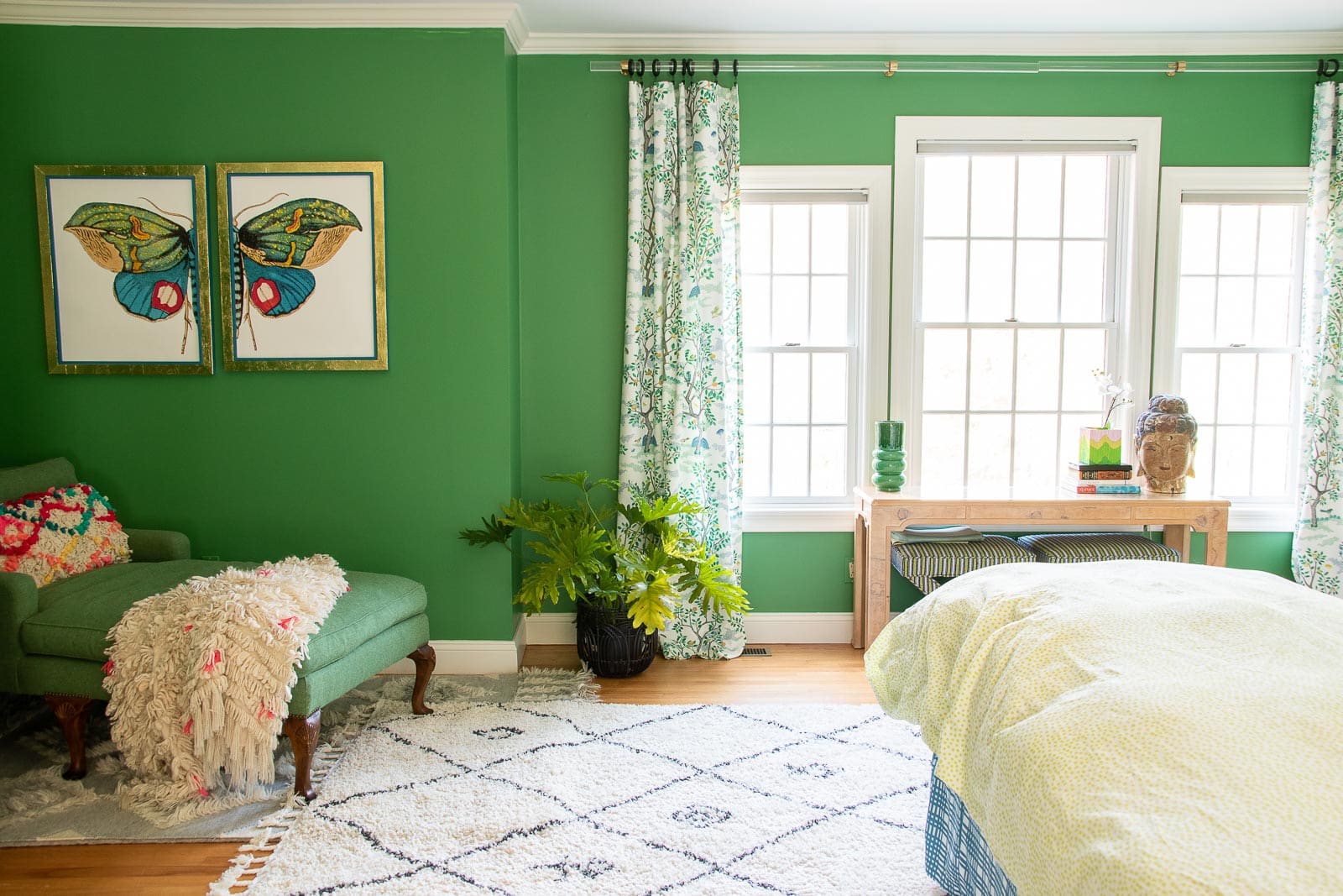
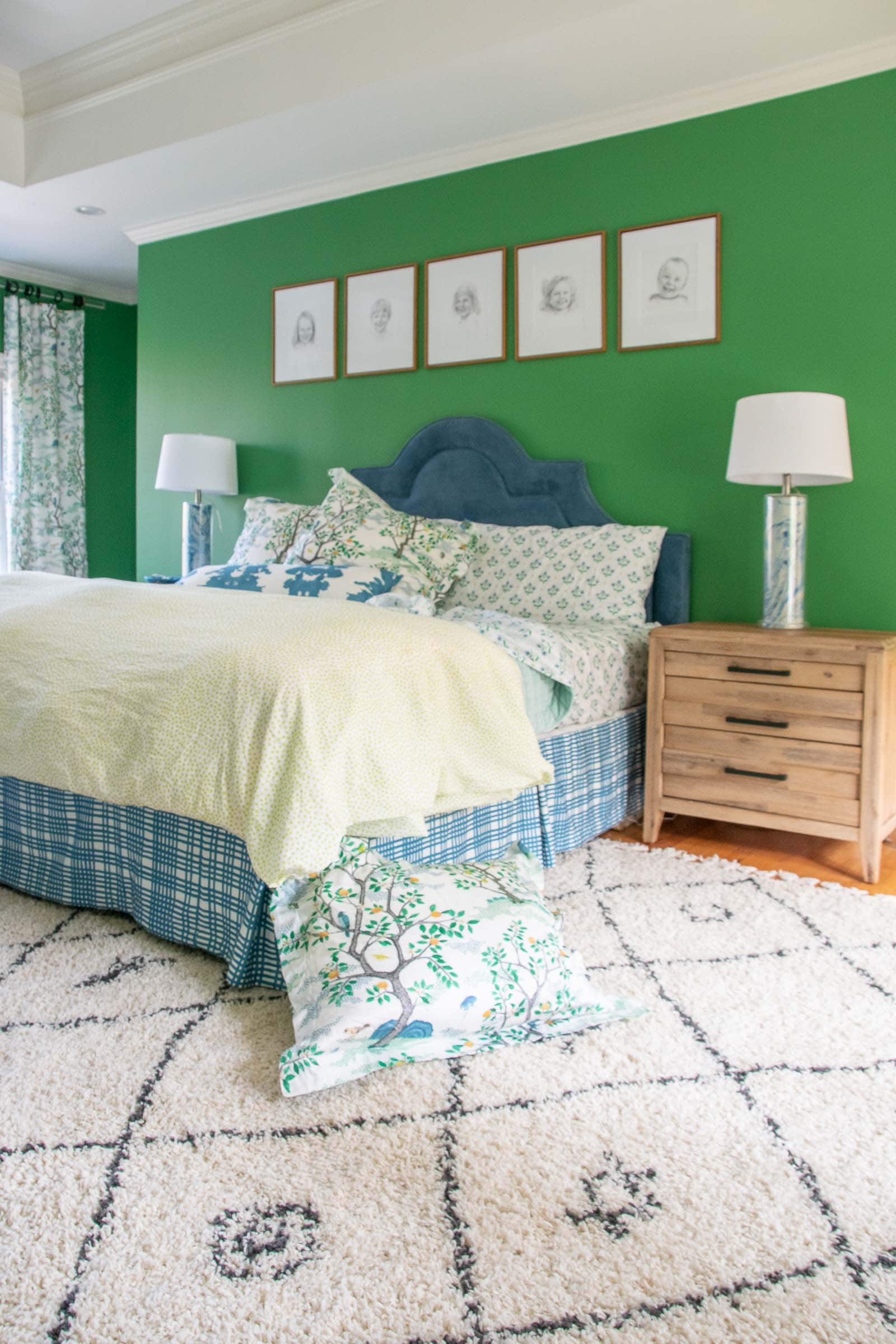
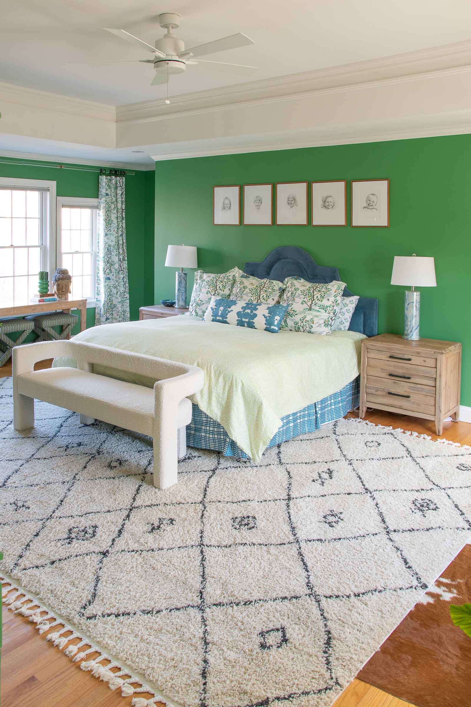
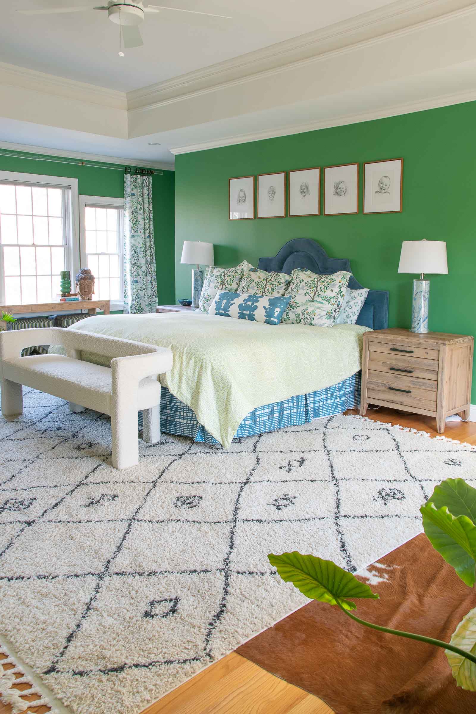
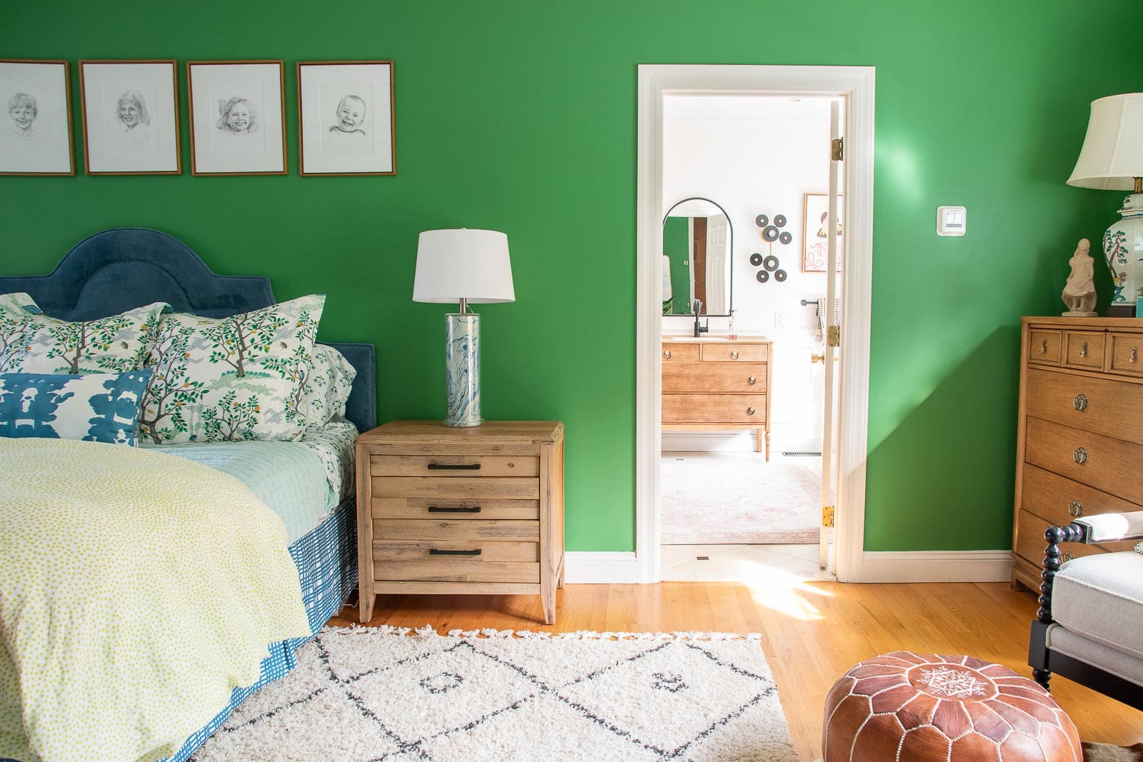
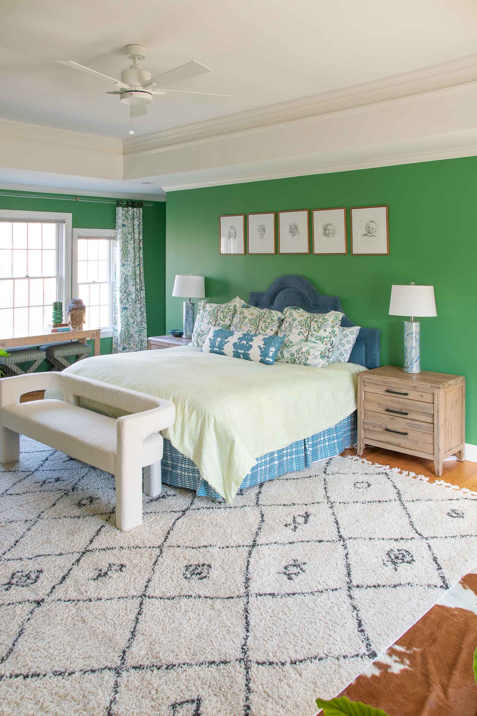
With the exception of the built-ins, everything on here was pretty simple and small but all together… transformative. The biggest change came when I painted, obviously. I wanted a darker shade but still something with color and Matcha Latte by Clare Paint was exactly the shade I wanted. I LOVE Clare paint. It’s so nice to work with, has incredible coverage and is also low VOC as an added bonus. This specific color green is kind of amazing to observe as it changes its mood depending on the time of day or the lighting. It’s just a really interesting intricate color!
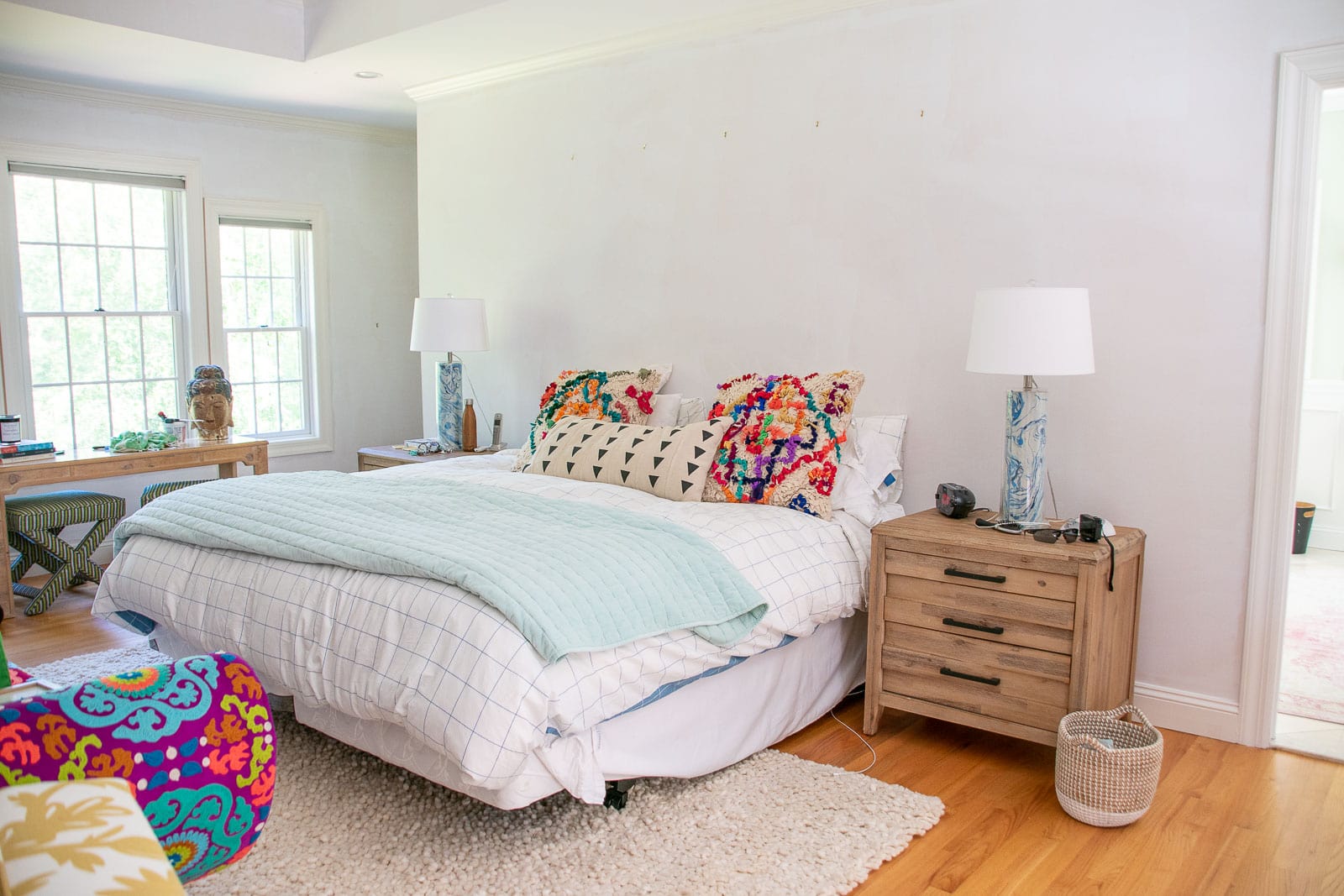
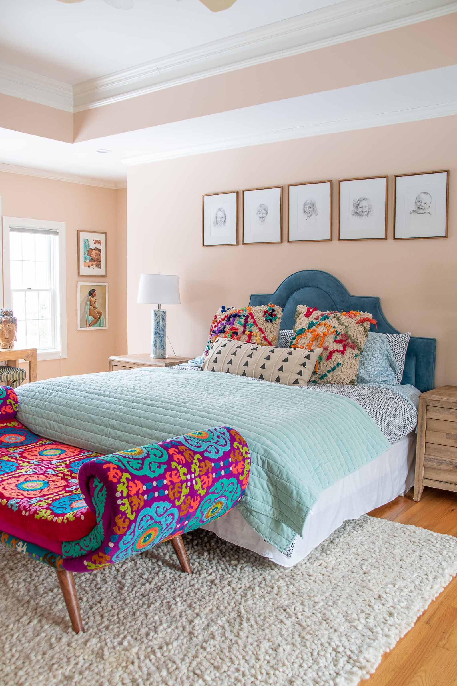
I primed the space first in order to prevent the pink from changing the undertones of the green. An added step, but always worth it in my opinion. I spend a lot of time considered whether or not to paint the trim and the molding and the windows in here. And I still don’t have a confident answer… do I think it would look AMAZING? YESSSS!!!! Am I a little intimidated and nervous to paint all the trim and the windows with such a big bold color because I might want a change in a couple of years? Also yes! For now… I left them white which I actually think works well with the tray ceiling and the curtains.
Layering in Fabric
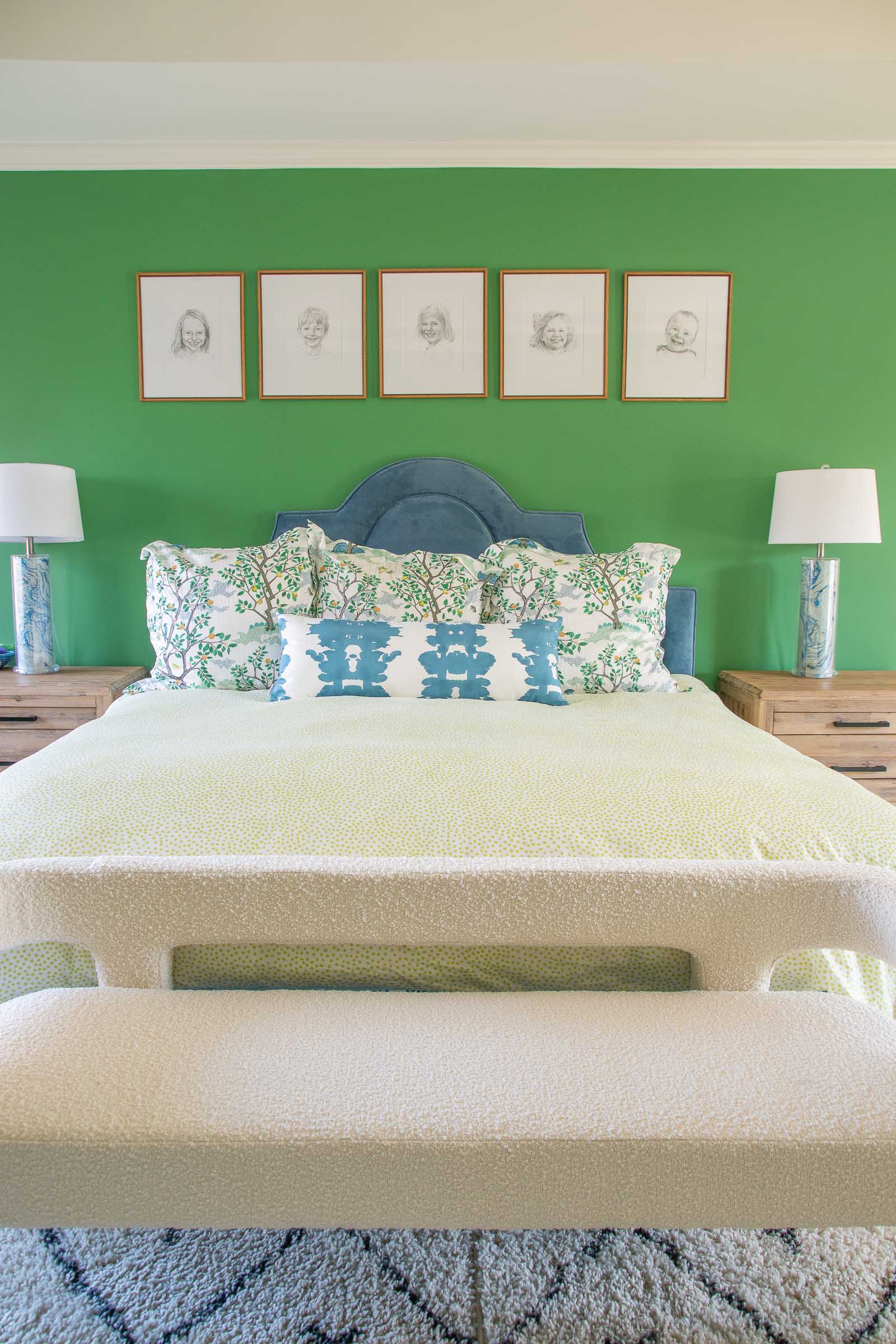
The fabric was a BIG part of my inspo for this space. Specifically this pattern by Danika Herrick available on Spoonflower. Here’s where I need to pause and talk a bit about this process because, as a designer, it was beyond helpful. I connected with Danika and talked about the space and, because of the process at Spoonflower, she was able to easily color match and customize HER fabrics to suit my space. She pulled the green from the Matcha Latte paint card and changed the leaves, etc. on the fabric to match. And then I gave her the color of the existing blue headboard so she could match the other fabrics to that! Final touch… bringing in a bit of that Citron color for the duvet that she coordinated with the lemons on her fabric!
We also brought in new bedding (also from Spoonflower). Sheets, those king shams and that bolster pillow. Such great quality and infinite patterns to choose from. A really easy way to level up your bedroom decor is to bring in sheets with design/ pattern that complements the space!
(View the entire collection Danika made for me here!)
Finally… the bedskirt was the finishing touch. Sewing is NOT my strong suit so I came up with this hack to make my own King dust ruffle. I’m crazy about that pattern and how it compliments the softer more whimsical design on the curtains/ shams!
The Built-Ins
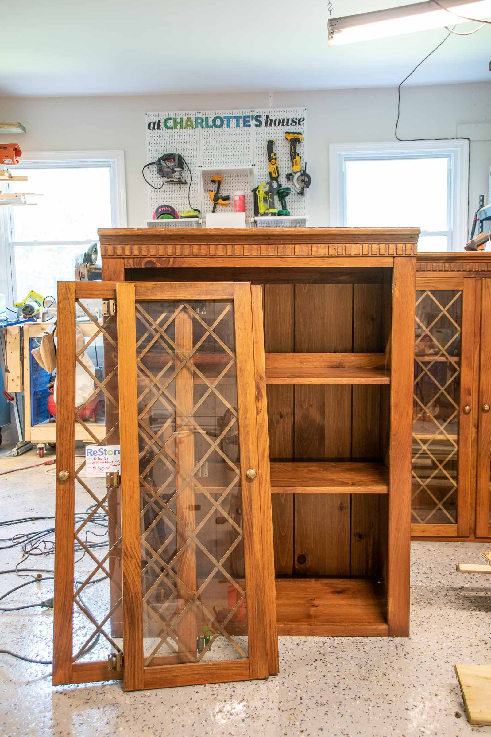
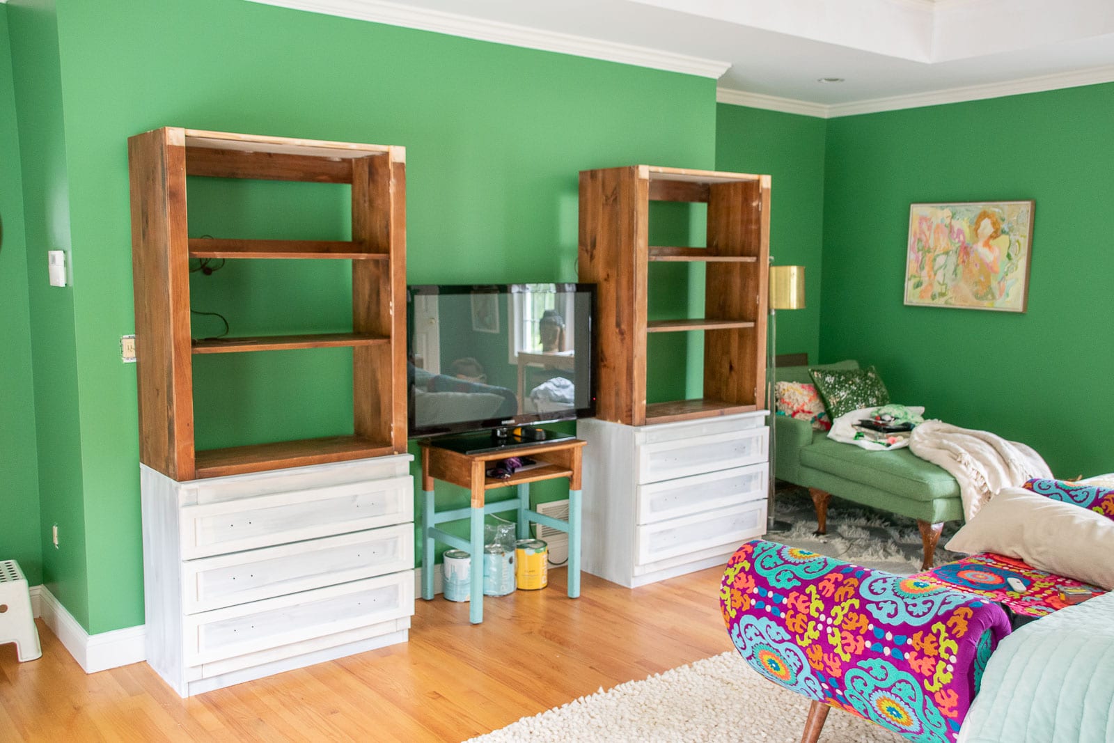
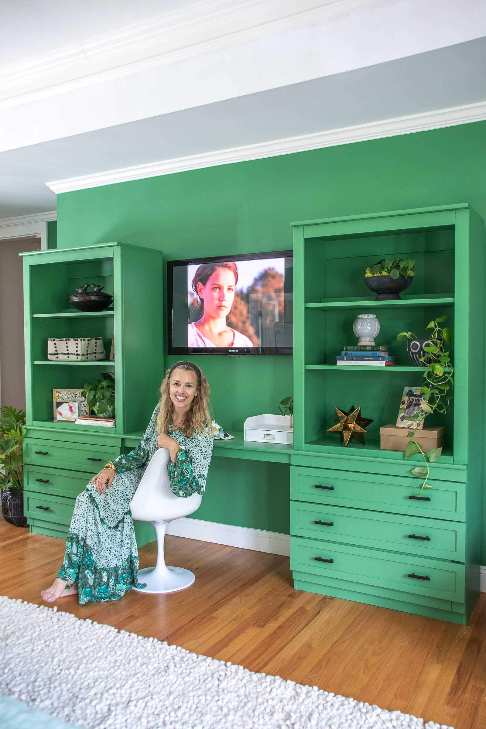
Because this room was so huge, I wanted to fill that space a bit more intentionally. Bedroom furniture can easily become a placeholder (I’m looking at you, armchair covered in clothes in the corner) and I didn’t want that to be the case here. Given the work from home situation going on right now…. a desk and added storage seemed like a great choice. But built-ins are pricey. And hard to make. And also… did I mention pricey? So what if I could use an existing piece of furniture and make it work for me? Bingo.
I found these two hutches at the Restore for $65 each and retrofitted them to suit my needs. I removed the doors, changed the profile of the drawers and added new hardware. I painted them the same Matcha Latte as the walls to give them that built-in feel. I wanted them to fill the space without filling the visual space if that makes sense. I added a desk and hung the TV and they’re perfect. If I need a quiet spot to work, this is where I hide, and the added storage is ALWAYS appreciated.

 Other details
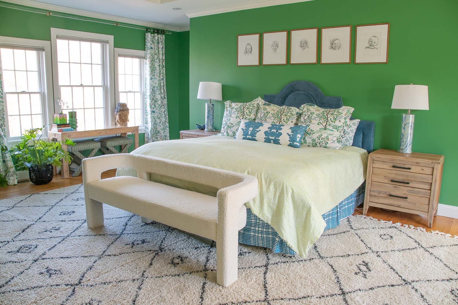
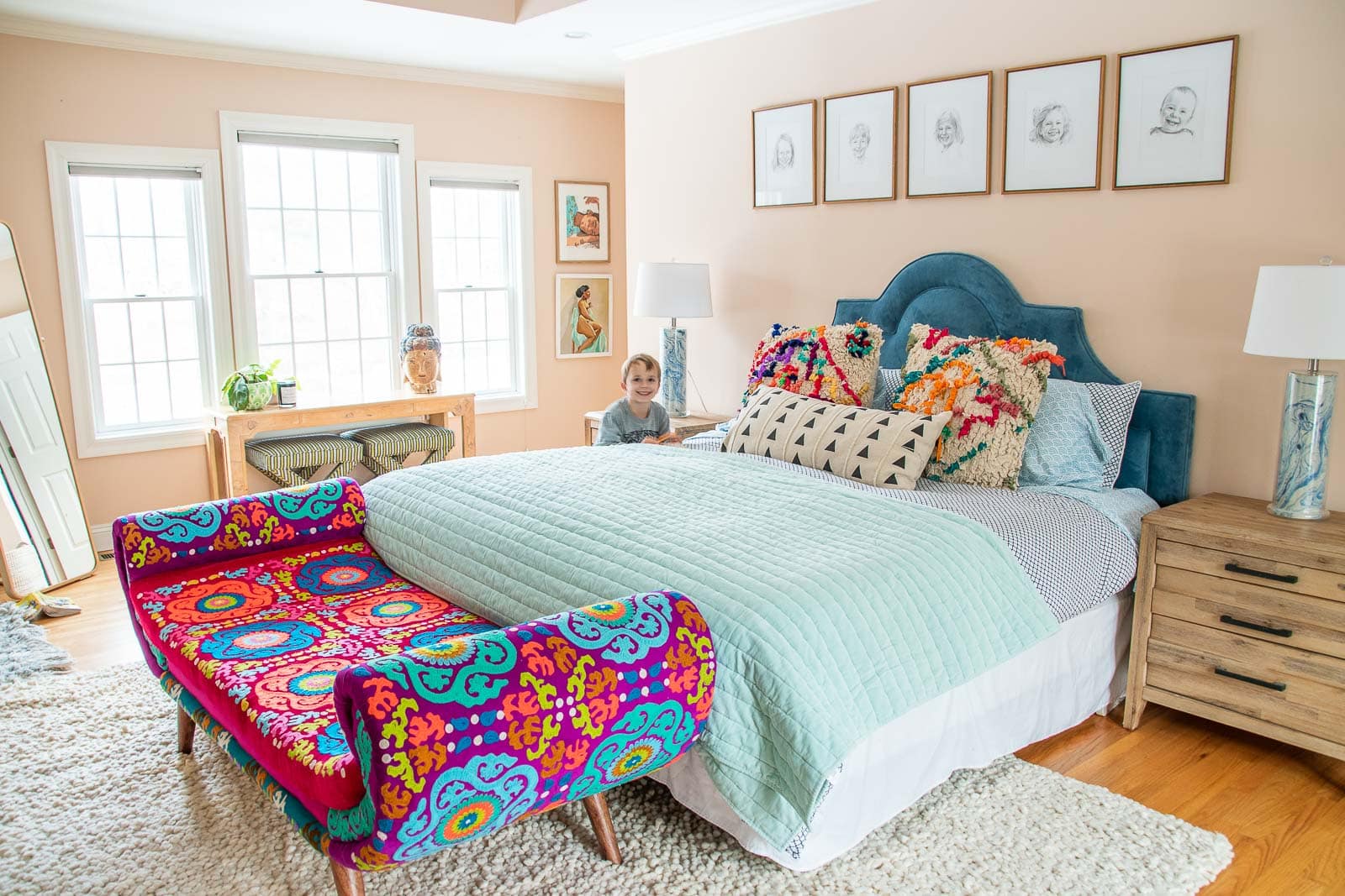
The bench that had been at the foot of our bed was amazing but didn’t really coordinate with the paint and fabric so…. I moved it down to my office and added this neutral stunner from CB2. Took months to arrive but it’s the perfect cherry on top in here.
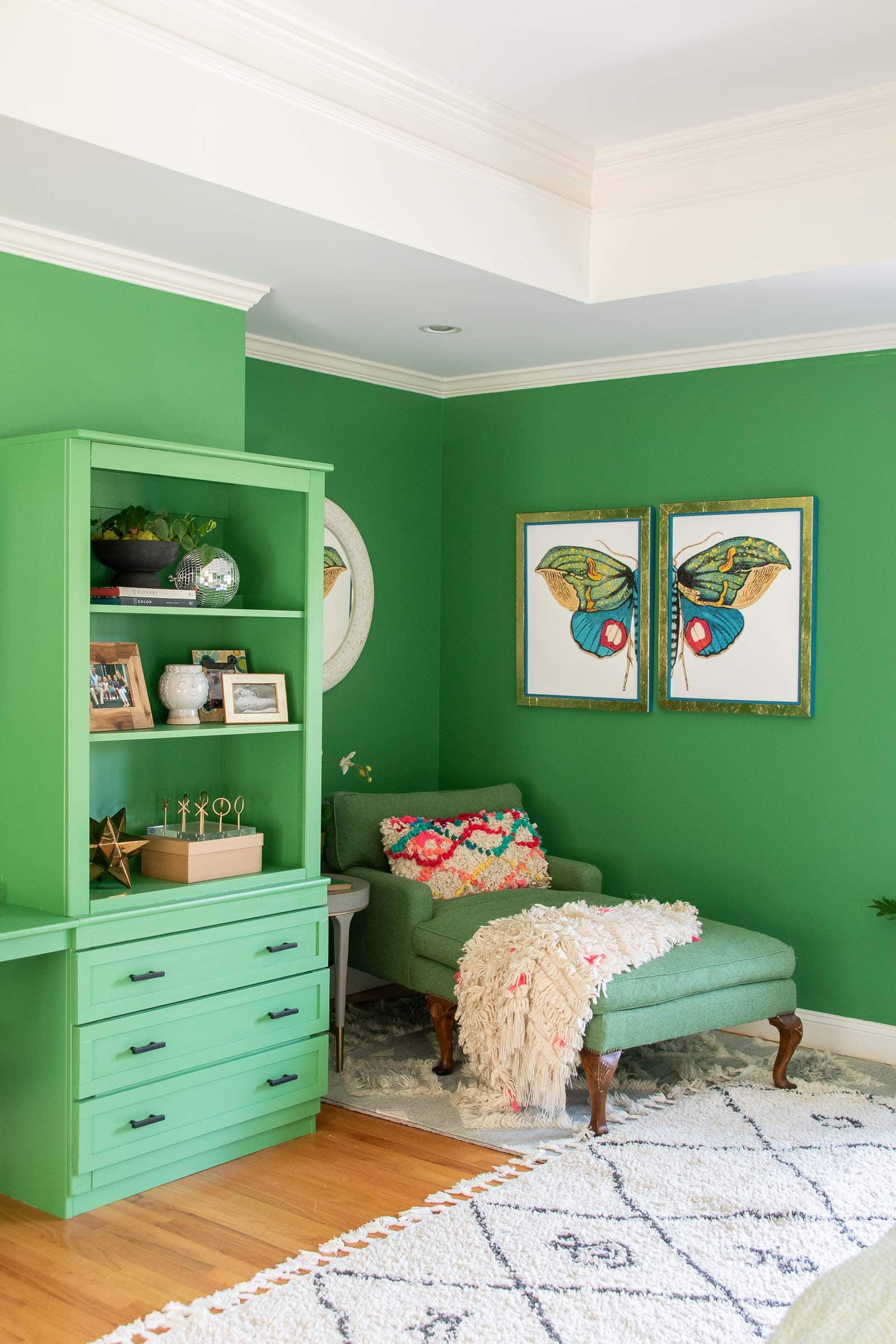
I built those frames to fit the butterfly diptych over in the reading nook and love how they fill that wall a bit. The frames are magnetic so I can easily swap out the art if I ever need, but I love that piece from Urban Garden Prints so for now… it’s definitely not going anywhere.
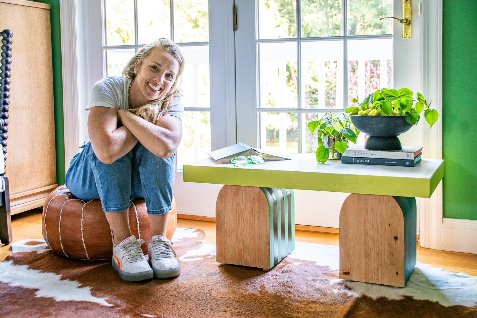
This summer I was one of the cohosts of the Furniture Flip Challenge and I made that quirky modern table. Technically it was a flip but I confess to having added/ changed a lot. Regardless, it’s a fun little piece for the area over the window. It’s become a quasi-plant stand but I used coordinating colors with the space and it works perfectly.
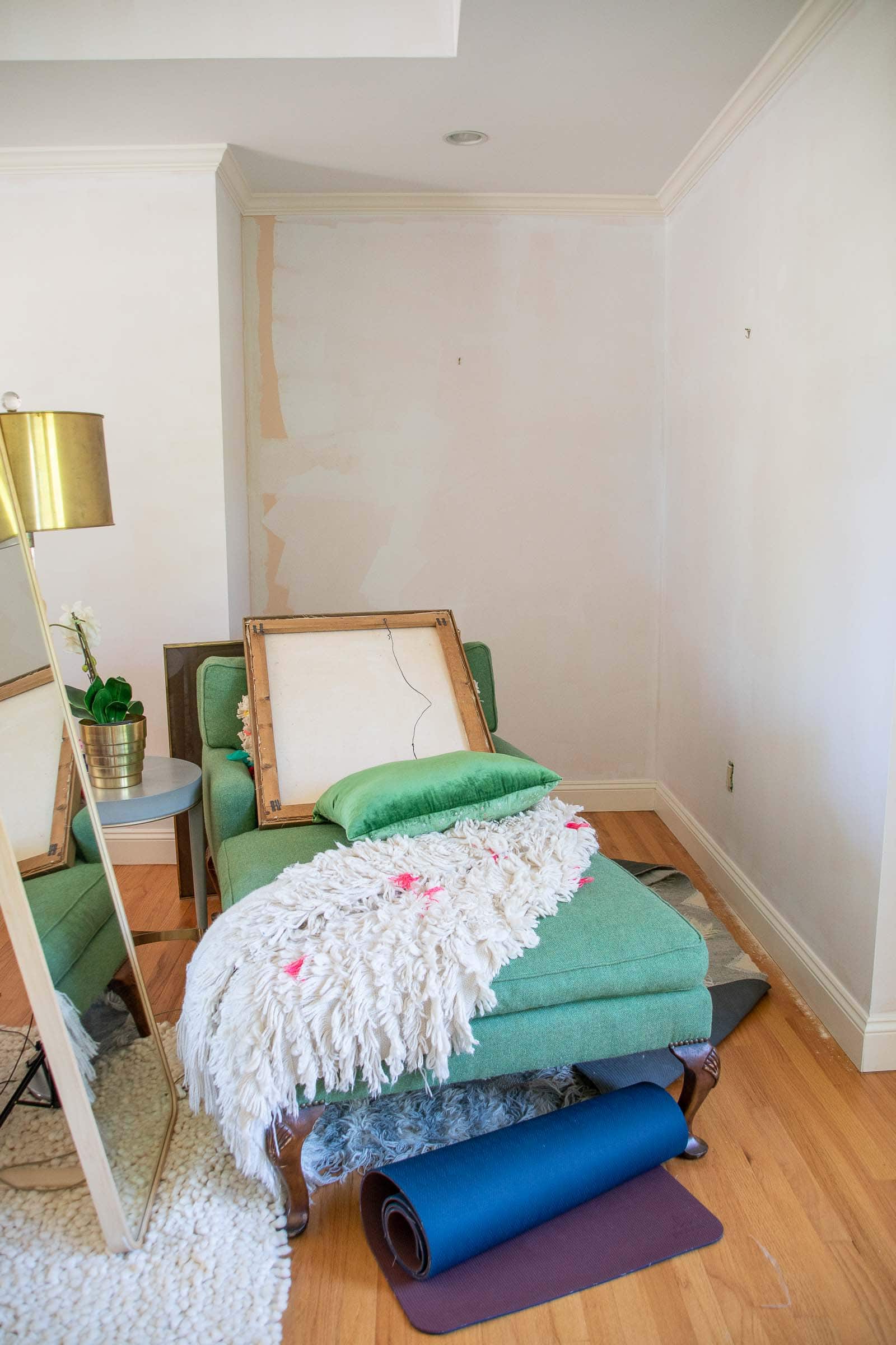
The biggest challenge for me in this space was the scale. It’s a really big room which means it’s easy to fill it with furniture such that the space feels a little cluttered and more like a furniture show room. I thrifted a large chaise to tuck into that corner. It doesn’t get used as much as I’d like, but the kids find their way there to read/ draw quite a bit! A small sofa table in front of the window is my go to place for Zoom calls because of the lighting and my dresser tucked in the corner takes advantage of an otherwise tricky corner because of the bathroom door adjacent.
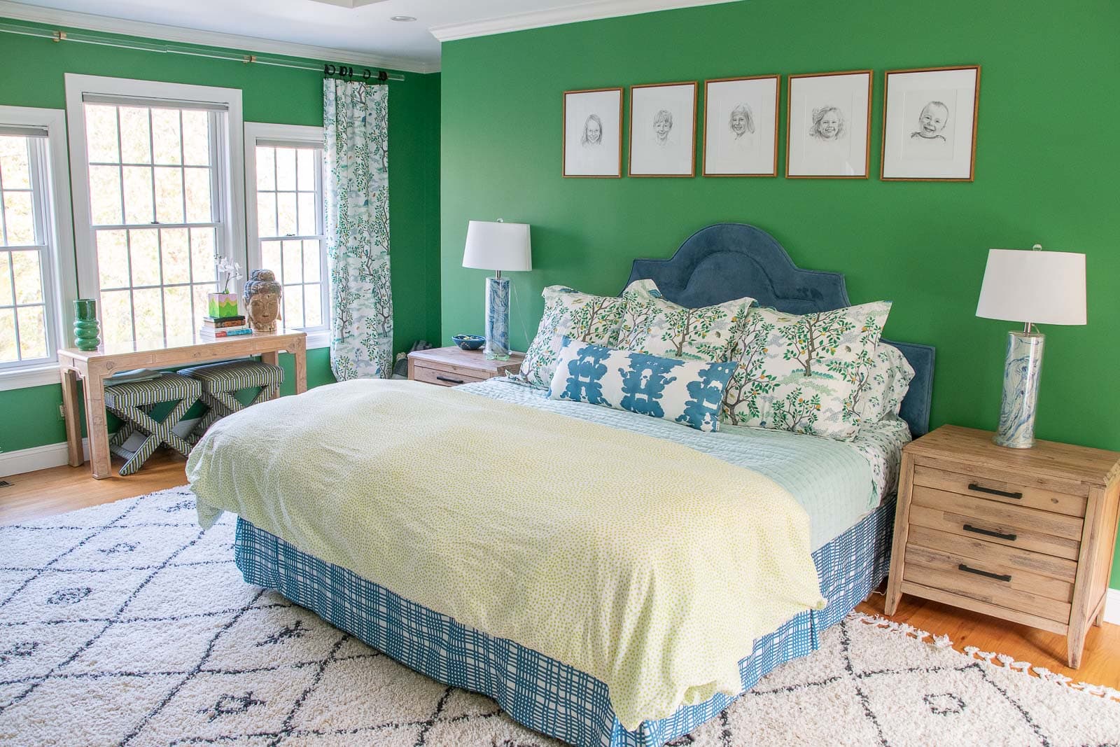
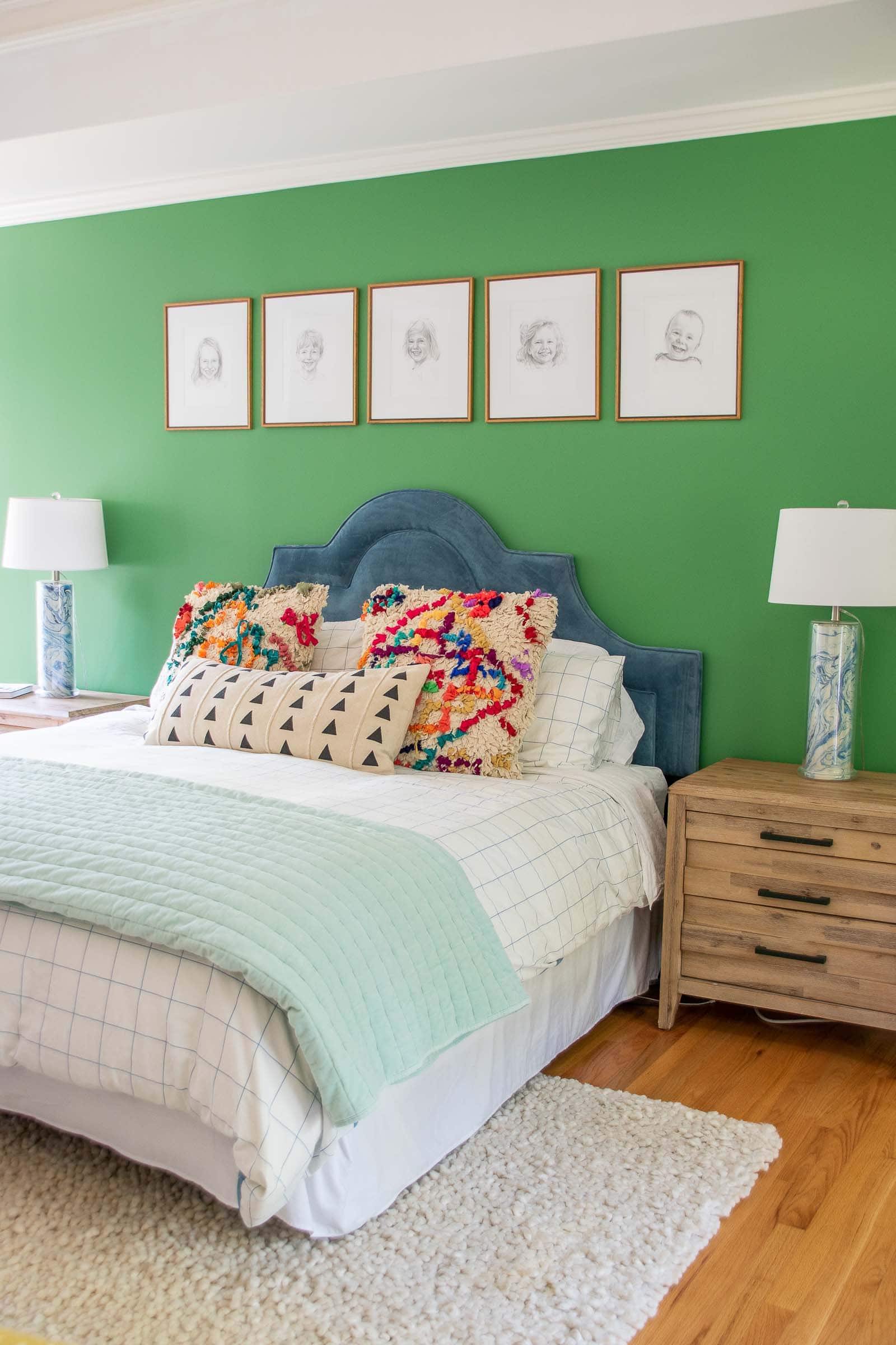
Those pencil portraits of the kids are a nice simple gallery for over the bed and two neutral shag rugs from Home Depot keep the room from feeling too bright and colorful. Needless to say, I’m THRILLED to be finished and am really proud of how this room came together. Big and bold and colorful but somehow still cozy and a little more grown up!
Bedroom Sources:
- Paint
- Curtains
- King Shams
- Sheets
- Bolster Pillow
- Duvet
- Bedskirt fabric
- Aqua Quilt
- Rug
- Moth Prints
- Headboard: Raymour & Flanigan but no longer available
- Nightstands: Raymour & Flanigan but no longer available
- Bench
- Chaise: thrifted
- Round Mirror
- Sofa Table: Thrifted
- Spindle Chair
- Dresser: Thrifted
One more time because it feels so good to see… here’s the BEFORE:
And here’s the AFTER:
SHOP MY BEDROOM FAVORITES:
 Other details


Gosh, I didn’t realize how much I missed reading blogs until I had a few minutes to sit down and found my way over here! I saw this room reveal on Ig but I totally missed the part about custom fabrics to match the paint colors in the room! they are all absolutely fantastic together. amazing job (as usual!) charlotte!
So sweet of you! Thank you! And yes… blog traffic has dropped so much over the years! Crazy how things evolve! xx