Restaurant Reveal
Psssst… this post *might* contain affiliate links: see my disclosure here.
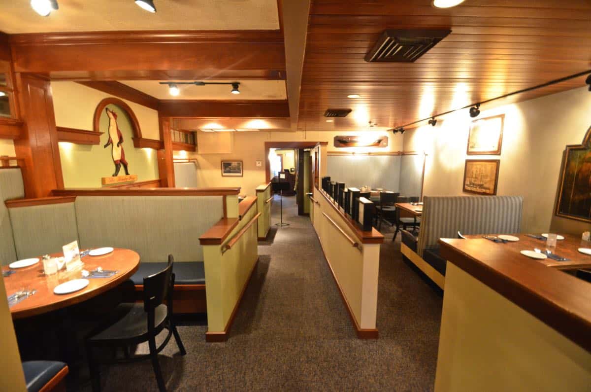
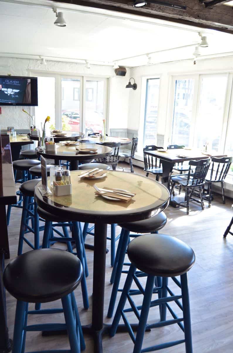
Back in February, I posted about an exciting new project… a restaurant. I’m a sucker for a challenge so of course I said ‘totes mcgotes’ and it’s been full speed ahead ever since! Now that the space is looking 90% improved, I can share the name and the details… 7 Central is in picturesque Manchester, MA. It’s the perfect spot for both upscale dining in the rear portion of the restaurant as well as casual pub fare in the sunny front room. They have an upstairs event space and nightly entertainment… long story short, this place is a hub in the community. Problem was, it needed some love. Lots and lots of love. (Update: You know that movie, Manchester by the Sea? That was filmed there… I think the exterior of 7 Central might even make an appearance!)
Shop my favorites!
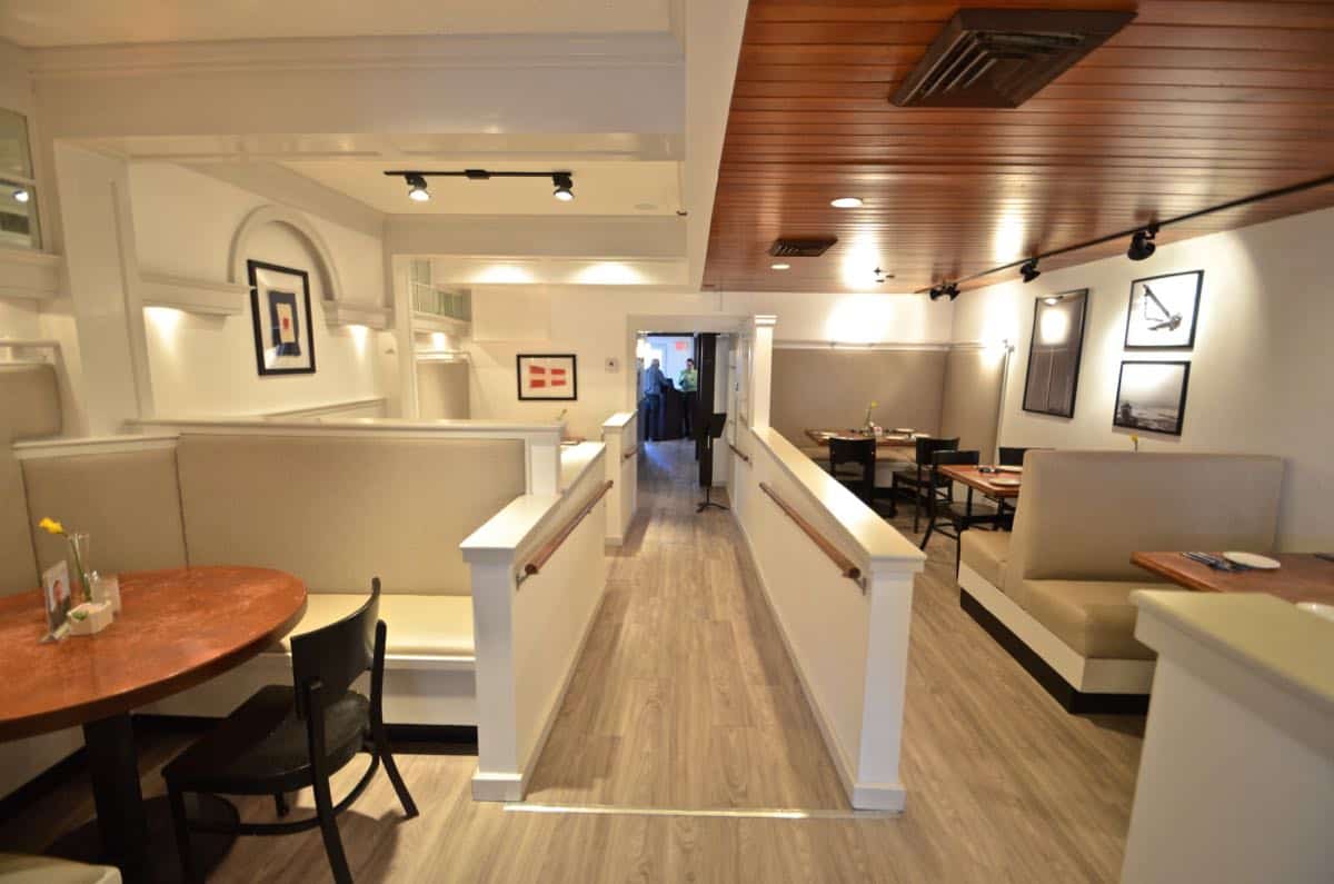
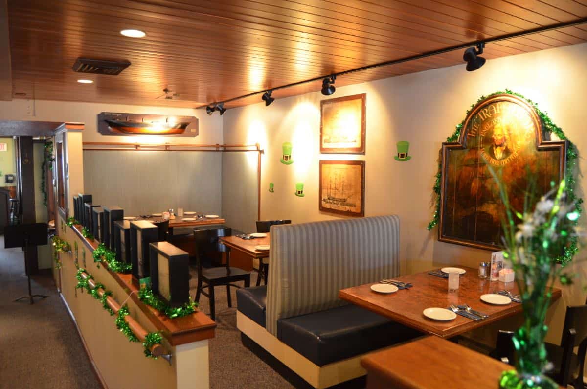
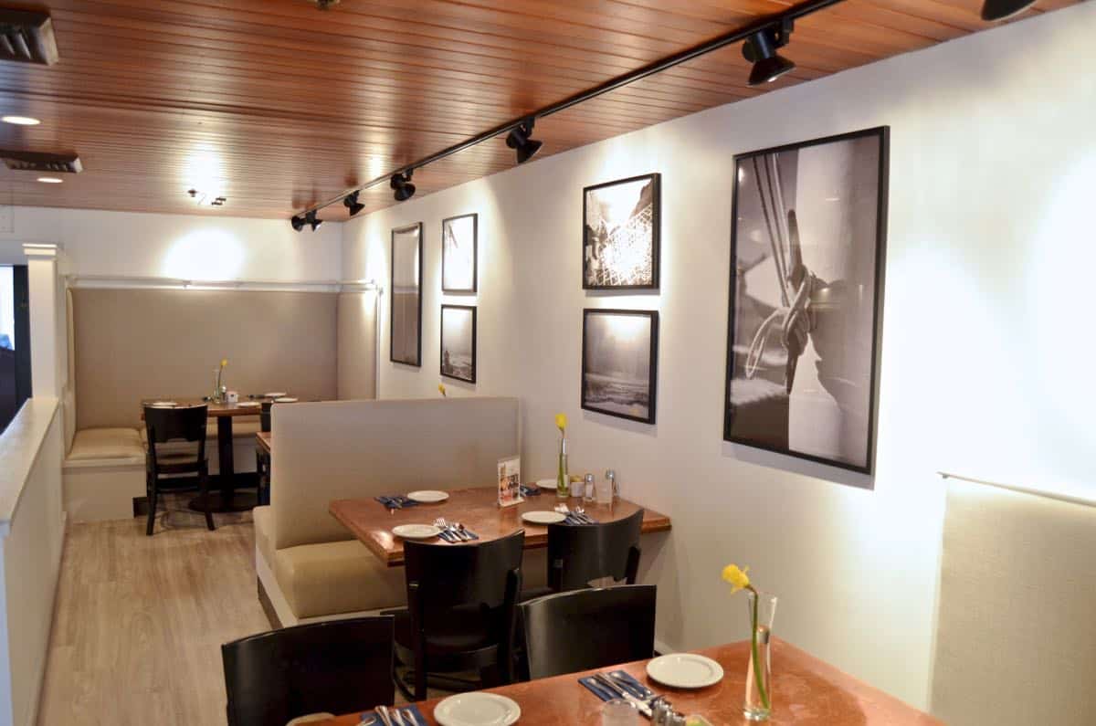
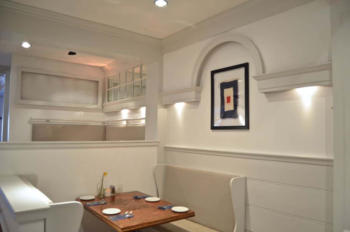
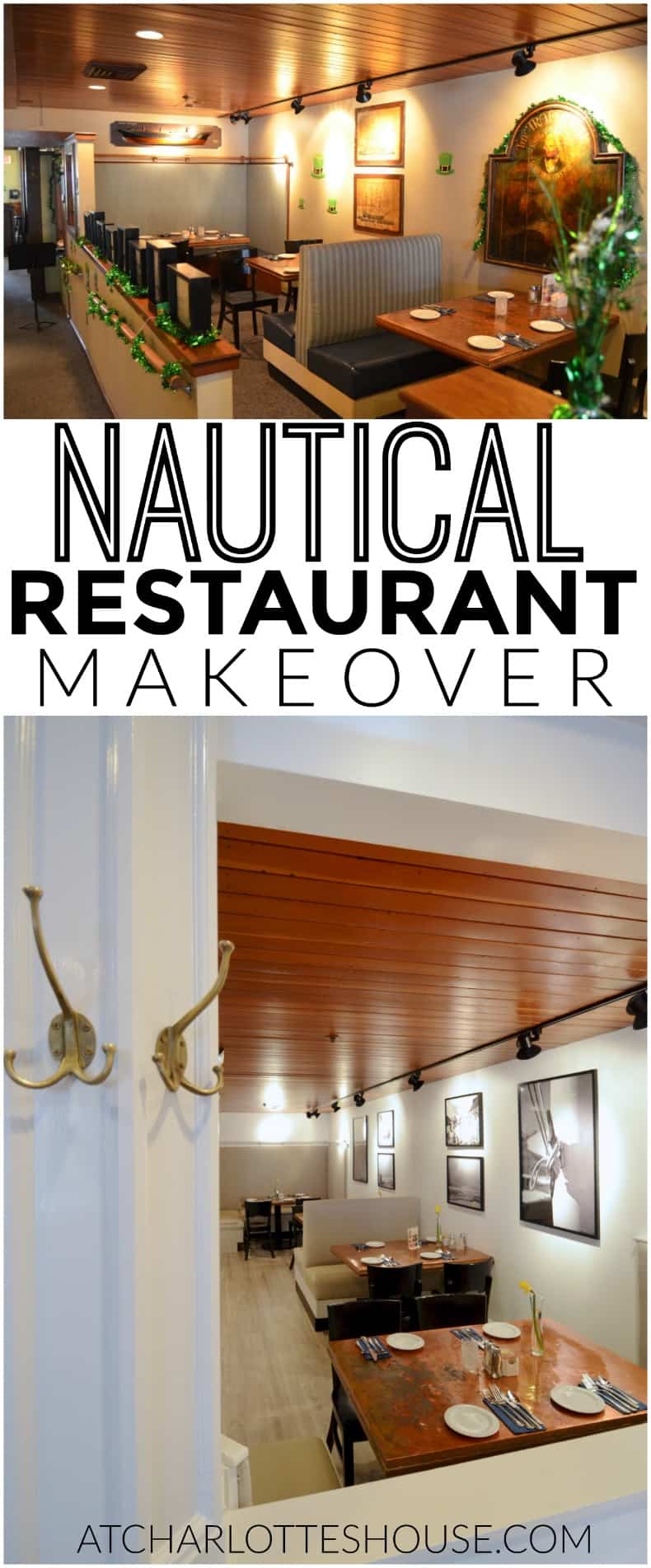
The theme for the redesign was nautical cool. The goal was to lighten and brighten the space and to modernize it a bit to reflect the new direction of fresh and clean dining. (See my original design boards in this post.) Our list of updates included: paint, floor, upholstery, artwork, branding and lighting. That’s a cute way of saying EVERYthing.
As of today, everything but the event room and the actual bar in the front pub has been taken care of. Those should be wrapped up in another six weeks or so and I can’t wait to head back up to see the final FINAL redesign. This project came together more than I ever imagined. Going into it all, I was hoping it would be more or less like any other room remodel… I’d say for the most part… that was true. But there were definitely some things to consider for a restaurant space that aren’t an issue in a home: fire code, acoustics, durability, cleanability…
Rather than string you along, I wanted to share some of the after shots today!! I’ll definitely be back with more explanation for how I chose certain finishes, tutorials for projects I brought in, and of course the last few pieces to this puzzle that should be finished sometime this spring: the upstairs event room and the bar.
I HAVE to thank the AMAZING brands who helped make this redesign possible. With a tight budget, we wouldn’t have made it over the finish line without the support of Build.com, Behr Paint and a last minute bail out from Plutonium spray paint.
(These brands all supplied some product for free, but my glowing reviews are completely my own opinion based on the undeniably fantastic results of this redesign!)
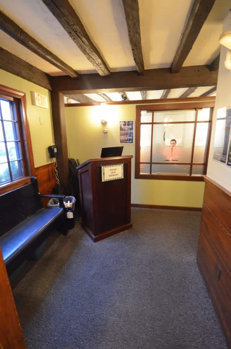
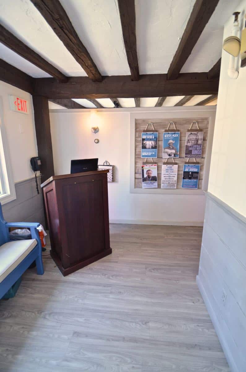
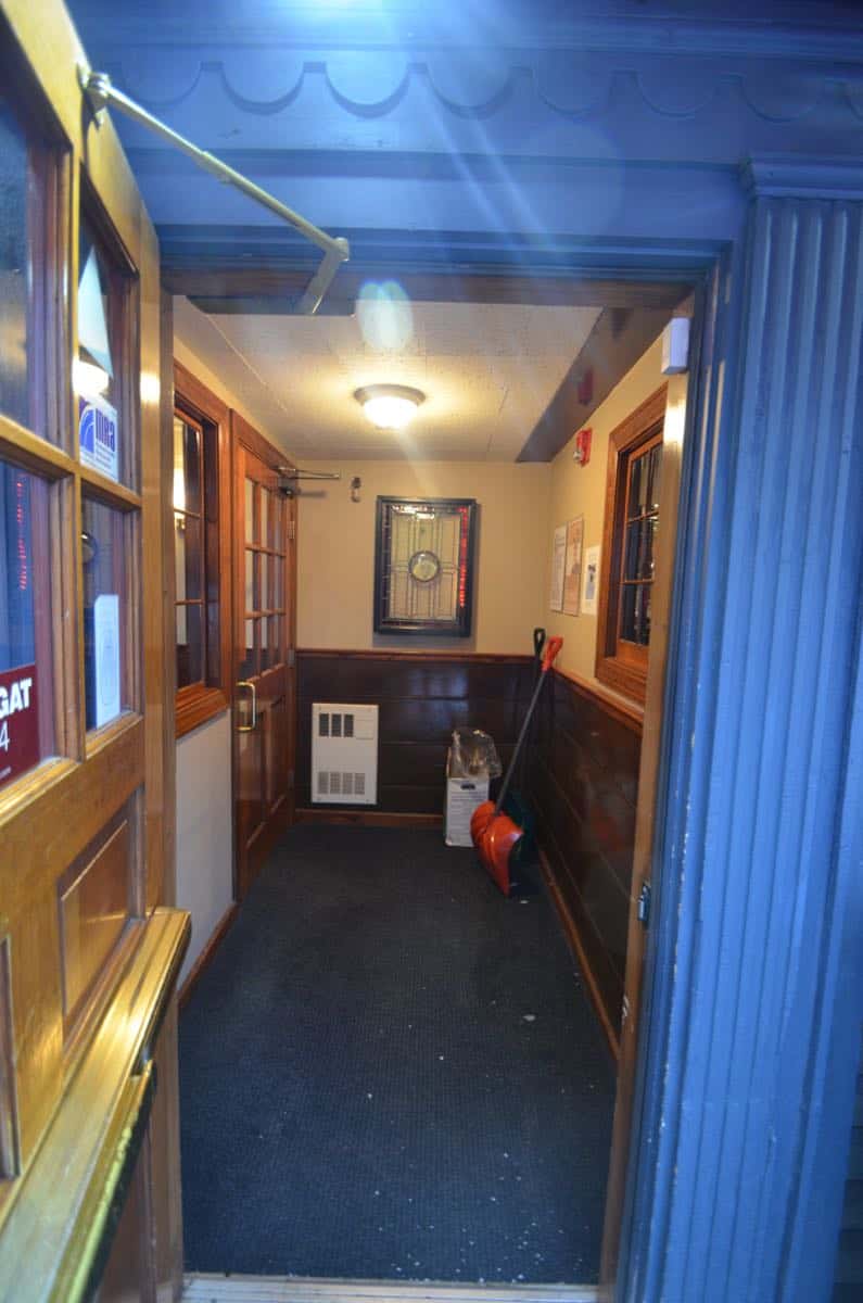
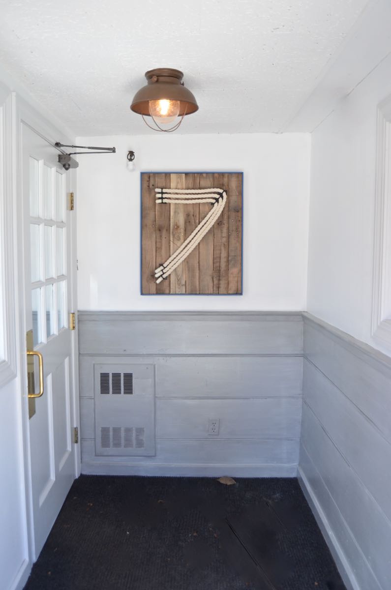
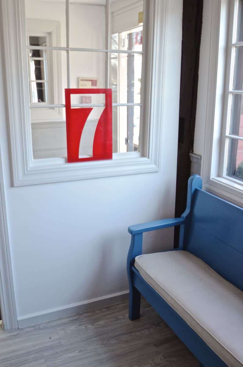
Welcome to the new and improved 7 Central! You walk in from the street through a sweet little entry area into the foyer where the hostess greets you. If you read this post, you saw how I took apart a pallet, but never had the full reveal. Well there it sits!
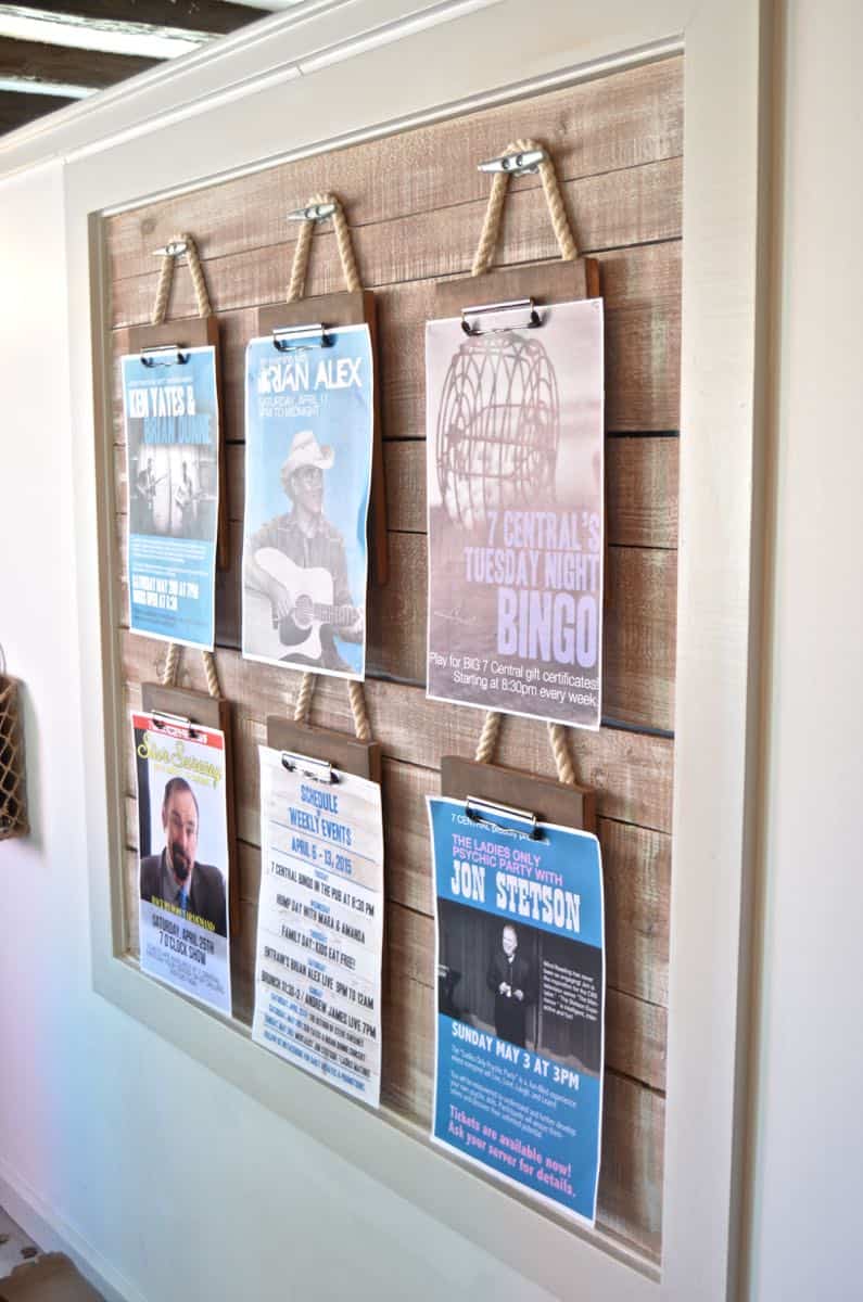
Because the restaurant has such a fun calendar of events, we wanted a better way to display them. That clipboard wall is perfect for a nautical vibe. I’ll post a How To for that project later.
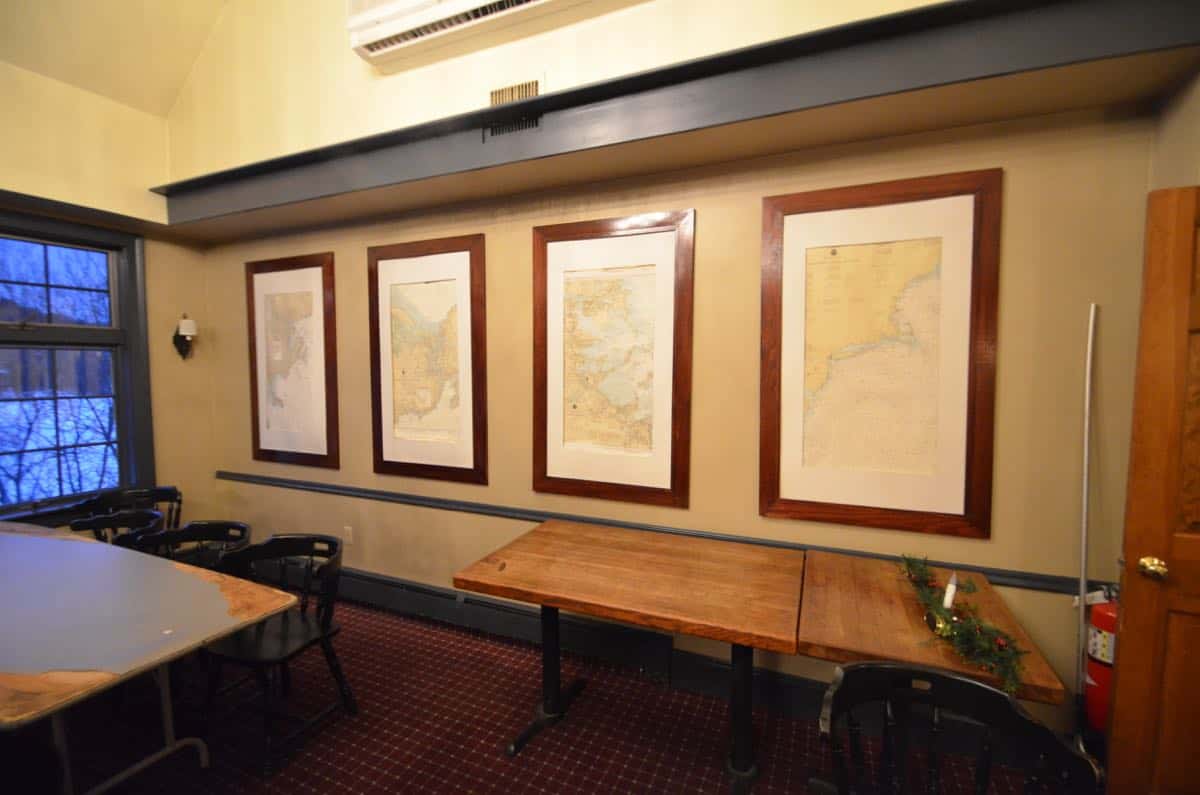
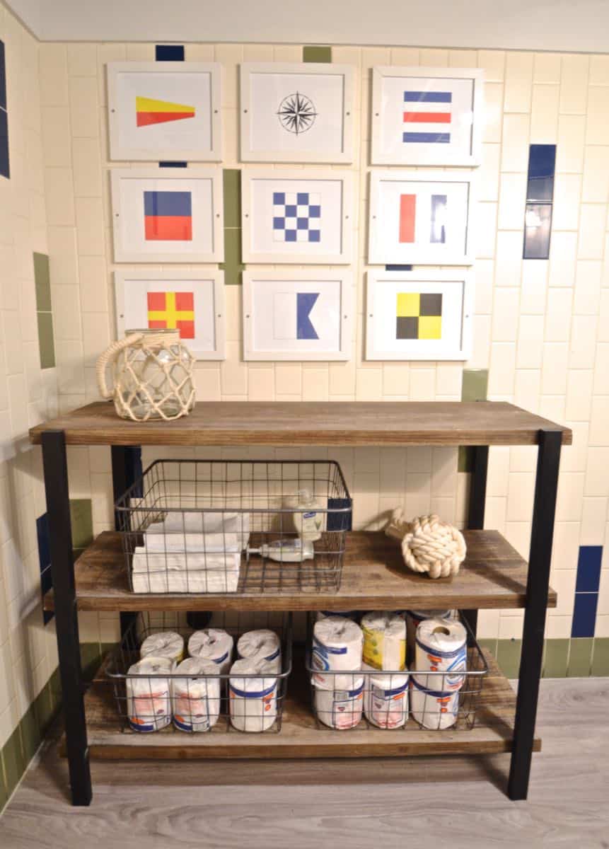
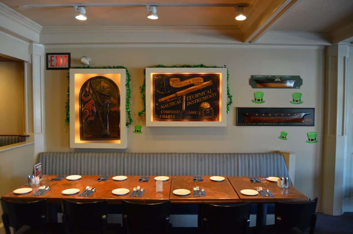
You walk by the map room (great for large gatherings) and turn right into the pub. Tune in later for how we freshened up these maps and generally outfitted the artwork in the entire space for less than $400.
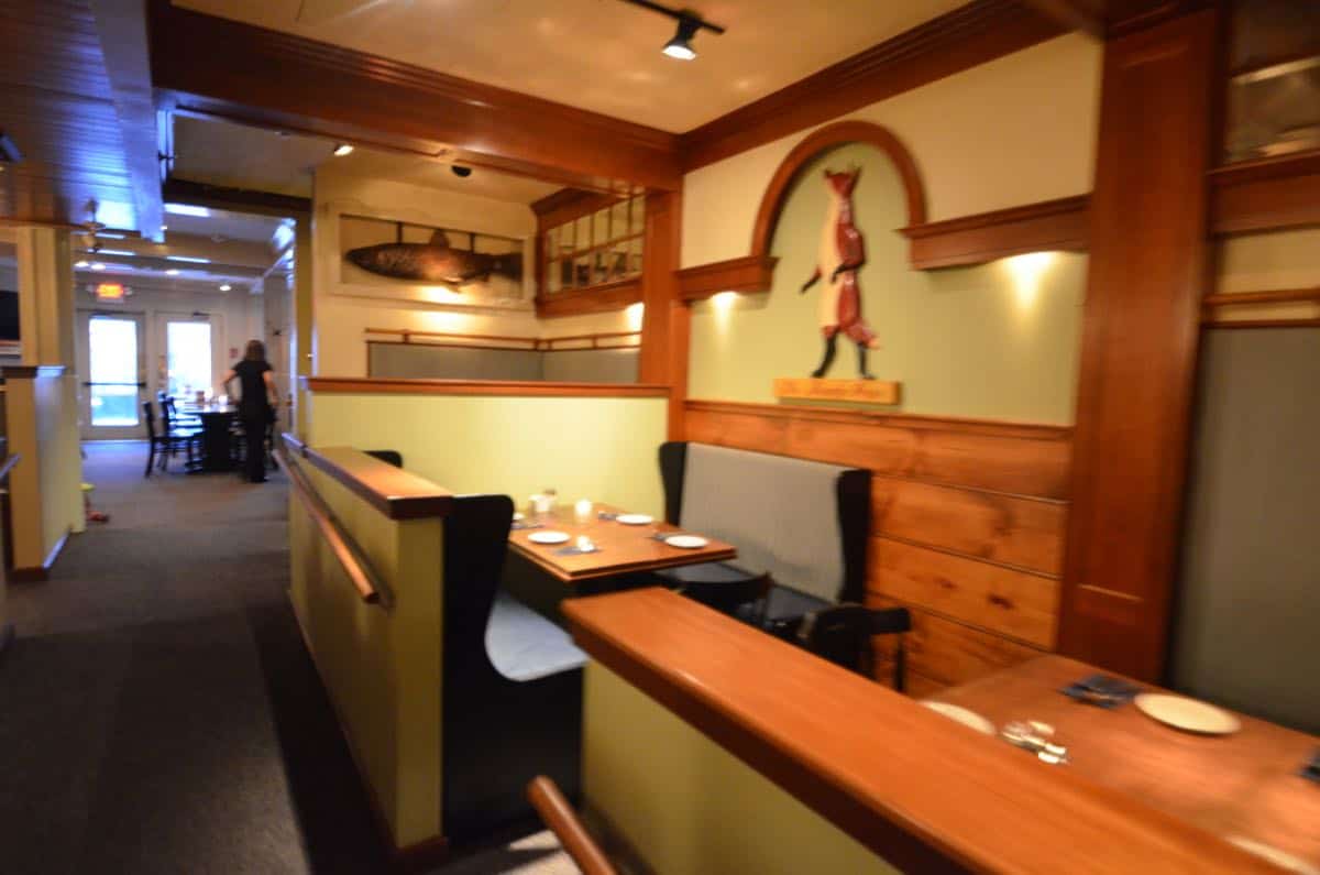
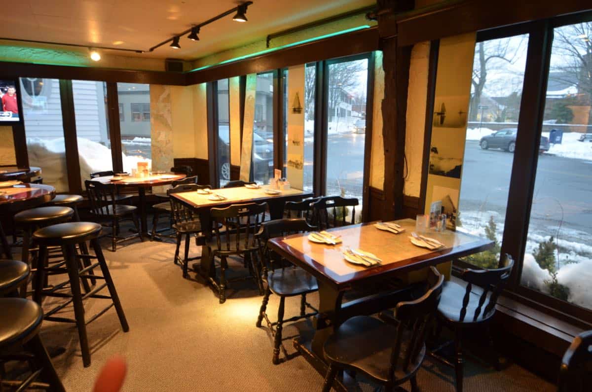
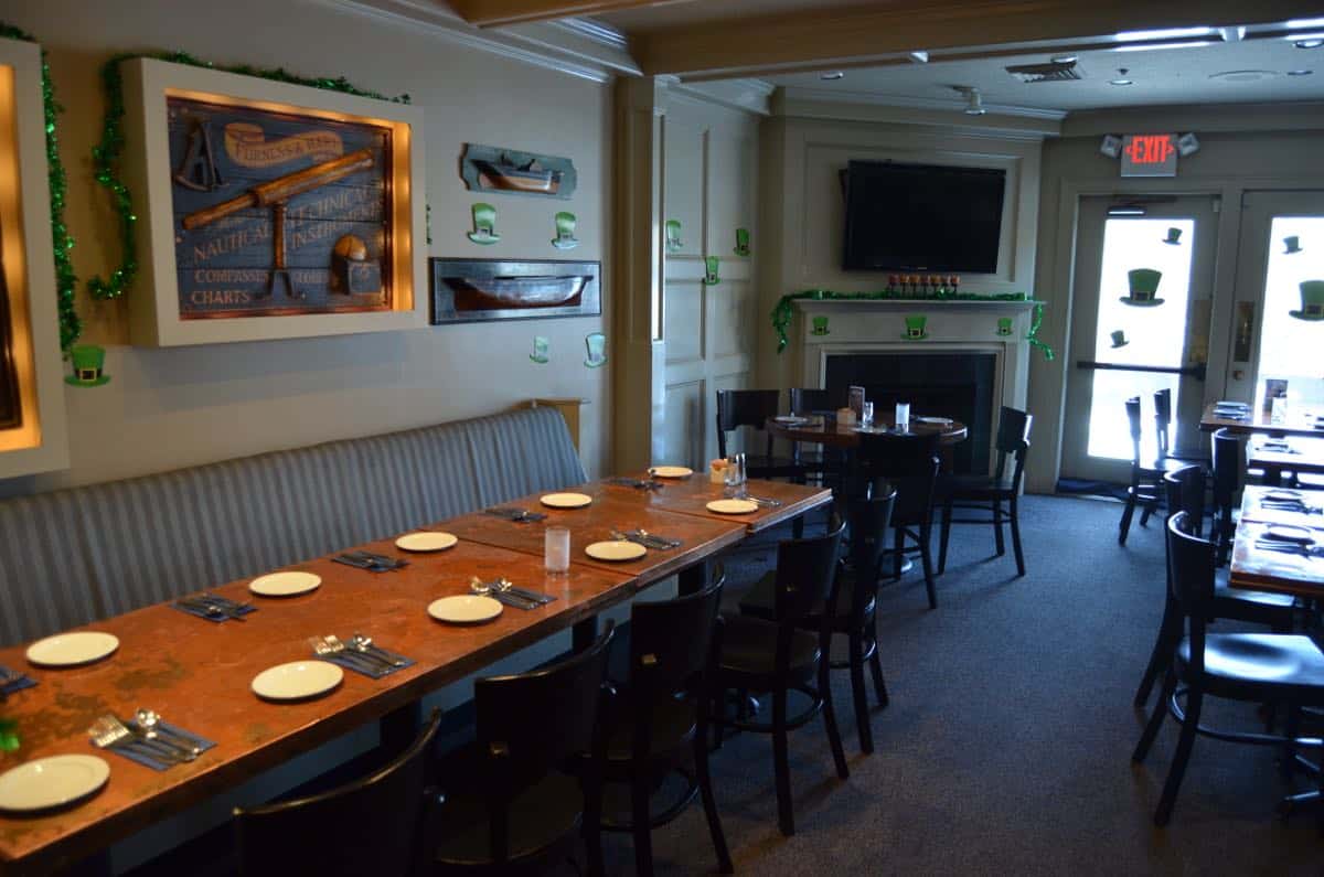
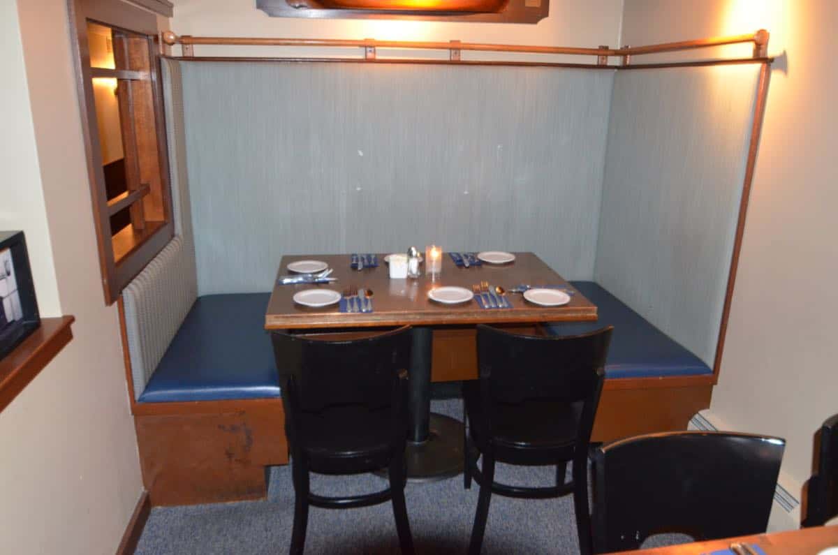
The pub itself is dripping with New England ch-ahm. Exposed beams, low ceilings, textured walls… I didn’t want to deny this character, but… it needed to be cleaner and brighter. I don’t have as many pictures in here because it won’t *really* be done until the bar itself gets replaced, but this gives you the sense of improvement!
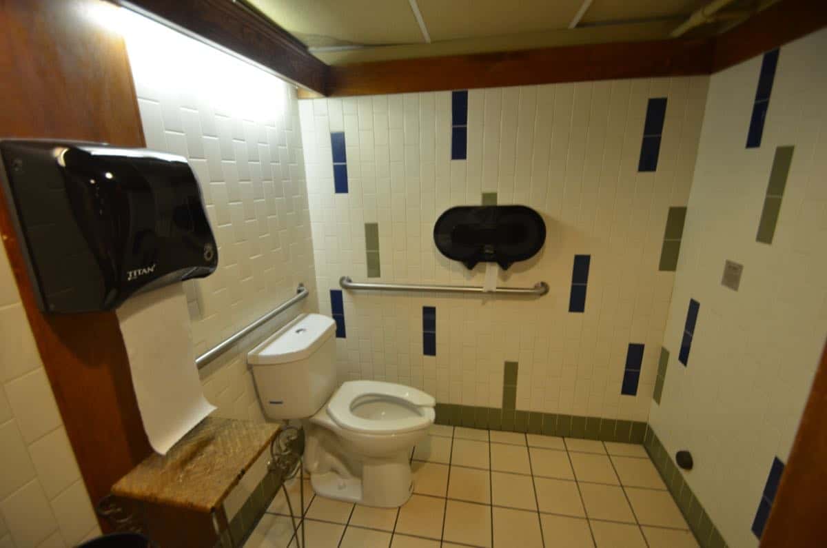
The main bathroom for the restaurant is off of the pub. Our budget didn’t allow for a full gut which was ideally what the space could have used, so we did our best. It has to remain ADA compliant so the sink needed to stay as well as the toilet and the space around the toilet (you need 60″ clearance to allow for a wheelchair to maneuver).
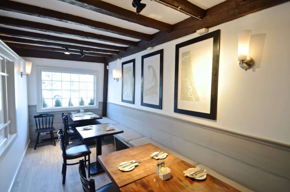
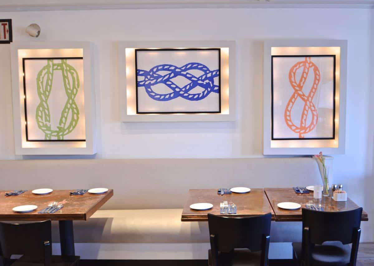
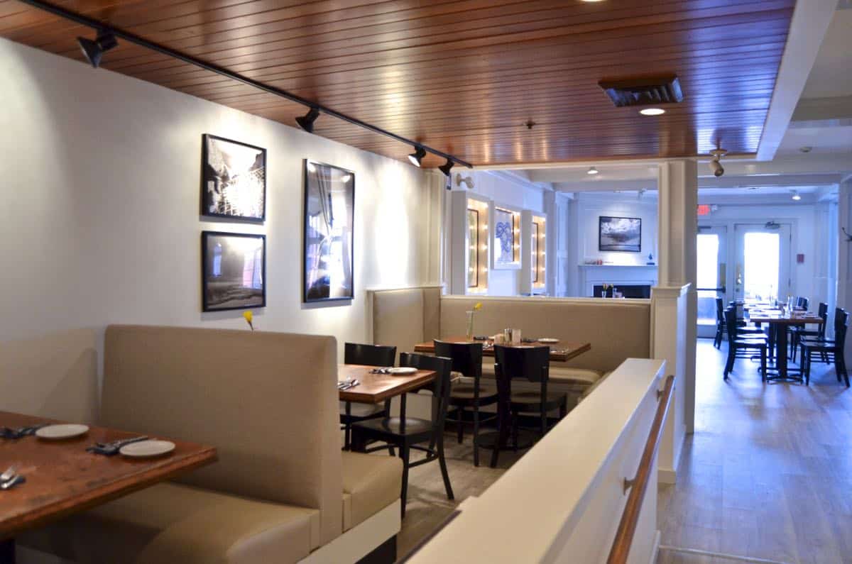
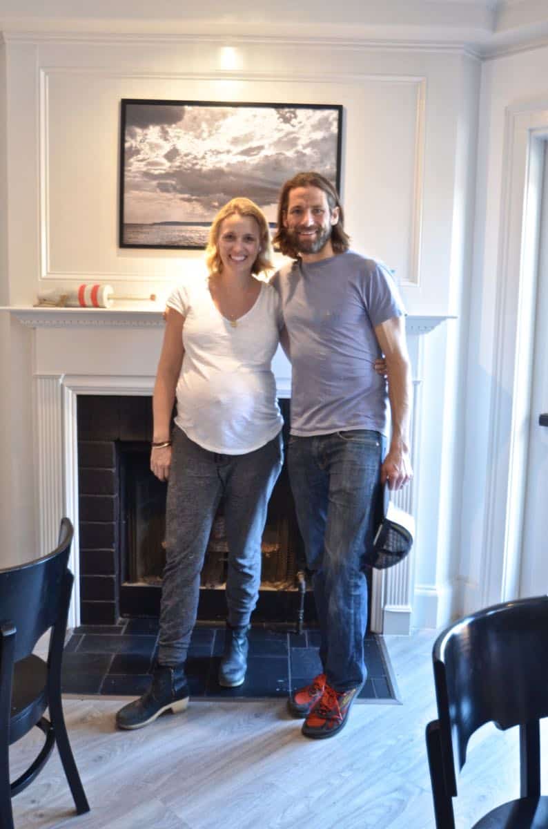
The back of the restaurant has a classic fireplace, a bar and windows out to the deck. I shared a tutorial to that fun graphic wall art and otherwise, this space is new and improved thanks to paint and upholstery and the new floor!
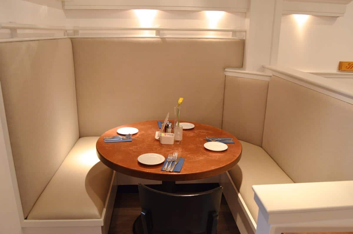
Here’s a close up of what a difference the upholstery made to the light in the space. I’m not an expert, but I definitely made sure to find fabric that was intended for commercial high wear spaces… these are all clean-able and as durable as I could get without going with vinyl.
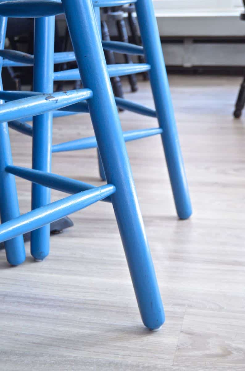
I love how the little details relate to the ‘theme’ of the space… even though this was a large restaurant, the same principles of design that I use in my own home came into play! Who knew?!
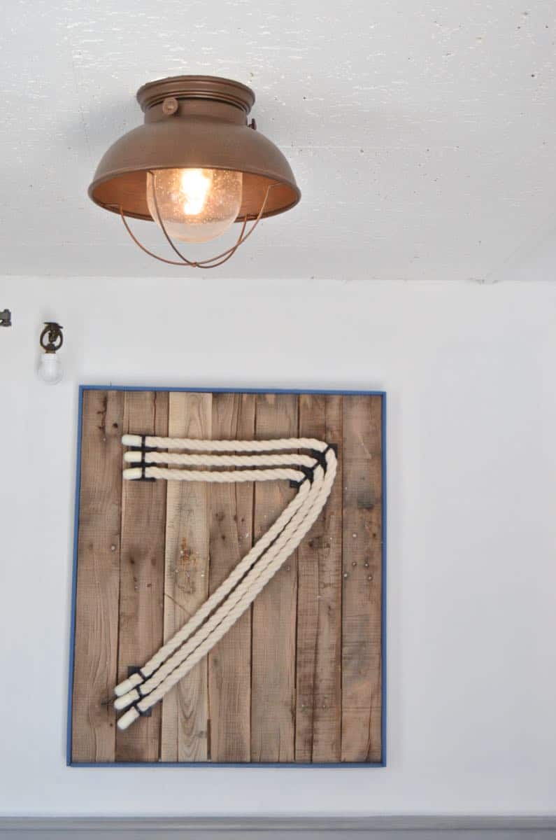
We were hoping to use this one in the bathroom but it was too tight to change the lightbulb… minor detail. There are also 5 more rarin’ to go for the bar makeover. Stay tuned… I’ll keep those secret!! And that’s the gist! Can you believe the improvement!! I’m really pleased and can’t wait to get the final push over the finish line sometime next month!
P.S. I completed this project alongside one of my oldest friends in the world… that was the best part!
Sources:
Wall paint is Behr Ultra White
Trim paint is Behr Statuesque
Fabric on the booth backs is Douglass Utley in Linen
Fabric on the booth seats is Kravet Trezzo 11
Flooring is Creekside Jatoba click in place vinyl by BuildDirect.com
Ceiling paint in the bathroom is Plutonium Spray Paint in Submarine
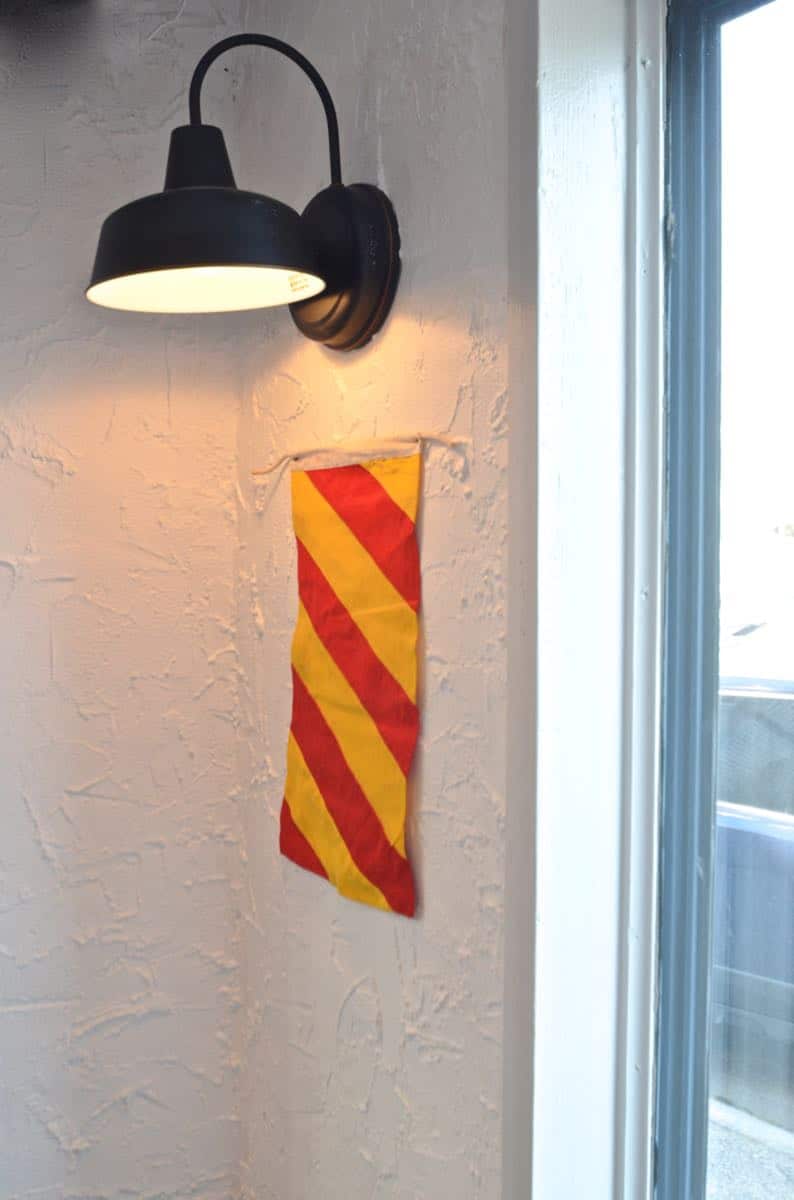
Last but CERTAINLY not least are the amazing light fixtures by Build.com. The ones in the pub have been installed and look KILLER.



Nicely done!! Was wondering what finish you used on the paint since cleaning in a restaurant is so key. Was the Behr white a high gloss or semi-gloss? Did you use the same finish throughout? What kind of treatment d you give the fabrics to help with cleaning them. Well executed design elements!
Hi Kate! For the paint, the walls are regular ol’ eggshell (which is usually ok for cleaning… but it also helps that they’re pure white so easy to touch up on the occasion of a MAJOR incident.) 🙂 The trim is semi-gloss so has a bit more sheen. Because this space was so old, I was hesitant to go any shinier because it really accentuates lots of imperfections. The fabric is definitely commercial grade so it has a built in cleanability factor as well as high rub counts. Fingers crossed everything will hold us as promised!
It looks amazing! I totally want to go, but it’s probably a bit too far from CT for a night out 🙂
Great job!
Ha! I’ve done it a couple times, but… wouldn’t be my first choice! 🙂
Melissa, thank you so much. I received a great looking pallet when some furniture was delivered. Have always wanted to show my creativity using a pallet. My husband kept saying we needed someone to pick it up and take it AWAY! There was no way that was going to happen. So far my pallet still sits in the garage—but not for long.
Absolutely incredible, Charlotte! It looks fantastic – freshened up, but you definitely maintained so much character! I’m in awe!
Thanks, Brynne!! SO much fresher I can’t believe it! I mean, you KNOW that bringing in brighter colors/ fabrics will help, but then you see it and… whoa!
It looks great, Char! So fresh and so clean!
Thanks!!! And yes!! It makes the before pictures look like a cave. It truly wasn’t that bad but compared to the after shots, so dark and dreary. 🙂
In-freakin-credible!!!! You would never know this was done on a small budget! Youve got serious skills!! I can’t wait to see more.
Thanks, Katie! Even a small budget is a bit of money for a space like this, but we tried to keep it lean and mean!!
I love it!!! You did so well 🙂
xoo
Thanks, Laurie! It’s SO much different. Trifecta of paint, fabric and floor! 🙂
FANTASTIC!
Thanks!! xo
Great job! Looks amazing. I love the flooring!
Thanks. It’s great, right!! So pleased with how it came out!
it looks great— and so fitting for the area (it’s only about an hour and a half from me). can’t wait to see the rest!
Thanks! You should take a road trip along the coast this summer and check it out!! xx
It turned out great!
It looks like a luxury yacht to me.
Well done. 🙂
Ha! Love that description. Next time I’ll have to bring my yachting gear!! 🙂
Love it to pieces! What a clean, fresh vibe it has now. Makes me want to book a flight, and go visit right now! Great job!!!
Awww, thanks!! The food is delicious, but it miiiight not be worth a flight. 🙂 I mean, that better be a good brownie sundae, right?!