Updating the Exterior of Our House
Psssst… this post *might* contain affiliate links: see my disclosure here.
Easy Updates to the Exterior of Our Home
We made a few easy changes that helped to transform the exterior of our house.
Disclosure: This post is sponsored by Lamps Plus but all opinions are my own.
Shop my favorites!
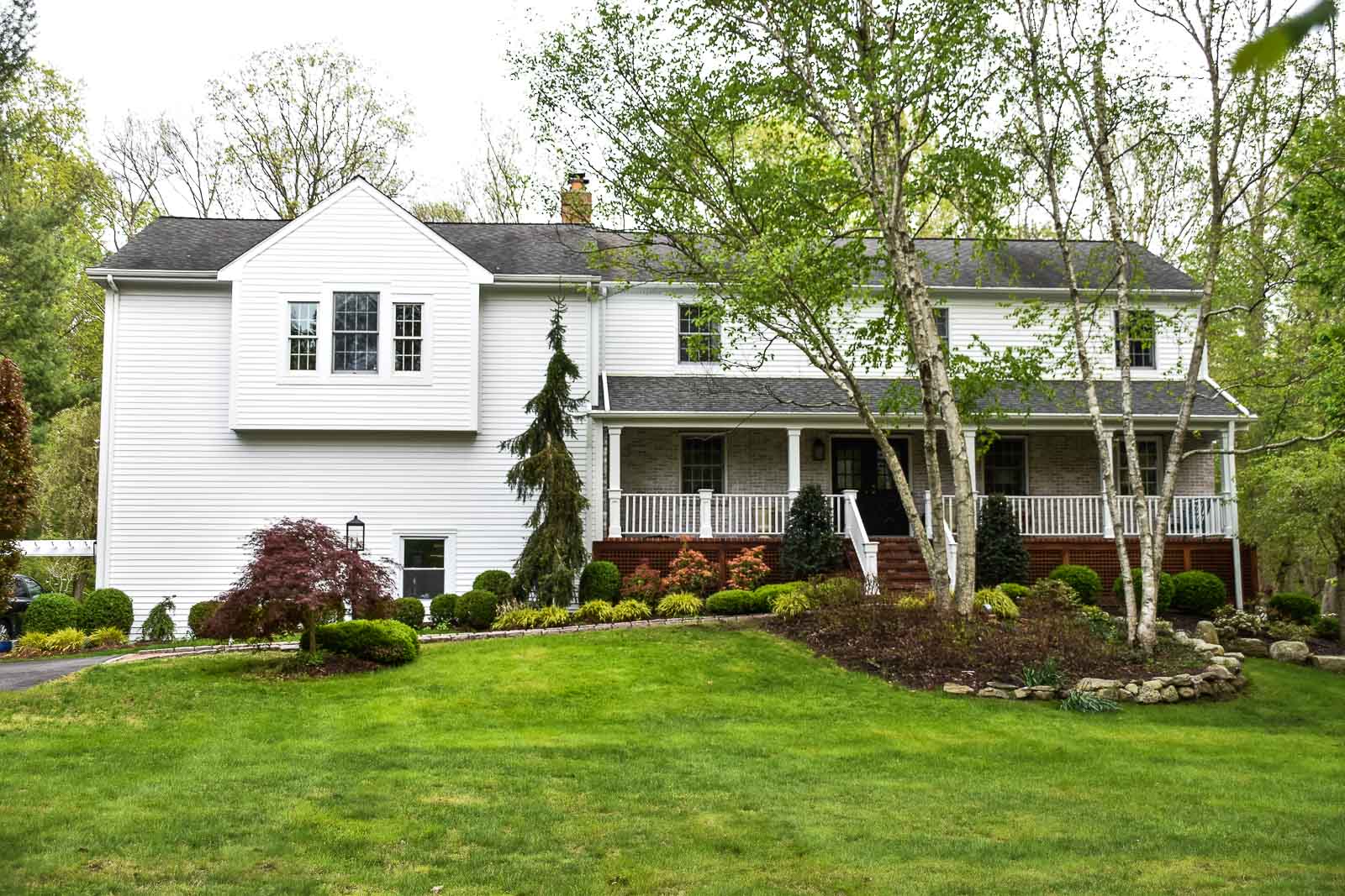
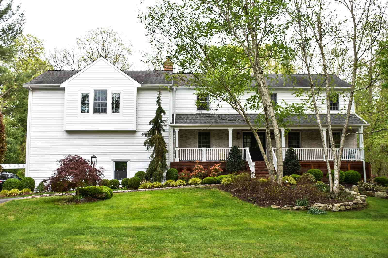
Sometimes a small change can have a HUGE impact. That’s how I feel about our exterior lights at the new house! Before I give all the details, let’s rewind to the first time I saw this home. I’m not sure if I’ve mentioned before, but… I didn’t love it. It didn’t have too much character beyond the lovely front porch and there were lots of little details that felt dated and a little cheesy to me. Granted all of this is simply personal preference, but for whatever reason the home didn’t grab me right away. Perhaps it was our affinity for old historic homes. Perhaps it was just a series of little things. Who knows. After looking at a dozen or so other homes, none of which were quite right (too small, too expensive, too much work…), our agent suggested we come back and look a this house with an eye for “undoing” some of the things I didn’t love. (Our agent’s the bomb.)
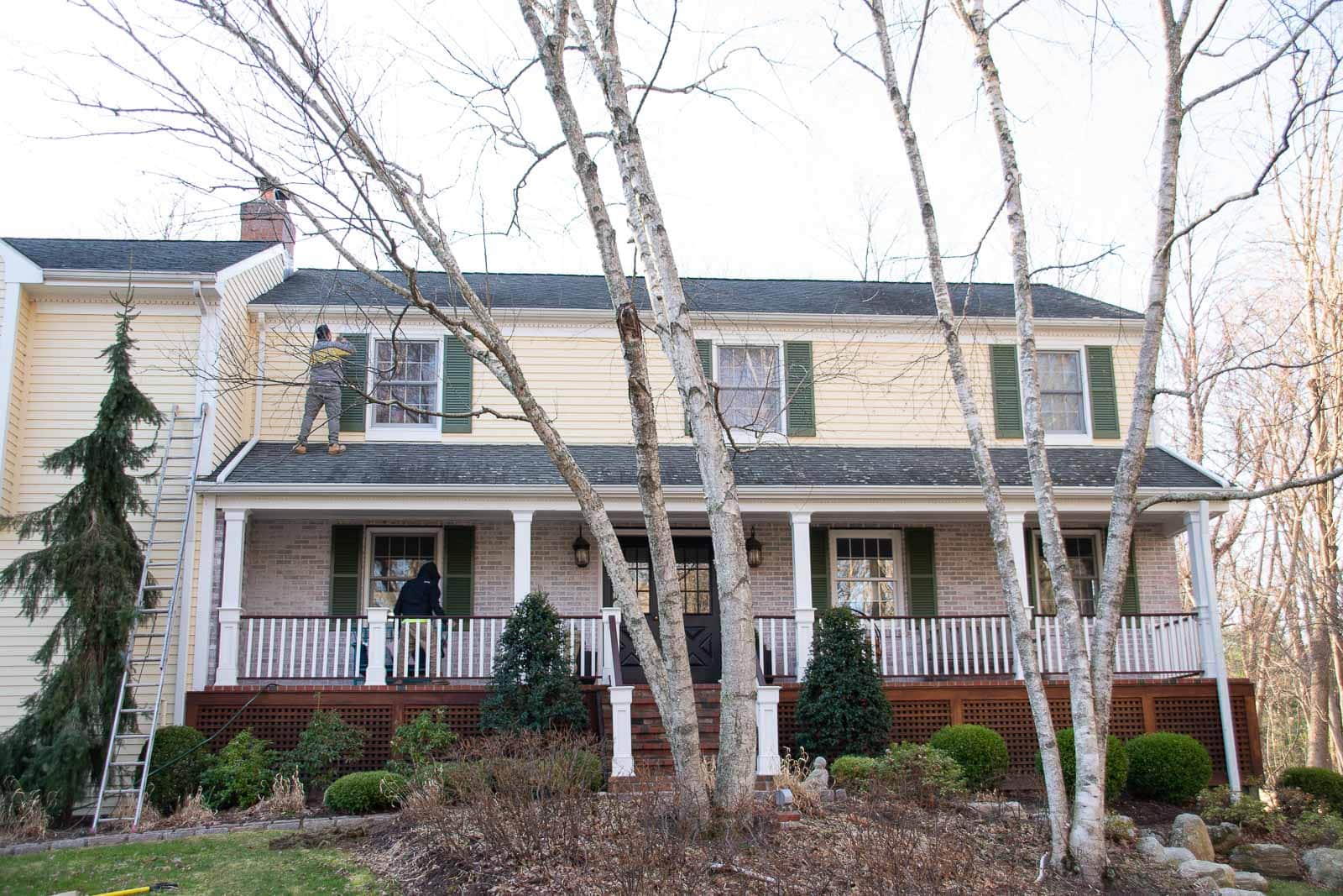
Starting with the exterior, the first few things I didn’t love were the lights, the paint color, and the random bump out where our primary bedroom is. The paint color was easy to address as were the lights. I’m sure the bump out is there to break up the large wall expanse above the garage, but it feels silly. Our painters arrived this past spring, and the lights have finally been swapped out. Stay tuned for my plans for that bump out! I have something in mind that I *hope* will help make sense of it a bit more.
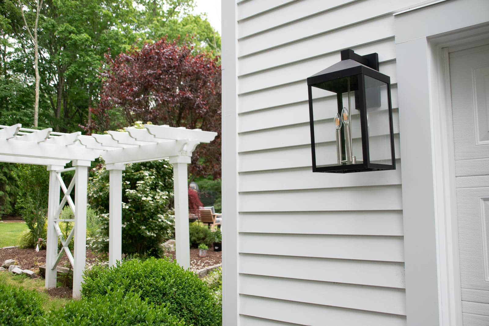
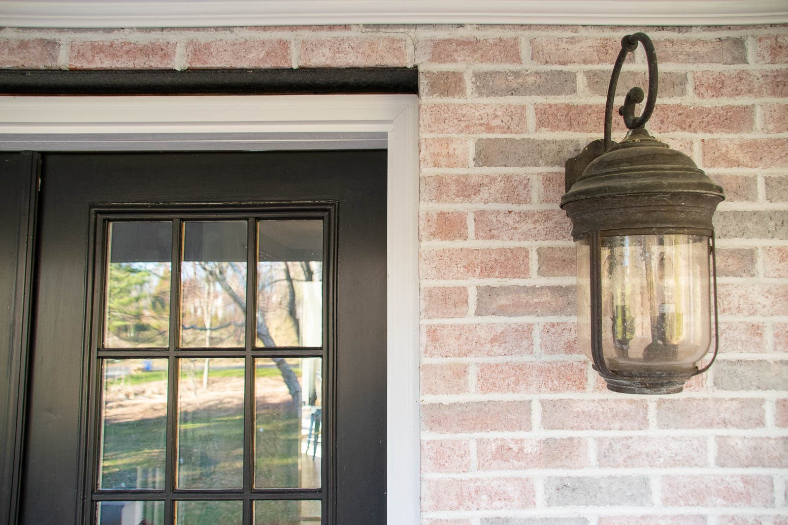
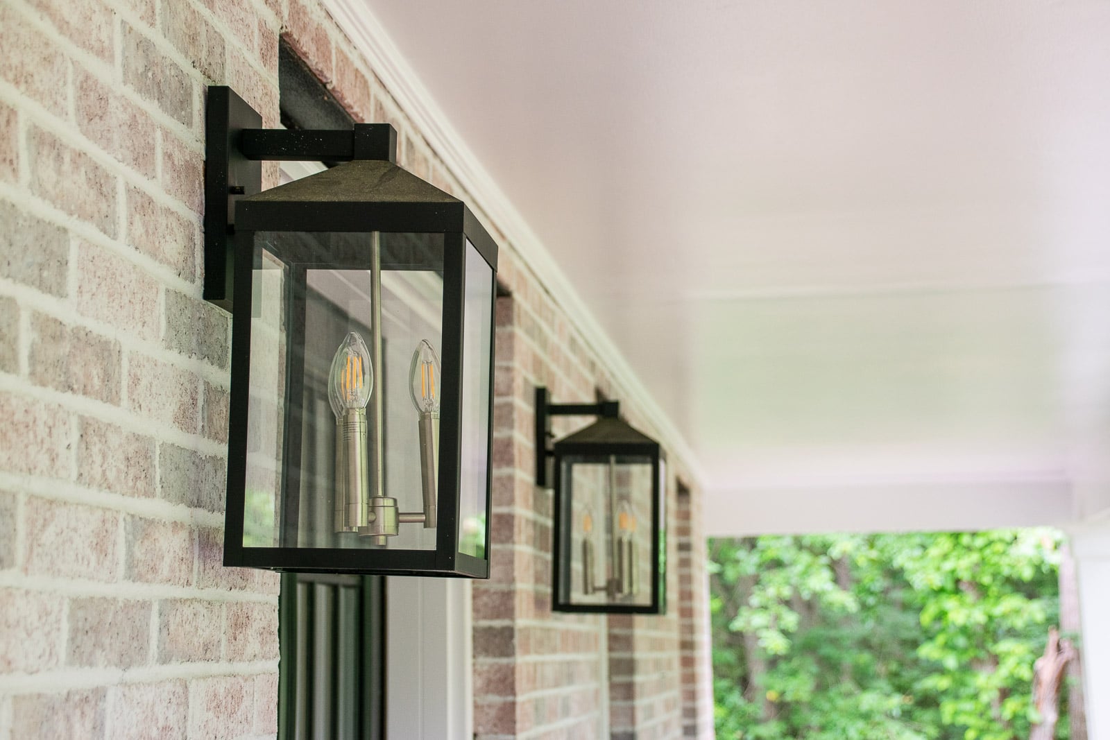
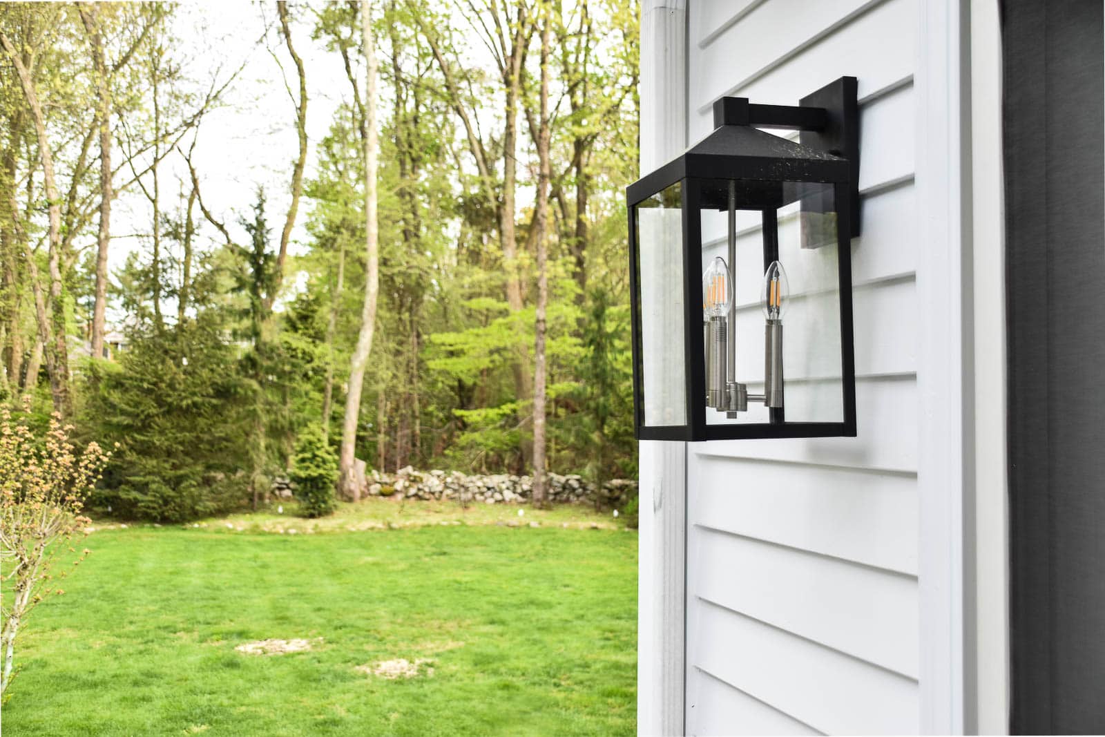
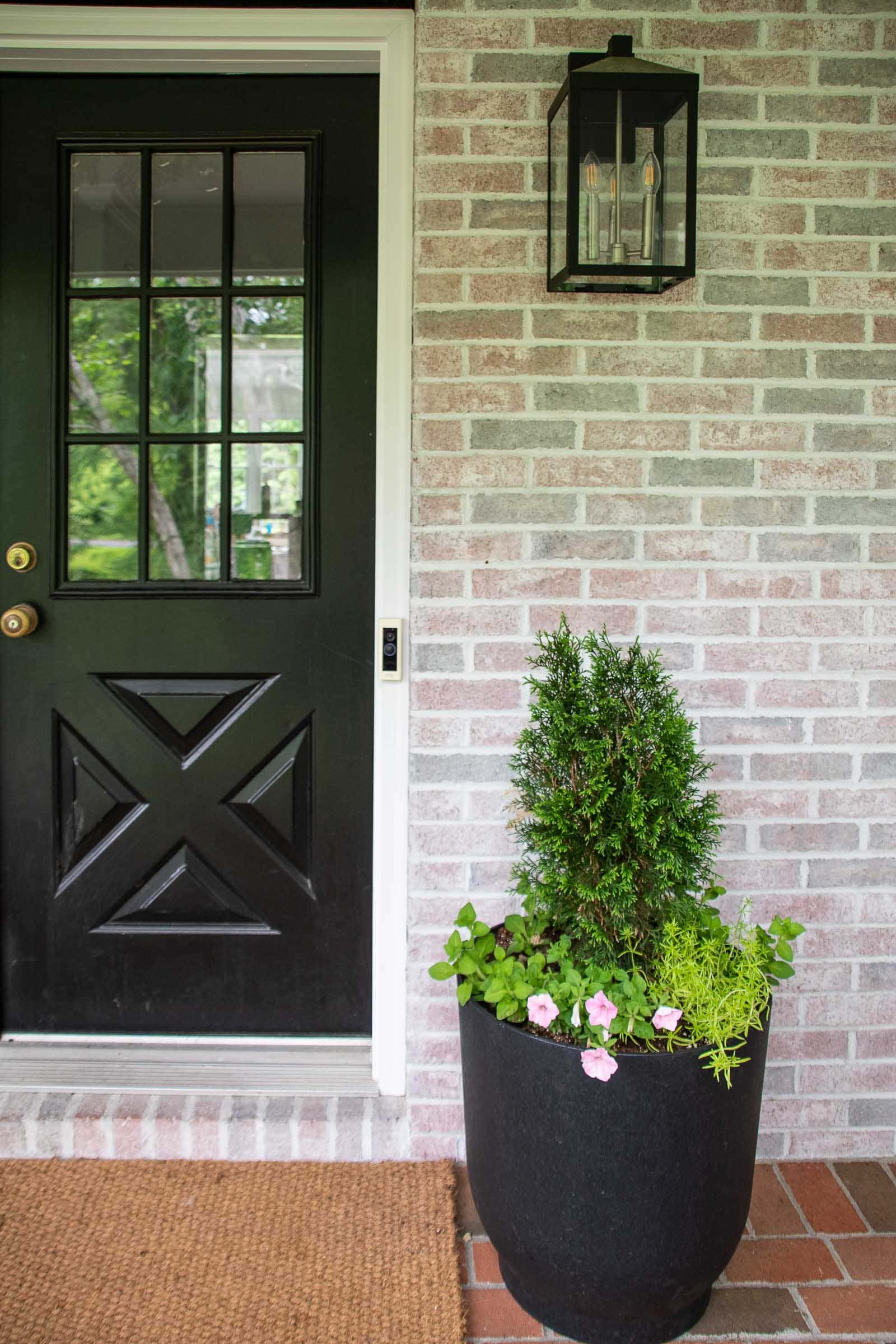
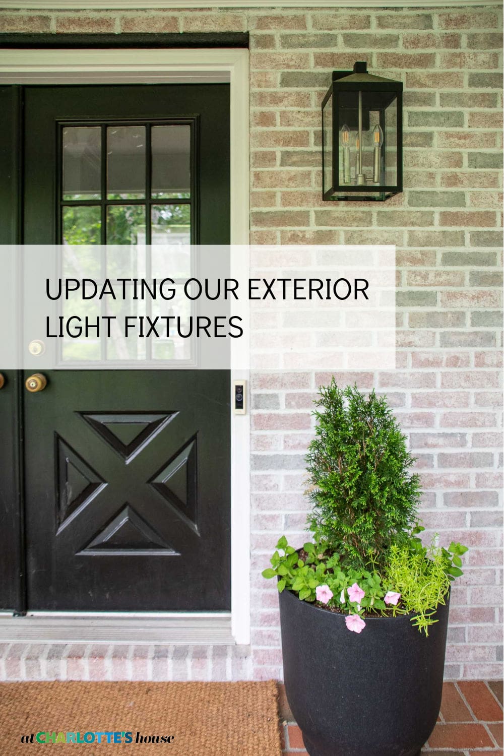
Let’s talk about the lights because as far as bang for you buck makeovers go, this is a great option! The previous ones felt a little dated and not really my style. Although lovely lights, I wasn’t crazy about the scrolls or the overall shape. Even though it’s a small element of the exterior, they somehow set the tone for the home if that makes sense. When you consider the exterior of a home, there are only a few decorative details: paint color, the front door, shutters and… lighting. For our home, all of these elements were “off”. I swapped out the exterior lights for these amazingly chic and streamlined ones from Lamps Plus and I am CRAZY about them. The original lights were three different sizes: large ones on either side of the big garage door, slightly smaller ones by the front door and then small ones by the back doors. I was able to find this style light in three different sizes which made it really easy because I didn’t have to worry about scale of the new lights.
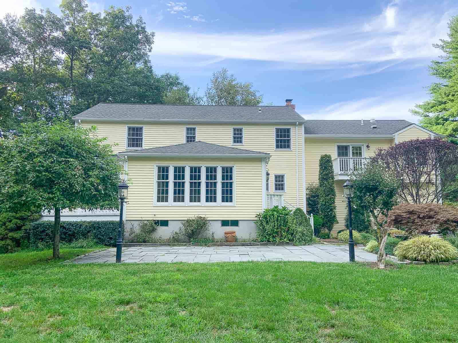
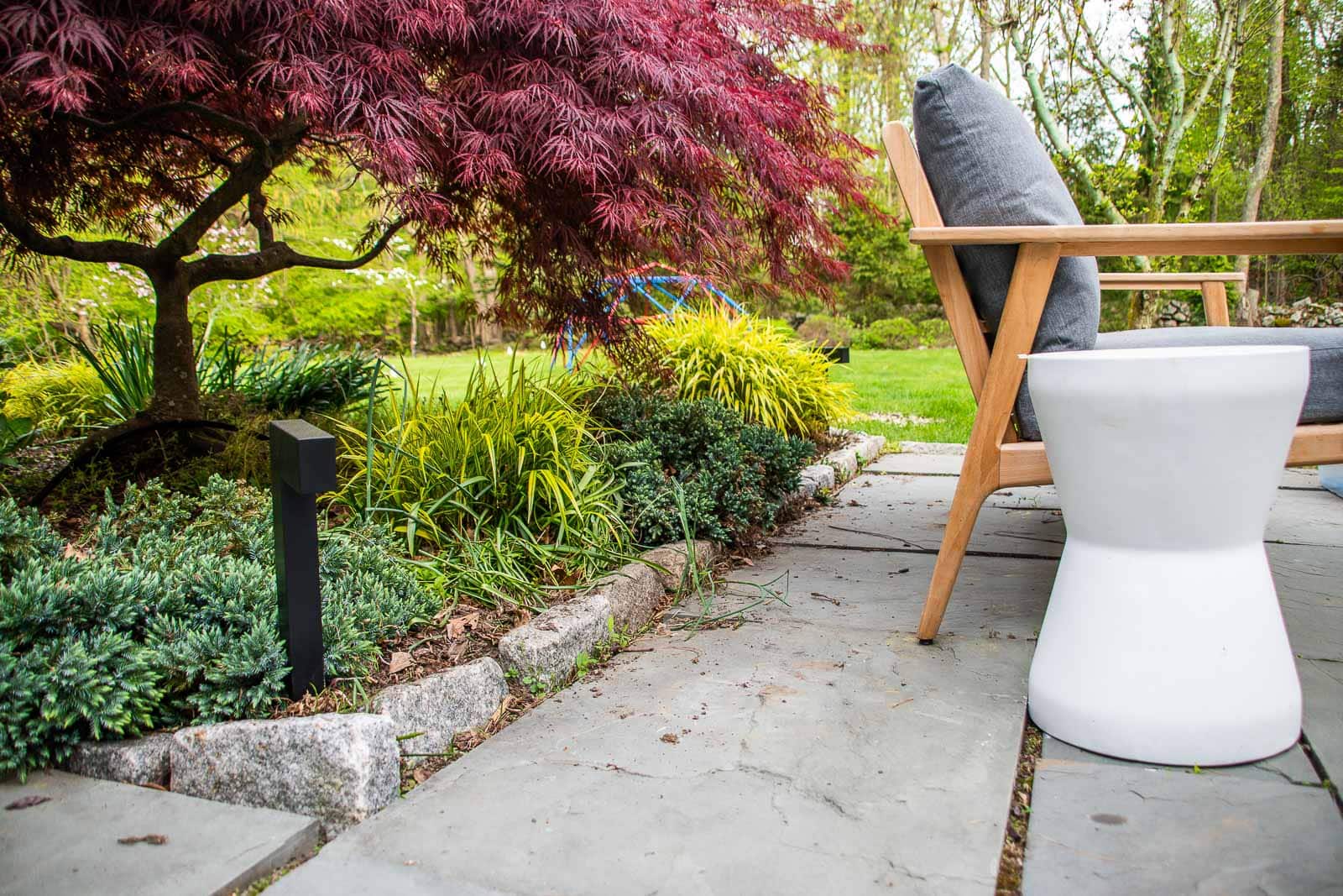
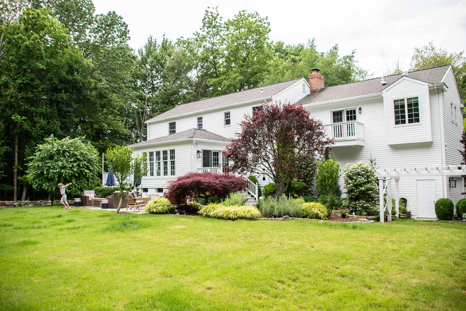
You can see in these early pictures of the back that the patio had two lamp posts right next to it. No question they provided a great deal of light, but I didn’t love the aesthetic and I really didn’t love the way they seemed to block the flow between the patio and the lawn. There are exterior lights on the house and we have some portable LED lights so I took the gamble and had our electrician remove the posts entirely and replace them with a few landscape lights along the edge of the garden. Landscape lights don’t illuminate the yard nearly as much as the post lights, but they create a lovely ambiance around the patio.
Probably hard to tell in this picture, but it’s nice not having those two posts cutting off the patio. The kids can just run back and forth between the patio and the grass and it doesn’t feel quite as cramped on the patio.
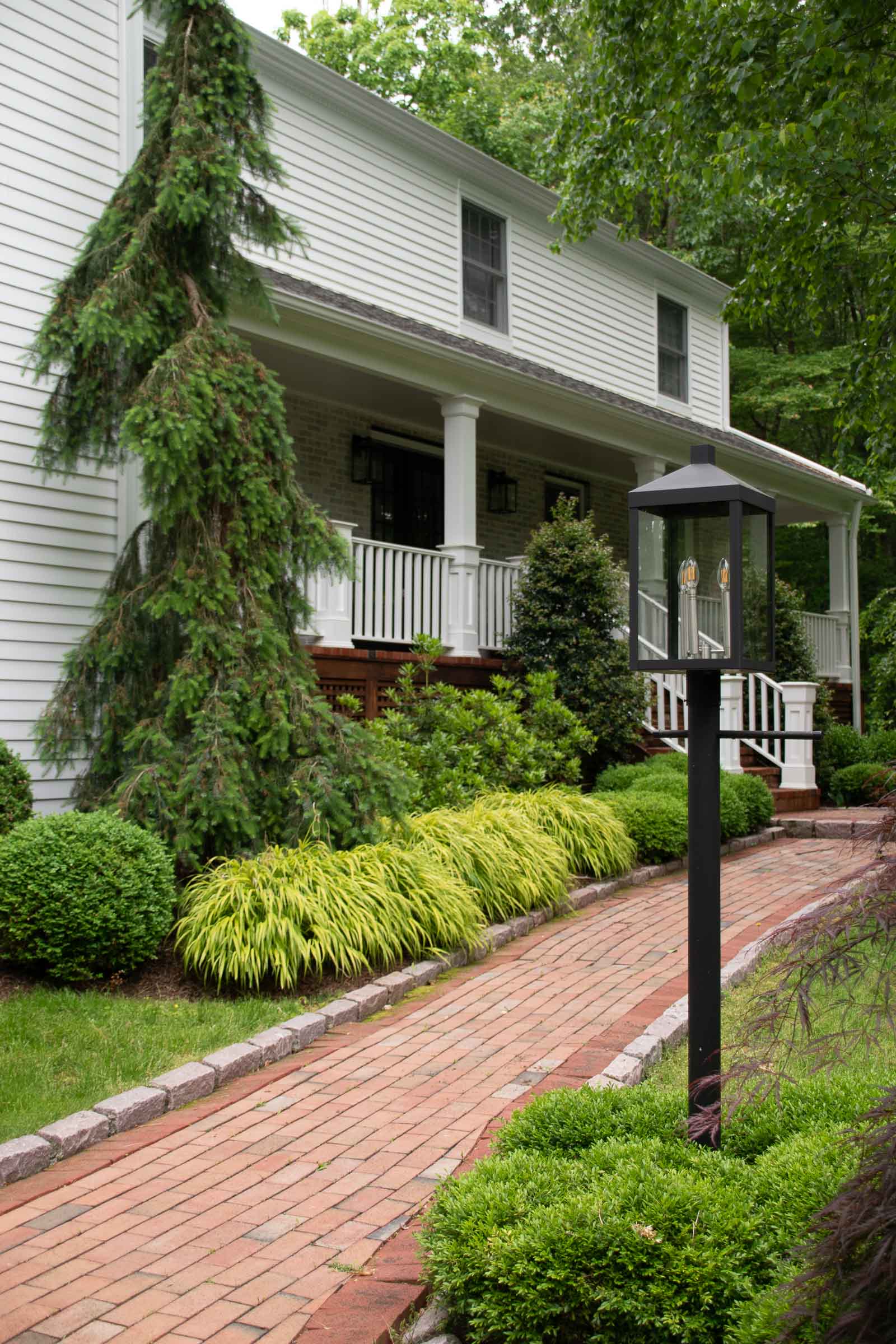
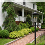
We got lucky and the final touch was that the matching post light fit the existing post out front. Changing out the lights along with painting the exterior and ditching the shutters and replacing the front door (not shown) has definitely made this home feel more up to date and stylish! Sure, paint is a big expense, and all the new lights add up, but… in the grand scheme of a home purchase, $10,000 in expenses is the tiniest fraction of the overall cost so well worth it if you ask me!
Thanks to Lamps Plus for partnering with me and providing all the amazing new lights. I heard from so many of you that you have the same ones and love them just as much as I do! These lights are clean and simple and can work well on any style home from updating an older home to complementing a newer one.
Click here for a link to the wall lights.
Click here for a link to the post light.
Click here for a link to the landscape lighting!
Here’s a final peek at how the house looked when we first came through and how it looks today! Although… we swapped out the front door since I took these pictures so I already owe you an update!
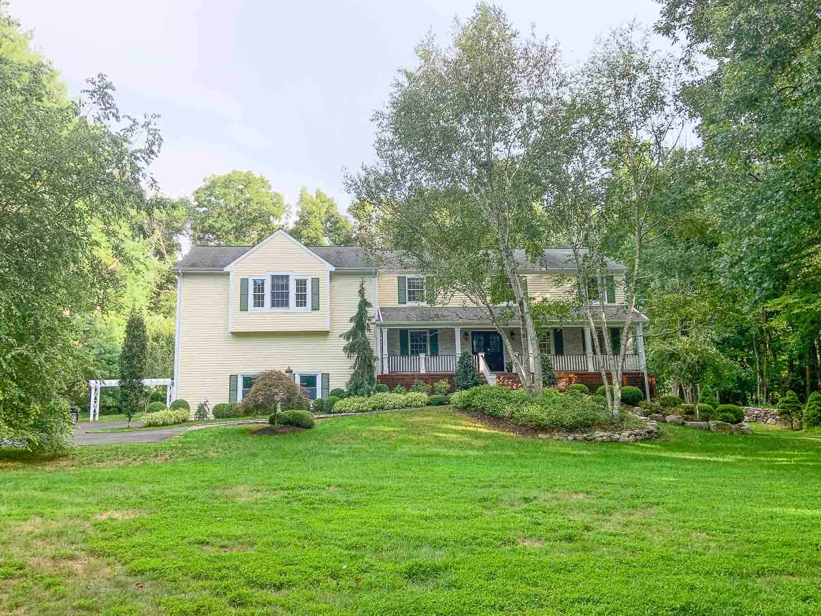



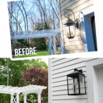




Considering the fact that that was a comparatively “minor” change It has a Massive Impact!
And I am Sure you already considered this, but would “Extending” the Bump downward to the ground make it look less random and more Cohesive?
I Usually am better at spelling and typing, i think the capslock threw me off! 😀
Hi! I worry that extending that bump out would draw more attention to the weird scale of the garage windows and the blank wall there?
KInd of hard to tell from these pictures, but how far out does that “bump” go? And, more important: what is inside? My two first impulses were 1) extend the bump to the right and left, so that it covers the entire length of that section, leaving the pointed roof-part as it is. That way it will look more “in tune” with the GEneral lines of the house and more like an integrated part of the structure. 2)this i am not so sure of, ut could you turn it into a small balCony-kind of thing, with no FronT wall, but only a glass ( or even a metal one,to pick up the shapes and material of your fab new lamps)railing? ( is railing the correct word? Like a low “fence”…my english is sorely laCking in correct Architectural Lingo,ha ha) your house is gorgeous, btw!
Haha! It’s about 18 inches deep so quite shallow. We could certainly make it work better with architectural work like you’ve described. Removing it and replacing with something all glass would be amazing but.. expensive!