
Colorful Green Dining Room Makeover

Psssst… this post *might* contain affiliate links: see my disclosure here.
The dining room in the new house is small but mighty… and she needed some color.
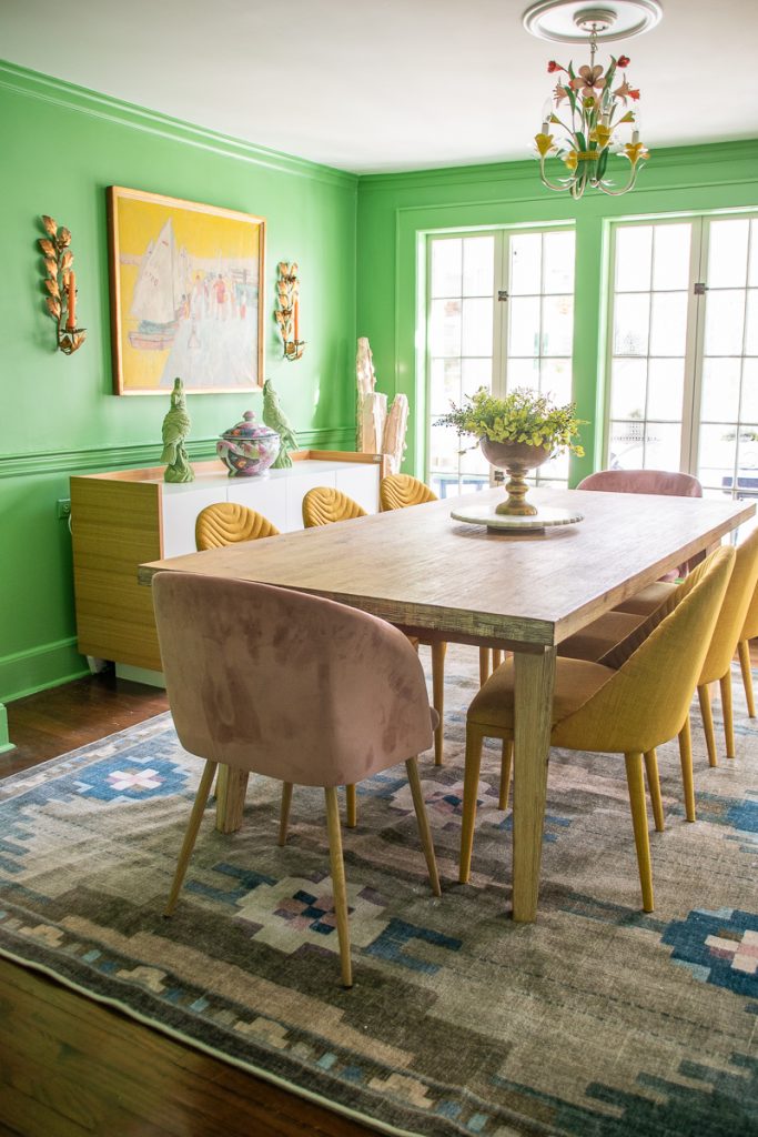
The challenges of this room were not only the size (it’s on the smaller side of things) but also allllll the trim and molding and doors and windows. There are a lot of surfaces and lines in here.
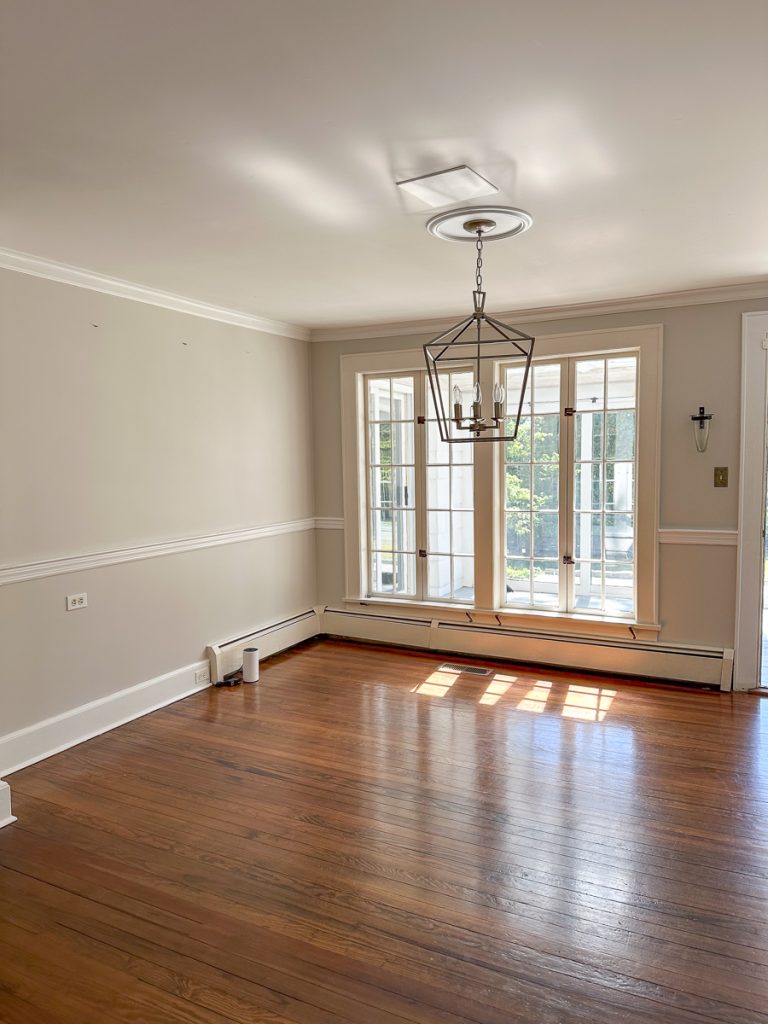
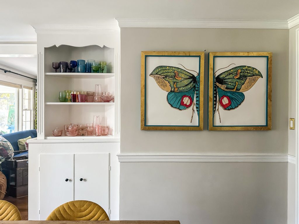
All of these various details are incredibly charming and exactly what we loved about this house… none of the rooms are necessarily *bigger*. Don’t get me wrong, I would have LOVED a little more space but also? We probably don’t need it and I much prefer the charm and details like this that come with an older home. Until about 2 weeks before I painted this space, I was convinced I was going to bring in wallpaper like our old dining room.
Shop my favorites!
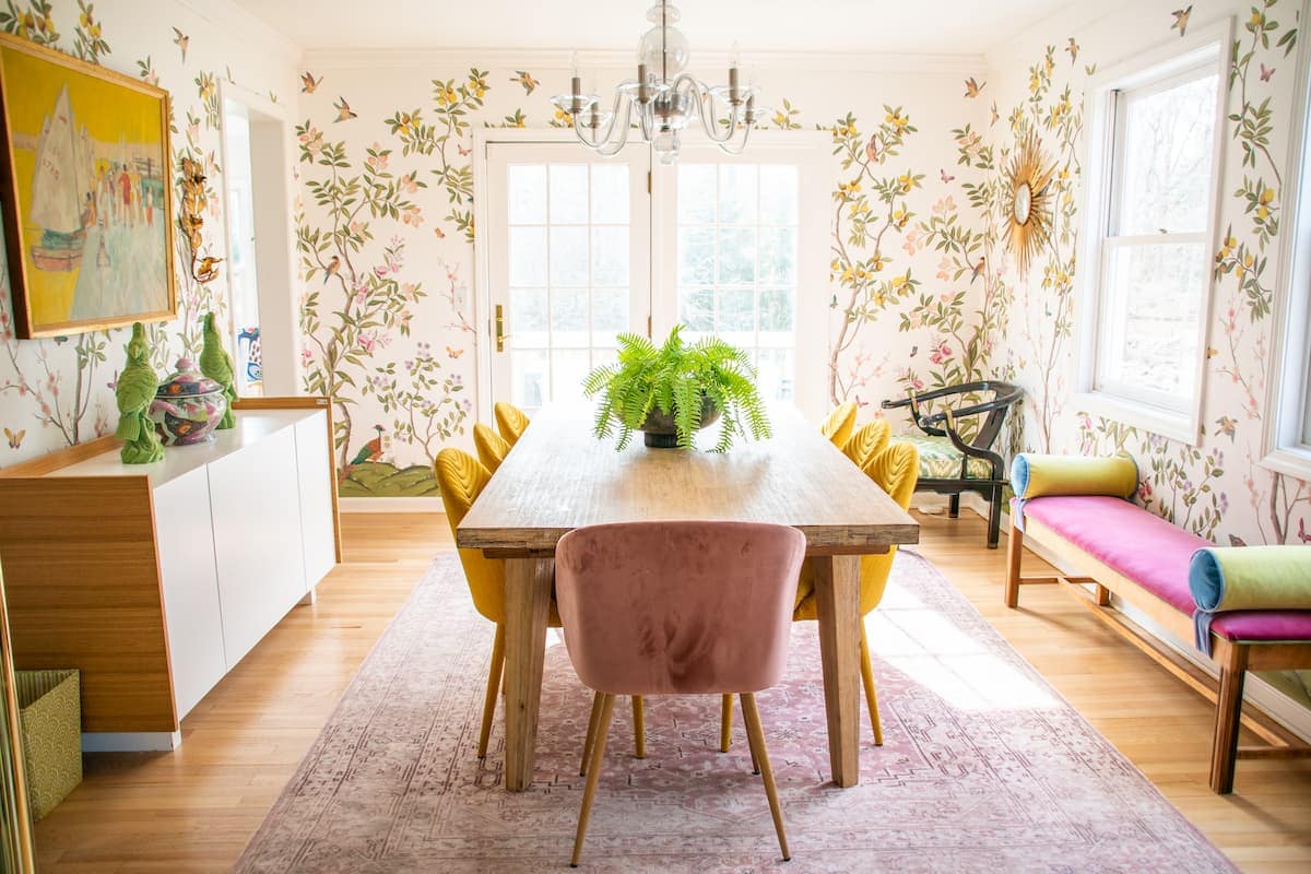
But then I kept coming back to all the details in the new dining room… the chair rail. The shelves. The doors and windows and the idea of wallpaper began to feel not only complicated but also, maybe, a little too busy? Would wallpaper accentuate all the architectural details? My fear was yes so… back to the drawing board.
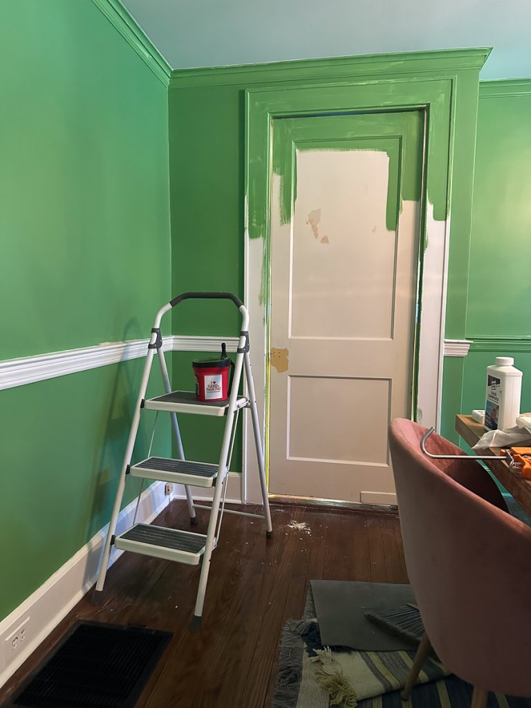
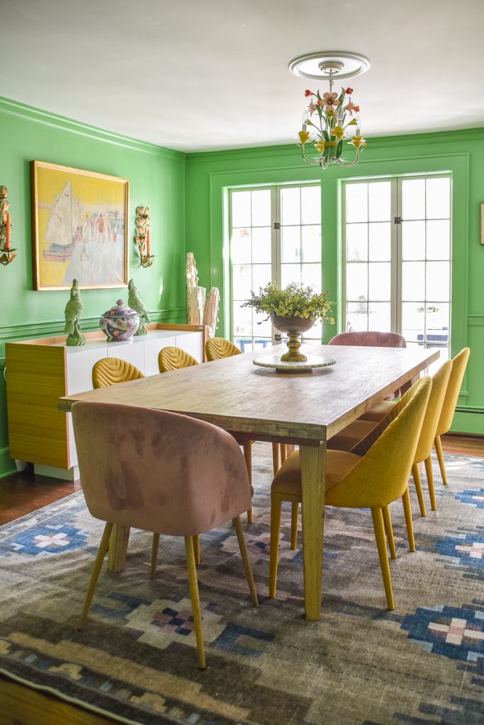
I don’t have a great answer for how I landed on this green. (It’s BEHR paint but color matched to Benjamin Moore’s Aurora Borealis.) But this is my process. When I decided not to go with wallpaper, I pivoted to color drenching. I googled “color drench dining room” and there were a few spaces with a bright cheerful saturated green that spoke to me so I immediately went to Home Depot and grabbed some samples. This paint color did not come without some worry that I’d gone the wrong direction. Rose pink was another close contender, but I had 2 gallons of green paint so onwards.
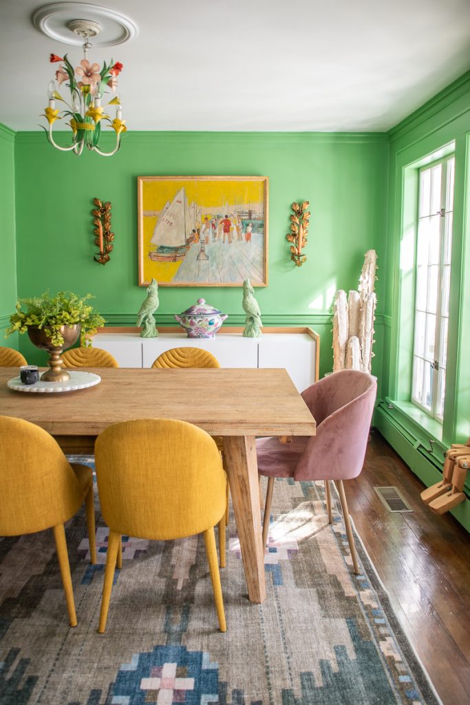
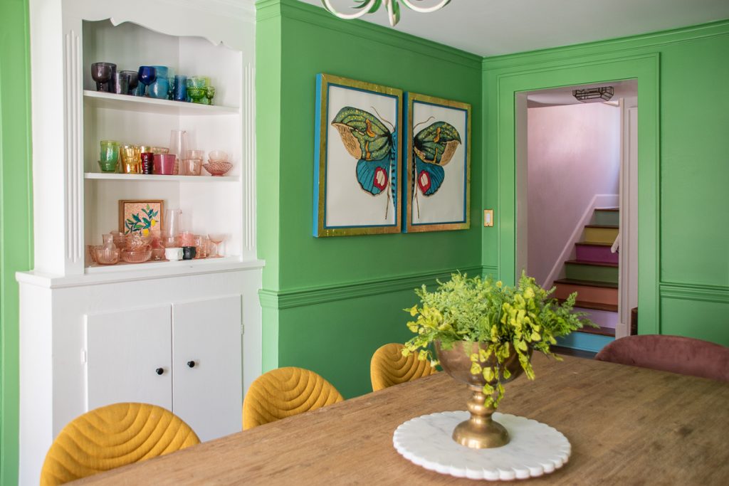
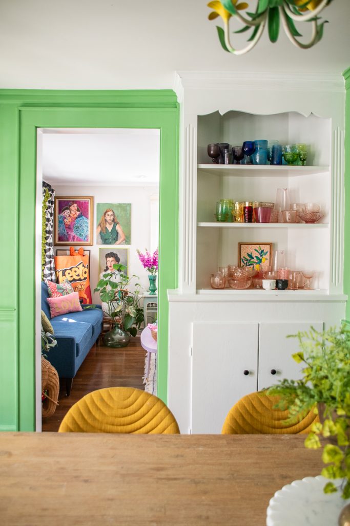
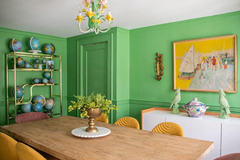
I actually LOVE this green and feel like it came together once I painted the trim and molding. Partly because I’m lazy but partly because this is a big bold color, I left the ceiling white, alllllllll forty of those window panes and the hutch white. I worried a green ceiling would feel like a lot. The 40 window panes is where I got lazy. And the white hutch showcases my rainbow glass so well, I wasn’t sure how green would affect them. But again… lazy.
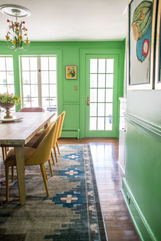
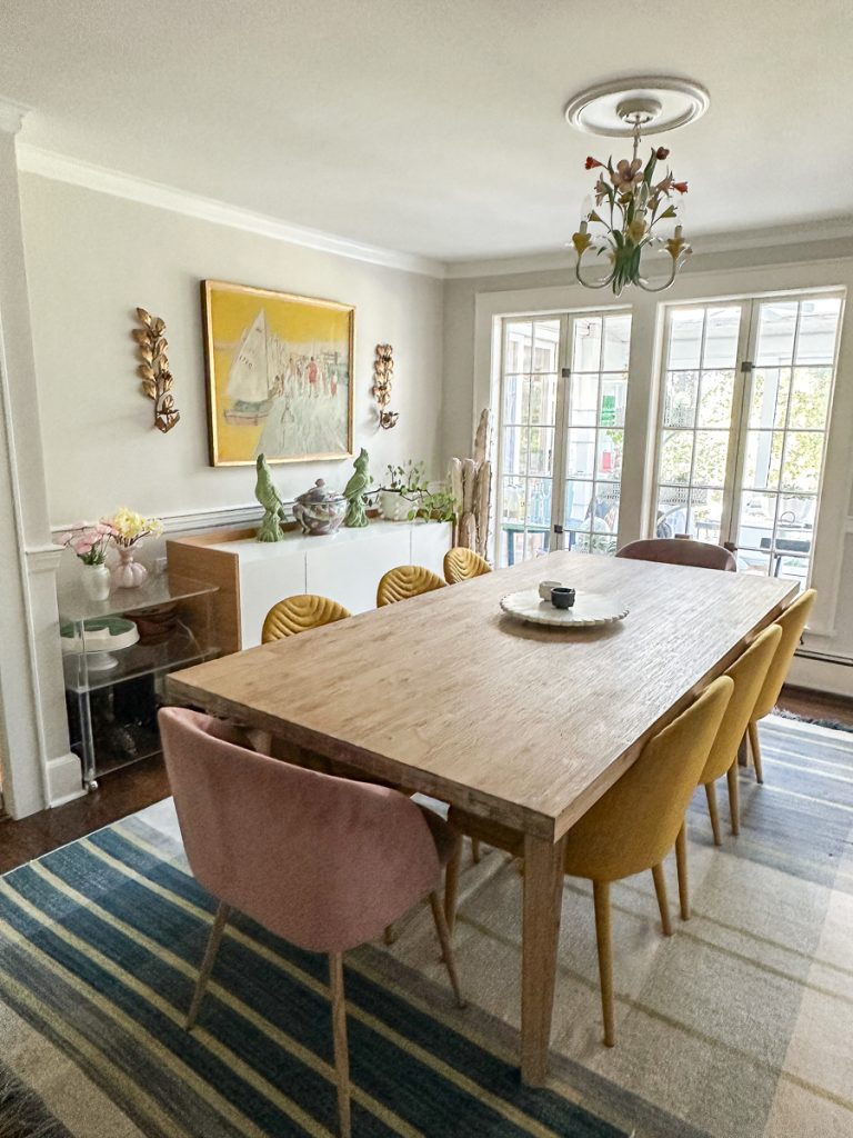
I swapped out the rug for this incredible one from Ruggable. It’s a little brighter in person, but the pattern just feels a bit more cheerful and suitable for the space. I love how it has a border that frames the table and… it’s technically washable so yay for that given this is a dining room.
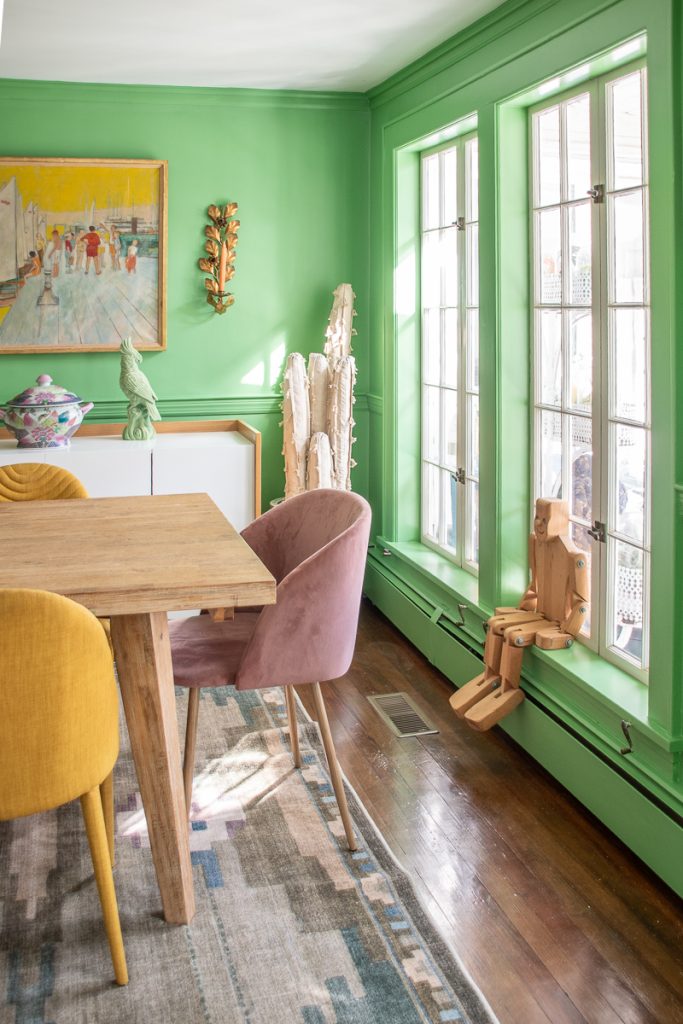
Just about everything else in the space has been in our last few dining rooms and/ or was thrifted or inherited. Sorry! The pendant light came from my aunt. The painting came from the grandmother. The leafy sconces, the brass etagere, the globes, the small painting, the fabric cactus and all the rainbow glass- thrifted. Table and chairs were from a makeover YEARS ago but they still do the trick!
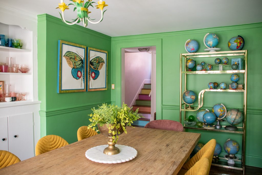
You can see how I made that butterfly diptych HERE!
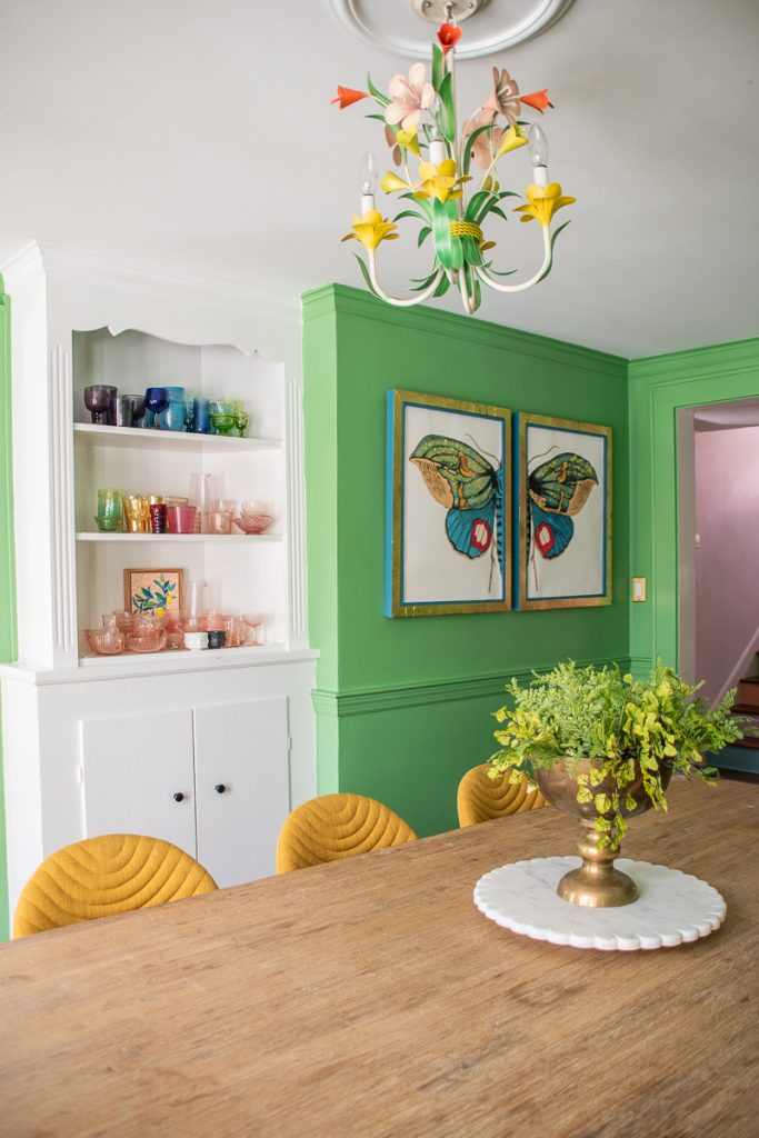
When all is said and done, I obviously MUCH prefer the color drenched version of the space. I look back at old pictures and even though all the furniture is the same, it just feels so… dull. The addition of color ALWAYS feels like an improvement, in my opinion, and… it typically only takes a few days so not a crazy amount of time. In other words… WORTH IT!


Don’t Miss Out
Become An Insider!
Signup for exclusive tips, and tricks from Charlotte’s House!
Let’s chat!
I love comments from you, so feel free to leave your thoughts and ideas below! And don’t forget to follow me on Instagram for even more!