Foyer Reveal: Eclectic Wallpaper and Colorful Details
Psssst… this post *might* contain affiliate links: see my disclosure here.
Bold Foyer Design
I added wallpaper and some bold paint choices to great a foyer with an impact.
Story Time:
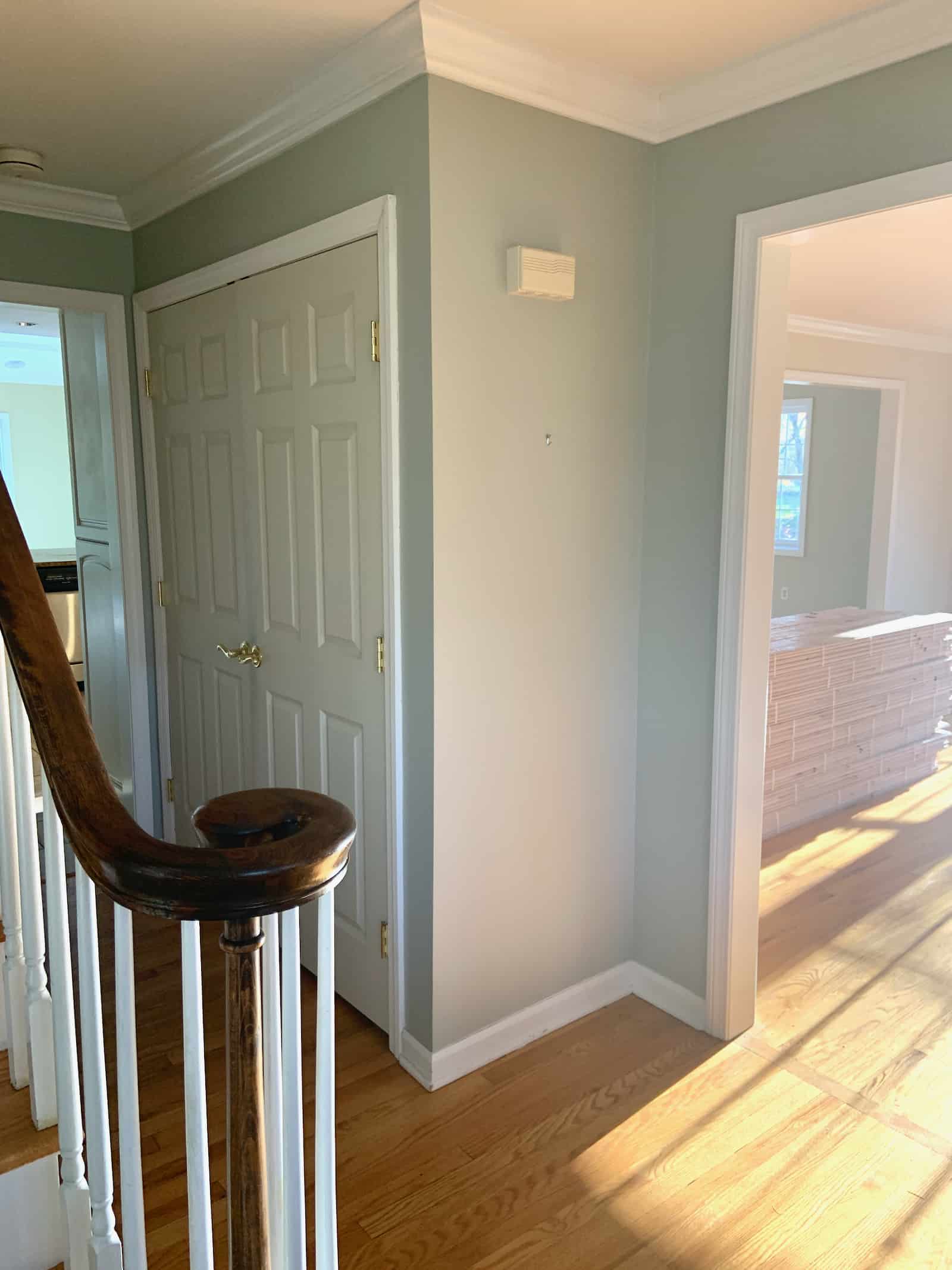
When I first saw our house, I hated it. It felt basic, lacking any charm, and my first reaction was “immediately no.” Our beloved agent showed us a dozen more homes and suggested that *maybe* I take a second look at this house and consider ways I could add my special sauce to the space to make it more exciting. This tiny foyer was one of the first problems I wanted to solve. Here’s how it looked when we moved in:
Shop my favorites!
Stage 1- Custom Rast
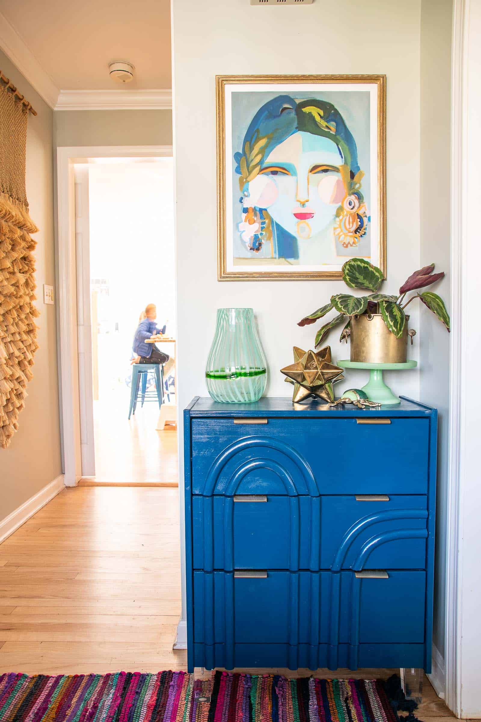
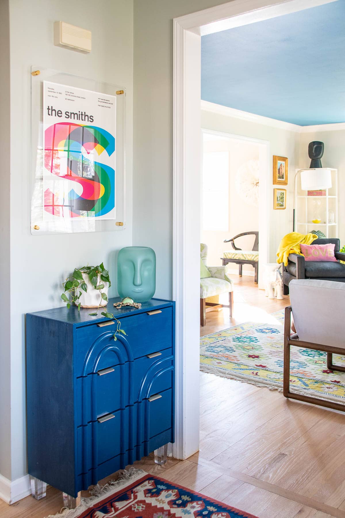
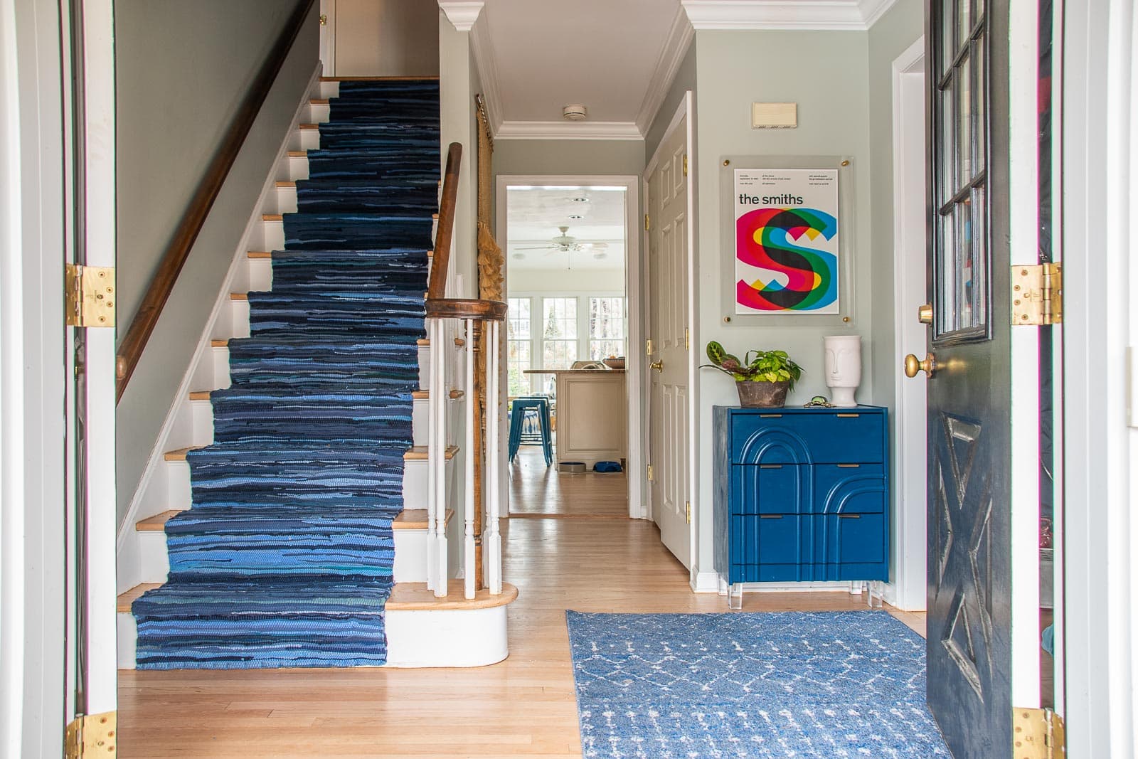
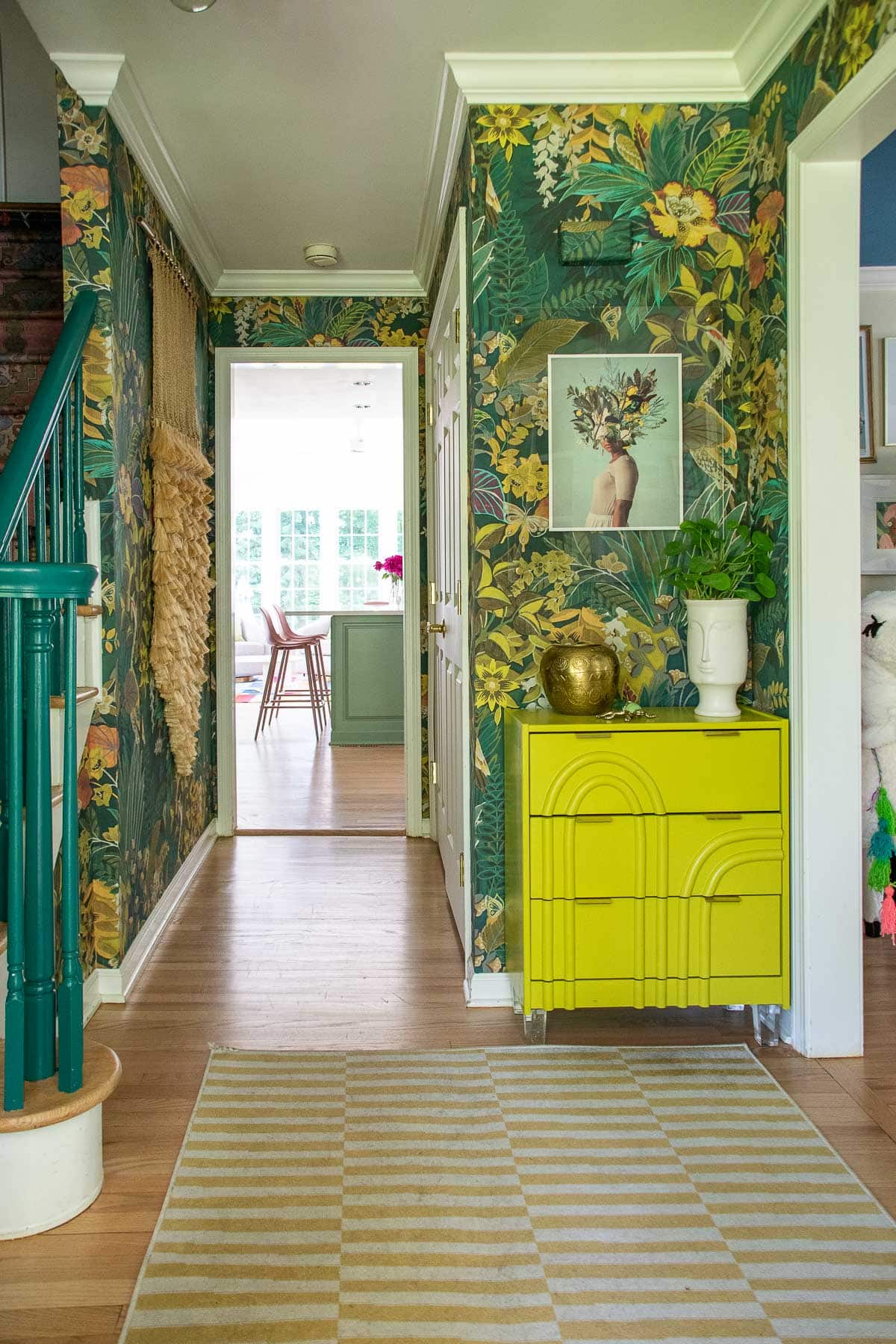
The first time I walked into this space, I knew I wanted to go BIG. Like real big. It’s a small diminutive little area that could easily become a basic pass through. My plan was simple but impactful: bold colorful wallpaper and as big a light fixture as I could fit in there. Until I found the right wallpaper and light fixture, I added a small Ikea hack. That wall is really small so this tiny Rast dresser was the right shape.
I borrowed that picture from my portrait wall of ladies in the living room and later replaced it with this acrylic frame and that old Smiths poster we’ve had kicking around for ages.
Adding a Runner
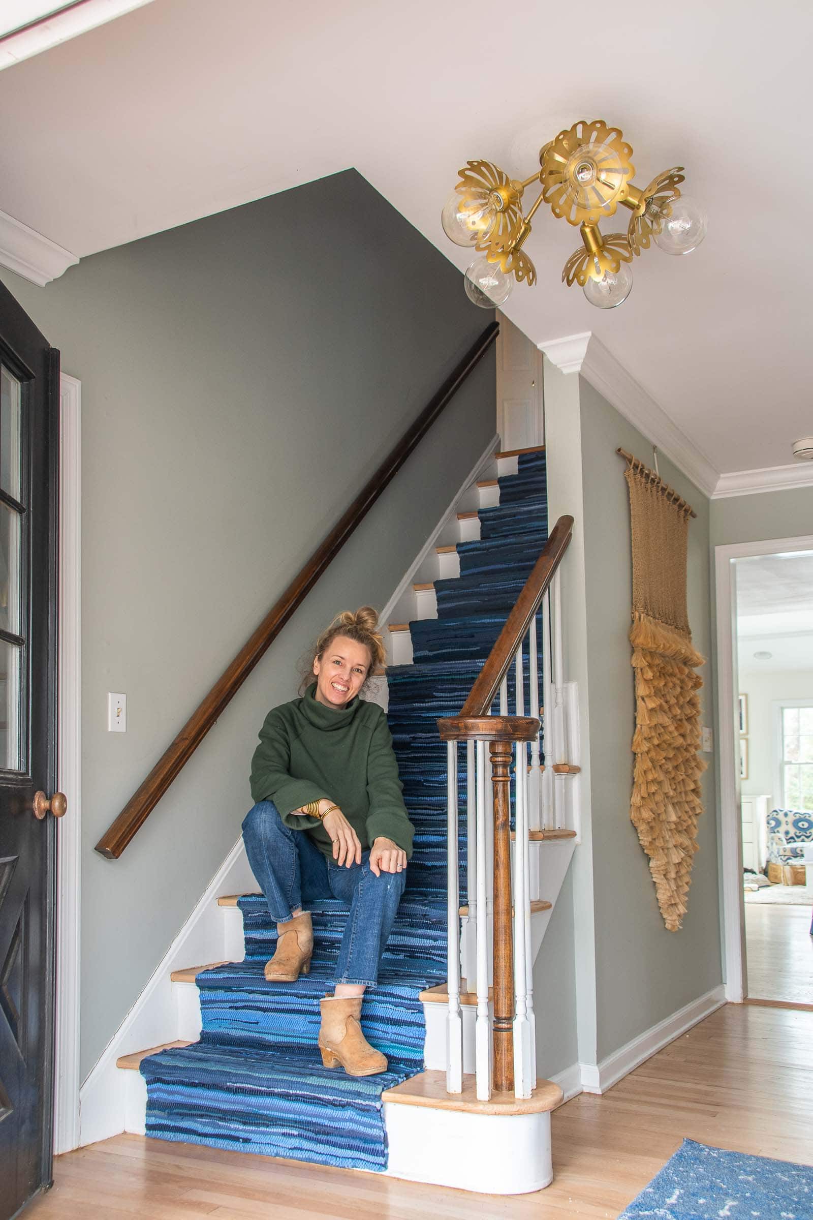
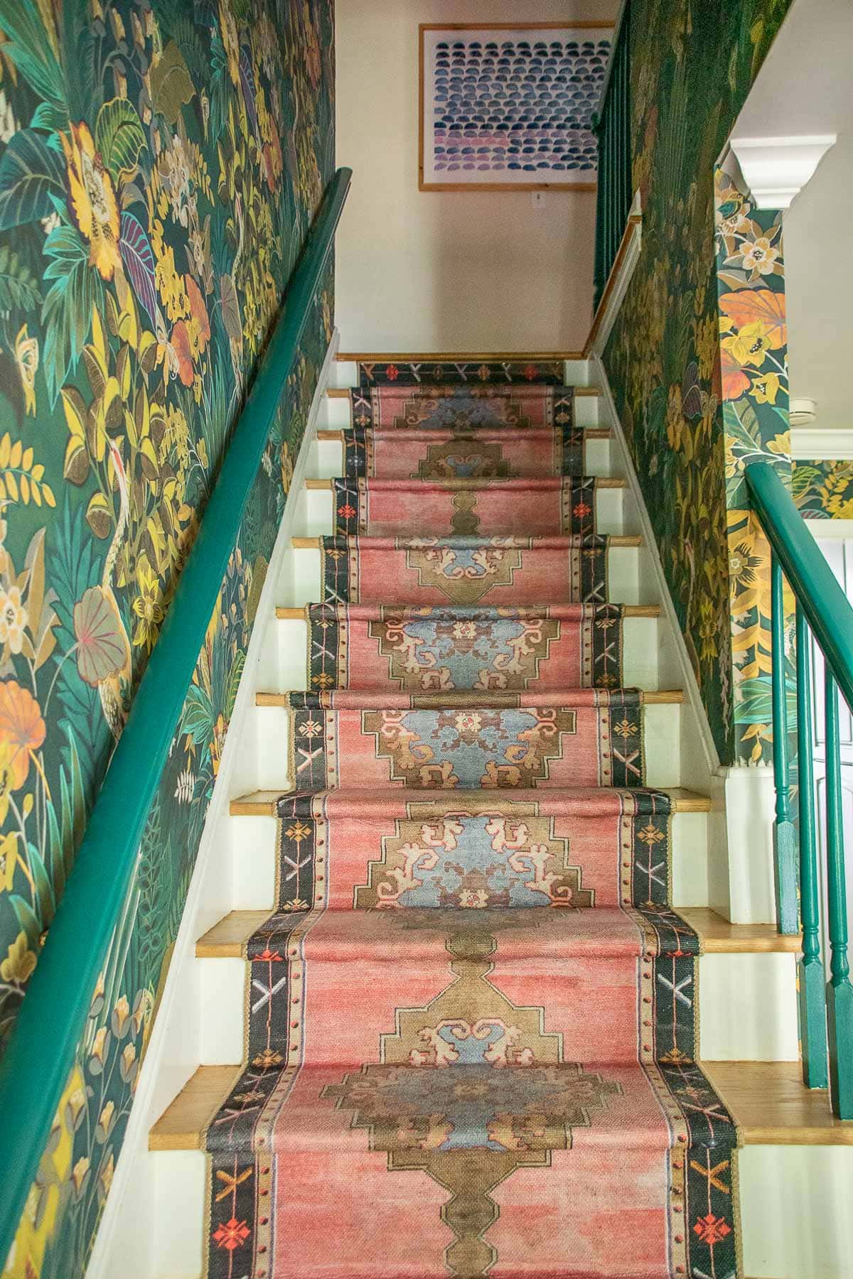
After living in the house for a few months, it was clear that the heavy footed children needed a runner on those stairs to quiet things down. DIY stair runner was project number 2 for the foyer. I LOVED this chindi runner because it was super inexpensive (like $80 total) and the colors were my favorites. It took one afternoon to install it and it seemed like the next first step towards operation big bold foyer.
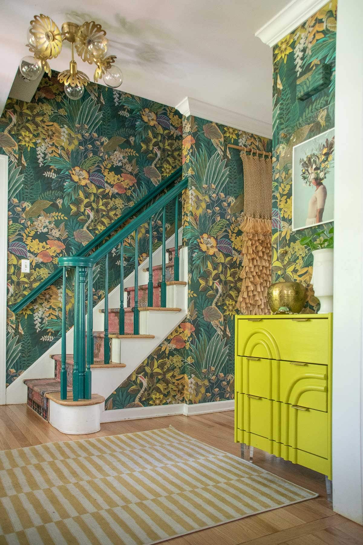
At some point, I also received that stunning pendant light from My Mitzi. I would have gone even bigger, but anything too wide would have stuck out into the staircase which I didn’t want. I loved the playful flowers combined with the antique gold finish. A stunner!
Wallpaper!
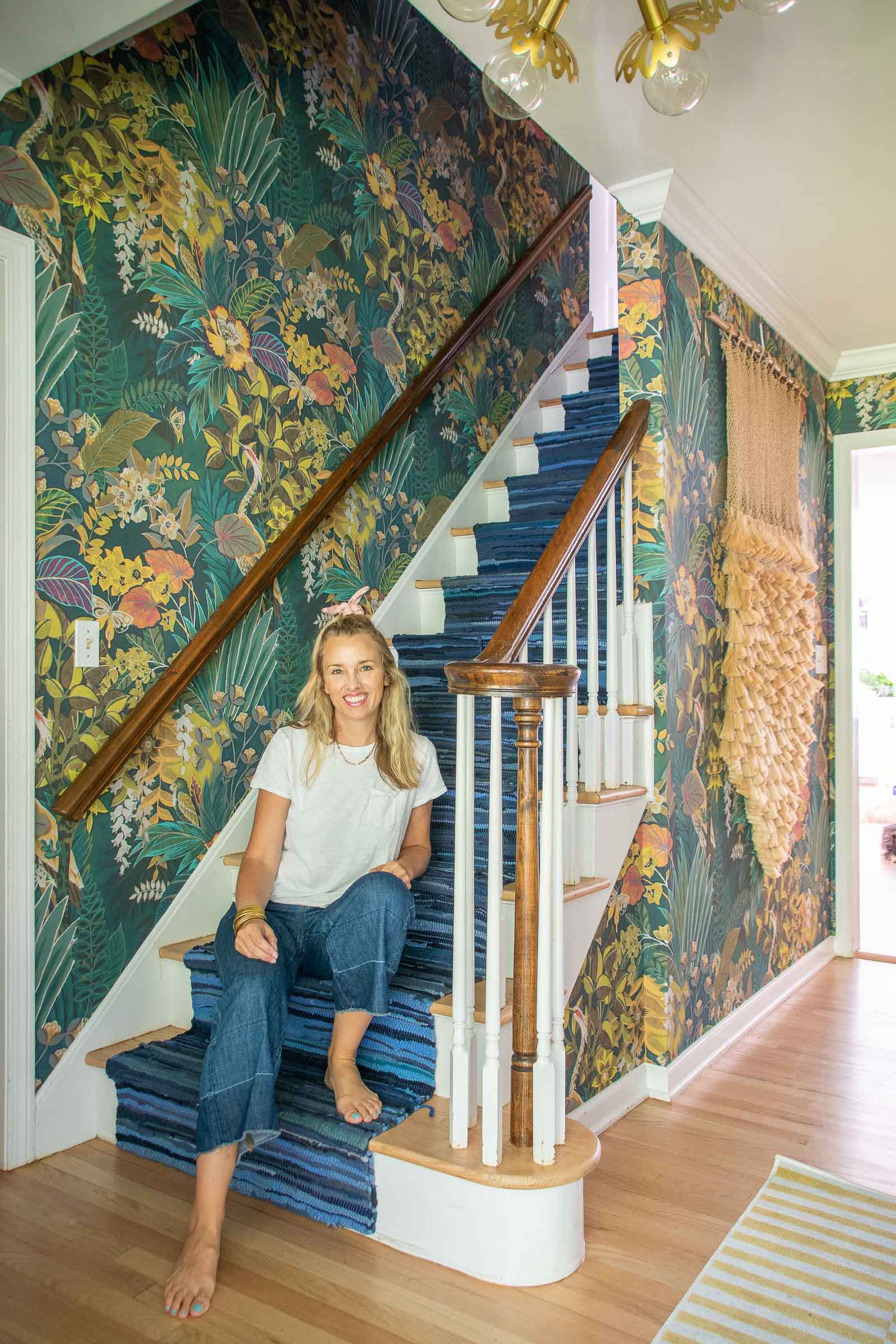
Months after these first few changes, I finally found a wallpaper. And then I heard from the brand that the one I wanted wasn’t available. So found another one. It looked like it might be amazing. But the sample was a fraction of the full pattern so it was really hard to get a sense of how the whole wall would look with this wallpaper. Thankfully… the pattern was even more incredible and vibrant in person and it’s a thick luxe material that I love. I hired this one out because of the ceiling height over the stairs. It took him a day to hang it and it probably would have taken me a month! With wallpaper in place… clearly my beloved chindi runner was not the right fit for the space. “If you give a mouse a cookie…”
Replacing the Runner
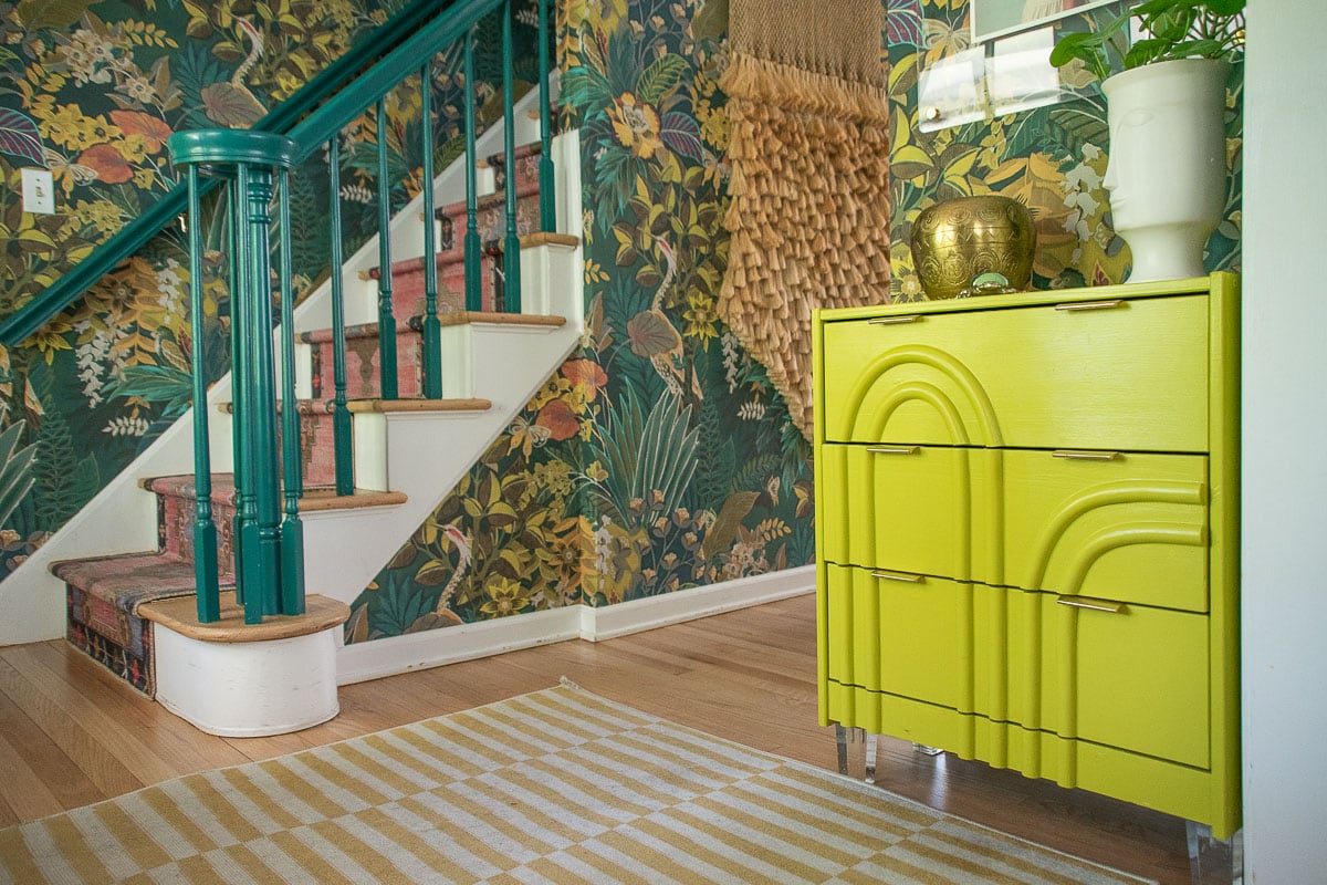
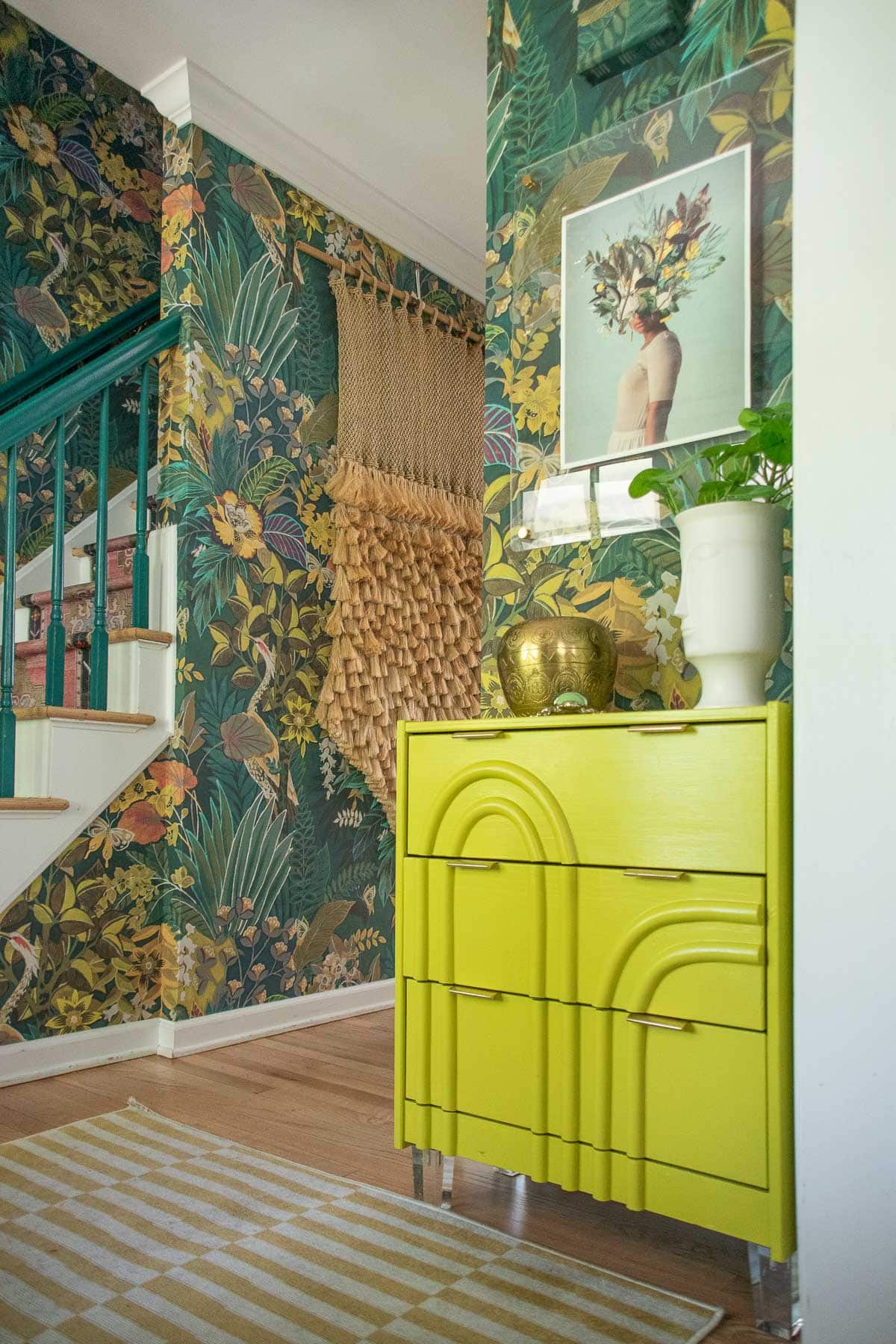
I brought in this AMAZING runner and loved it so much it’s also a small area rug in our kitchen. I installed it the same way as the chindi runner but had to cut them both in the middle to make the pattern line up a bit better. I love that this rug looks old and worn but it’s actually budget friendly and durable! I also painted the banister that dark teal from the wallpaper so railing would blend in a bit and the paper could be the star.
Repaint the Foyer Table
Final detail of the foyer was to address the foyer table. The teal blue just didn’t work. At all. When choosing a new color for the foyer table, there were a few different options. That greeny teal to match the banister and the wallpaper. A pink to match the rug. OR… a riskier potentially too bold choice that obviously I was going to go with because it’s only paint: that amazing greeny yellow citron from the wallpaper.
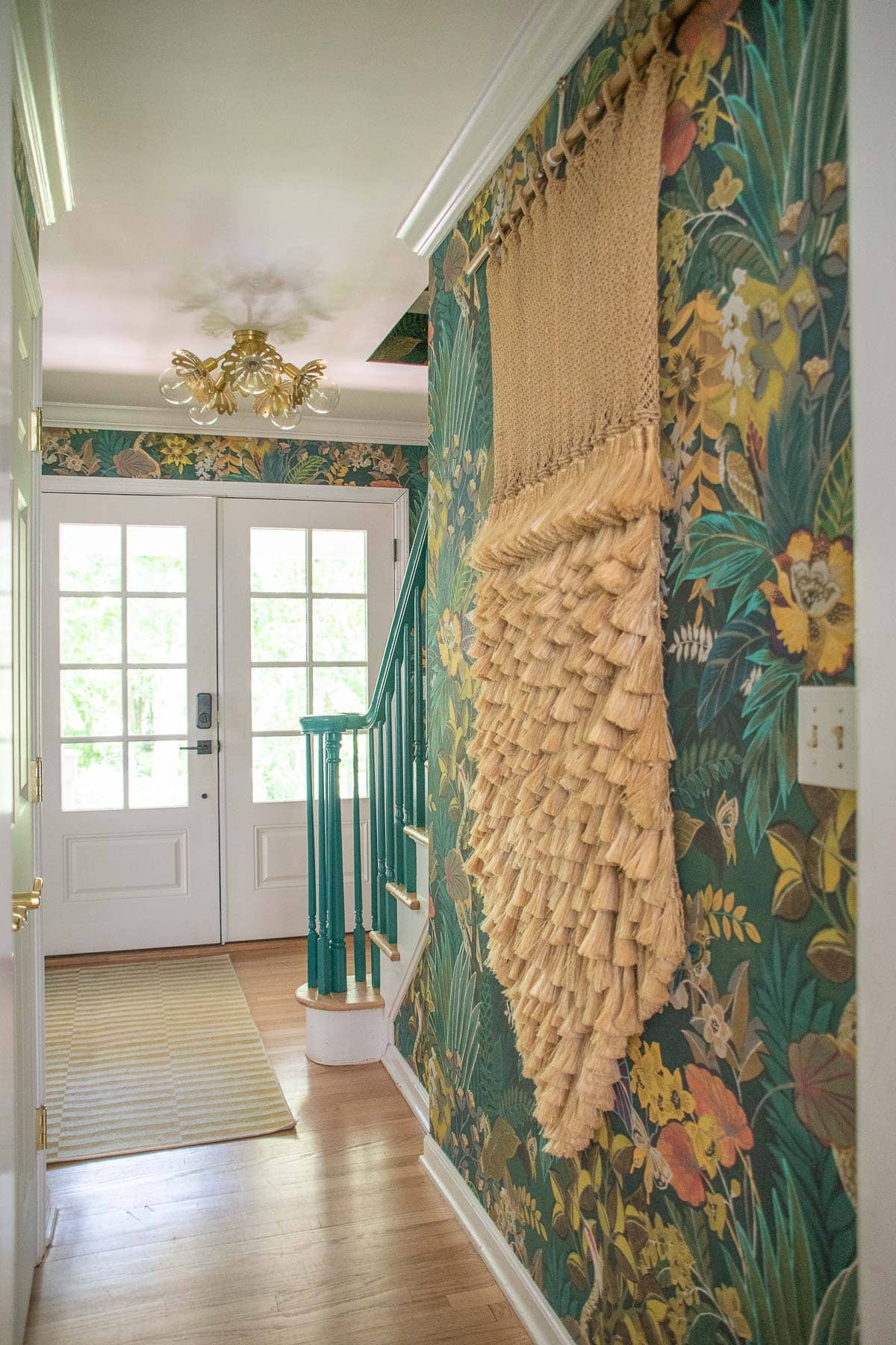
This angle isn’t as exciting, but I also had our front door replaced and may or may not paint the inside a different color one day. That wall hanging came from the flea market and I love it.
I was asked the other day in an Instagram direct message what I would do when I had “finished” this house and I immediately started thinking about rooms that I would say are done. Sometimes I think about these rooms and look for small tweeks or changes I might make just because… I love how this foyer has come together, but the dated newel post and railing is one other area that I could stand to change one day. I also hate the handles/ hardware on the front hall closest so, just like that, a few more little projects for the To Do list!
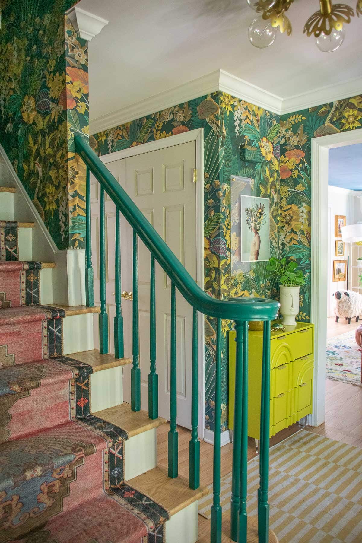
Thanks so much to Wallpaperdirect.com for providing me with this wallpaper. I’m asked about it everytime someone sees it in a photo and it’s a true showstopper!


This is knoCk-your-socks-off stunning! I love every detail. And its so nice to see how much personality can be injected into builder-grade houses as long as you go bold. Love, love, love!
Awww thank you so much!!! Big and bold for the win!! xx
Love how this turned out! also love the front door…was planning on doing the same with my double doors and its nice to see it in action!
Yes! With our front porch, it’s nice to have glass here to let a little more light in!