
Styling a Mantel Three Ways
Psssst… this post *might* contain affiliate links: see my disclosure here.
How To Style the Perfect Mantel
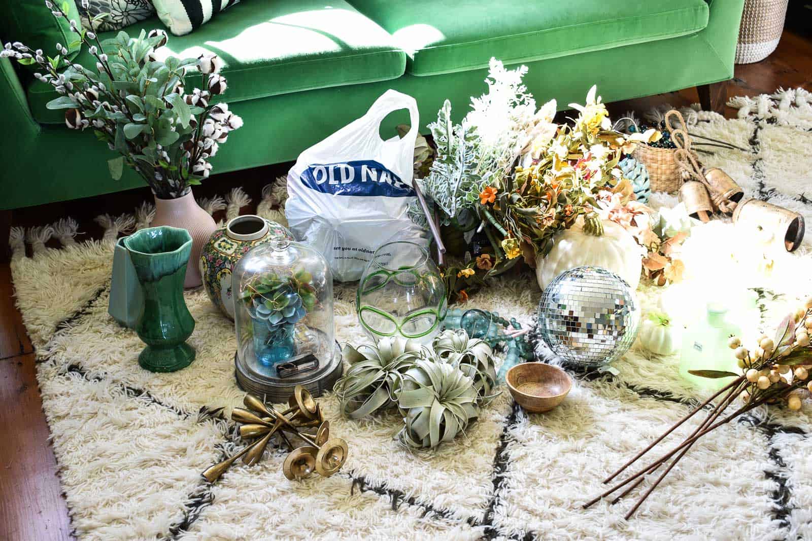
GUYS! I am up way too late, but I am SO excited about these mantels and I wanted to share them!!! I’ve had lots of request for tips for styling a mantel, and the only way I could think to show you was to style it few different ways and talk you through it! So here it goes! Before you even start, walk around your house and grab everything that might work on a mantel. Containers, florals, little accessories… you name it. (Source list at the end of the post!)
Shop my favorites!
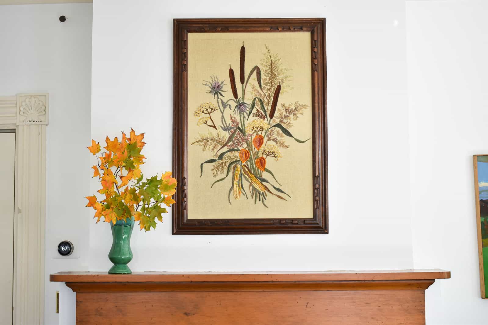
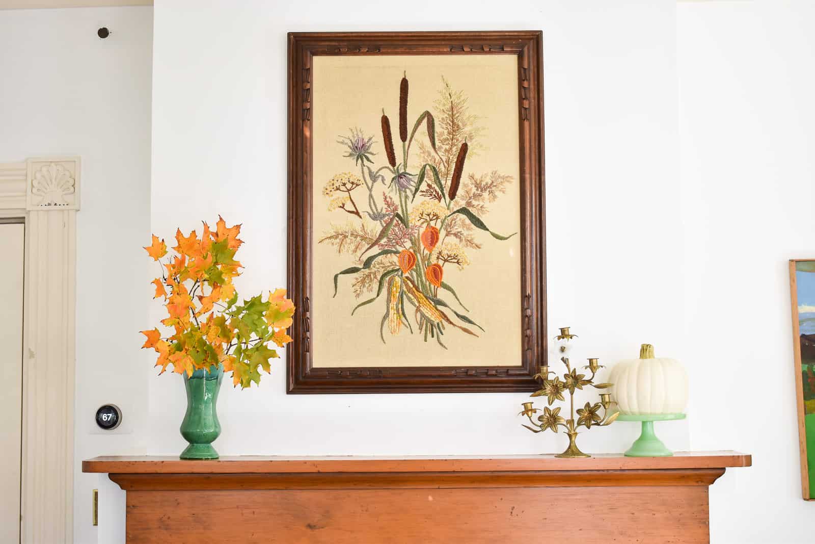
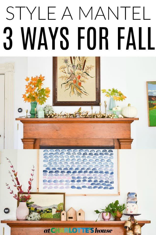
Mantel #1
Step 1: Find a Focal Point
I started with my big ol’ embroidered painting hanging in the middle of the mantel. Obviously it’s great for fall, but the proportions of the art are perfect for the very large space over the mantel.
Step 2: Fill in on either side of focal point
The tall vertical artwork left two spaces on either side of it so I wanted to fill those spaces with taller items. Play around with accessories until you feel like you have a good spatial layout. Things like cake stands can help add height if need be.
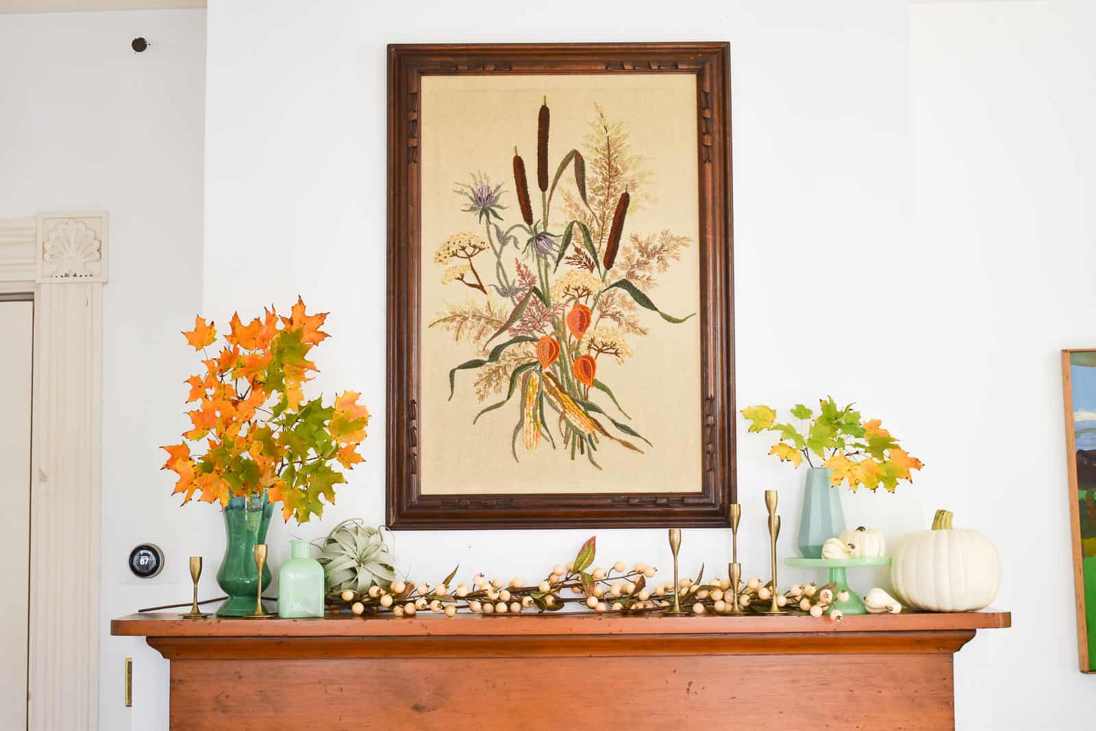
Step 3: Balance
At this point, I’m trying to strike the right balance of color and texture. Typically I’ll arrange an item or two, and then step back to see how they look. Sometimes an item won’t work in one place, but move it over 3 feet and it works great!
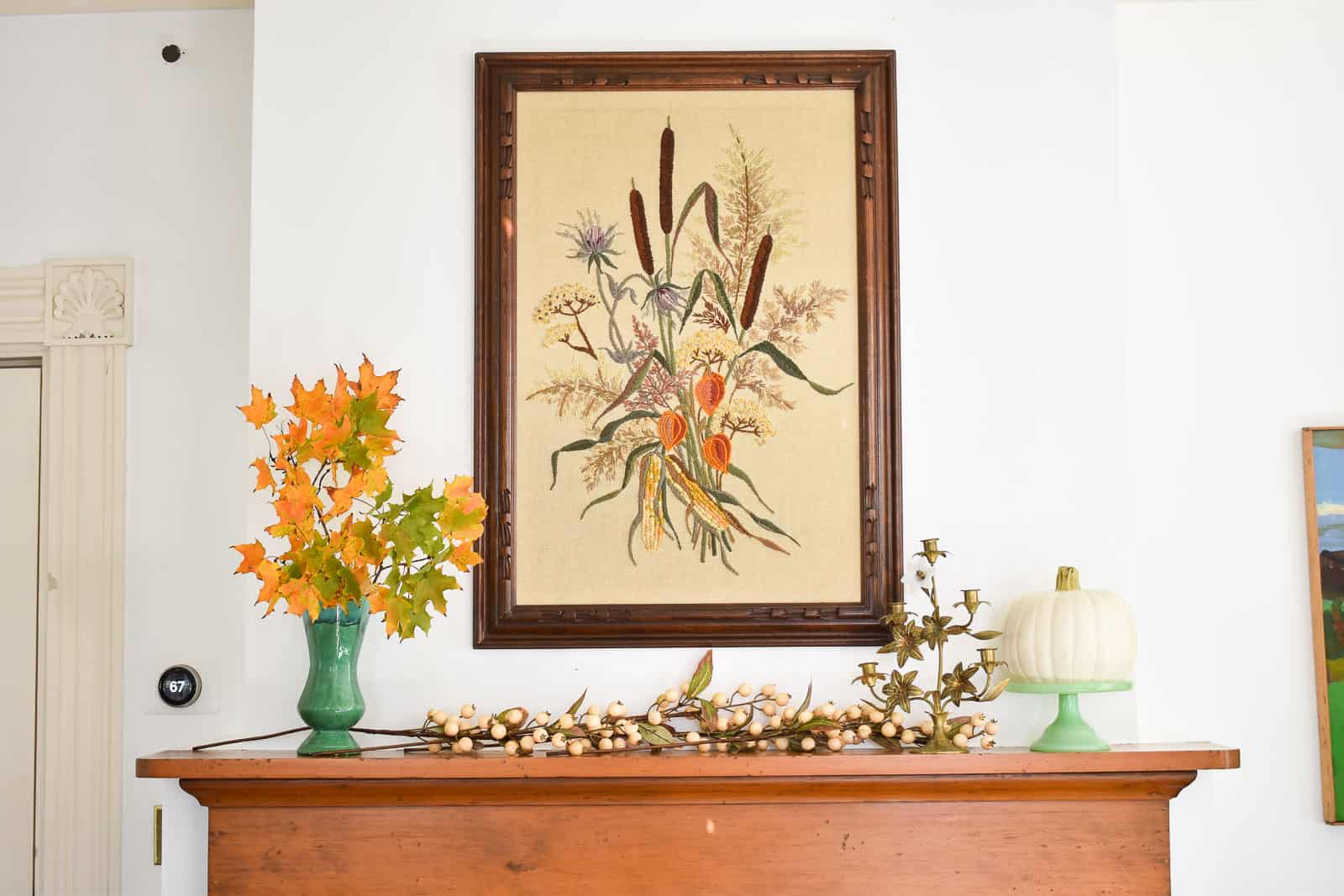
I didn’t love how the floral candle holder felt too similar to the lines of the leaves. It started to feel a little busy, so I swapped them out for those sleek brass candlesticks and I LOVE that change! I also didn’t love how all the leaves were on the left side, so see how I shifted those around a bit in the final photo too.
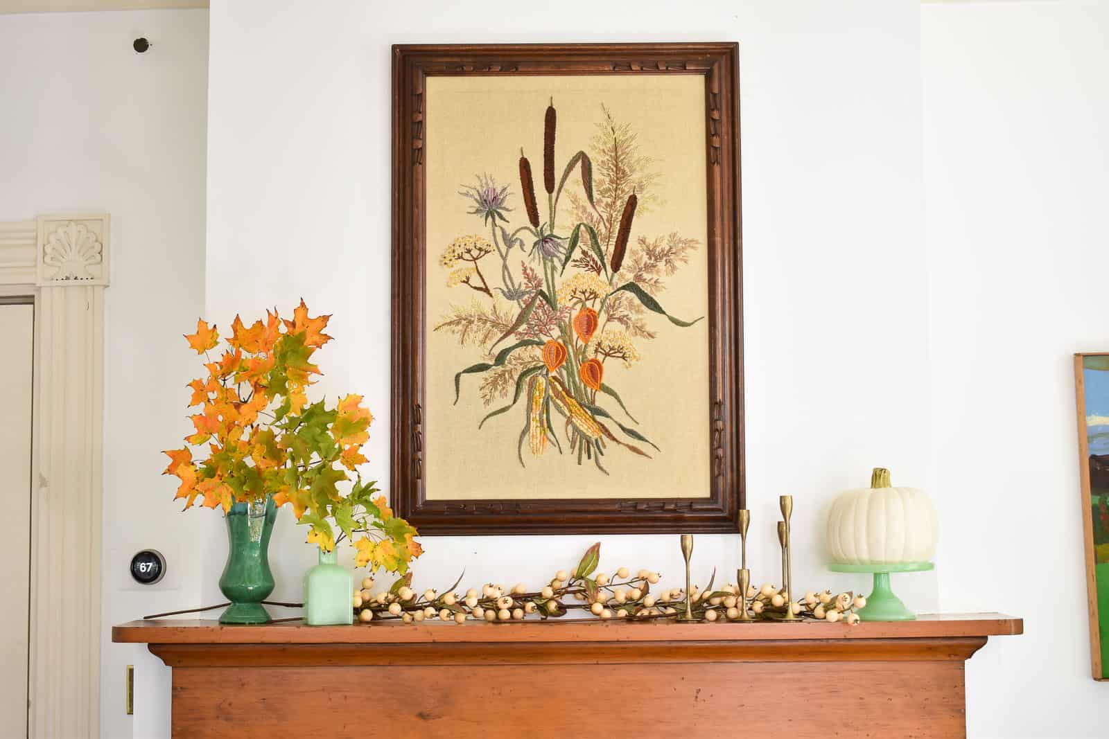
Here’s why I like Mantel 1! I love that it has a fun unexpected fall theme with the leaves and the embroidered art. I also love how many fun textures are up there from the sleek brass candlesticks to the jadeite cake stand to my beloved air plant.
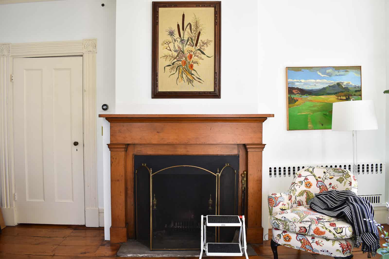
Mantel #1
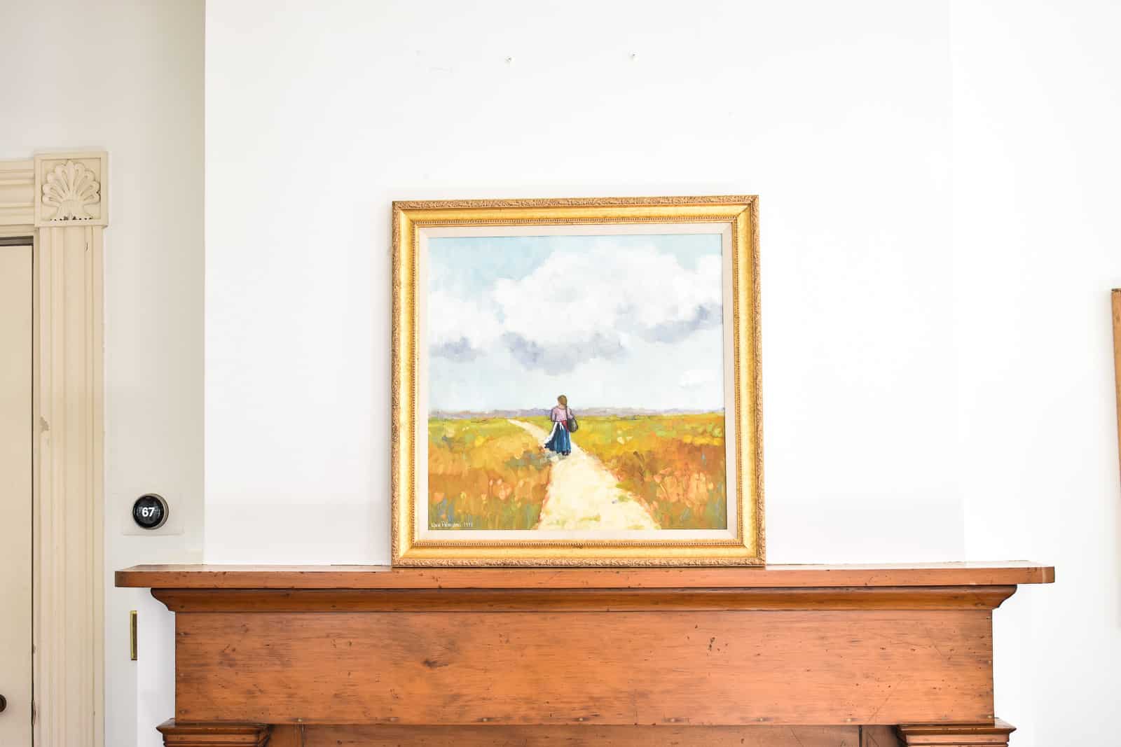
Step 1. Focal point.
This time I leaned a smaller painting with colors that fit the decor in this room a bit better. Fun fact: the wall above the mantel is SOLID concrete so we can’t easily hang anything. There are 2 screws in place and they’re the only ones we use, so if a painting doesn’t fit hanging from those screws… too bad!
Step 2. Fill In.
For this mantel, I grabbed everything that suited the colors of the painting. Once I had everything on the mantel that seemed to fit the color scheme, I played around with where to arrange things.
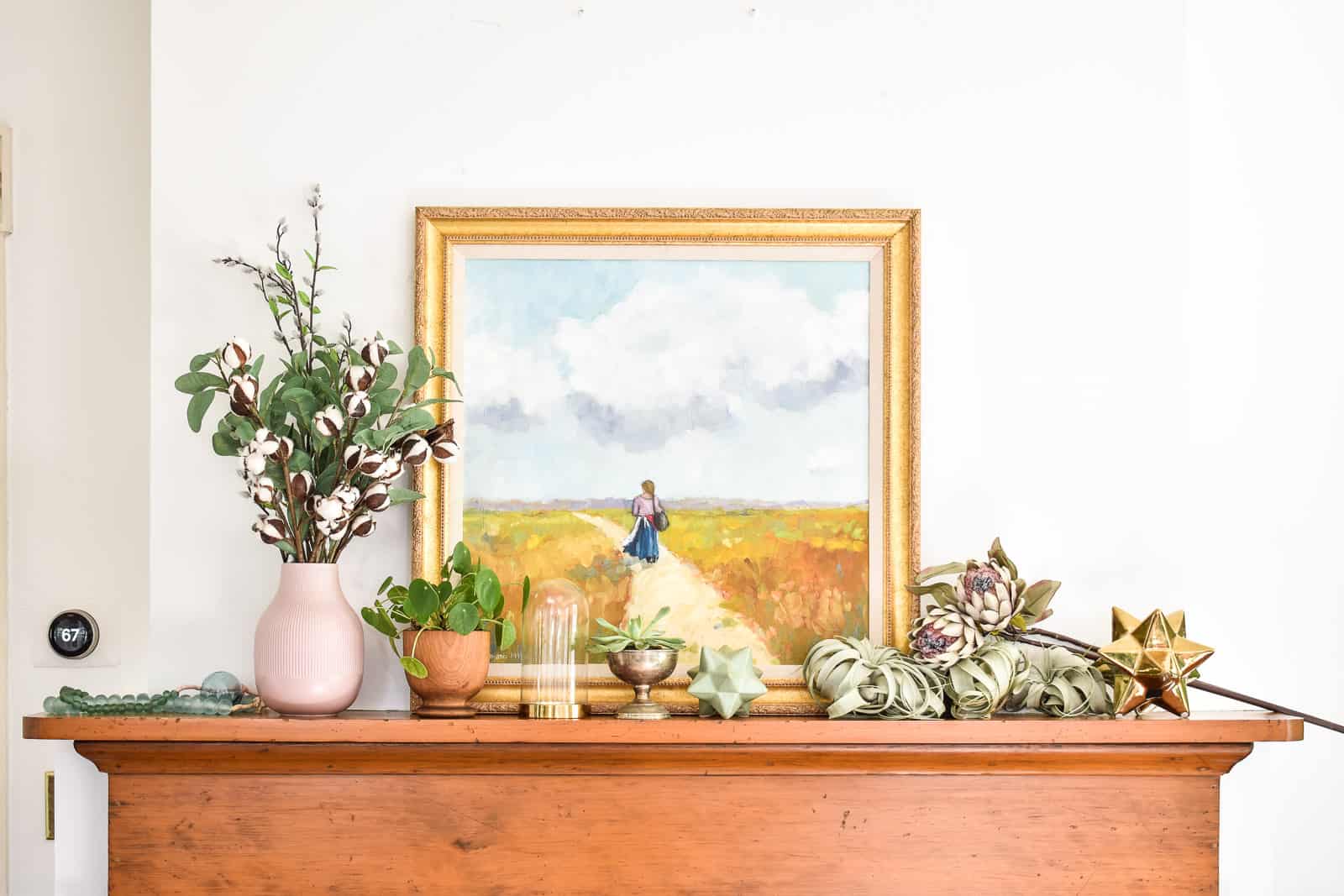
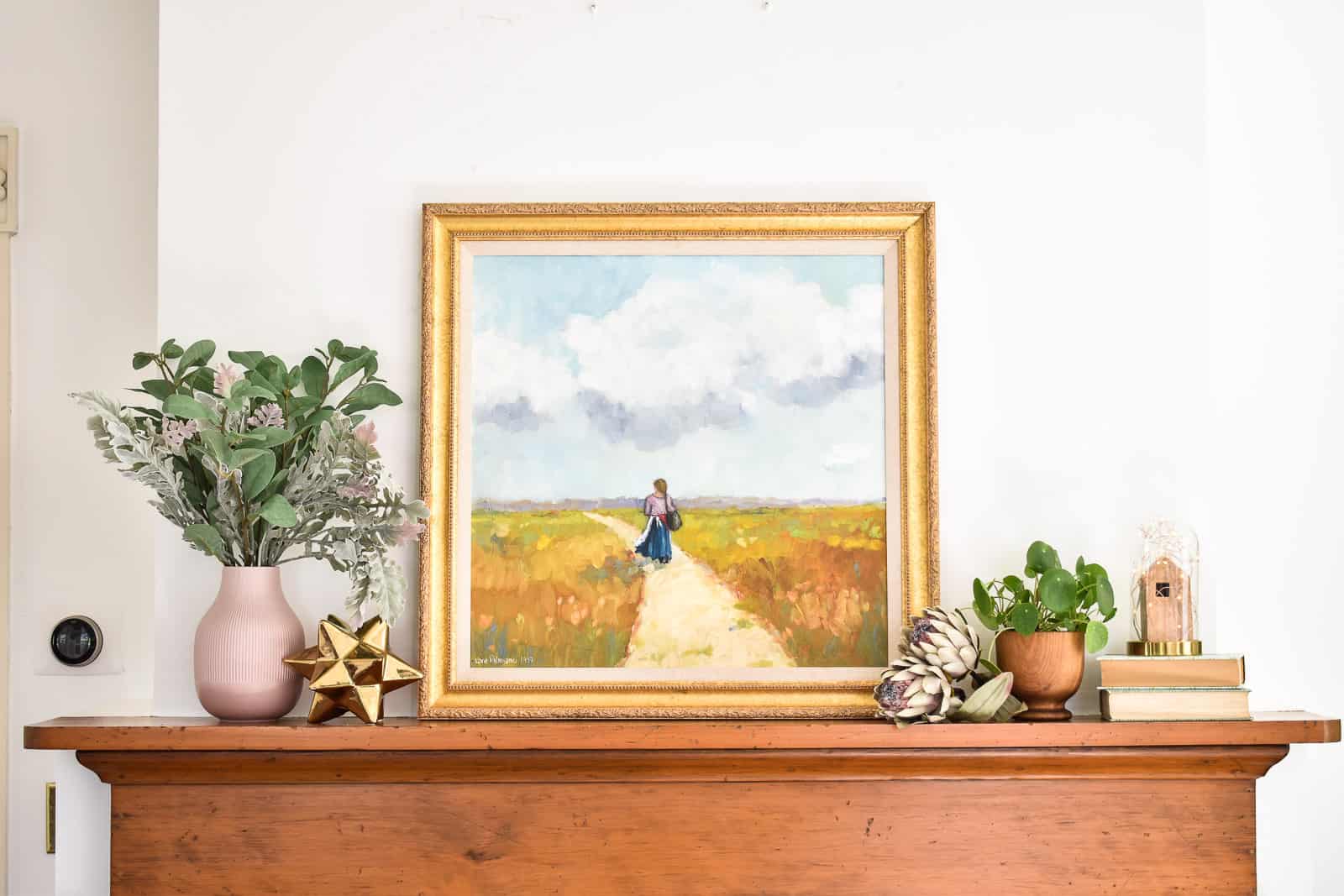
Step 3. Balance and layout
Similar to mantel 1, I had two large spaces on either side of the painting to fill in. Varying the height of items can be the biggest challenge when styling a mantel, so one of my favorite tricks is to grab a couple of old books to elevate certain things.
When I stepped back, the right side of the mantel felt a little light, so I draped 2 strands of glass beads on the corner of the painting. That one simple addition pulled it all together.
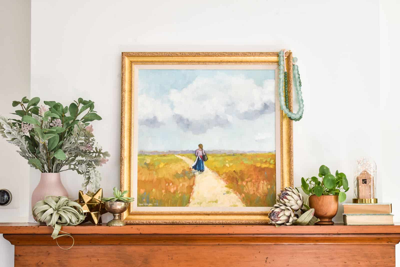
Here’s why I like Mantel 2. Lots of my favorite colors. The bell jar with the fairy lights. Mixed metals!
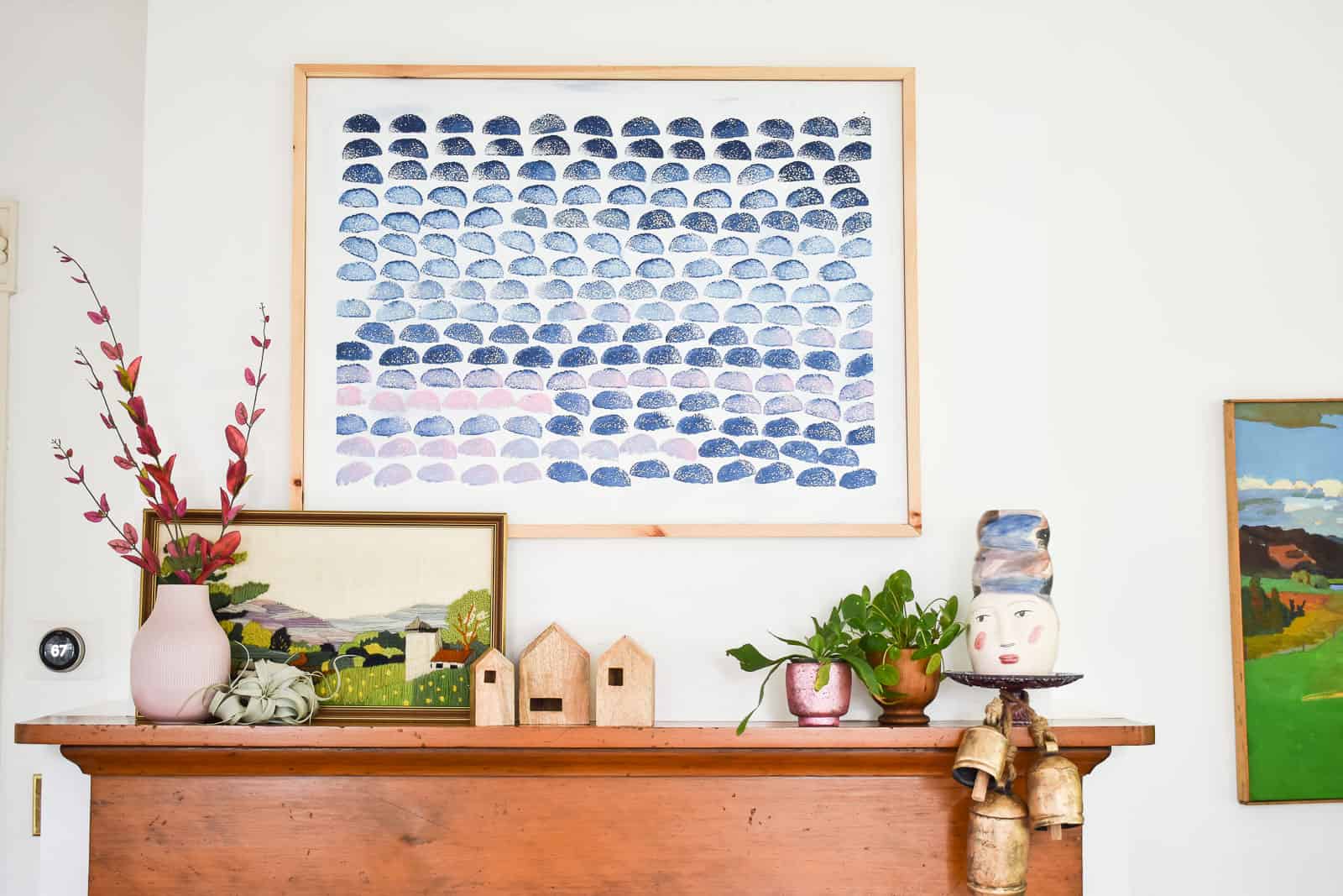
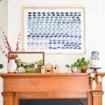
Mantel #3
Step 1. Focal Point
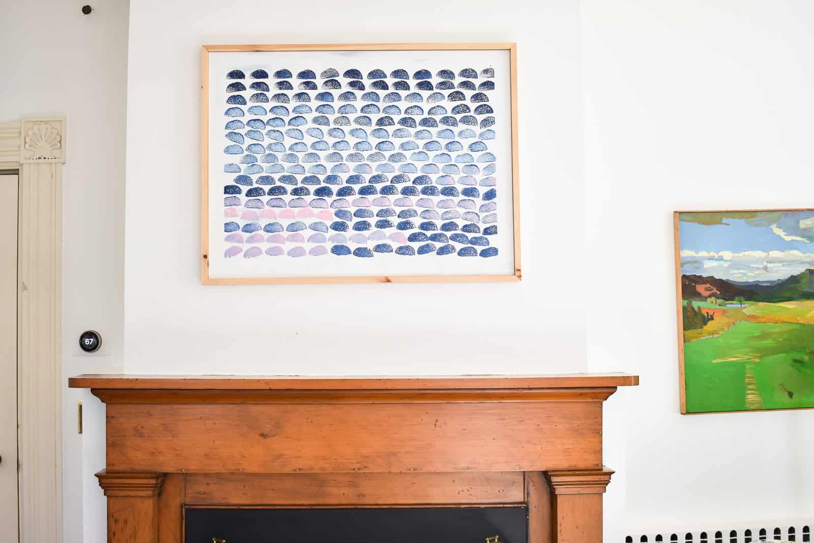
I hung that stamp print painting I made and love not only the pattern but also the colors! This painting is hanging on the screws and it fits okay, but it’s a little bit high.
I struggled to find items that were just the right colors for the artwork, so I leaned one of my favorite embroidered art pieces against the hanging painting. Again, the colors aren’t an exact match, but here’s why I think they work. There are *some* colors in the embroidered piece that compliment the stamped painting. The ones that aren’t in the stamped painting (greens) look perfectly nice with the blues and pinks AND, most importantly, they introduce another color for me to coordinate with on the mantel. Yay!
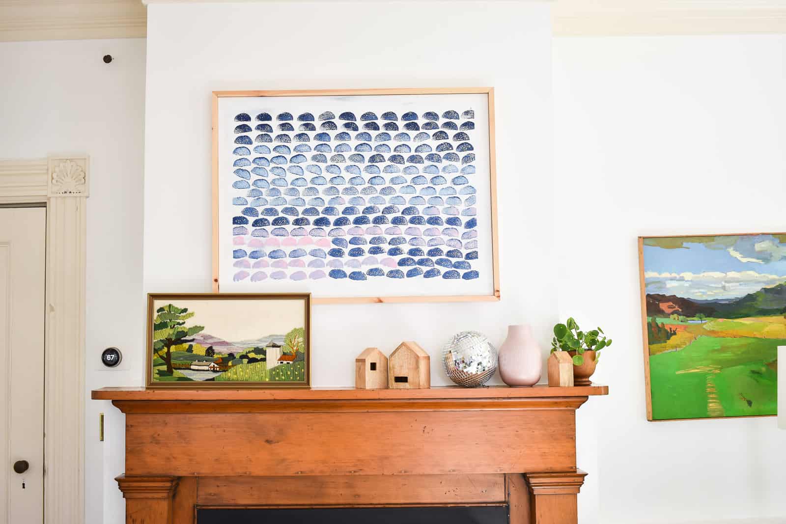
Step 2. Layout and Spatial Balance
My goal for this last layout was to fill in the empty space under the blue painting without it feeling like I had a big blob of stuff on the mantel.
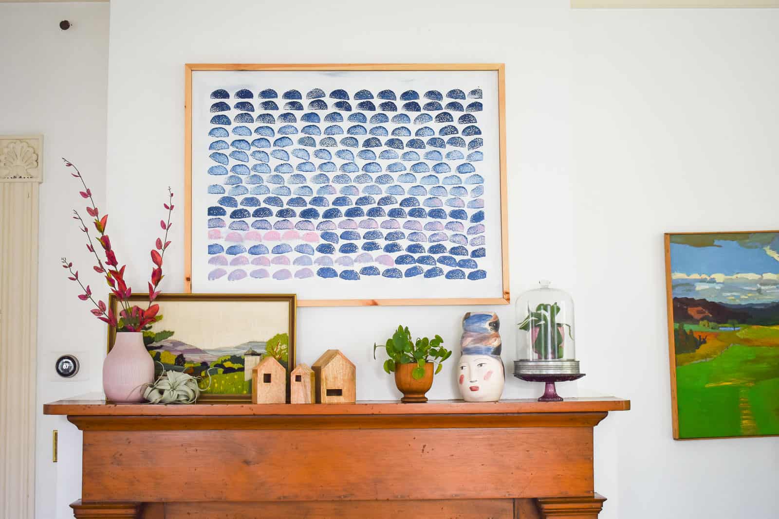
Adding a few sprigs of greenery to the tall pink vase and then bringing more plants over to the right side helped create some balance. My flea market vase made an appearance as well! Finally, I added those brass bells (affiliate) hanging over the mantel and, in my opinion, they balance the height of the vase on the left side really well!
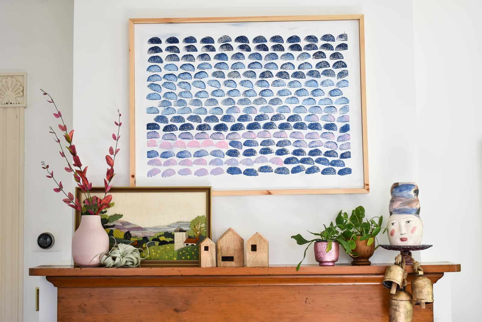
Here’s why I love Mantel #3: The artwork makes me super happy. I love the stamped artwork, and that embroidered piece is one of my faves. I also love the color scheme of blues and greens. And finally, I love that it incorporates a handful of my thrifted items… always a good thing!
For more explanation as to how I made this, here’s a pretty comprehensive video walking you through each mantel and how I got there!
I hope this helped to see some of the choices I made when decorating my mantel. Lots of trial and error and experimenting. It’s definitely not a science, but there are basic things I think about: finding the right balance for layout, color, and texture!
![]()


Don’t Miss Out
Become An Insider!
Signup for exclusive tips, and tricks from Charlotte’s House!
Let’s chat!
I love comments from you, so feel free to leave your thoughts and ideas below! And don’t forget to follow me on Instagram for even more!