Bright Updated Kitchen Reveal
Psssst… this post *might* contain affiliate links: see my disclosure here.
Updating Our 70s Kitchen
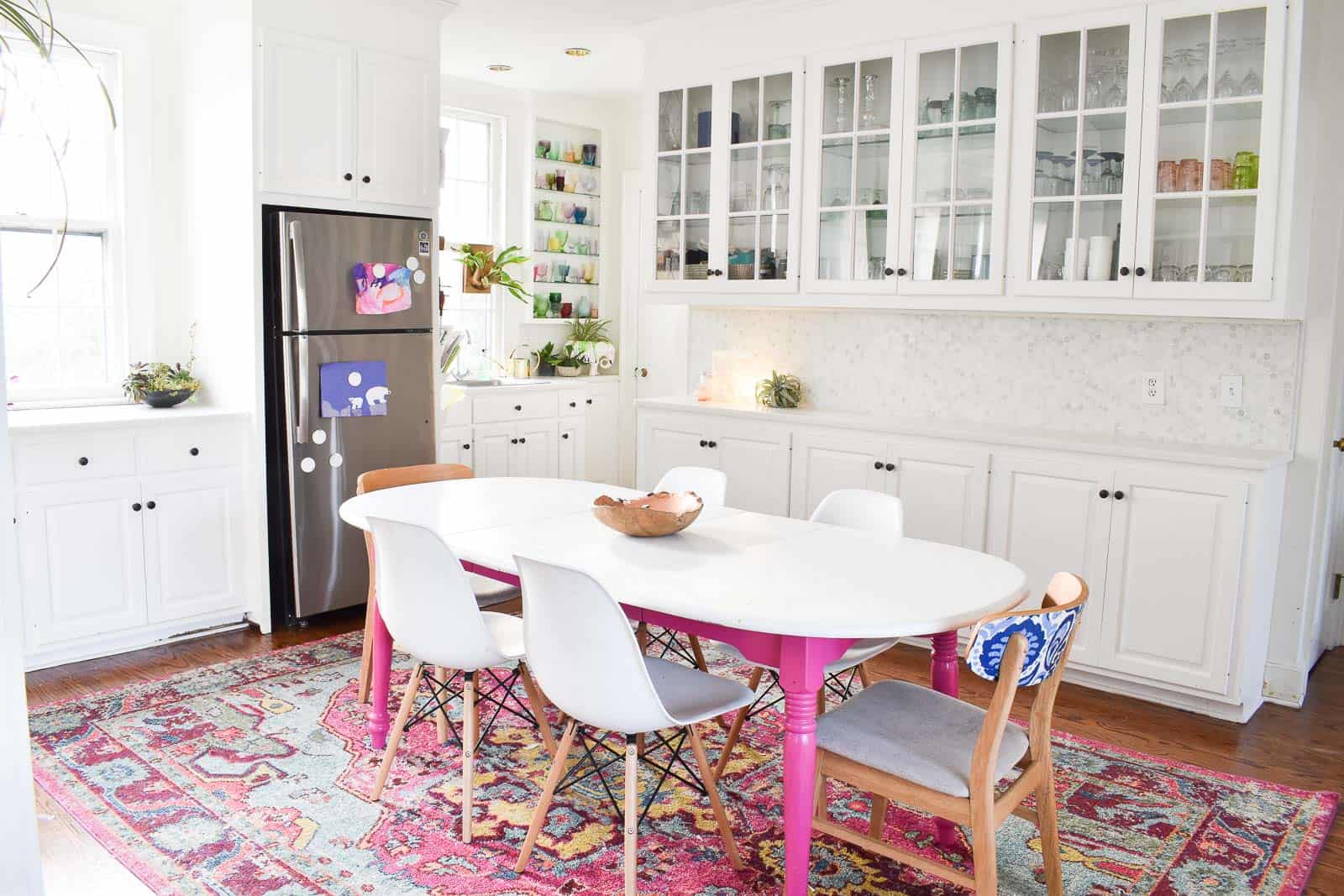
Disclosure: I am SO grateful to GE Appliances, Liberty Hardware and The Home Depot for sending me products to make this kitchen update a reality. Like , so so grateful. Opinions and 21st century images are all my own!
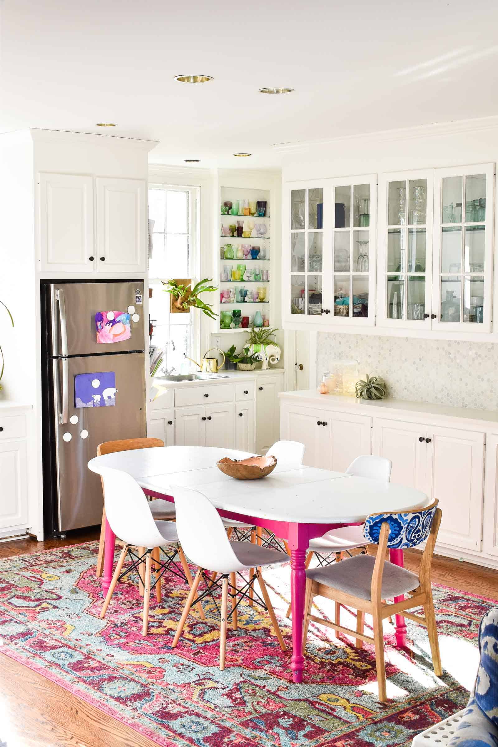
Frankly I’m surprised I didn’t share this with you at 4:30 in the morning the day I finished taking the pictures! But self control is clearly my super power so today’s the day. Feast your eyes on our new and improved renovation-free KITCHEN!
Shop my favorites!
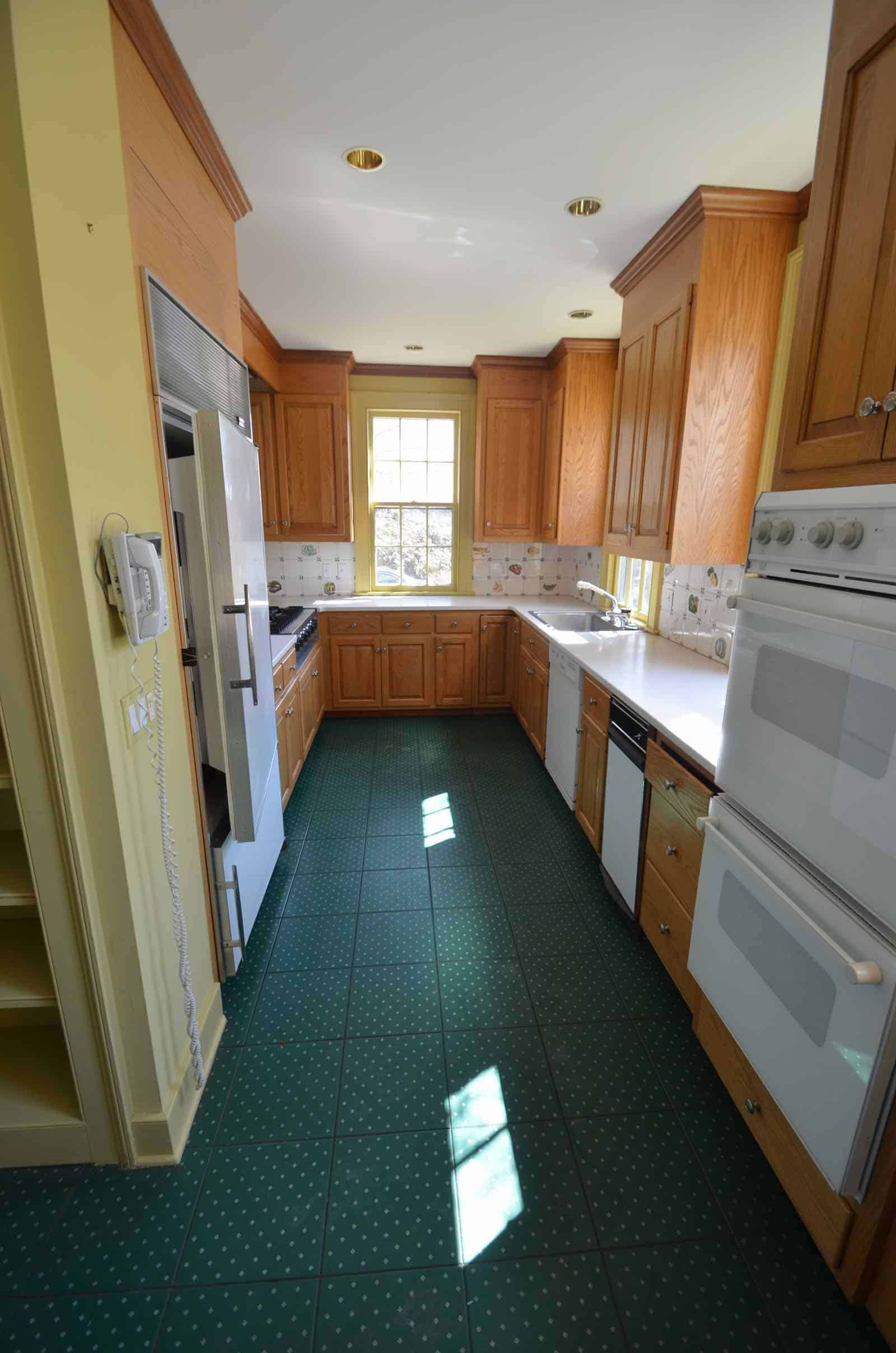
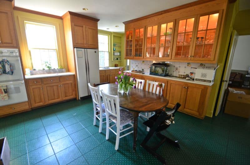
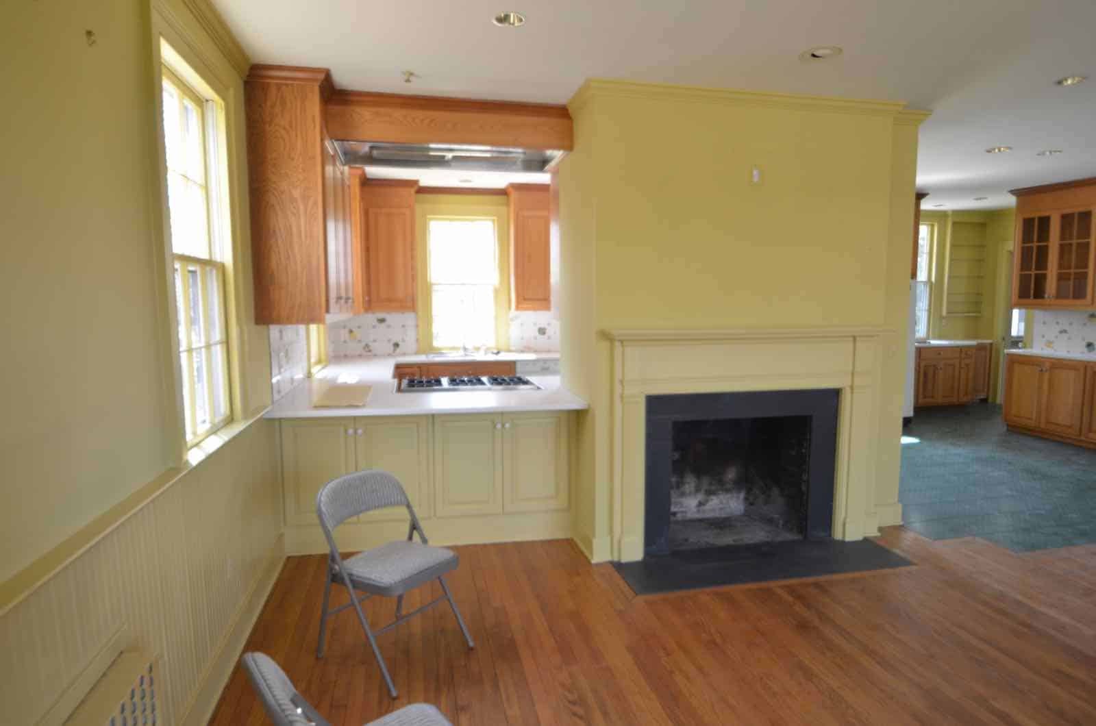
Let’s back it up to when we first moved in. The remarkable color of the walls… the unmistakeable green tone of the floors… the dated pine cabinets… fruit and vegetables on the backsplash.
A full kitchen renovation was never in our budget and, honestly, I don’t mind the layout. I love having the working part of the kitchen tucked away a bit from the site lines of the family room. The open area is plenty big enough for a table around which we can all sit, there’s great counter space, great storage… so the aesthetics were really the biggest problem.
Lighten and Brighten
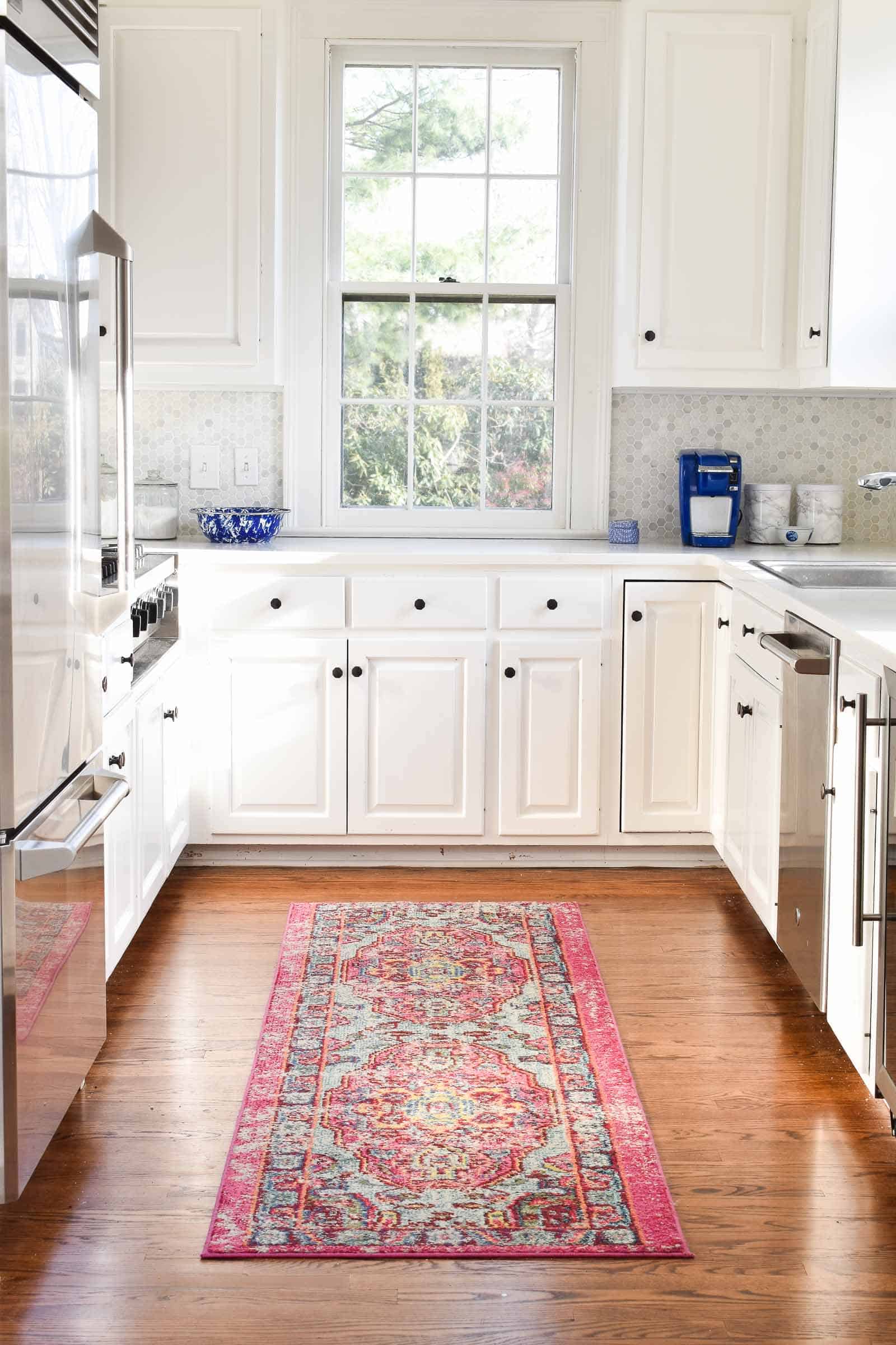
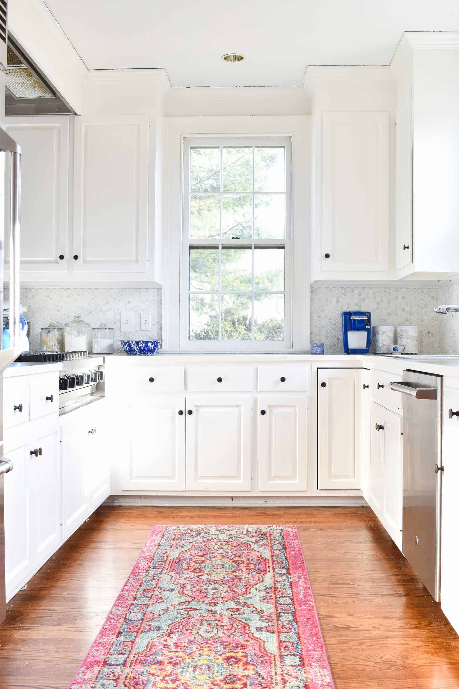
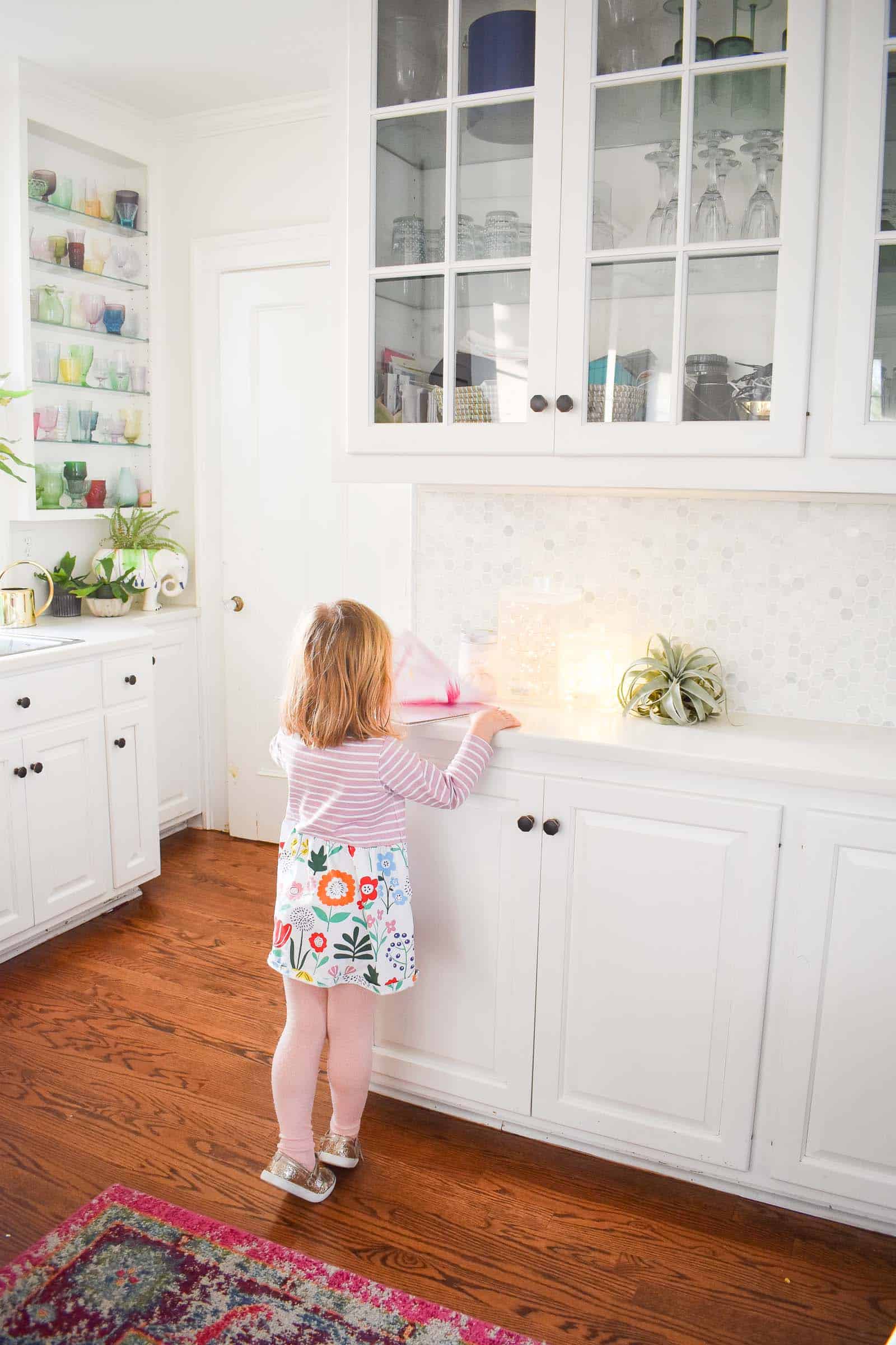
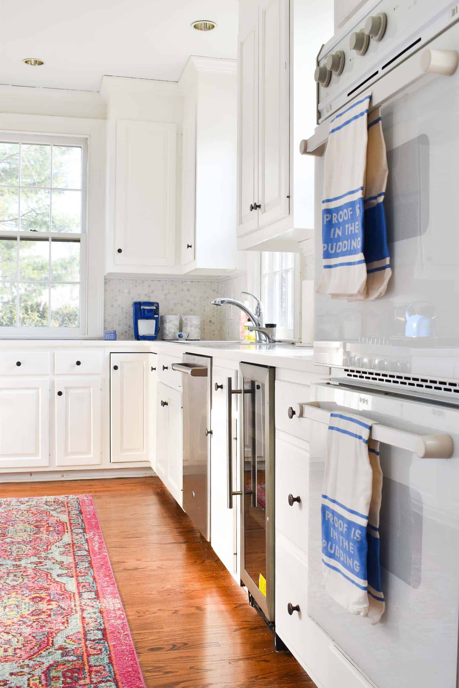
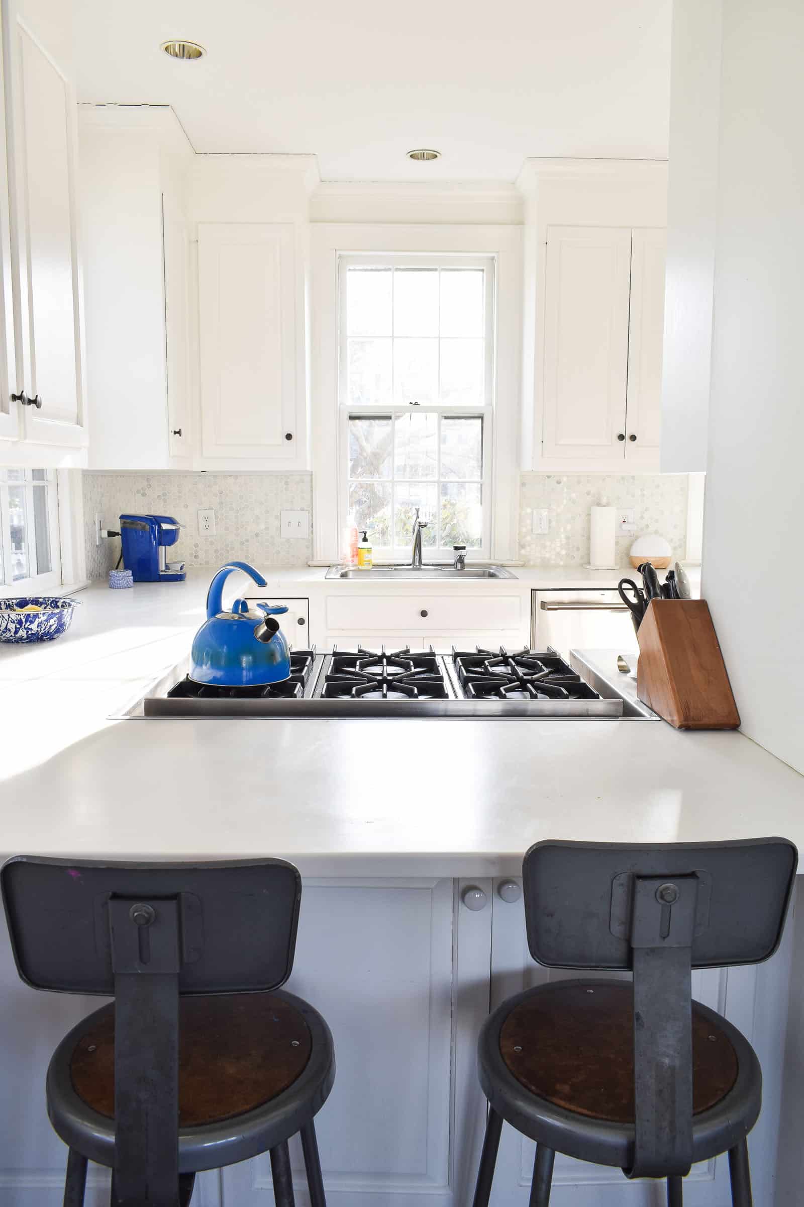
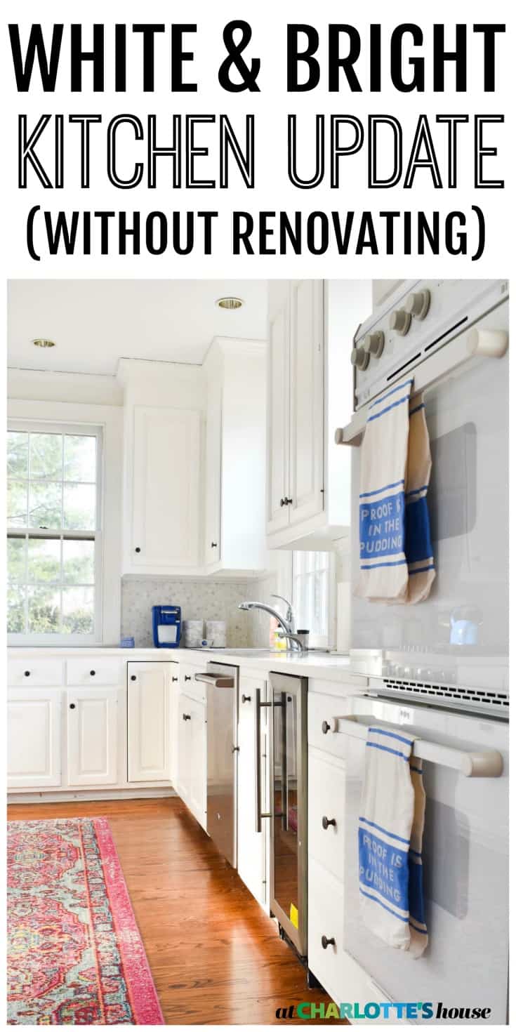
This summer we had our painter paint the cabinets, then I replaced the backsplash, and then we pulled up the green floor tile and put in the same hardwood that was in the rest of the room. New hardware and a couple of new appliances and that, my friends, is how we do that!
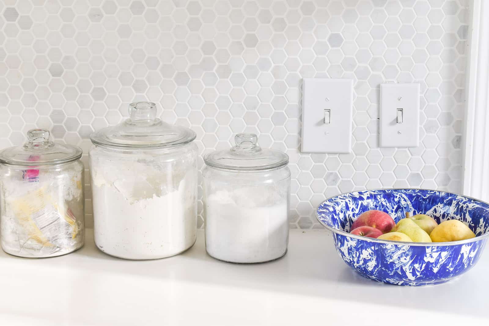
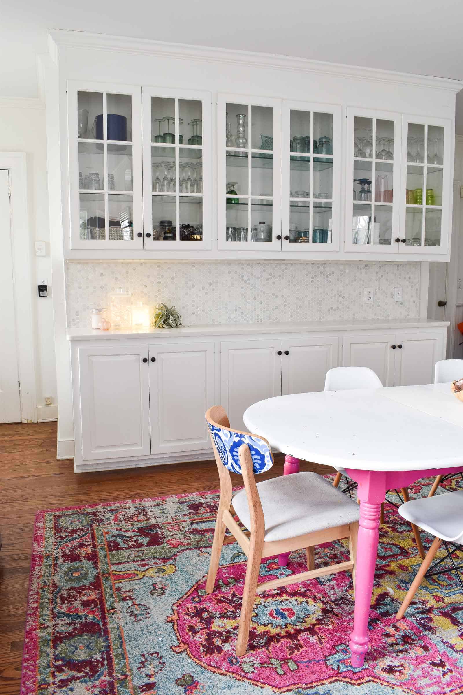
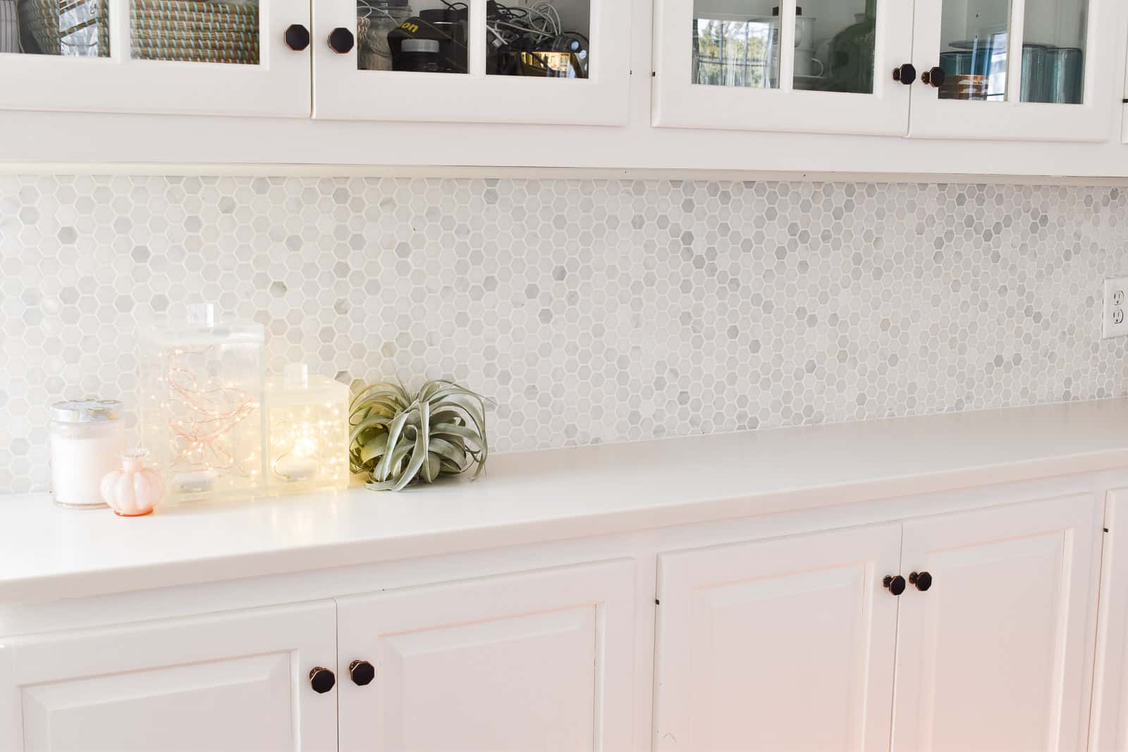
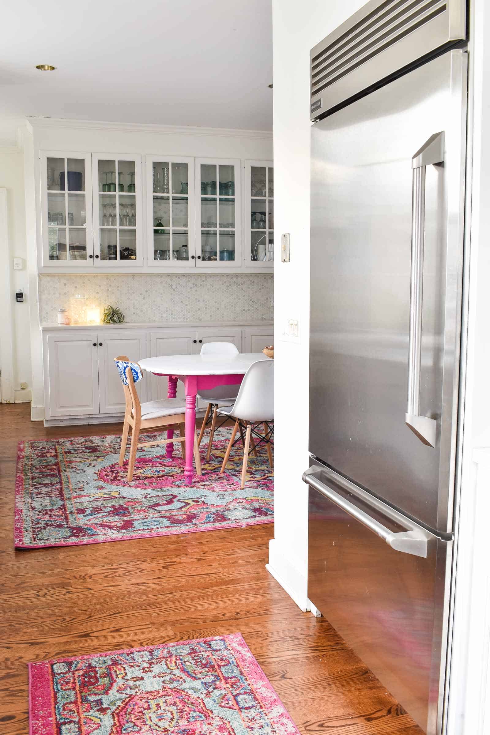
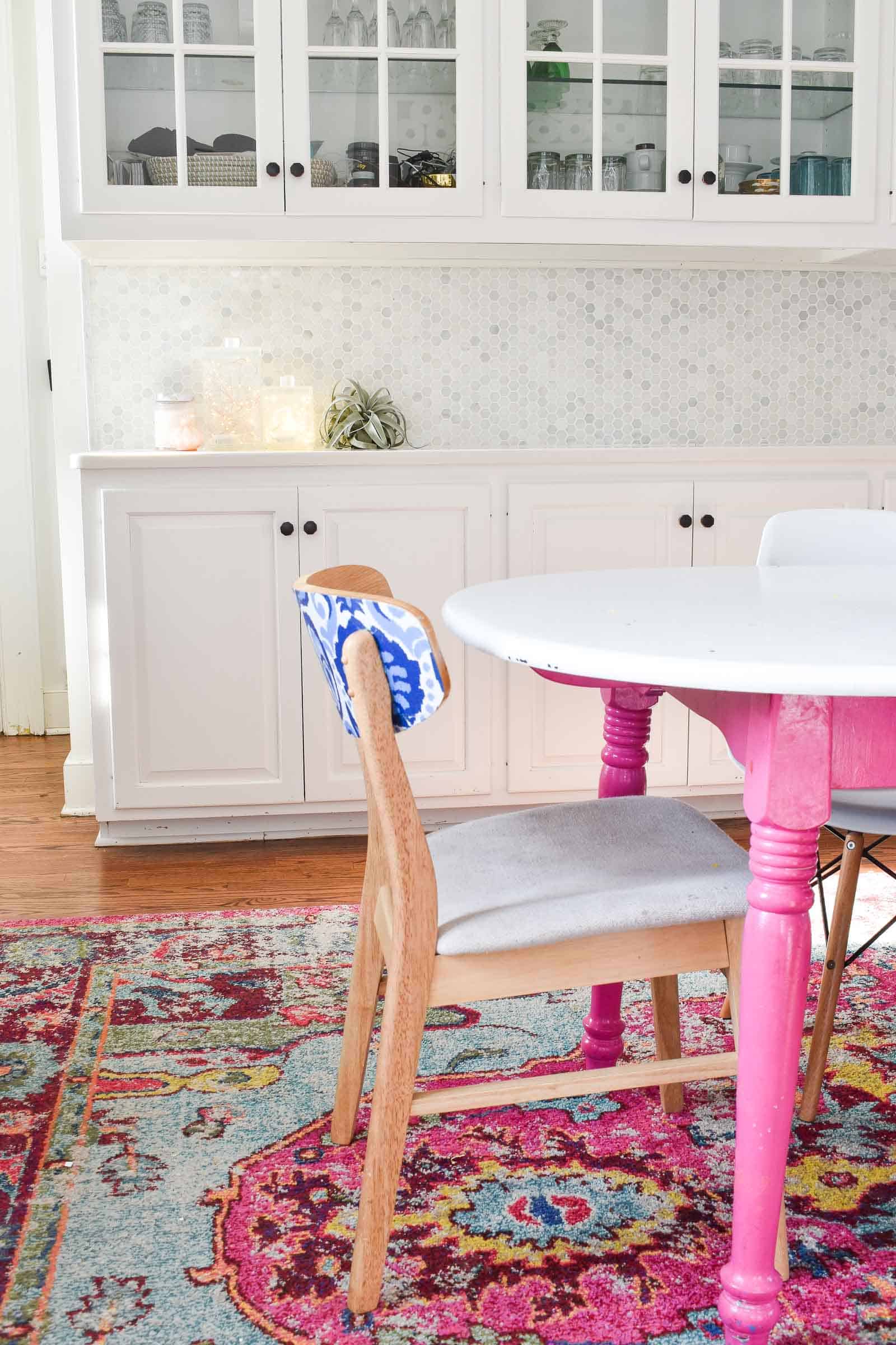
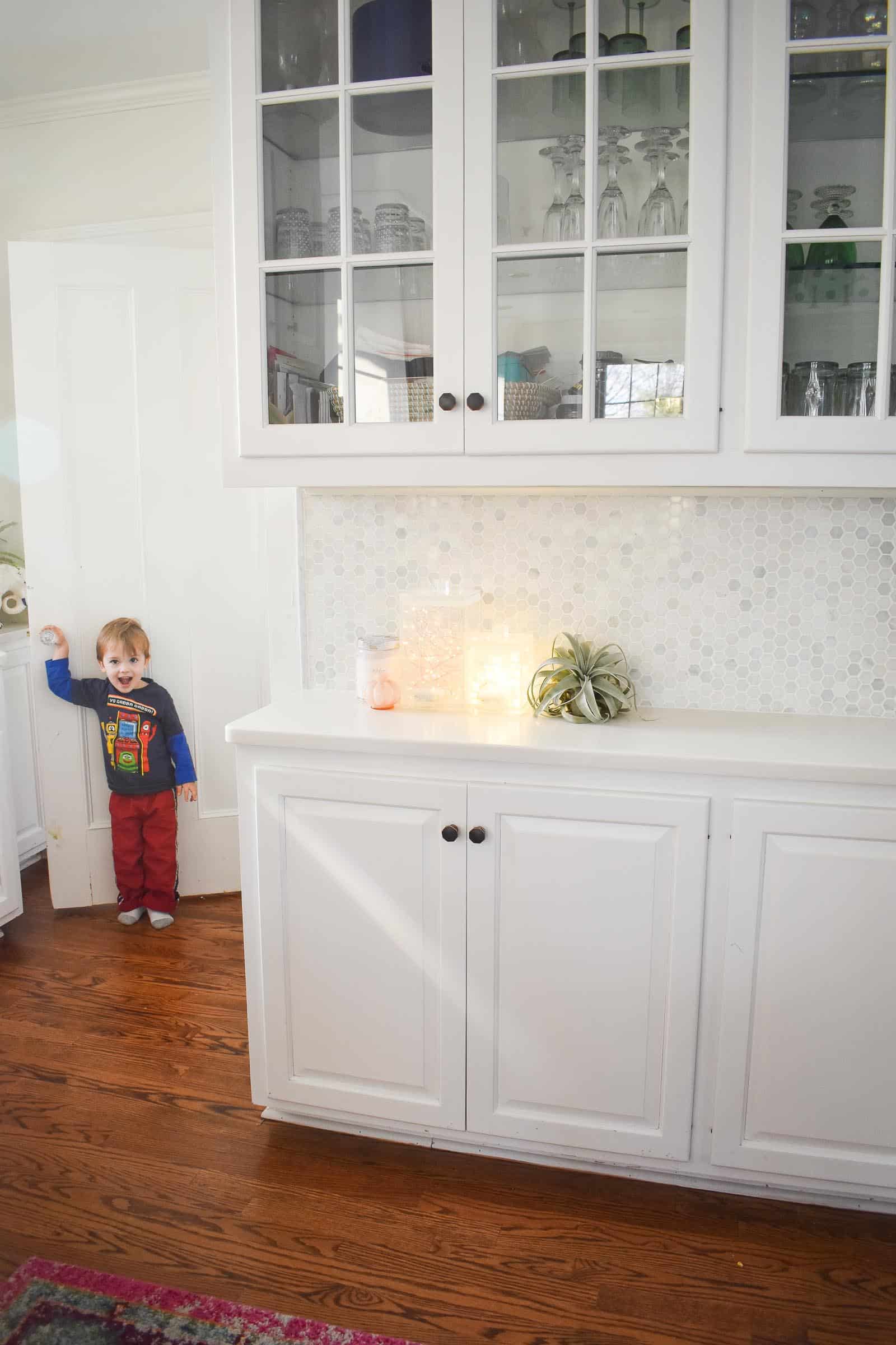
You’ve already seen the backsplash here. The smaller hexagon tiles are much more contemporary and stylish and I LOVE how it gives the space a little neutral depth. It’s not perfect, but… my eyes don’t zero in on the imperfections quite as much as they used to.
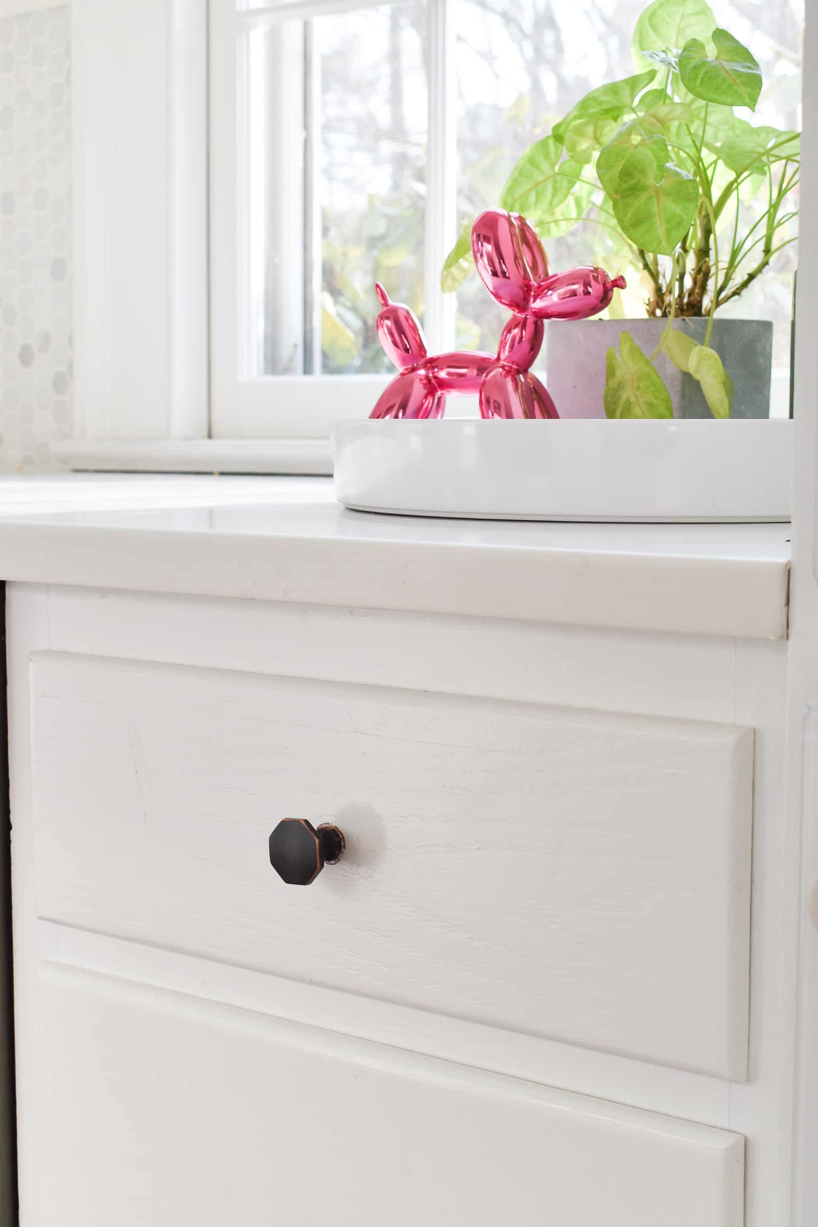
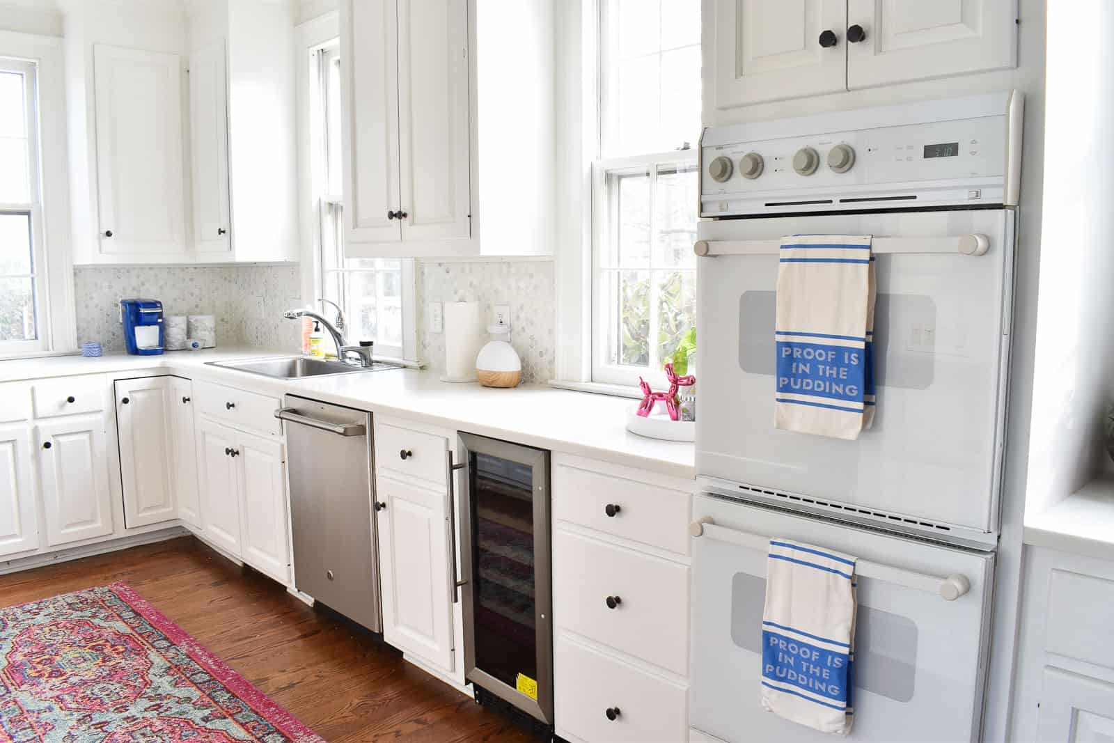
I’m SO grateful to Liberty Hardware for providing me with knew knobs… when I chose those black hexagons, I had no idea that I would echo that shape with my tile selection. I mean, I chose them both so I guess it’s not a huge shock, but I didn’t do it intentionally! The black knobs bring a clean modernity to the space that I love. There was nothing wrong with the old silver knobs, but swapping out the hardware always changes the mood of a space and I love these new ones.
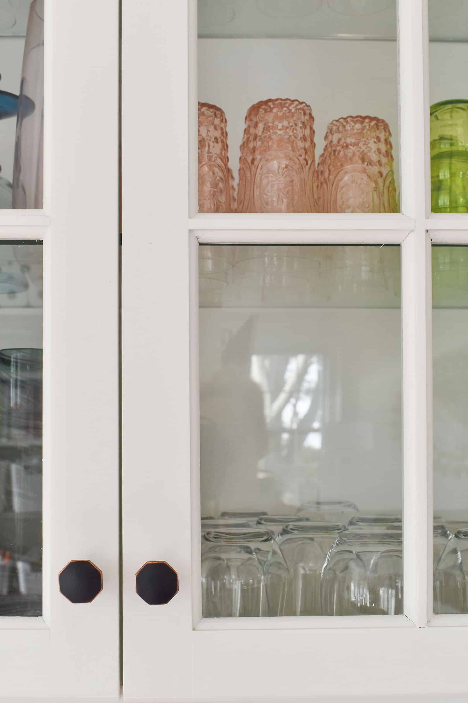
Modern Additions: Updated Kitchen Appliances
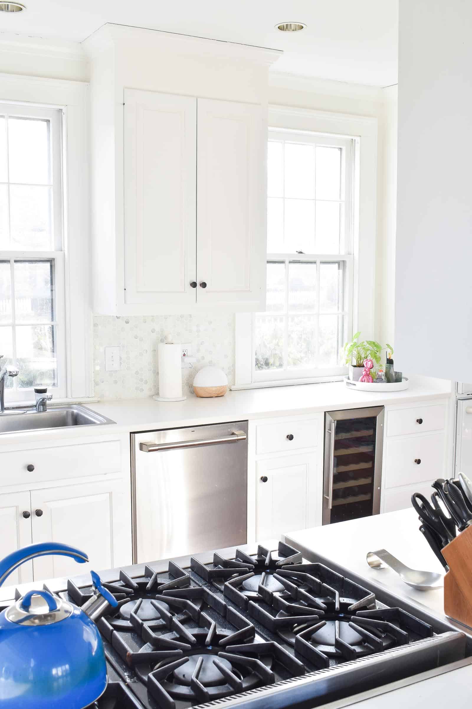
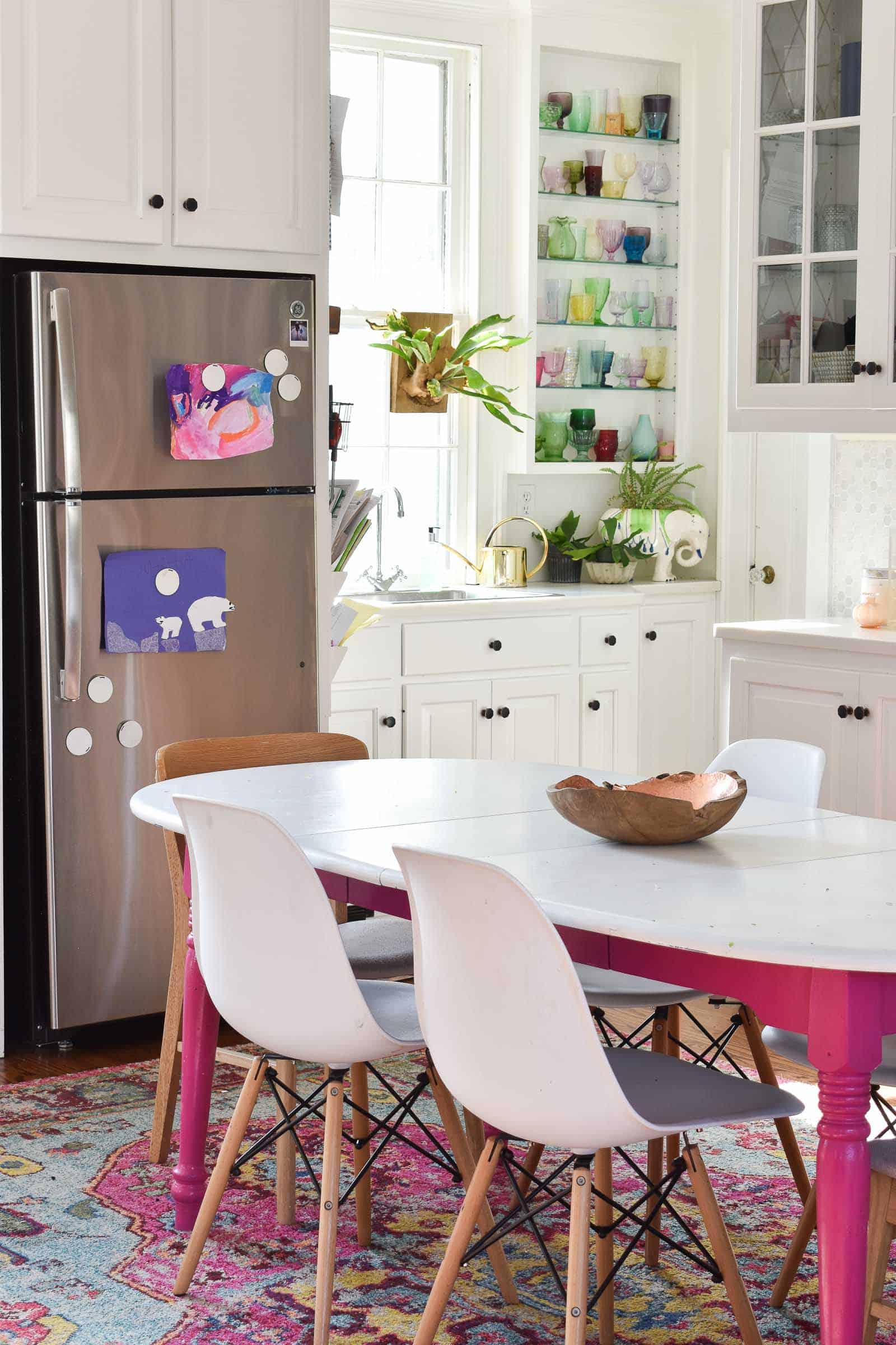
Last but certainly not least… I owe the folks at GE bed in breakfast for a year! They provided us with a new fridge and a new dishwasher both of which make the whole room feel like it belongs in the 21st century! When we bought the house, there were already two refrigerators in the kitchen and that’s been a handy feature for our family of seven. We had to replace one right when we moved in and landed on the GE Monogram. When the second one started misbehaving, I reached out to GE Appliances who provided me with this smaller one that fits the space perfectly.
As for the dishwasher? I’m mildly obsessed. Say tuned for a post on all the things you’re screwing up with your dishwasher… I maybe kind of was. GE Appliances sent us this cafe model to better coordinate with the monogram fridge handle and it’s whisper quiet and has a setting for everything. It fits allllllll the things and looks so so so pretty.
It’s In the Details: Colors and Furniture
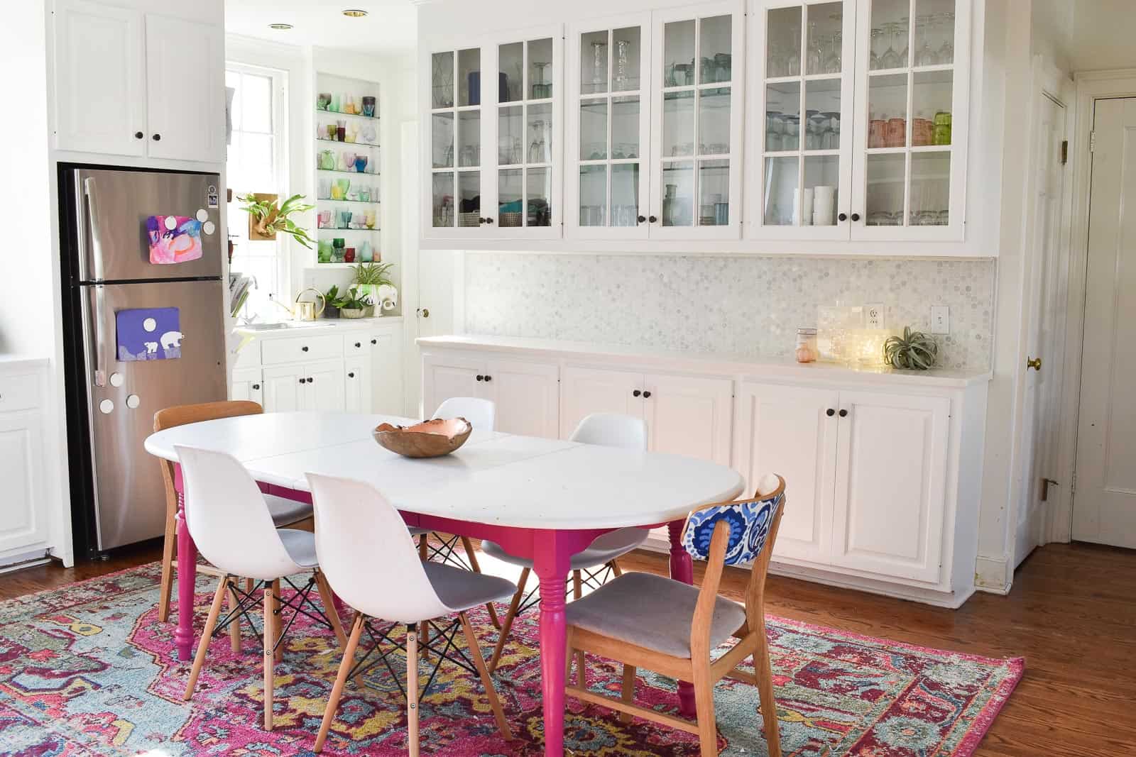
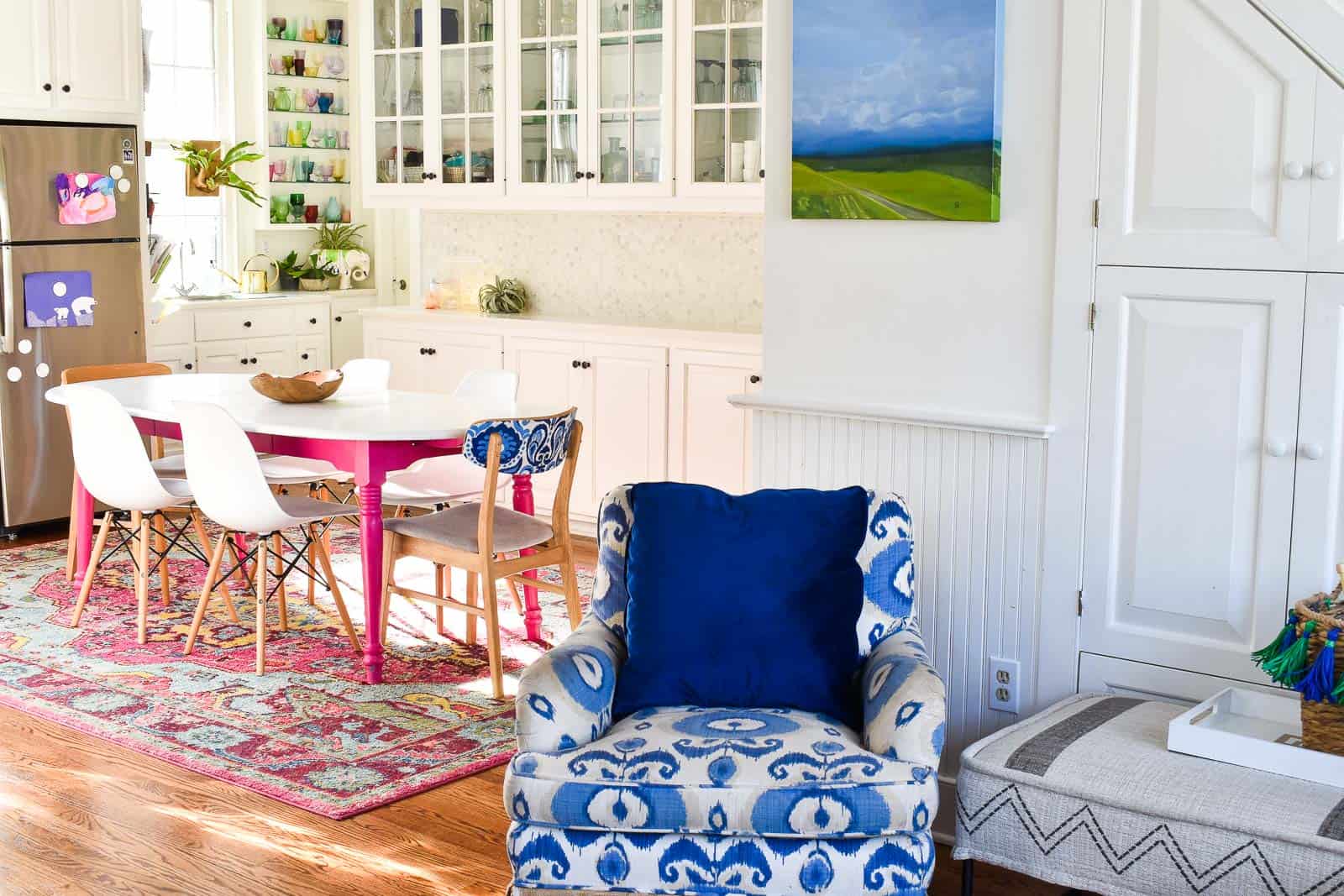
What else? I shared that fun makeover I did on our chairs a few months ago. They’re in perfect shape (except for a few footprints on the seats) and I love the surprise pop of pattern on the back. That table was $70 on Craigslist. I used my favorite glossy paint on the top and then gave the legs a fun coat of pink paint to match the rug.
I’m still not great at it, but I’m trying SO hard to keep the counters clear in here. I made those marble canisters for coffee grinds and reusable keurig pods. Our command center is still getting HEAVY use and I added a round tray to the counter to help corral the rest.
Undoubtedly some folks would walk in and balk at our kitchen because it doesn’t have sleek new countertops or updated modern cabinets or a temperature controlled peanut butter drawer. Granted I’ve never lived in an updated kitchen, but this space is proof that paint, finishes, and some accessories can make a room feel completely new and improved without demolishing things down to the studs.
I cannot thank my friends at GE Appliances, Liberty Hardware and The Home Depot enough for helping to get this kitchen over the 21st century finish line…. Just a reminder of how bad things were, here’s the before again:

And the beloved AFTER:
Another…
And After…
Last one! Promise… nothing like seeing that yellow burned into your brain one last time, huh?!
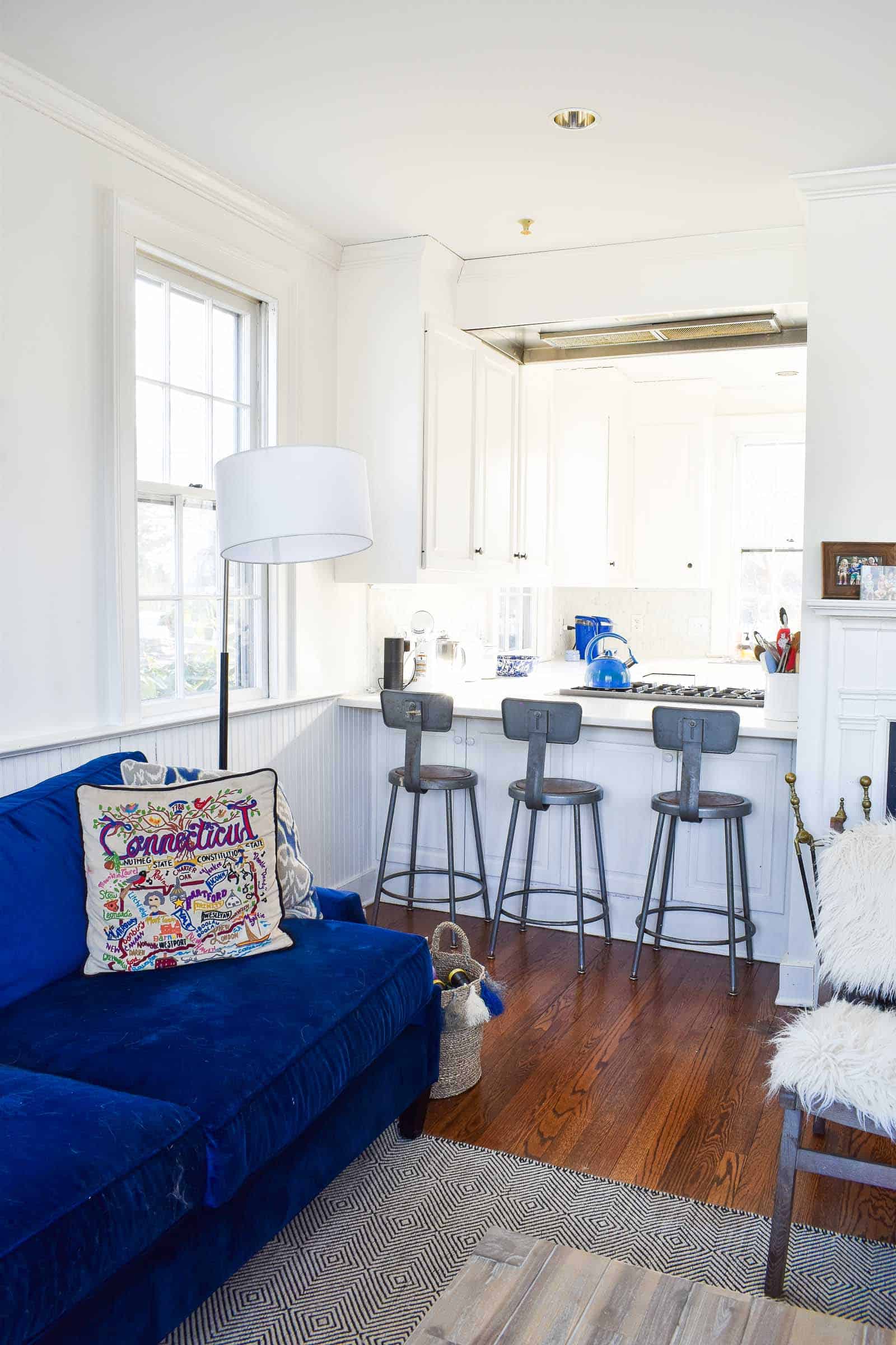
I swear it’s the same space. I swear we didn’t do any major construction. The biggest project was replacing that green tile with hardwood floors (we had someone else do that!). Smoke and mirrors I tell ya! If you want to shop similar items from this space, click the images below… I tried to gather up all the things I used to update our dated kitchen!
Looking back through all the rooms when we first saw the house makes me want to share a before/ after post with you so keep an eye out for that. It’s AMAZING what some elbow grease and new vision can do to a house.




Wow!! This is an awesome update Charlotte! Changing the flooring made a huge change just by itself! I love it all, great job!
Thanks! Oh boy did it ever… I wish I liked the color more as it would be fun to design around it, but… I just couldn’t do it. 🙂
It looks absolutely incredible. What a gorgeous renovation, Charlotte!
Thanks, Amanda! I LOVE a “renovation” that doesn’t require moving any walls or replumbing anywhere! #winning
Amazing transformation❣Love your new kitchen…smiles for the pink legs on the tAble and thOse rugs❤️
I mean… if you can do bright pink legs on a $70 table… where can you? 🙂 Thanks!
Oh my gosh! It is so beautiful, and I love that it wasn’t a total demo/reno that most of us can’t afford. Keep up the good work-love the inspiration that it gives the rest of us!
Thanks! I’m not sure what I would do if someone gave me the option of a full gut! 🙂
White paint is nothing short of miraculous! i know it hurt to give up those green floors but……well done you.
Hahaha! Yeah… pain like an ice cream sundae. 🙂 Made SUCH a difference! Thanks!
Charlotte this is huge! It looks like a different kitchen ALTOGETHER! And you did it without anything involving those costly handymen. I am so impressed by the power of paint. And I bet little arthur also helped out!
Thanks, Mary!! It really does look like a different space! Arthur has been running through the kitchen quite a bit so yes… that helps. 🙂
WOW! I love your kitchen and you don’t always have to change the layout to make it look fabulous, what a gorgeous makeover!
Thanks so much Katrin! I laugh that I wouldn’t know where to begin if changing the layout was even an option! 🙂
It is amazing what a little paint can do. I am glad you shared this easy update, without a major reno. This has been on my list to do for our 1970’s orange wood kitchen, Maybe now i will have the confidence to tackle it! Oh, and I love that rug and the cute back detail on those chairs!
YOUR KITCHEN IS A REALLY GREAT SPACE, CHARLOTTE, MADE BETTER WITH YOUR UPDATES. IT’S ALL WORTH CELEBRATING. CHEERS, ARDITH
Thank you! It is so much cheerier with the neutral updates… also makes it easier to have fun with colorful finishing touches. xx
dreamy!!! Amazing job!
Thanks! Wish you could come grab a cup of coffee! 🙂 xx
Charlotte this is seriously insane……I can’t believe this transformation without ripping out your old kitchen, it’s so inspiring!! Such a great before and after!!
I laugh that I didn’t realize how bad the BEFORE was until I saw the AFTER! 🙂 It always felt a little dark and a little dated, but not… THAT dark and dated. Ha! Thank you! xx
These updates are gorgeous!! I’m loving every single detail!
Thanks! I keep watching your kitchen updates and am feeling very envious… We still have 1 sets of ovens to replace before we’re out of the ’80s. 🙂
Hi Charlotte
Don’t understand why you went to all that trouble. I loved it Before.
Did I get you? JK It is so fantastic. I would’ve capitalized Fantastic but for some reason everything is in caps(?).
I love color , so you are getting an a++
The rug is so beautiful , I recently bought it in a runner , for in front of my sink.
Well done , girlie.
Haha!!! My friend replaced this AWFUL wallpaper in her bathroom and she swore to me that one or two readers told her they liked it better before. So funny. Thanks!!
Looks amazing! Honestly i am a little bit confused tough, as to what your current house is at the moment? Under the “home Tour” is a “Current Home” listed, that does not loook like that house?
Thanks so much for sheding light in what i am missing here!
All the best!
Hi Miriam! That’s the one! We moved in three years ago and I’ve been updating rooms ever since! The kitchen has never been shared so you won’t find that on the house tour!
Hey charlotte, I was hoping you could let me know where your bench and runner in the kitchen are from?
Hi Susie! I linked to everything in the space if you scroll to the end of the post! The runner is there… which bench are you referring to? Thanks!
Love your kitchen especially the fact that you have a table and chairs instead of an island! I spent most of my childhood around the kitchen table.
Me too! So many memories! xx
Your “shop this picture” images link to Pinterest, not where to buy 🙁
Hi there! Do you have the Pinterest extension on your browser? Sometimes I have a tough time with these shop widget thumbnails if my Pinterest extension is there because it identifies every image as one you want to Pin. I double checked on my end and it *should* be working, but let me know if you are still have trouble! Thanks so much for letting me know!
This is fabulous & inSpIrational! I love the brightness! I am curreNtly painting my kitchen….white! And off of the kitchen is my dining room….and I have the Same pink rug in there! I know I am going to look at your amazing transformation over & over
Thanks, Rae! The white made SUCH a difference and I love bringing in little bits of color whenever I can! Good luck! xx
Oh, the power of white paint! I have no idea why my caps lock won’t turn off- sorry.
Sitting in my “cave kitchen” admiring the white cabinets and all the light. Do you have a tutorial on how to paint them? Not that I don’t just love the Golden Oak look but i’m ready for a change. Thanks for sharing your beautiful renos that are budget friendly and realistic.
Ha! Caps lock is just the way my website works! 🙂 I know enough about my painting abilities to know that I wouldn’t the right gal for the job so we hired this one out! I painted kitchen cabs in our old house and that tutorial is here: https://atcharlotteshouse.com/island-dreams/
Thanks so much and good luck! xx
What is an astonishing transformation! Frankly, I’ve never seen a kitchen update this stunning! the before/after photos are an eye-opener and this project is truley inspiring. Can appreciate your excitement when you finished the remodeling.
Thank you!
Nice job and so inspirational! After years of moving from new home to new home with my husband’s corporate career. we landed in a little 1950s Cape Cod that is our favorite house ever. I even like the worn spots on the original kitchen drawers. But our neighborhood is changing as people “age out” of their homes, so now I am thinking about re-sale. Especially kitchens and baths need to look clean and fresh. Just like YOURS! Thank you very much for showing how white paint can update a kitchen, and how to bring in your personal style with color.
It’s amazing to see how styles change and you’re right… people want everything new and updated now. White makes a HUGE difference! 🙂 Good luck!