Designing a Living Room Dining Room Combo
Psssst… this post *might* contain affiliate links: see my disclosure here.
One Room Challenge Living Room Dining Room Reveal
Disclosure: I am so fortunate to have partnered with lots of brands to make this room makeover possible. All links and brand mentions are included at the end of this post and all opinions are mine.
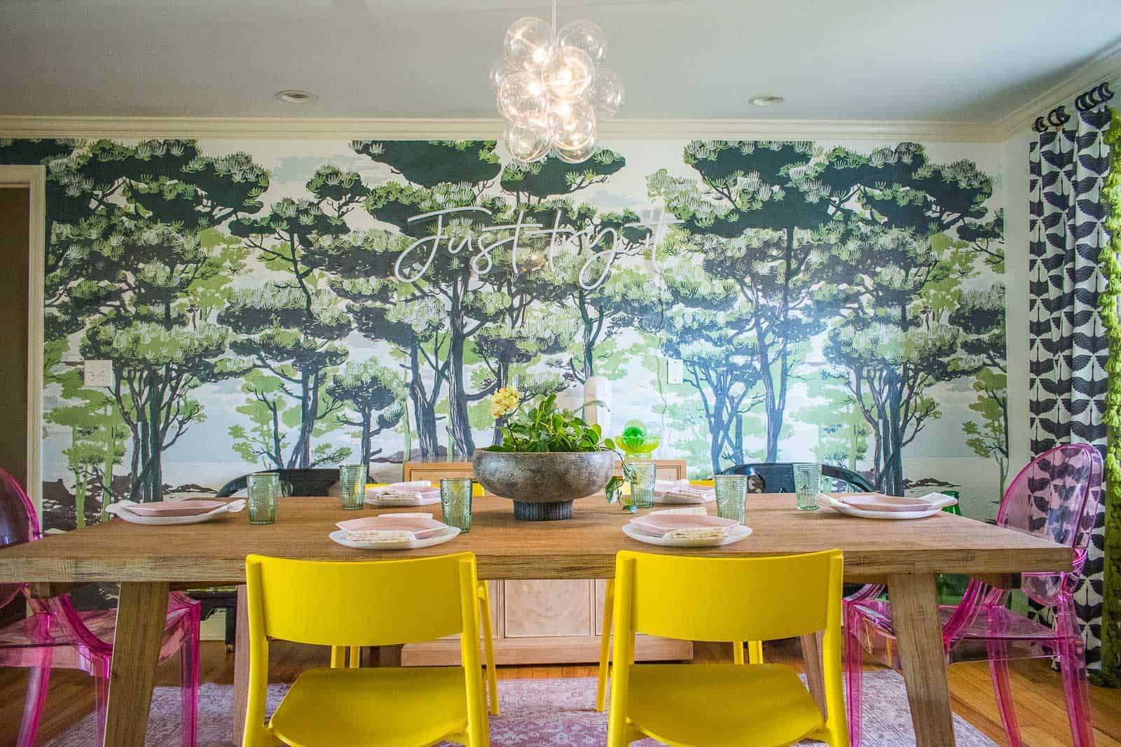
To say that the last six weeks have flown by is an understatement! I need to start by extending my profound thanks to Linda from the One Room Challenge for believing in me and inviting me to participate I am beyond grateful for the opportunity! When I started designing this room, I knew I would be limited because of renting, so my goal was to maximize the makeover with color and pattern and furniture choices! A couple things I’m self conscious about right from the get go: compared to some of the other makeovers…. this feels totally minimal. I didn’t gut the room first. I didn’t reframe the windows. I didn’t pull up the hardwood floors. And frankly, I didn’t even change the function of the room! BUT… I added LOTS of new details and DIYed a handful of really fun easy projects and dang it if I don’t love this space.
Shop my favorites!
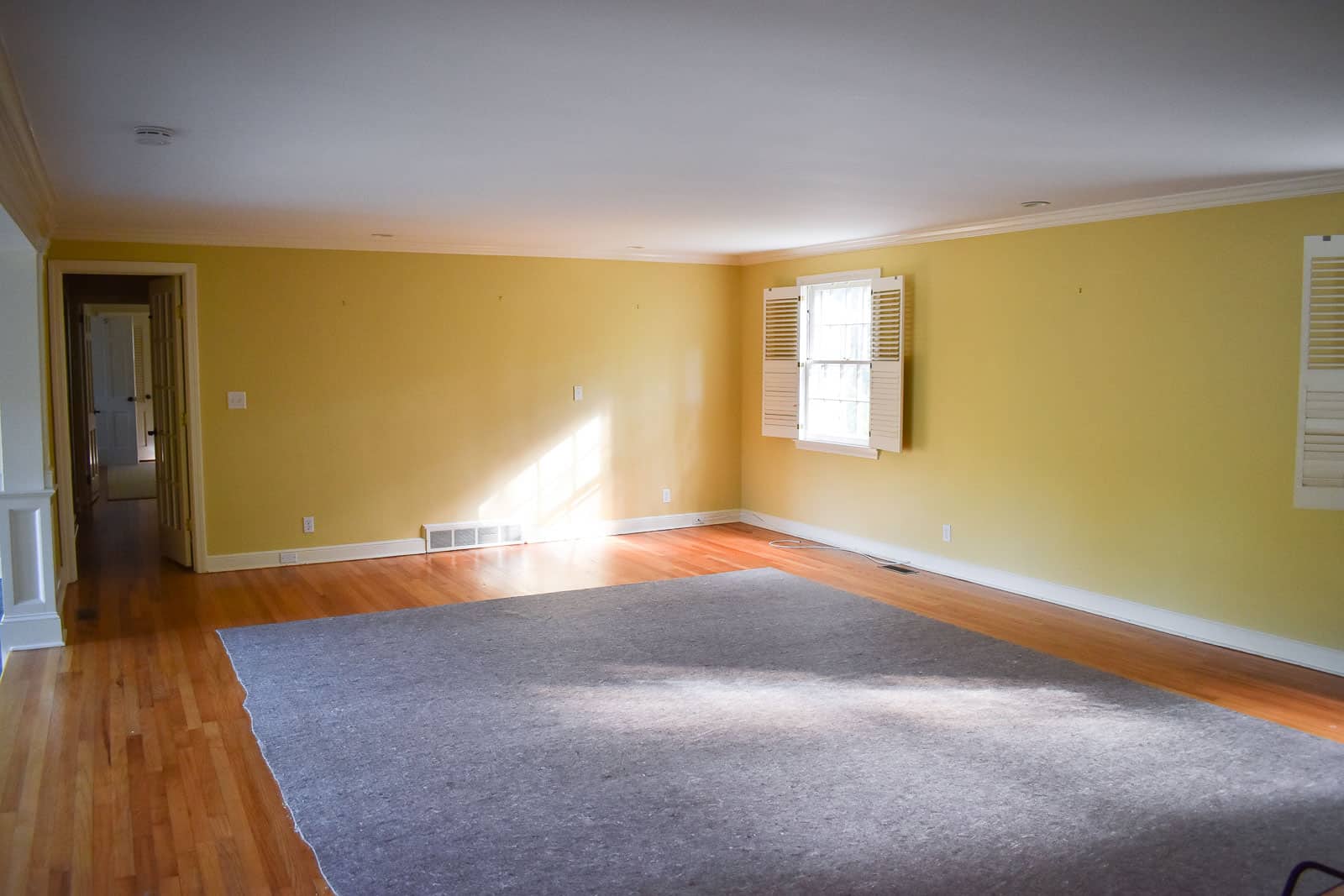
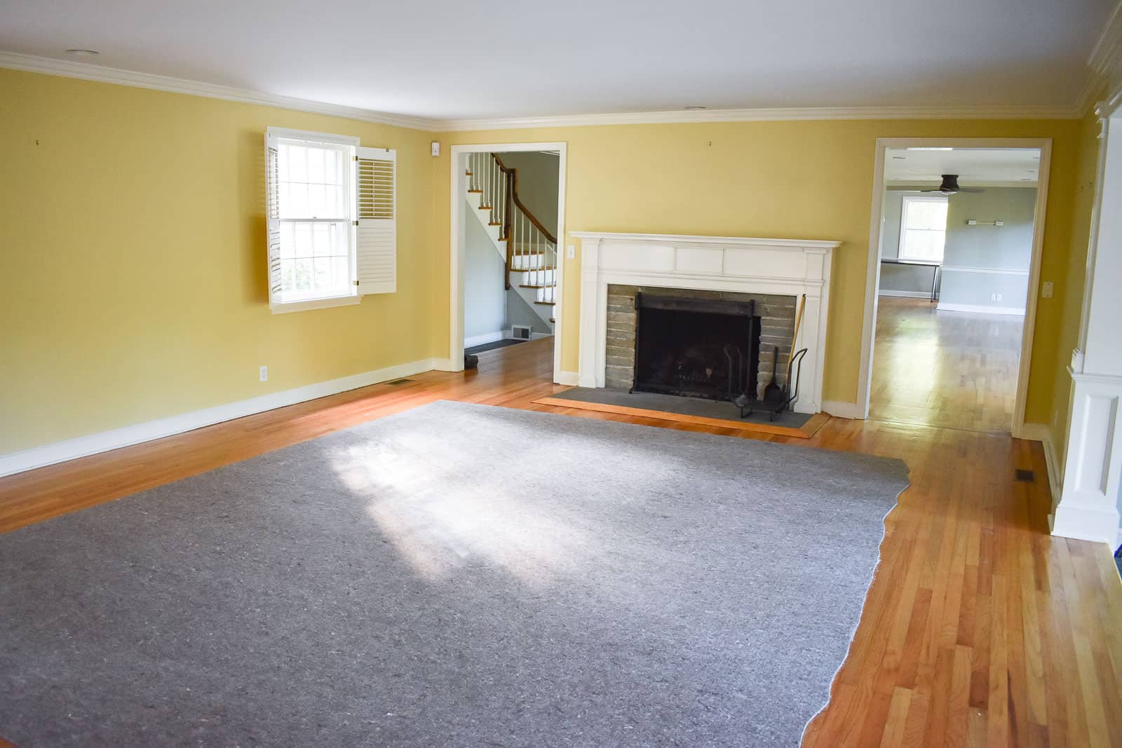
Thank you for sharing in my enthusiasm and cheering me on these past six weeks. It’s hard not to be humbled amongst this crew of featured designers so I thank you for your encouragement and kind words! Just to make this reveal that much more legit, let’s remember where we started shall we? When we first walked through the rental, the living room dining room space was an interesting shade of ochre. Low ceilings. Shutters that were 75% dysfunctional. But hardwood floors and lots of space.
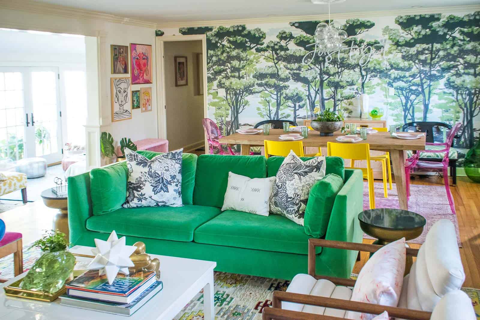
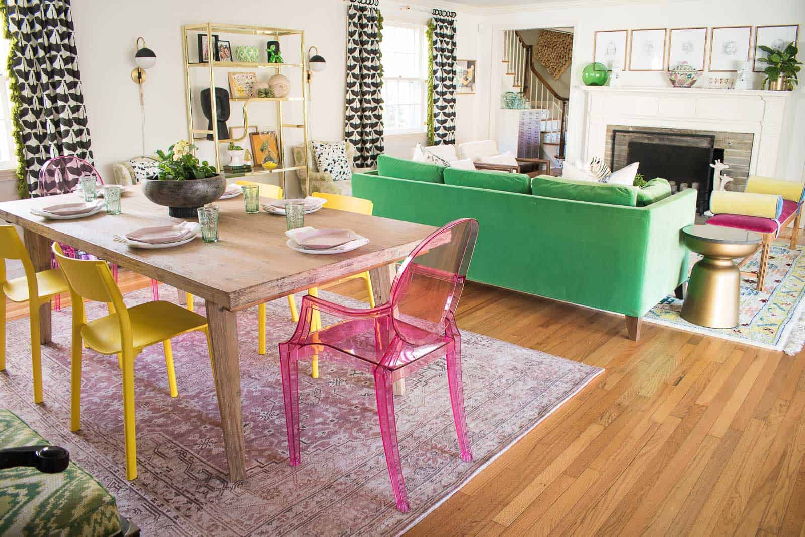
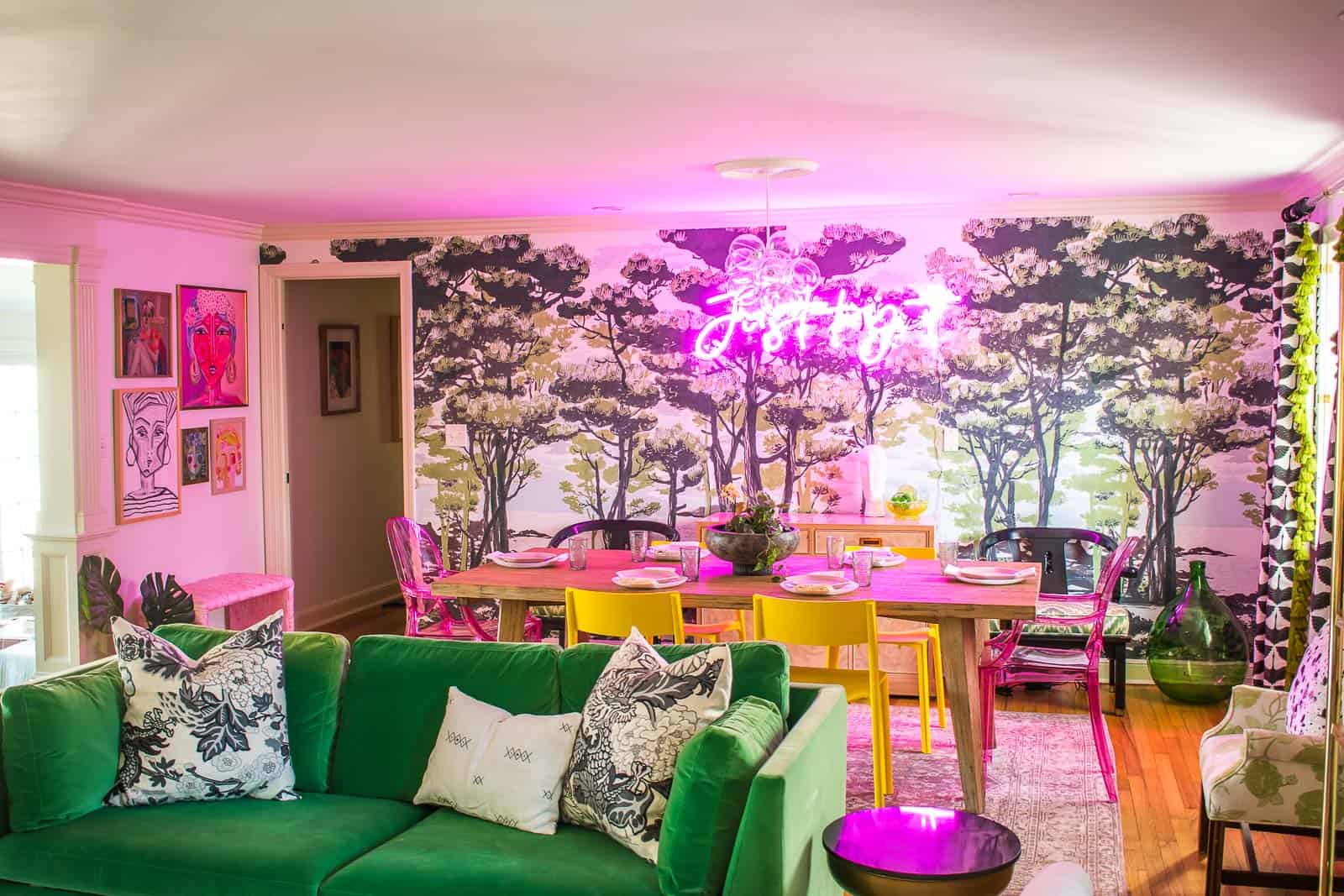
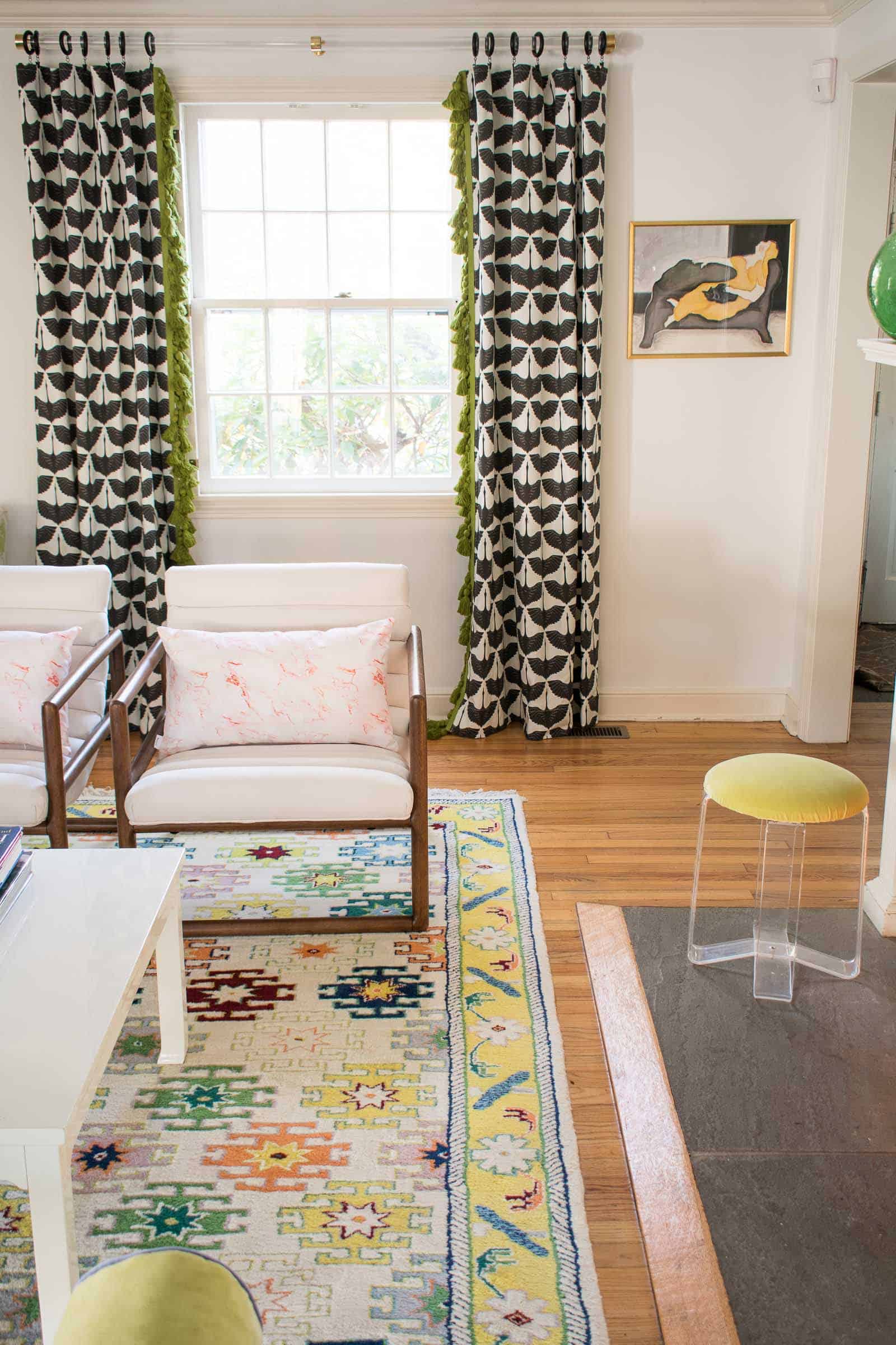
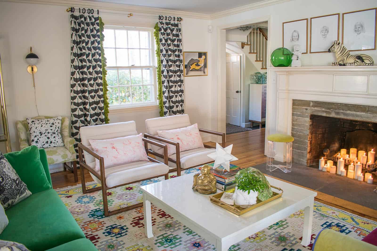
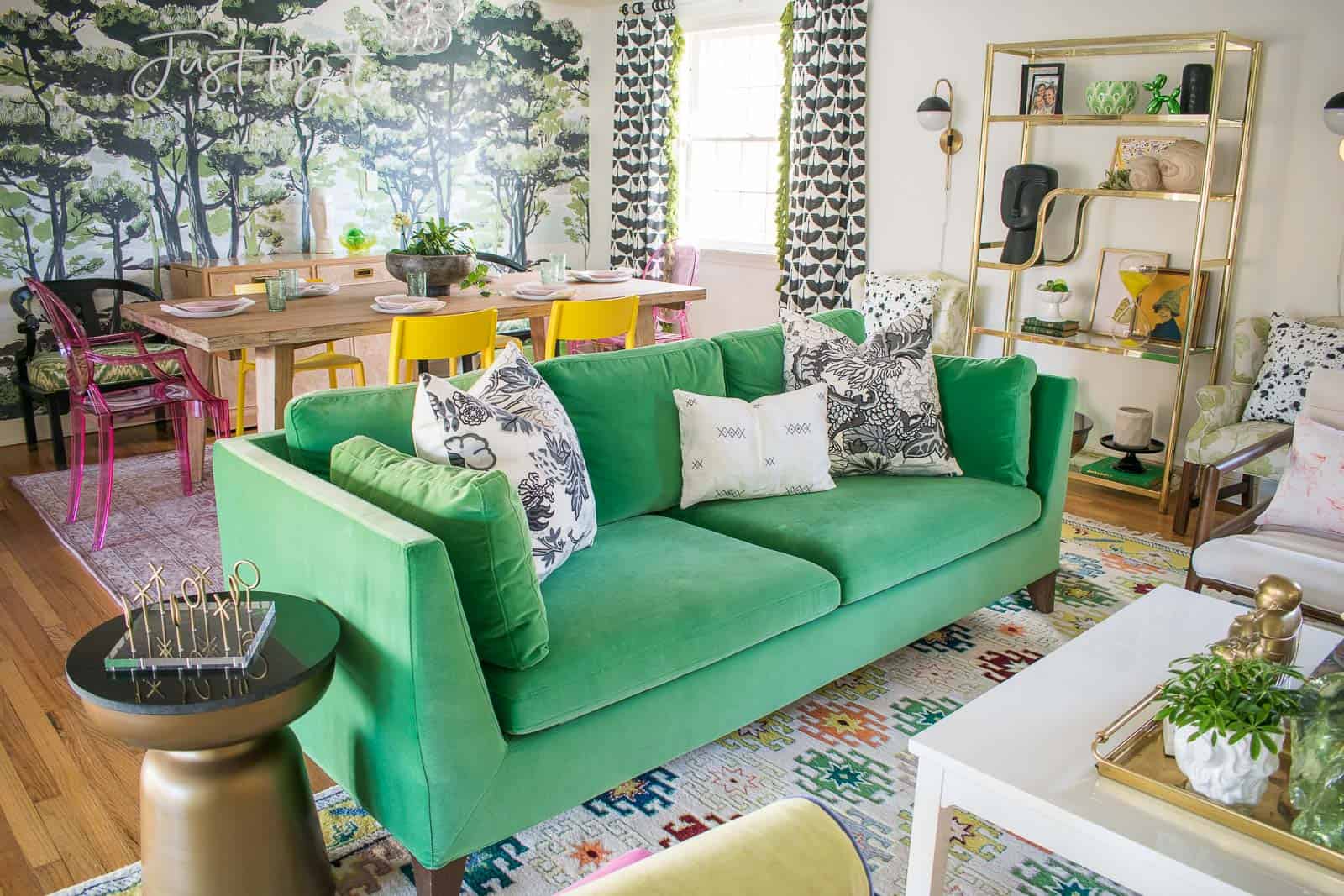
With a fireplace at one end, it seemed obvious that the dining room would be opposite. The room is big enough that it makes sense to have two separate areas so dining room living room combo it is. As much as I love a makeover, I didn’t want to swap out every piece of furniture on principle. My green couch has been discontinued and, without anywhere to store it, I couldn’t bear to part with it. Ditto my colorful carpet purchased years ago from a local carpet outlet.
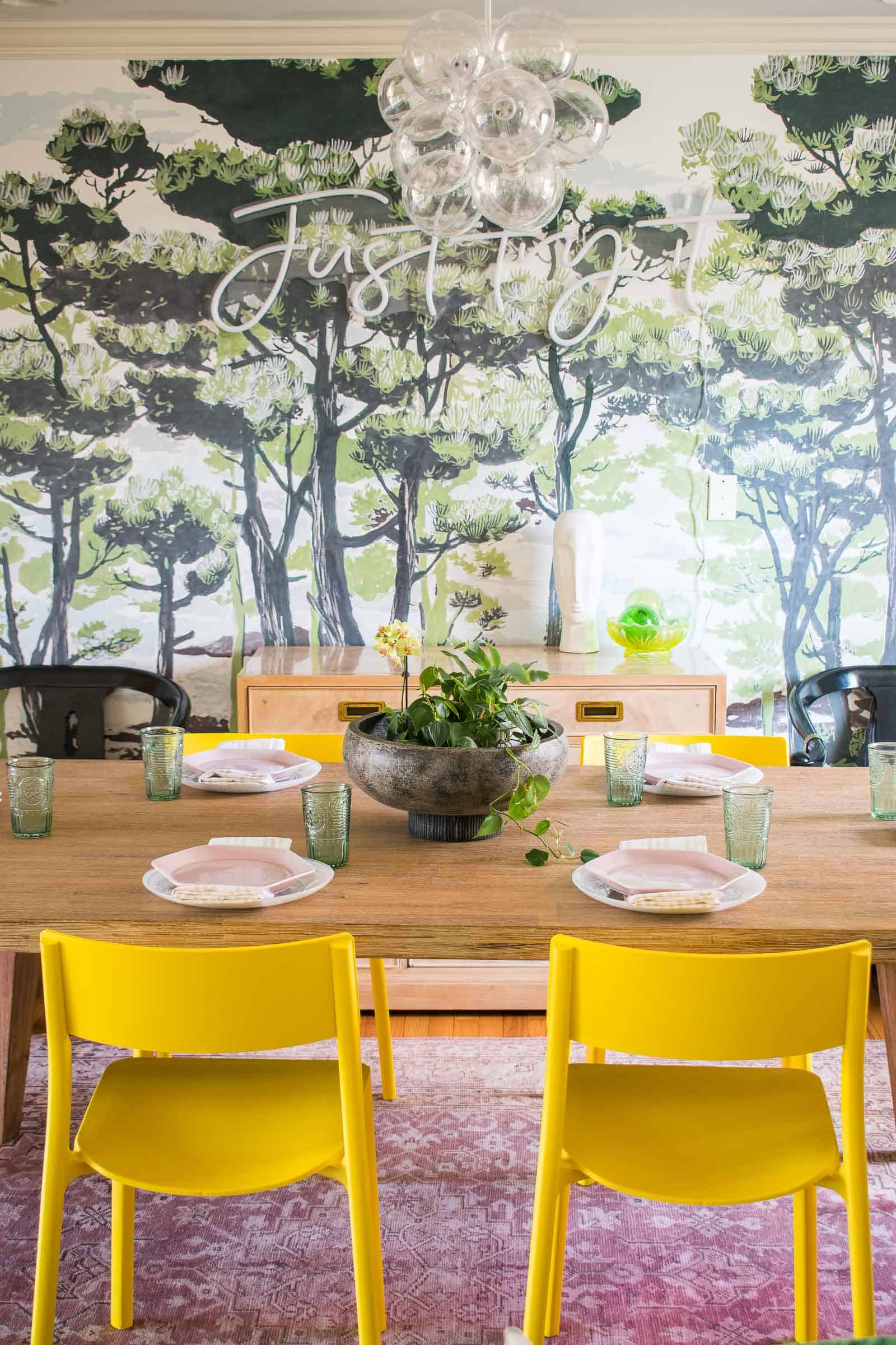
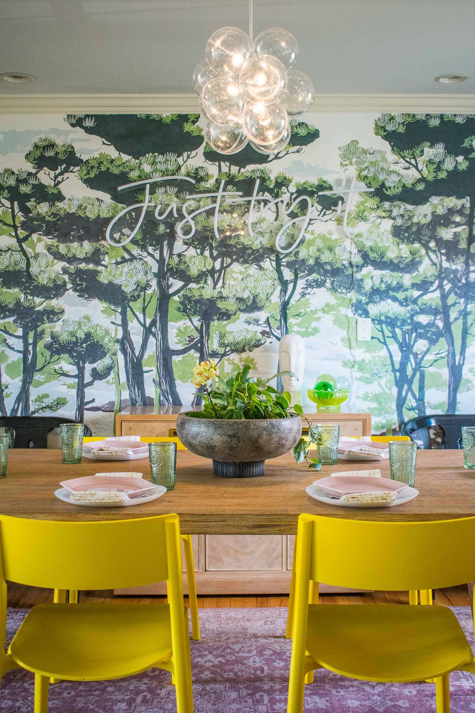
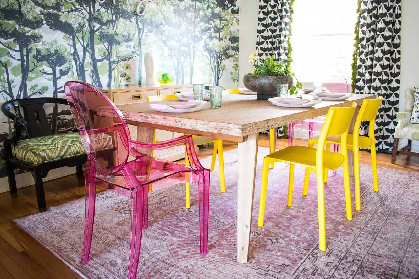
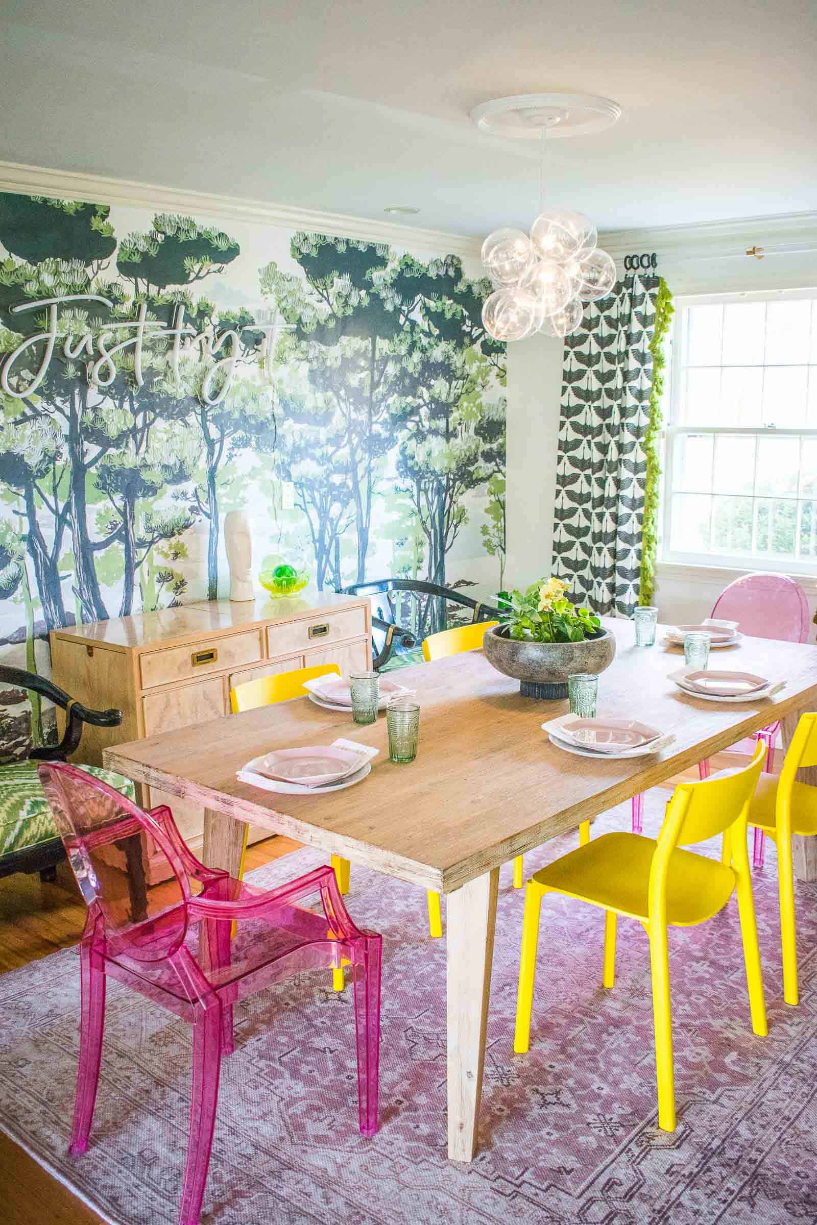
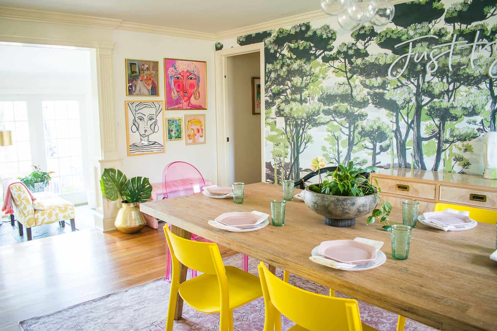
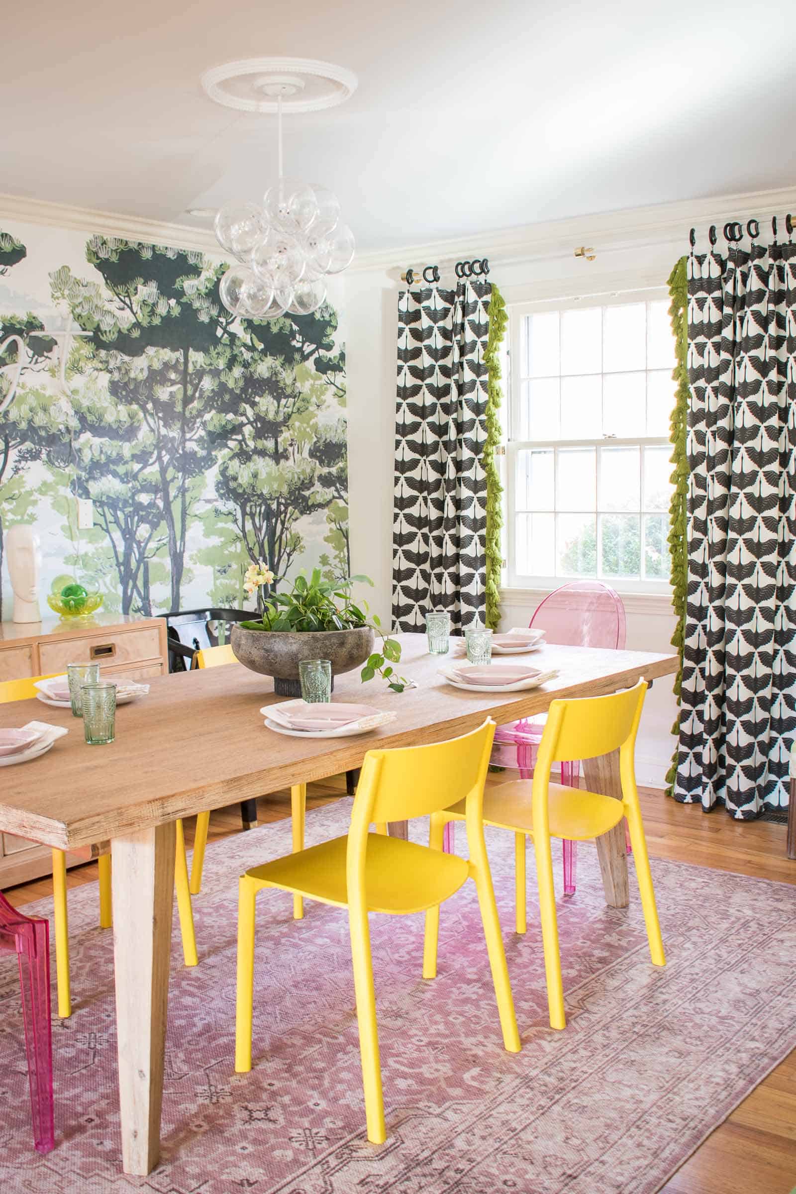
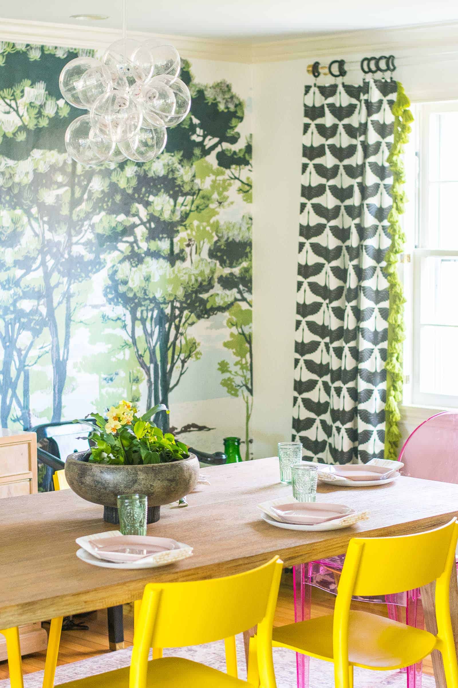
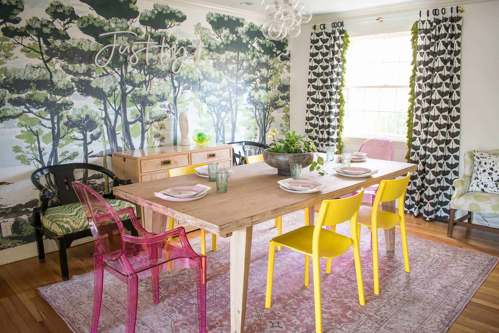
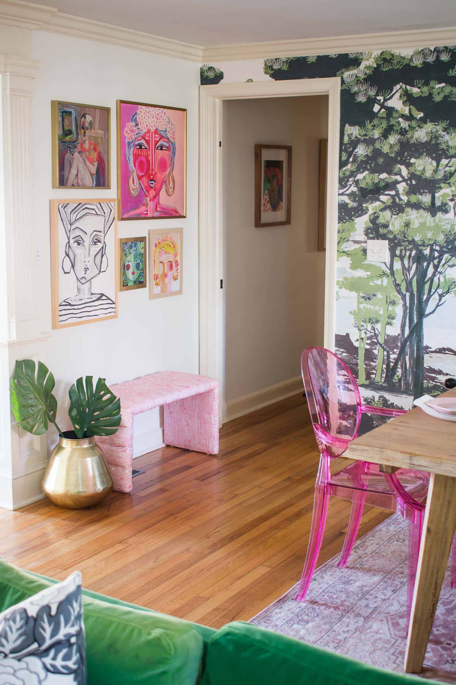
Let’s talk about what I DID do. My favorite detail is the mural on the far wall. It brings in so much fun texture and color. Check out my post on how I was able to hang the mural without worrying about my security deposit. I didn’t want to cover the mural with any large artwork so I opted for this cheerful pink “neon” sign. It’s LED so it doesn’t get too hot and it says “Just Try It” which is kind of my motto for anything DIY (and dining as it turns out. ha!).
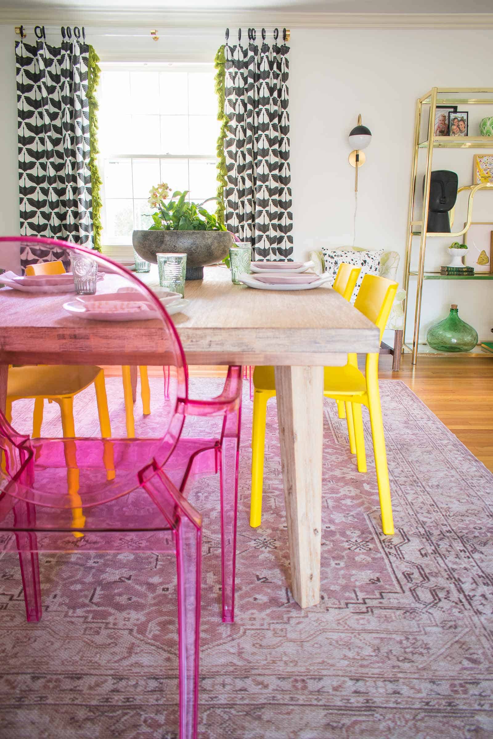
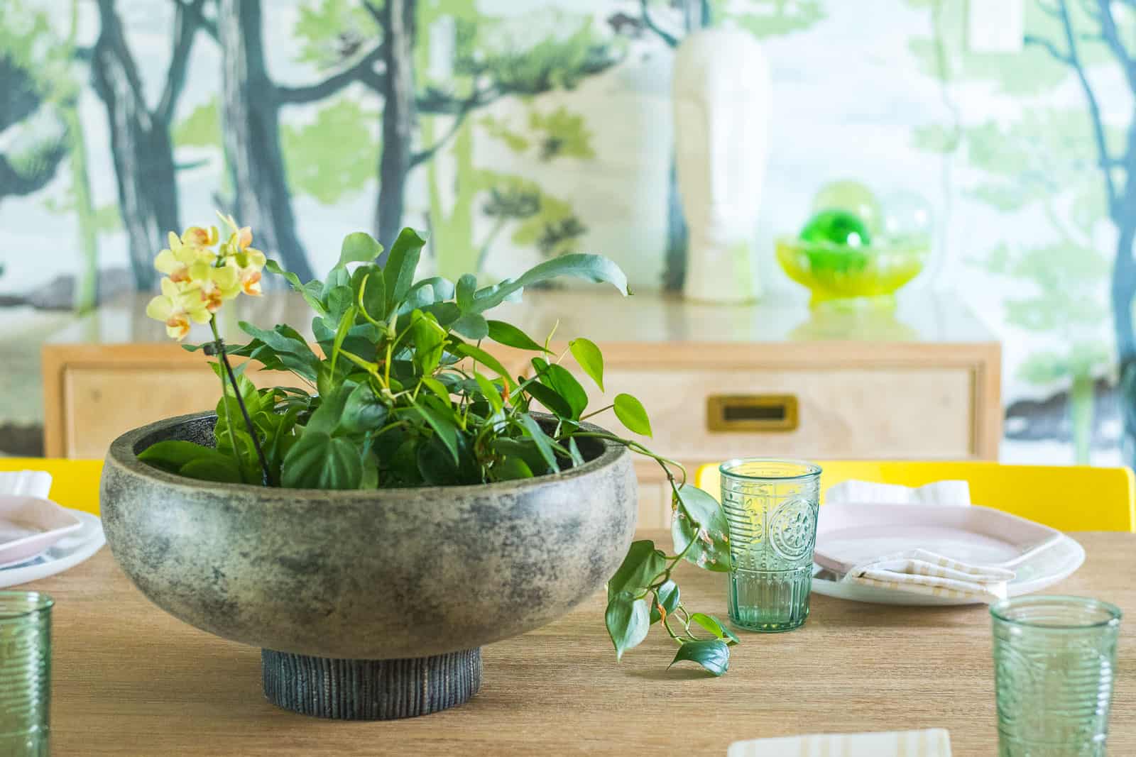
I have a new dining room table from Raymour and Flanigan and I love how the wood softens the space and feels a bit more contemporary than the painted blue farmhouse table that was there before. I found out a week ago that my dining chairs and sideboard were backordered so I had to scramble and found a sideboard from Facebook marketplace and those yellow chairs from Ikea. The head chairs were always part of my plan!
I shared the tutorial here, but I added that non electric bubble light chandelier just to define the dining space a bit more and give the eye a higher focal point. You’ll also notice a new distressed pink rug under the table. In my various vision boards, a color looked best under the dining room table (versus black and white) and this pale pink vintage style rug by Magnolia Home for Loloi fit the bill!
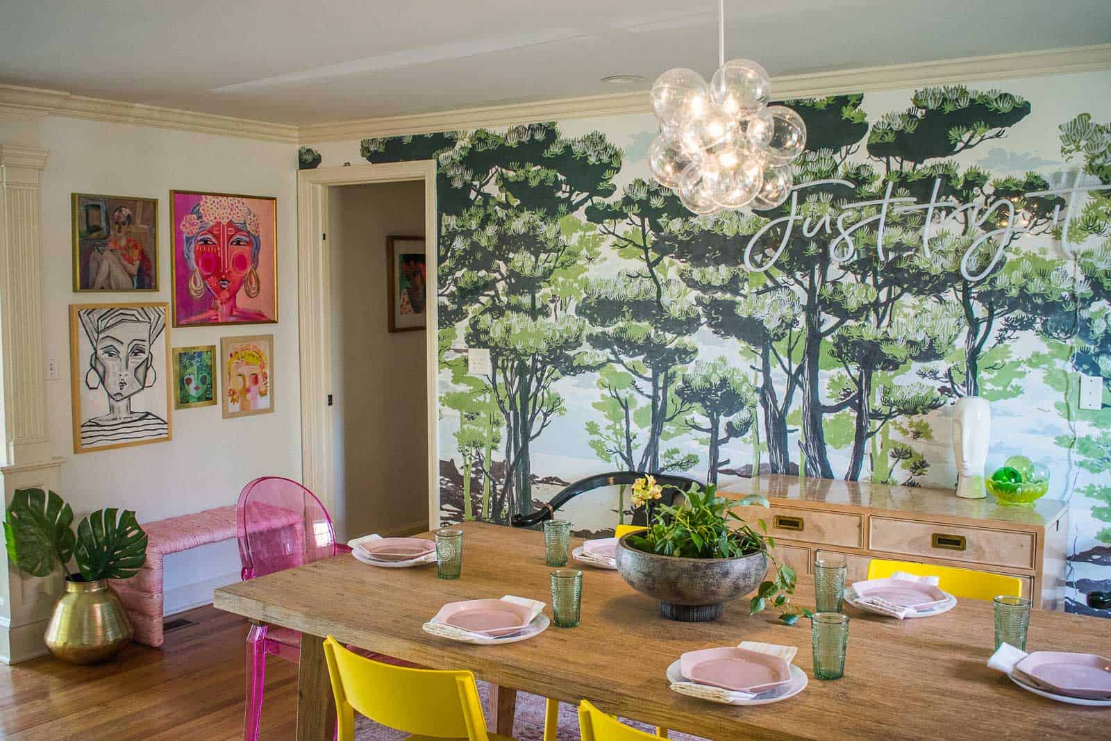
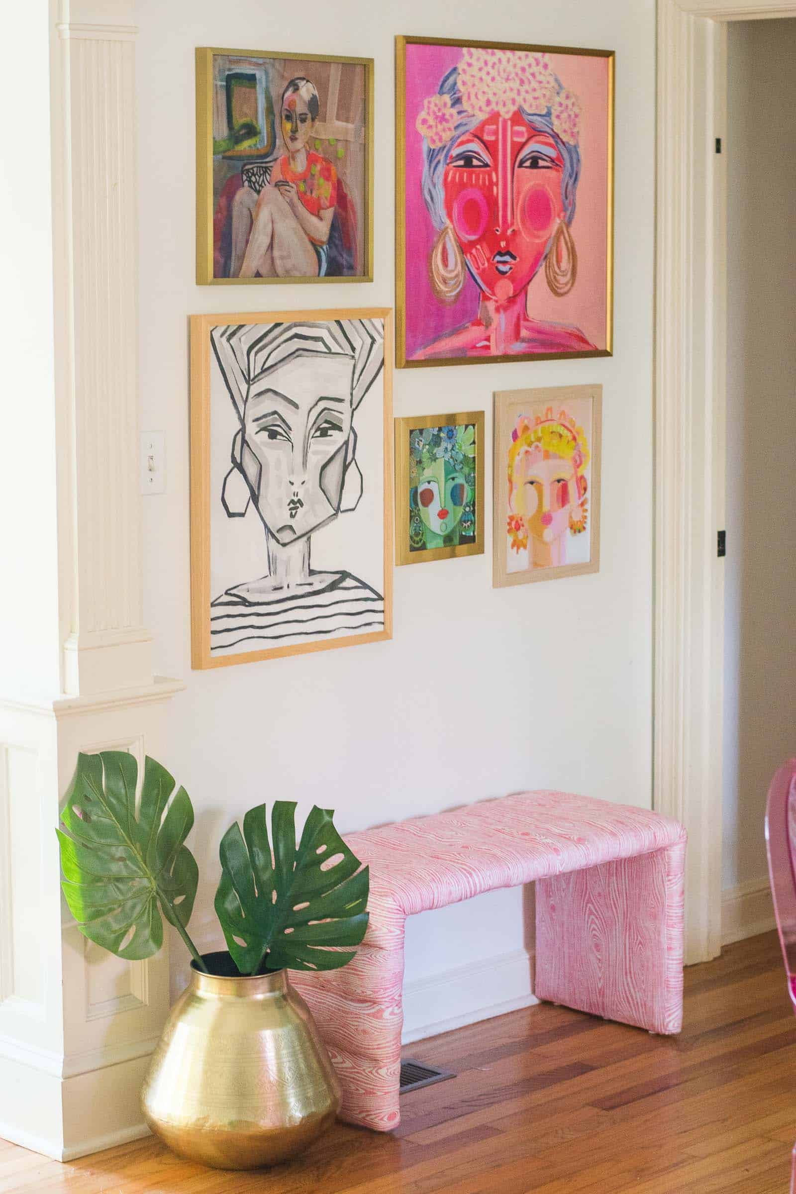
Minted was one of our sponsors and I was able to gather a handful of glorious prints to hang throughout the space. I’m crazy about the gallery wall of colorful ladies (featuring the work of Juniper Biggs, Gloria Blatt and Hailey Mitchell). Underneath the gallery wall is that fun channel tufted upholstered bench. (Full tutorial here.) I used that subtle pink faux bois fabric from Spoonflower and it’s the perfect bit of pattern without being too bold.
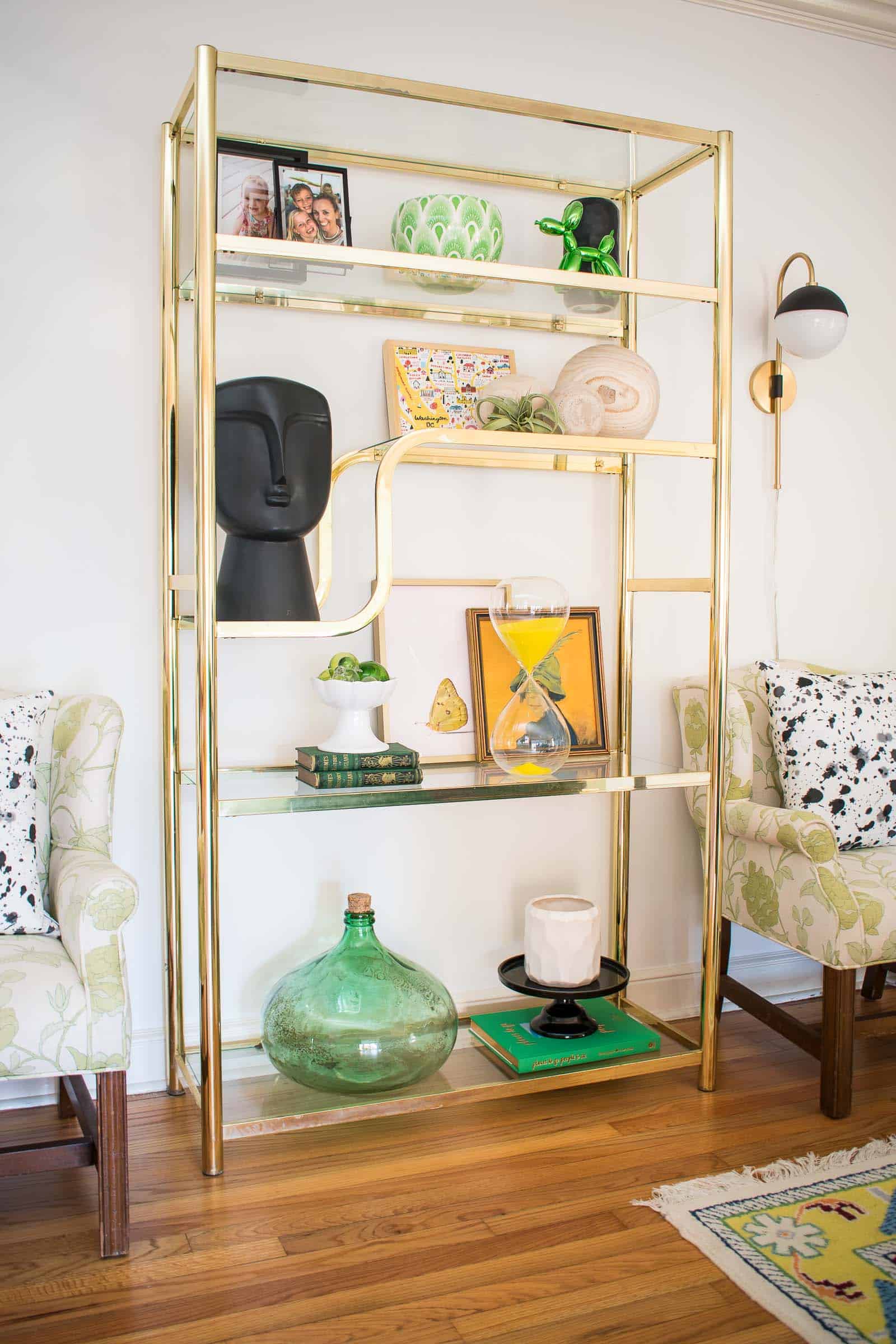
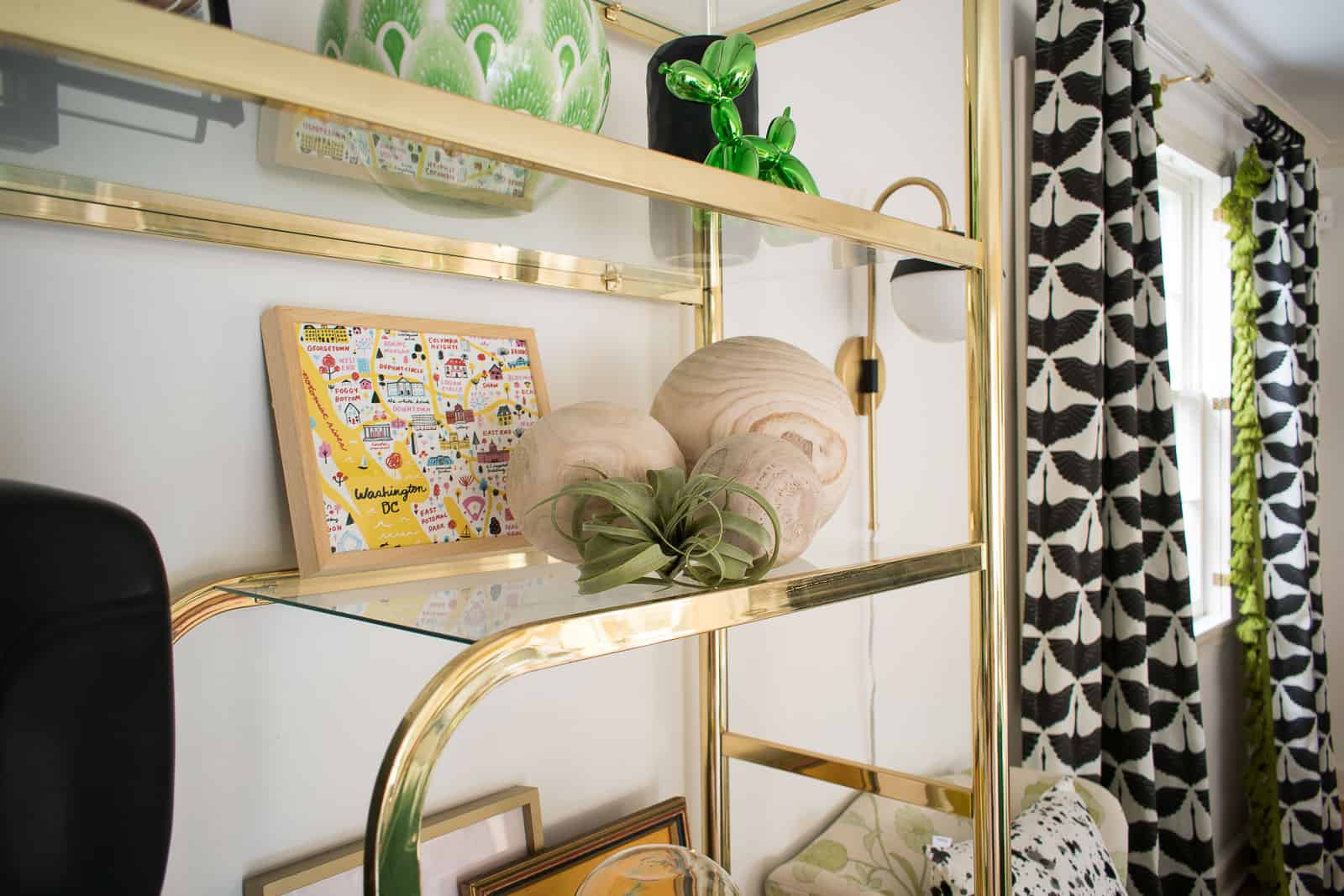
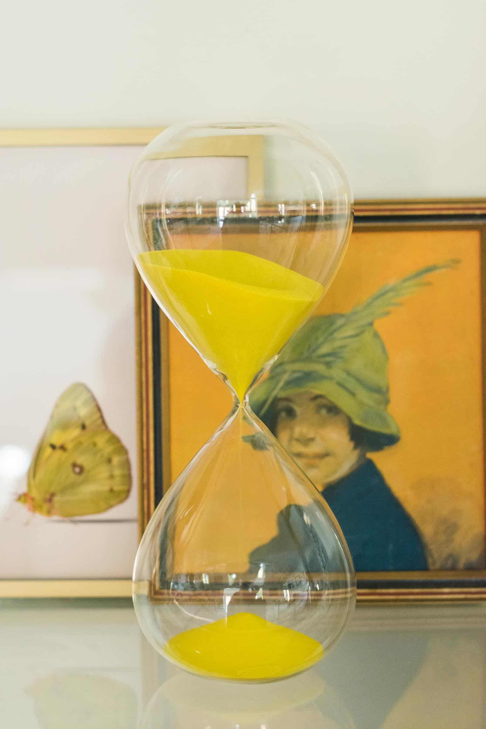
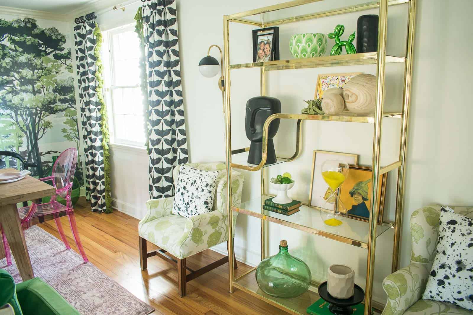
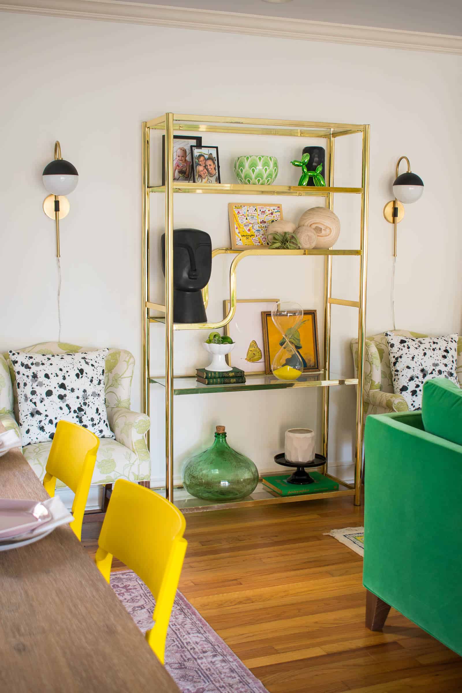
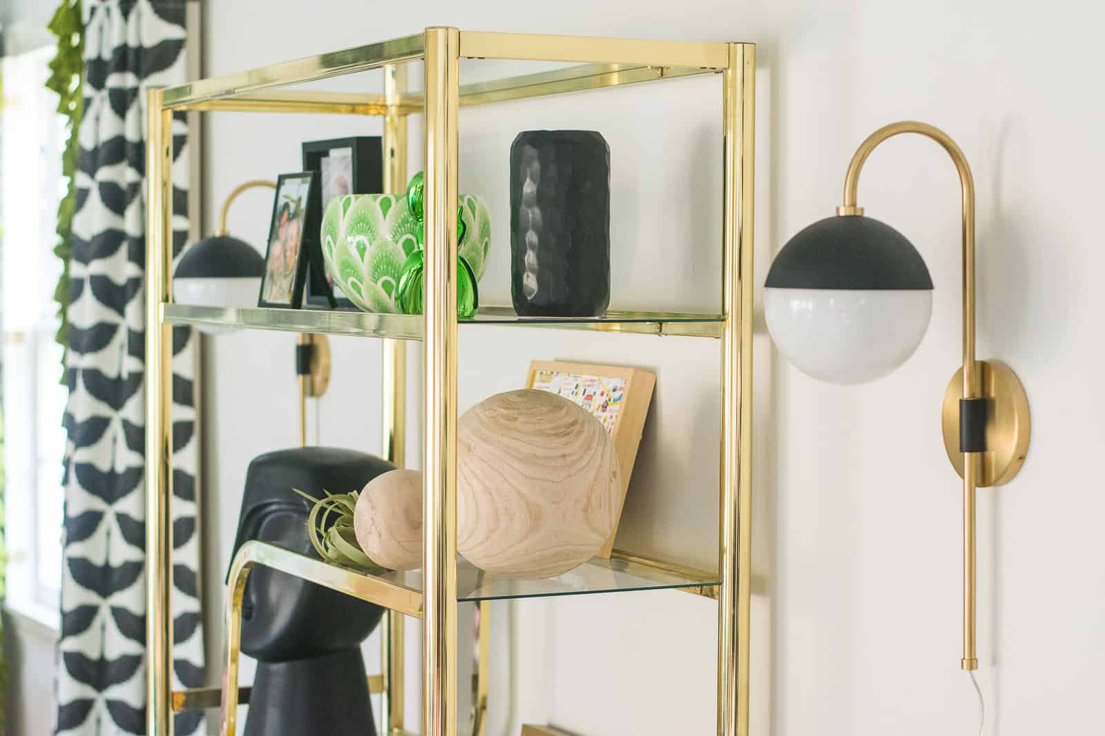
When we moved in, I put a large gray sideboard between the windows with a mirror and artwork above. Now that I’ve replaced the sideboard with those vintage brass shelves, I realized how heavy it was. The shelves are much better suited for that wall and… they gave me a chance to practice my shelf styling.
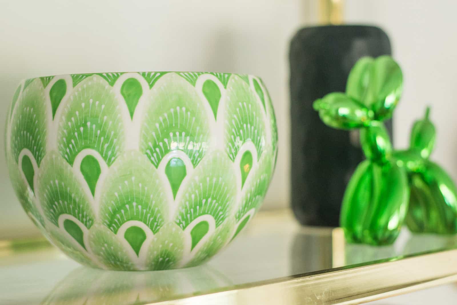
Taking a closer look at the shelves, I certainly used some of my own items from around the house, but there are a few notable pieces I need to mention. First and foremost is that exquisite hand painted green bowl from the illustrious Jill Rosenwald. When I shared this in my Instagram stories, I heard from dozens of you that owning one of your pieces was a goal… I am beyond thrilled and flattered that she agreed to work with me on this piece.
Elsewhere on the shelf… that stunning black head from Lamps Plus. My hope was that this piece would help ground some of the colorful whimsy in the room. I love a bright and playful space, but I didn’t want this room to feel ‘childlike’ so little details like this help create that balance in my opinion.
One of the reasons the brass shelves work between the windows is that I decided to add curtains. I decided on this chic egret pattern by Brains Are Pretty… I wanted black and white to offset the color in the rest of the room, and I love that this fabric has a print but reads as graphic if that makes any sense. Not only to they cover the ill-working shutters, but they also help stretch the ceiling a tad higher. (Hopefully.) I used lucite curtain rods from Luxe Holdups which create the illusion of height and then hung them quite a bit wider than the windows to fill in that wall space a bit. And just to add a little bit of flair… that exquisite green tassel fringe from Fringe Market is complete icing on the cake.
I’ve worked with Hudson Valley and My Mitzi in other areas of this house and I LOVE their clean lines. These Renee sconces can be hardwired or plugged in so they’re perfect flanking the brass shelves. I have them plugged into remote control outlets, but we may upgrade to Amazon Alexa plugs so they are voice controlled.
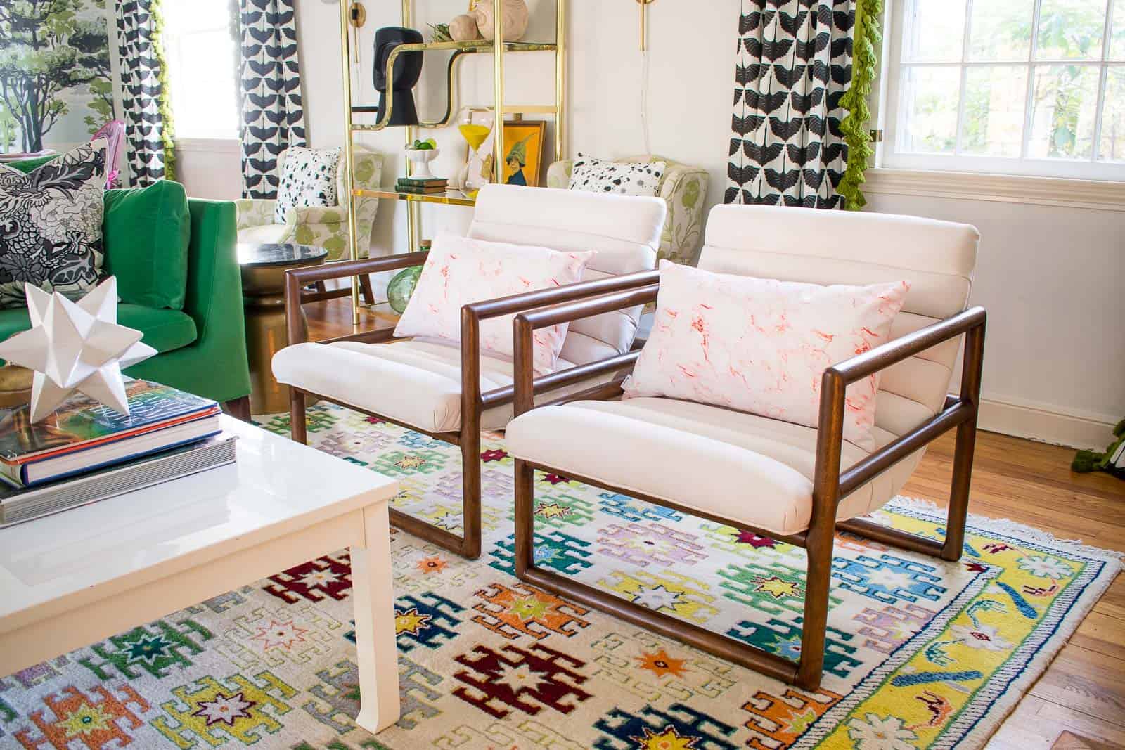
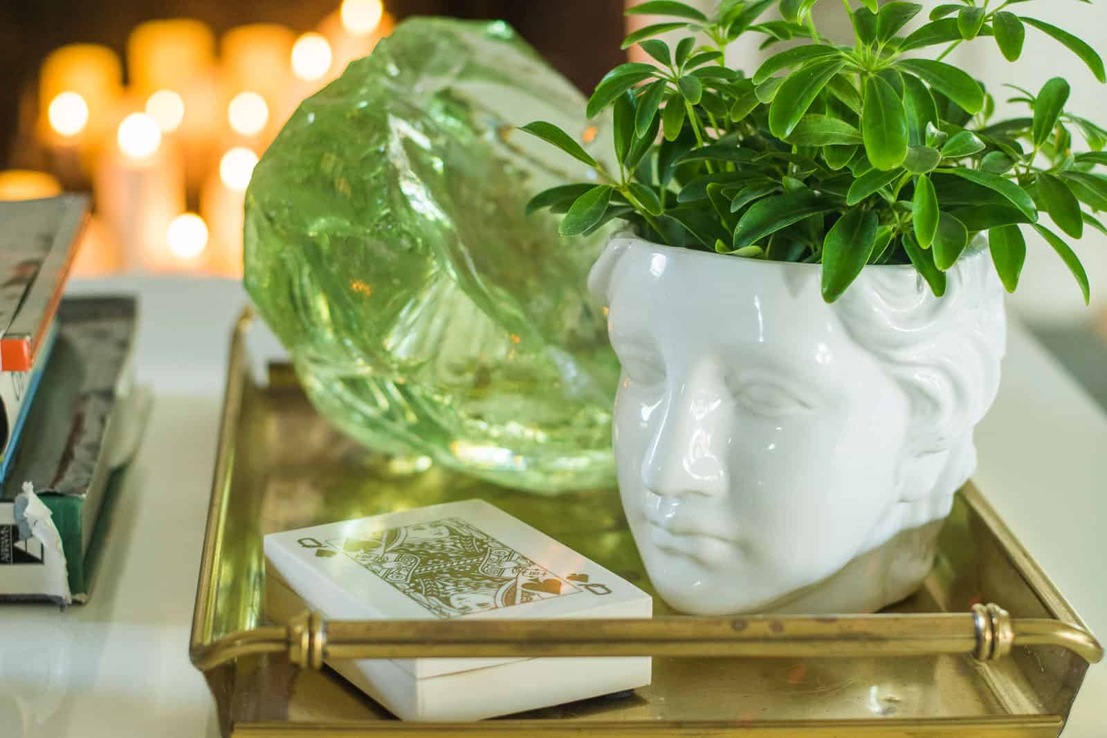
Moving into the living room, you all recognize the green couch and the colorful rug. I pulled from these colors when planning the rest of the room. The white coffee table is Jonathan Adler via Facebook marketplace and the size is right. I have two new armchairs from Raymour with the same channel tufting as my bench. I love that they bring in a more contemporary vibe as well as a neutral color. Yep. I said neutral.
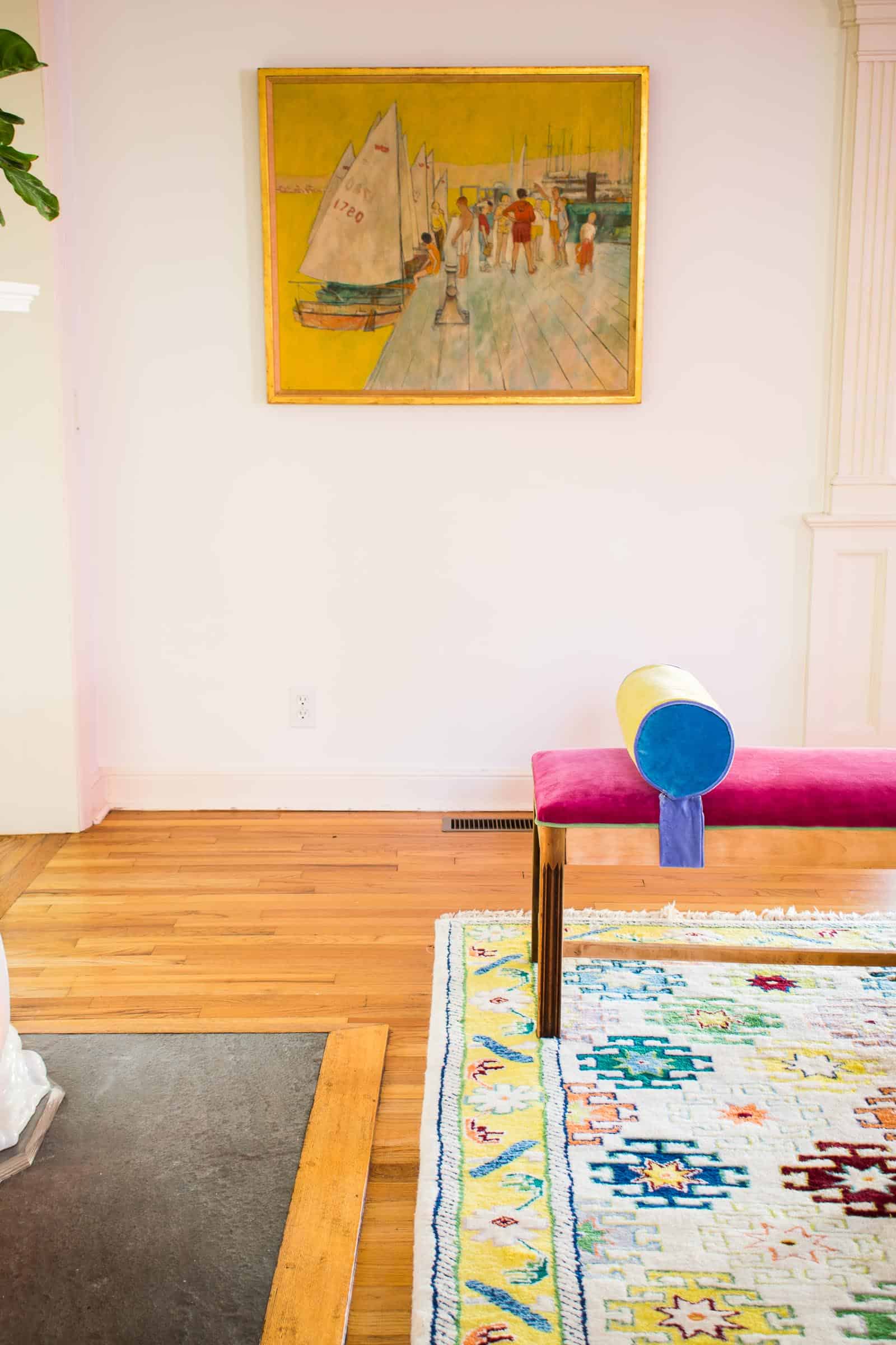
Across from the chairs is my updated bench. I love having a bench there instead of *another* pair of chairs. I’d already upholstered that bench with the pink velvet, but then I decided to add contrasting trim and those homemade bolsters. I love that it adds a bit of color to that side of the room, but doesn’t compete with the patterns elsewhere in the space.
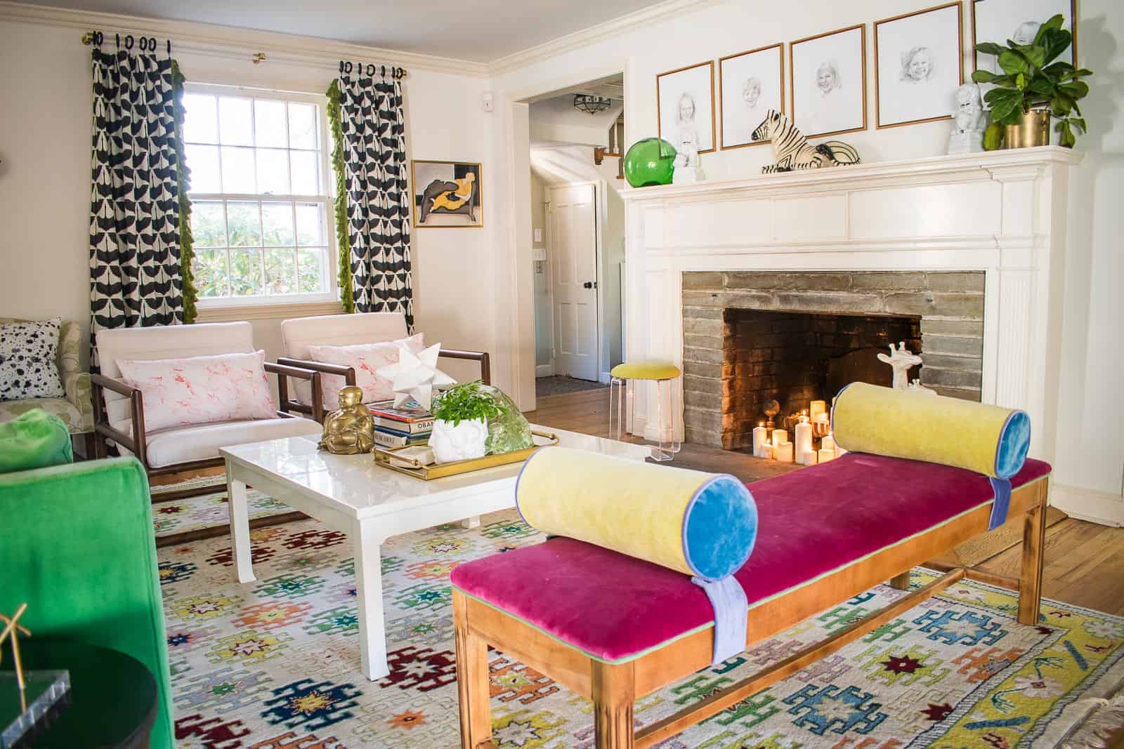
I’ve been walking through this room for the last couple of weeks watching it come together and I honestly don’t know if any of that comes across in these photos. I love how much fun pattern and color is present in the room. I love that the colors compliment the rest of the house. I love that it feels grown up but still cheerful. I love that there’s not a stray sock to be found!
Source List
Thanks to the wonderful sponsors of the One Room Challenge. They make it possible for us to pull together these massive makeovers in six weeks and I truly appreciate their generosity!
- Enchanted Forest Mural by Rebel Walls
- Neon Sign by Custom Neon (use code Discount5Charlotte for 5% off your order)
- Table and accent chairs from Raymour and Flanigan
- Artwork from Minted (featuring Gloria Blatt, Juniper Biggs, Mary Ketch, Jordan Sondler, and Andrew McClintock)
- Rug from Magnolia Home for Loloi
- Yellow chairs
- Pink Head chairs
- Black bust, wooden balls, terra cotta bowl, tic tac toe from Lamps Plus
- Painted Ceramic Bowl from Jill Rosenwald
- Egret Curtains, Black splattered accent pillows, pink upholstery fabric and pink marbled lumbar pillows from Spoonflower
- Curtain rods LuxHoldups
- Renee Sconces from My Mitzi
- Green tassel fringe from Fringe Market
Now… I’m going to brew a cup of coffee and go revel in the spaces my fellow featured designers have pulled together. I’ve been STUNNED by the hard work and transformations these folks have taken on.
Design Addict Mom | Erika Ward Interiors | Erin Kestenbaum | Girl & Grey
Gray Malin | Hommeboys | I Spy DIY | Jewel Marlowe | The Learner Observer | Making it Lovely
Nicole White Designs | Old Brand New | Oscar Bravo Home | Place of My Taste | The Rath Project
Room for Tuesday | SG Style | Undecorated Home | Veronica Solomon | Media BH&G | TM by ORC
And just in case you want to walk down memory lane… here are my posts from the very beginning.





Charlotte! Way to go!!! It’s all so fun!
Love it!!!
Thank you, Louise!!
Thanks, Haneen!!! Tried to keep it bright and cheerful! xx
Fun yes. Kind of like a circus IS FUN!
Way too busy. Ones eYe cant settle on one FocAl point because there are too many colors and patterns! Goes Against every design principle and insults my eyes.
Here’s the thing, Justine. You’ll note it didn’t cost you a thing to scroll through this room. This design isn’t going to show up at your front door and force it’s way into your home. Thankfully, there’s a pretty easy way for you to rest your fragile eyes… just click away. In your four juvenile sentences you’ve insulted 6+ weeks of my hard work. You’ve insulted every single person who decided this space didn’t hurt their eyes and chose to compliment it. You’ve insulted every brand who is supporting the One Room Challenge. And, frankly, you come across as mean at best and infantile and petty at the worst. Just for sh*ts and giggles, here’s another way you could have shared your opinion without sounding like a jerk: “I’m not sure I’d be comfortable with all this color and pattern in MY home, but good for you to finish such a big project and thank you for taking weeks of your life to share this with us.” Just a thought…
It’s beautiful! I love that you’re doing this in a rental – it’s alot more inline with the types of projects I’d try to take on in my own home, but still so cool. Thanks for your hard work and sharing!
Thank you, Beth!! I love hearing that!! xx
Obsessed!! this has you written all over it! So well done! So creative! So outside the box! I hope you are bursting with pride, friend. Brava!
xo Michael
You are the sweetest!! Thank you, Michael! Means the world!! xx
AnothEr winning space, Charlotte!! I love it! I especi adore the wallpaper and little green details!
Thank you Cory! The wallpaper is really amazing, I agree!! xx
Mind Blown, but not at all surprised.!!
haha! Thank you! I wasn’t so sure for a while there. 🙂
Love it! I am not good at mixing color and pattern, so I wasn’t sure where this was all going but Wow! How fun and beautiful! I love the wallpaper, the brass etagere and sconces, but my favorite that ties it altogether are your drapes with that fringe! Congrats!
Thank you!! It all started to come together when I hung those!! xx
What an absoluteLy fabulous makeover! Congrats!
Thank you, Bari! I can’t wait to see yours! xx
It is amazing!
Thank you, my friend!! Come see in person. 😉
My favourite parts are the table (the link didn’t work for me), the curtains (makes me want to learn to sew so I can add a trim to some cool curtains) and the accent wall. I’m impressed with the light as well – great inspiration for other renters out there.
Thank you, Tanja! The table must be out of stock (it was OK last night 🙁 ). I’d check back periodically! And Spoonflower has home decor ready made on their site from the fabric so… they made the curtains! Win-win!!
It looks AMAZING! Love all the color and texture!
Thanks, Diane!!! The more color and texture the merrier! 🙂
Love it! Perfect comBo of glam, fun, and comfortable!
My favorite combo!! Thank you so much!!
Love this room from top to bottom! Congrats on a great ORC!! ~~ Susie from Chelsea Project
THank you Susie!! SO kind!! xx
Super fun ! i love the view from the sofa when the neon is on (I’m a sucker for pink & green combos ;))
I LOVE the neon! A little harder to photograph than I expected but it’s such a fun detail!!
The way you combined bold colors and patterns and shapes AND textures and materials is mind BLOWN! I wish i could be inside your head ?
Hahaha! Sometimes I wish the same thing… 🙂
as usual, job well done! Love it all!!
THANK YOU!! I appreciate it!! xx
Fantastic new look.. great job with color blending! I love the vintage shelf and how it’s styled.. the panels really makes the room pop
Thanks, Jamala! I love how all the smaller changes made for quite a new look!!
Charlotte! It’s perefct. Period. That’s all- PErfect.
Thank you, my friend!!
You did it again charlotte…you created a space filled with personality and sytle. I love your dining room and am really smitten with the wallpaper and the two benches you made. DiY perfection at its best.
Thank you Shelly!!! I never know until the last minute whether it will all come together! 🙂 xx
Love it!!! Can’t pick a favorite thing!
That’s so sweet! Thank you!!
such a fun and eclectic space! i love that mural so much!!!!
Thanks Cassie!! Isn’t it the best?! So happy with how it looks!
Well done! I love what you did with the space! Its amazing what you can do even with Just a rental and liMited OPtions! I’m impressed!! 🙂
Thank you so much for following along!!
AdoRe thE juicy colors & happy eNergy!!! The mural & curtains are my faves but everything is amazing! Reaaly appreciate what you did with your limitations.
Thank you, Michelle! Those are my favorites too!
You’ve done wonderfully well, and it’s been such fun to follow you as your ideas have popped like mushrooms after the rain (clumsy metaphor, sorry) and you’ve dug in and experimented (and succeeded) to create so many of the rooms’ one-of-a-kind elements. Enjoy the bold and endlessly creative pair of rooms that you have made!
I love that metaphor!! Thank you so much for going on this journey with me!! Can’t wait to enjoy the space! xx
you did an amazing job, Charlotte. I love how you mixed patterns and colors- very much you!! love it!
Aniko! I am FLOORED by your bathroom! I can’t believe your vision! xx
tHIS IS SO AMAZING. yOU ARE CRAZY TALENTED!
THank you, Jennifer! So sweet!! xx
Charlotte! OMG! You’ve managed to make this room feel like a party and yet somewhere that looks so cozy and comforting at the same time. Wow! I love all the color and pattern mixed with the woods and neutrals. You’re a goddess!
I LOVE this. “Make the room feel like a party” may be my new tagline! 🙂 Thank you my friend! xx
Wow Charlotte you pulled it off spectacularly!! That is one fun filled room. I bet the kids must love it.
Mary! Thank you so much!! Yes… they do love it. 🙂 so cute!
I can’t believe how different you made this without doing structural stuff! I need that brass shelving unit in my space! I have a similar DInING/”formal” living room are that I plan on re doing, so I am def pinning this for inspo!
Thanks, Mary! Isn’t that brass shelf PERFECT! I love that I got it from Erin Kestenbaum who’s also doing the ORC! Full circle!!
Such a wonderful fun sPace! I love it!
Thank you, Stacie! I’m so pleased with it! xx
This is great!! Love all the colors and your style!
Thanks much, Crystal!! xx
Love that a renter was featured! As a fellow rented I PARTICIPATED in the One Room Challenge and it’s a fun adventure re-inventing a space without changing the foot print. You have create a fun, bold and colourful space!
Yes! There are a whole different set of challenges! Congrats on finishing!! And thanks!!! xx
one word – joyous!
Thanks, Eva! I LOVE that word!!!
This colorful combo room came out amazing, charlotte! Those tassels, that bench, neon and black bust srsly take the cake!!!
Thank you my friend! I mean… tassels are a must, right?! 🙂
This room is so beautiful it actually made me love the color green! I am just beginning my journey in color and this is now my benchmark! I’m still learning to put patterns together because I think it is pattern that makes or breaks a room/color palet. Well done and thank you for the inspiration!
P.s. i found you by way of the tikes playhouse challenge and so glad i did!
Love this! I’m just seeing it today as I was googling how to set up a living room/dining room combo. Where is your kitchen in relation to this big amazing room? Thank you!
Hi there! Kitchen is on the other side of the family room which is on the other side of the wall from the fire place!
ReaLly really amazing, that is brilliant, Everything are gorgeous!!!
Thank you so much!
This is a few years late… love the room but super frustrated you imply that all the readers will know where that velvet sofa came from.. can you share? Thank you!
If you search around my site, you will probably find references to it. It’s discontinued from Ikea.