Master Bedroom Headboard Wall
Psssst… this post *might* contain affiliate links: see my disclosure here.
Simple Updates to the Headboard Wall in our Master Bedroom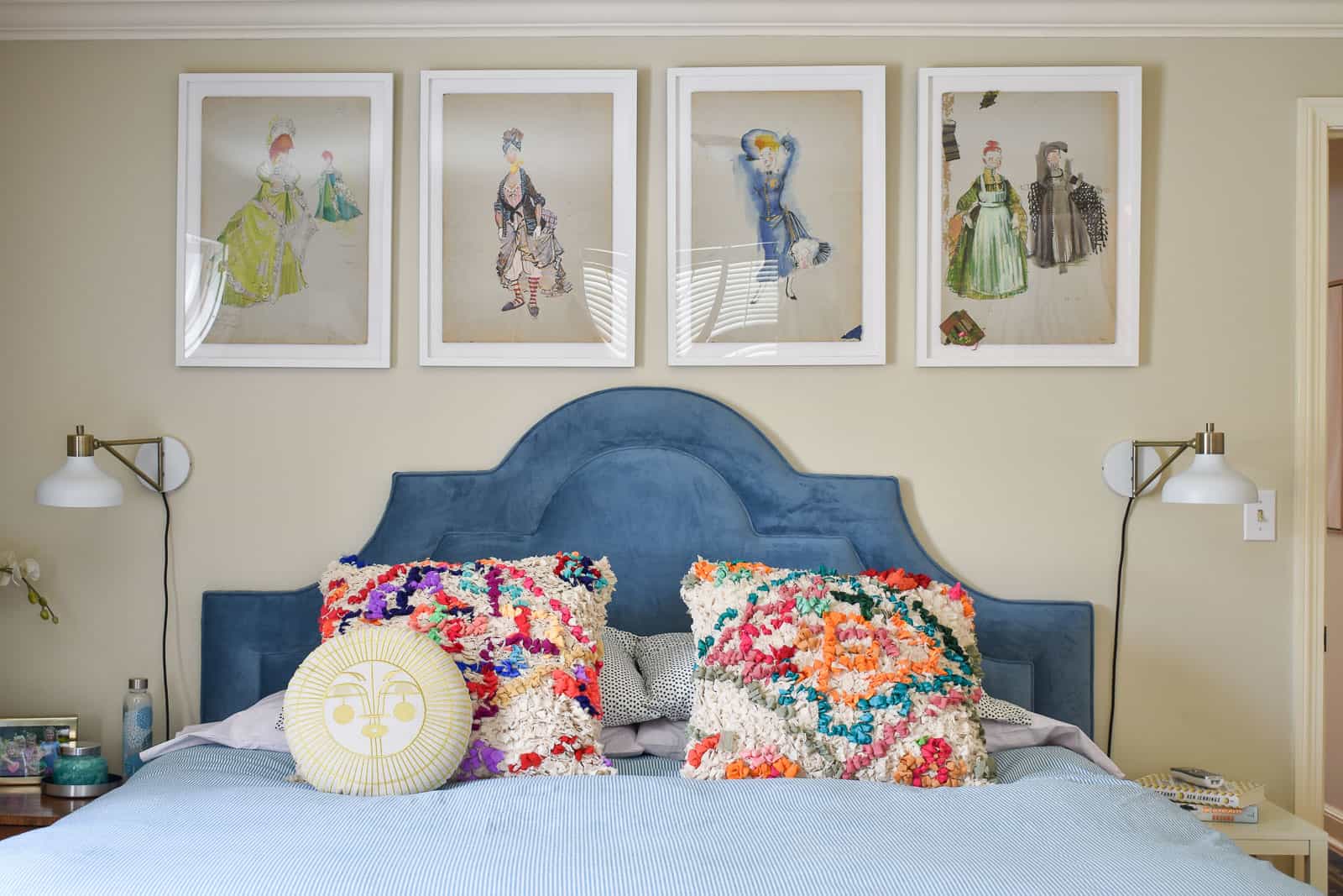
Thank you to Raymour & Flanigan for kindly sponsoring this post. All opinions are 100% honest & completely my own.
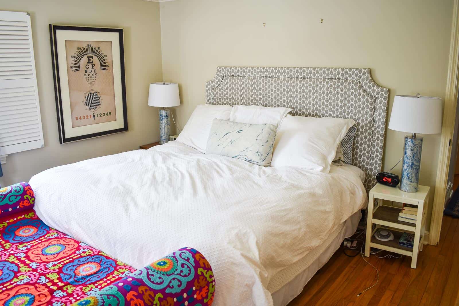
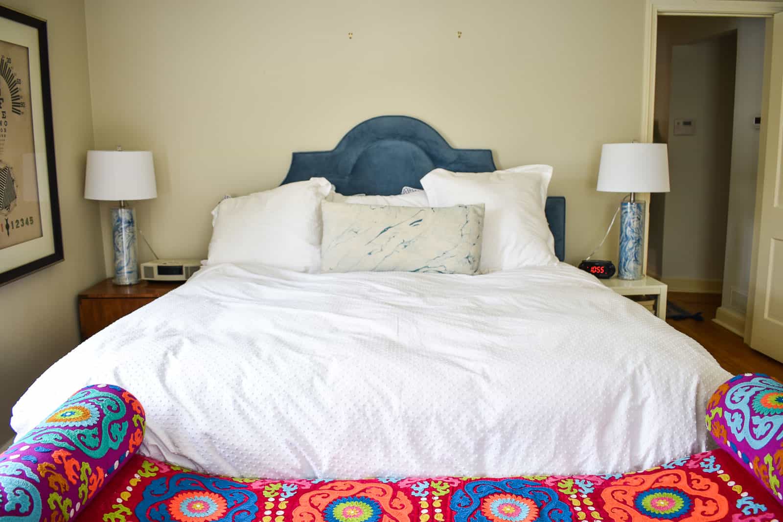
When we moved into the rental, most of our furniture worked great, but there was something about my DIY headboard that didn’t quite work in our master bedroom. I love working with Raymour and Flanigan so I immediately went to their site to see what kind of headboard options they had and… wouldn’t ya know, they had the PERFECT option. Let’s rewind a bit to how the old headboard looked when I started and why I didn’t love it.
Shop my favorites!
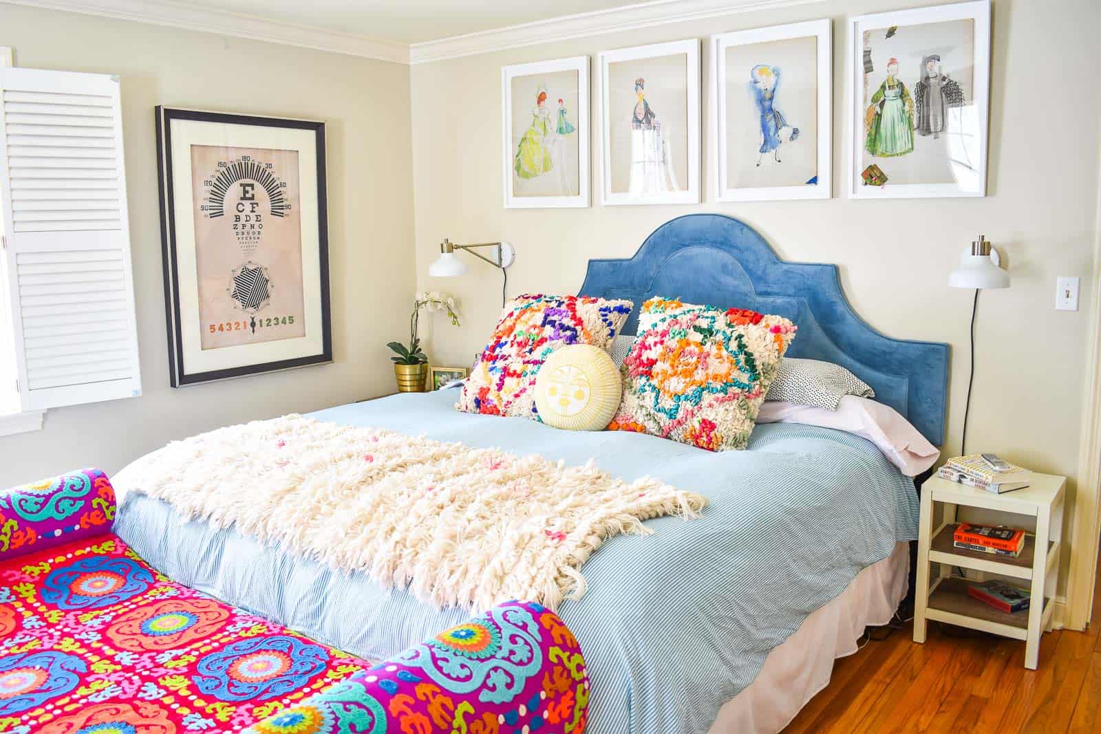
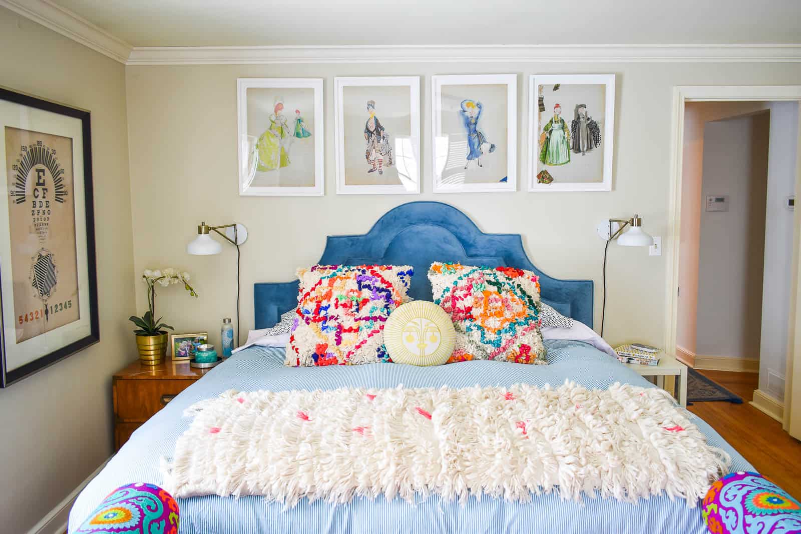
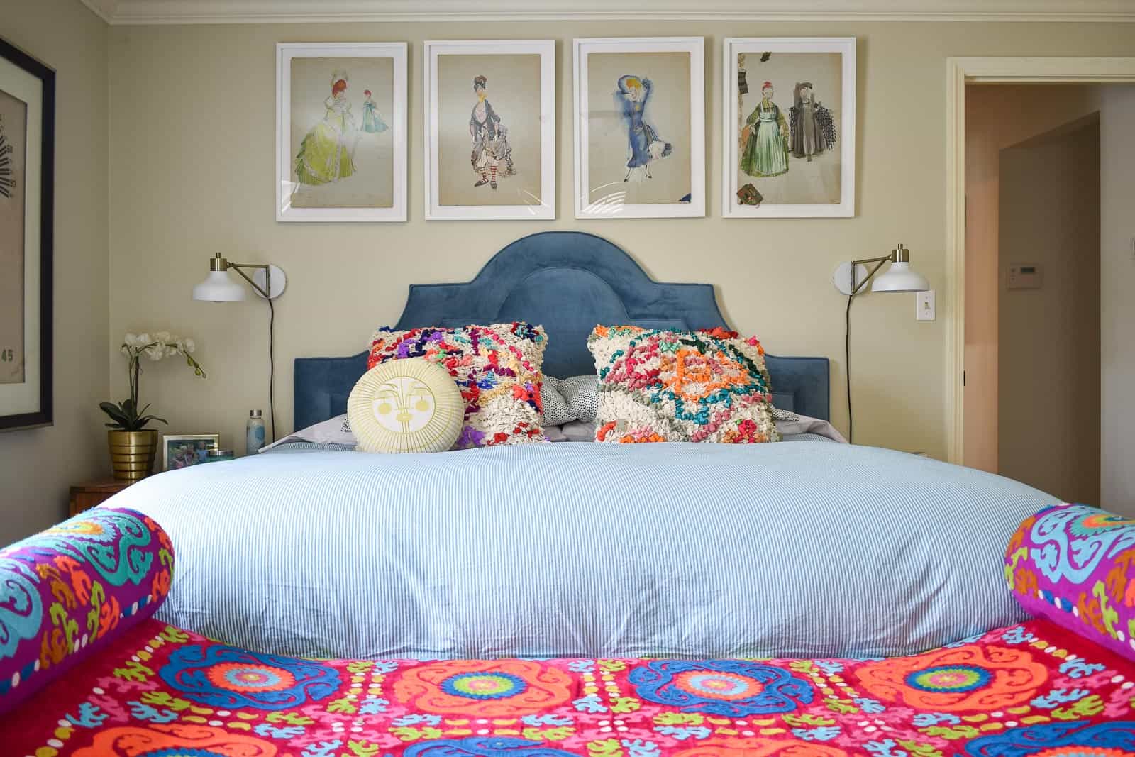
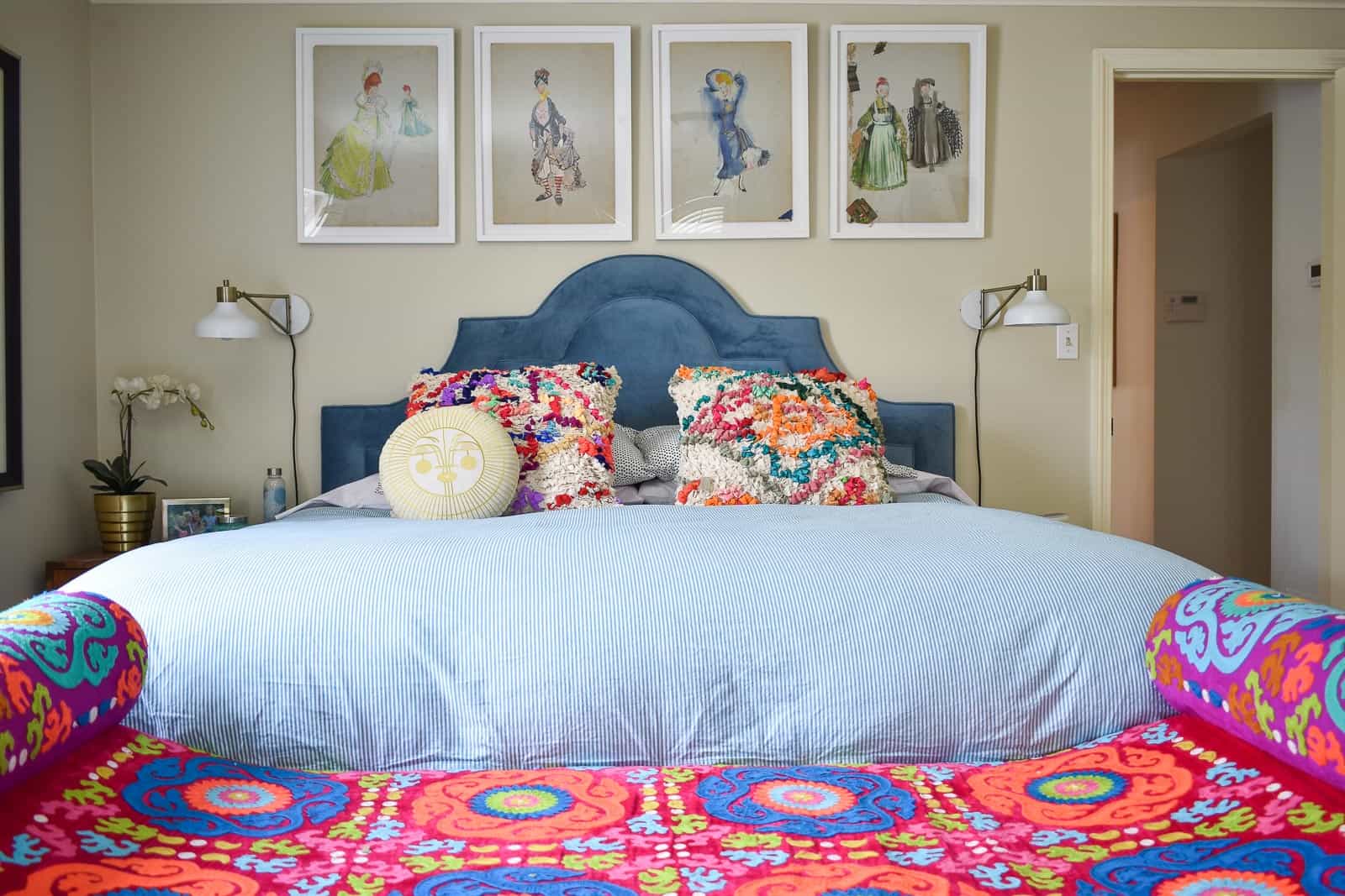
The walls in the rental are a soft beige. The headboard was also a neutral. But then I have this CRAZY bright bench at the foot of the bed. It felt like the headboard wall needed some attention in order to balance the bold bench… which is code speak for bring on some color! I should mention… the bench at the foot of the bed isn’t the *best* fit for this room… it’s too big for the space and a bit out of proportion, but it’s a rental so I’m doing my best to bring things together given the circumstances. Here we are mid-makeover. Already better but still some room for improvement. But I’m showing you just so you can see how ONE bit of color against the wall already helps balance the bench.
I loved the headboard for a few reasons. That blue is perfection. It’s actually not the exact same blue as the one on the bench, but they’re far enough apart that I think it works. I LOVE the shape of the headboard. It adds some interest to the wall and gives it a little more depth in my opinion. Finally, I love anything velvet so there’s that.
The headboard is slightly lower than I imagined (yes, dimensions are listed; no… I didn’t focus on them), but the universe was doing me a solid because the lower headboard meant that I had wall space to hang art. The old headboard was too high to allow for anything above the bed so that wall felt super bare!
You’ll have to come back for my post about those frames, but I love how they look hanging above the headboard. I shouldn’t point this out, but I opted to hang the frames over the headboard which means they’re actually off-center on the wall. Why you might ask? Centering the bed on the wall would mean it was SO close to the wall on my side of the bed, so I opted to keep my old nightstand and replace Mark’s since he has plenty of room on his side.
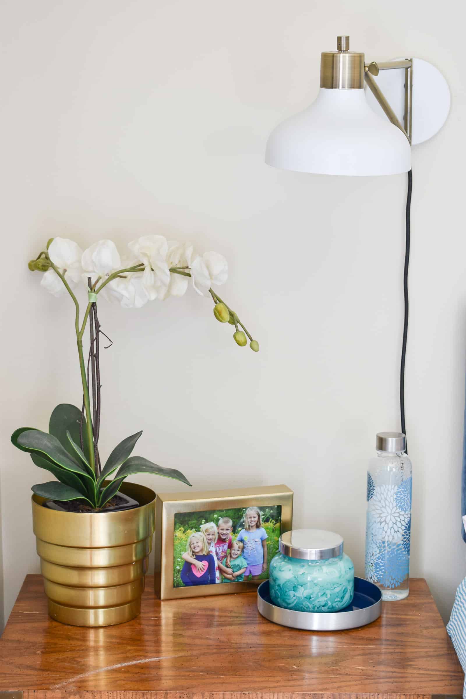
Another BIG change I made was ditching the table lamps and adding those fun sconces we had hanging in the old house. They’re plug-in so super easy to mount and they just help to fill out that headboard wall AND free up space on our nightstand.
Last but not least… I needed a new duvet. I grabbed this guy from Amazon and the simple stripe in the coordinating blue is the PERFECT style to mesh the headboard with the bench without being too busy!
To recap, without painting an inch of wall, I swapped out the headboard for this velvet blue one, added a new duvet, mounted the lights and hung artwork and it looks like an ENTIRELY DIFFERENT ROOM doesn’t it? Making a handful of simple design decisions made all the difference in the world and our master bedroom has secretly become one of my favorite spaces in the new house!
If you want to see some of the other spaces I’ve designed with the help of Raymour and Flanigan, check them out below:
I also am SO grateful to them for being such a generous partner for our Bloggers Heart Habitat spaces:


This room looks wonderful. As another color lover, I was wondering about the bench. I am new to your blog, so maybe you have shared the source before and I did not see it. Could you tell me where it came from?
Hi Ellen! The bench was something I couldn’t walk away from at Homegoods! I’ve looked for similar things to link for everyone and I haven’t had much luck! Good for me… frustrating for you guys, I know! :/
Wow, it is a great change! Funny how a few little things can make a room feel different.
Isn’t that so true??? I’m always amazed!
I LOVE the art!!! Where did you find/buy/make it?
I’m sharing about it tomorrow! Thanks!!
I love your fun whimiscal style. The colors are great and those frames look so nice above the headboard.
Thanks so much, Scarlet! I love these frames too!