
Mixing and Matching Color and Pattern
Psssst… this post *might* contain affiliate links: see my disclosure here.
Interior Color and Pattern Mixing
It’s no secret that I love color and I love pattern and I love texture. I am NO expert, but I get asked a lot about how I mix and match these elements in a space, so I thought I’d try and break things down a bit to shed a little light on my process!
Step 1. Balance the Room
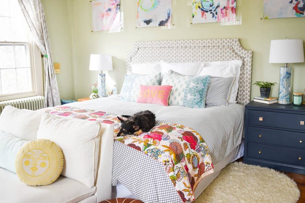
Design is all about balance in my opinion and I use these three elements to help keep the room even. In other words… if half the room is filled with dark rich colors, and the other half is more light and breezy… that might feel unbalanced so I’d bring some of those light elements into the dark side and vice versa.
Shop my favorites!
The same can be said about balancing pattern. If one textile is big bold floral pattern, then I combine that with something smaller and geometric. If one element is sleek and shiny metallic, then I might pair that with a more bohemian natural texture.
Step 2. Find a common thread
Color is an obvious place to start… If you find fuchsia pink curtains, then perhaps a throw pillow with that same fuchsia pink would match well.
Material is also a thread you could use to connect the space… shaggy throw blanket with a flokati rug perhaps? Metallic picture frame to complement that shiny planter? You get the idea. If it’s a focal point, I try to have one or two elements that relate in a space.
On a broader level, style might be something to weave in and out… love mid-century modern? Great, Pair that big bold patterned throw pillow with a graphic rug! Flea market signs with industrial thrifted bar chairs…
Step 3. Scale
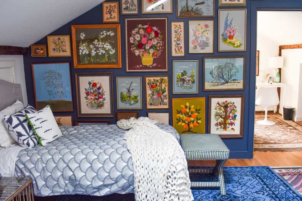
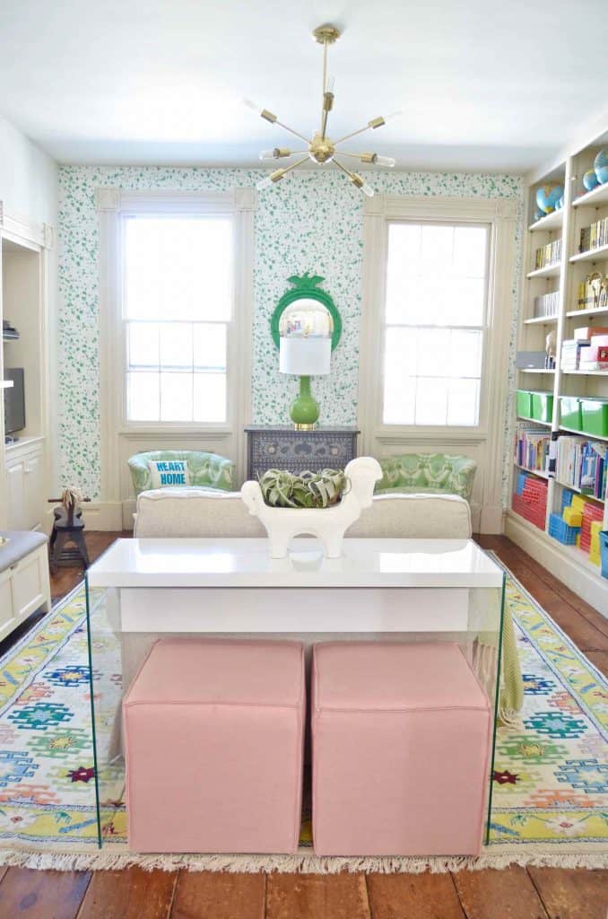
When mixing pattern, scale is super important. Remember when I mentioned balance? This is another way of achieving that. If one of the patterns in the room is big and bold, tone this down and pair it with something smaller and more subtle. In our playroom, we have a big bold colorful rug but I’m mixing it with that smaller single colored wallpaper. The colors play nice, and the patterns are a nice complement to each other.
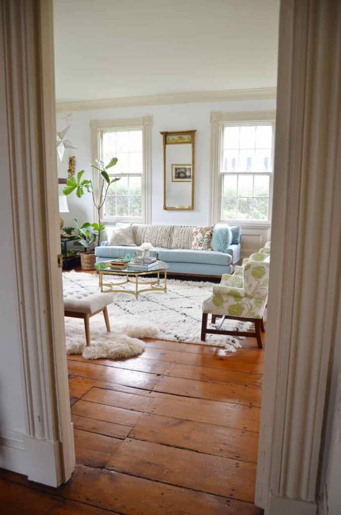
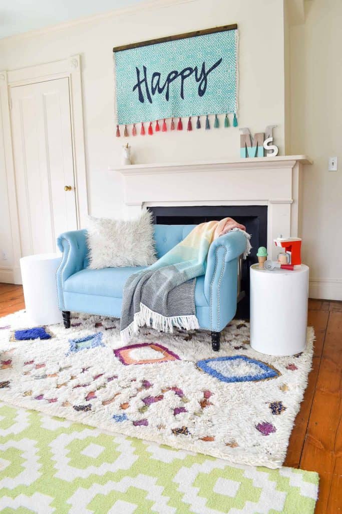
I love the way the smaller more boho pattern on the curtain panels contrasts with classic pattern on that throw rug. Again… the blue in the curtains works with the blue also present in the rug. The patterns complement each other
4. Let’s Talk Color
I know I called this post pattern AND COLOR mixing. I’ve talked a bit about pattern mixing and I’ve mention color when it comes to balancing the room… but I haven’t *really* talked about color mixing. So let’s get into it a bit. Personally, I don’t love ‘matchy matchy’ when it comes to color. That’s just a personal preference because I know TONS of amazing designers and stylists who use color symmetrically like ninjas. Blue lamps on the nightstands to match blue throw pillows to match blue armchairs. I approach color from a much more eclectic haphazard perspective.
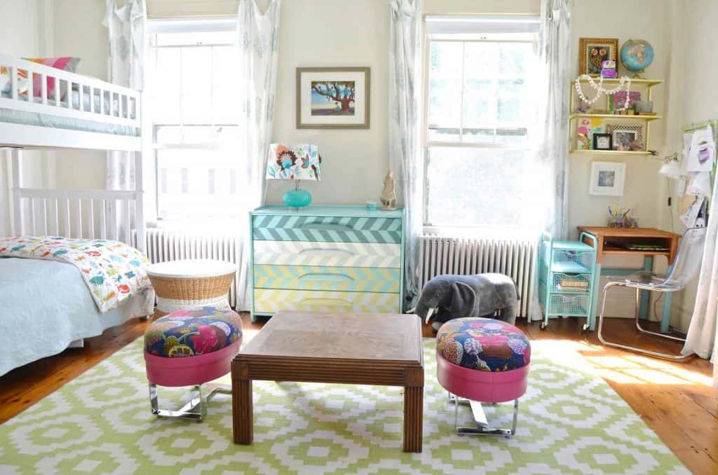
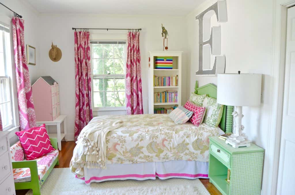
Despite how crazy and busy the girls shared room is, I do have a *slight* method to my madness. I try to choose two or three colors and bring them into the space a few different times. So above, that aqua blue and that green come up in a few different places. But Charlotte… there’s a big ol’ pair of bright pink ottomans… those don’t fit in at all! Yep. Ya got me. I just loved those and figured the room was crazy enough that I could make it work! There’s *some* pink in the throw pillows and wall hanging, but this is where I say: it’s YOUR space so do what brings you joy!
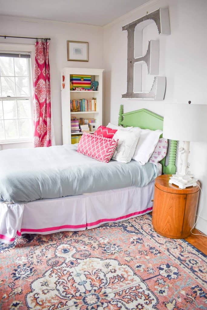
Here’s a quick example of a space that’s NOT working for me just now… I have a new rug for Eleanor’s room. Her room used to have some pops of green throughout. Now that the new rug brings in navy, it feels like too many disparate elements all in one space. Because there’s so much pattern already in the space, I’m going to get rid of that green and try to neutralize some of the tension between the colors.
I’m sure this post isn’t a perfect tutorial for mixing and matching colors and patterns, but perhaps it lays out a few parameters that are helpful. For me… I am never sure whether the ‘mixing and matching’ I’m doing is crazy or cool but I kind of soldier on anyways. I live with it for a bit and see it I love it or if it makes me crazy. And then I change my mind and move things around. Obviously there are bigger things when it comes to design that you DO want to have some reasonable confidence with, but… deciding whether a rug will go with a throw pillow is easy enough to change your mind with down the line. Start small… with something that can be removed. See how you like it. Take some chances. And, again… just TRY! You never know…

Don’t Miss Out
Become An Insider!
Signup for exclusive tips, and tricks from Charlotte’s House!
Let’s chat!
I love comments from you, so feel free to leave your thoughts and ideas below! And don’t forget to follow me on Instagram for even more!