
Paint Colors in Our Home
Psssst… this post *might* contain affiliate links: see my disclosure here.
All of the Paint Colors in Our House
Today I’m sharing the various paint colors I’m asked about the most!
How to choose the perfect paint color:
As much as I LOVE color, the irony is that my love for color often means my wall colors are white. But after a year in our current house, there are some paint colors I’m asked about all the time so I thought I would put them into one post for easy reference. A quick note about choosing paint colors… with ONE exception*, I’m more of an impulsive paint picker. I still go through the motions of choosing paint samples, but I also find that the more you stare at a wall of paint samples, the more they look simultaneously different and the same. With that said, here’s my cliff notes for how I choose paint colors and which ones I have used in our current house.
Shop my favorites!
1. Find a reference point if you can. 9 times out of 10, I choose a color that exists somewhere else in the room. Maybe a wallpaper or a rug or a fabric. Can the walls be their own exclusive color? Yep. There’s an exception to every rule, but for me… I find that having my colors present throughout a space is my preference.
2. Trust the experts at the paint desk. Pete at my local Home Depot is my go to for all paint questions. Not sure what finish to use in a storage space? Ask the expert. How to prime a bathroom cabinet? Ask the expert. Painted patio? You guessed it: expert.
3. Bring a sample into the space. Whether painting a swatch on the actual wall or painting a piece of foam core, seeing the color in the actual space is essential. Colors can look so different depending on how much light is on them and what other colors are adjacent/ in the same space.
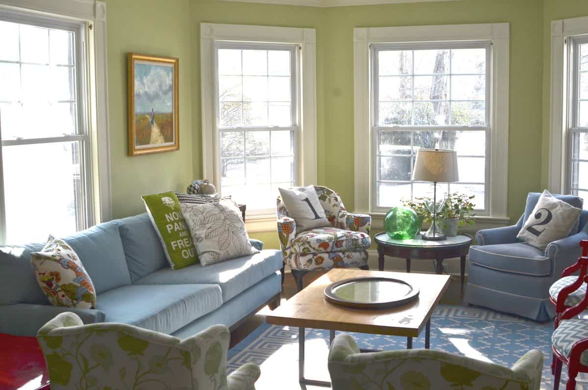
4. Repeat after me: mistakes will happen. It is *impossible* to tell how a room full of color will look until you have… a room full of color. No matter how confident you are in the shade or the tone or the saturation, don’t beat yourself up if you get it up on the wall and it’s just not right. Take some time to feel sorry for yourself and the time you just spent painting. And then get back on the paint horse and try again. (I give you this green paint I used in our first living room… I actually didn’t mind it at the time, but now… too green!)
Paint Colors in Our Home
Without further ado, here are the paint colors I’ve used throughout our house! First, let’s start with the neutral ones: white.
Neutral Colors:
Benjamin Moore’s White Dove is my go-to white. It’s got a tiny bit of warmth to it so if you prefer something cooler… this might not be the one for you. I have a color match for BM White Dove in our family room here.
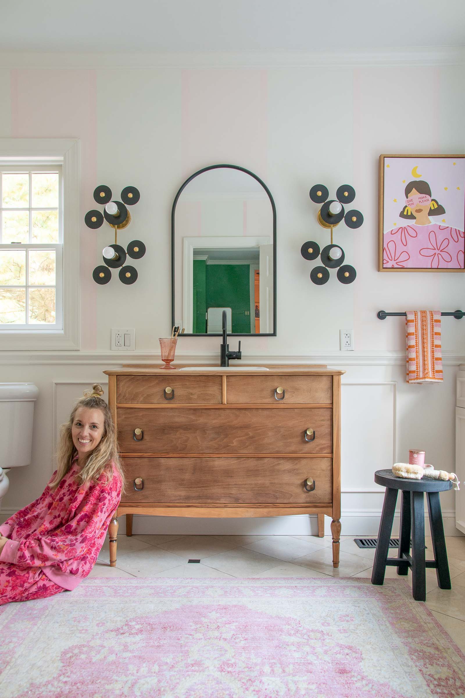
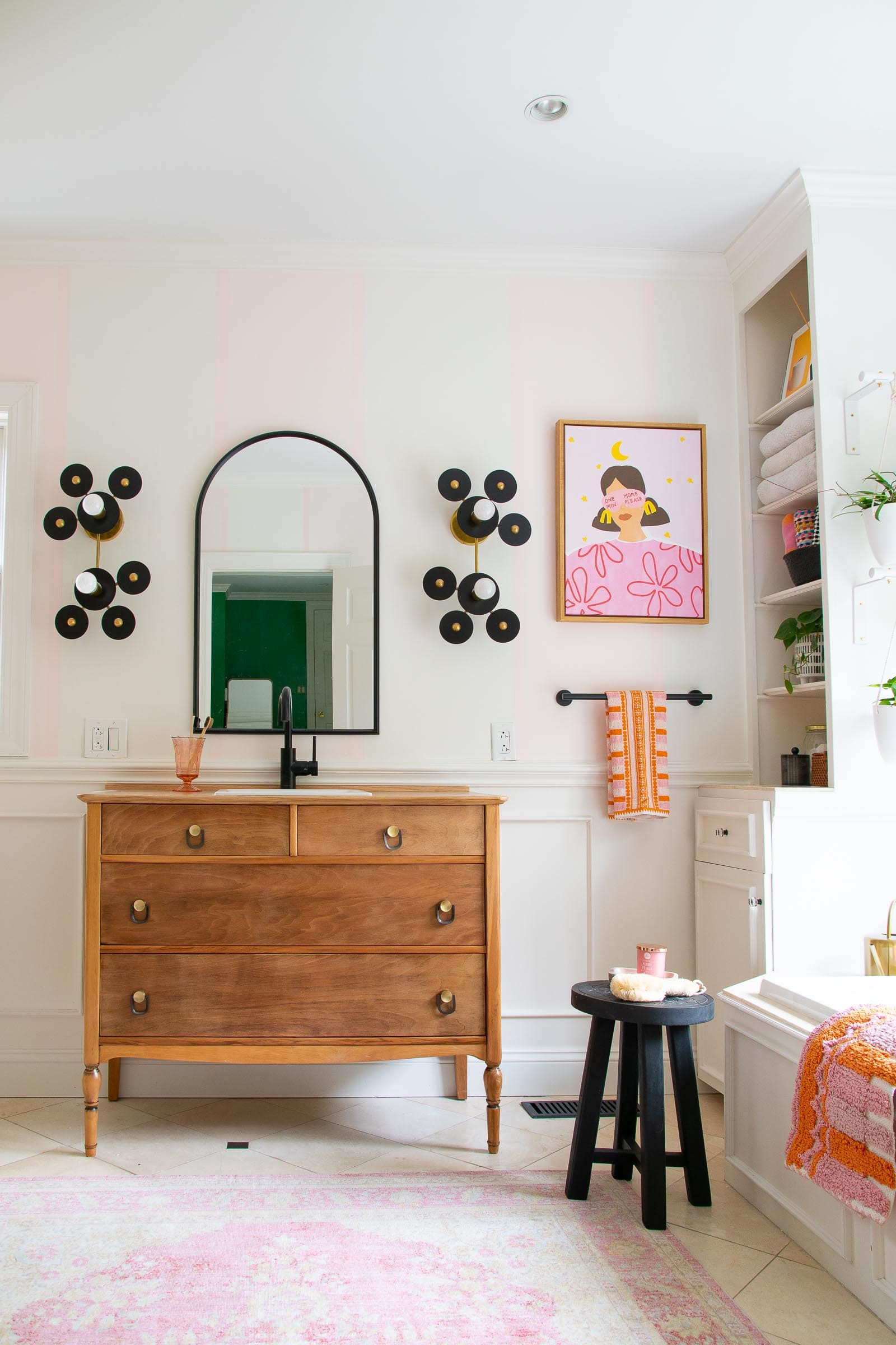
Other places I’ve used White Dove? The stripes in our primary bathroom:
I also used it in our family room here:
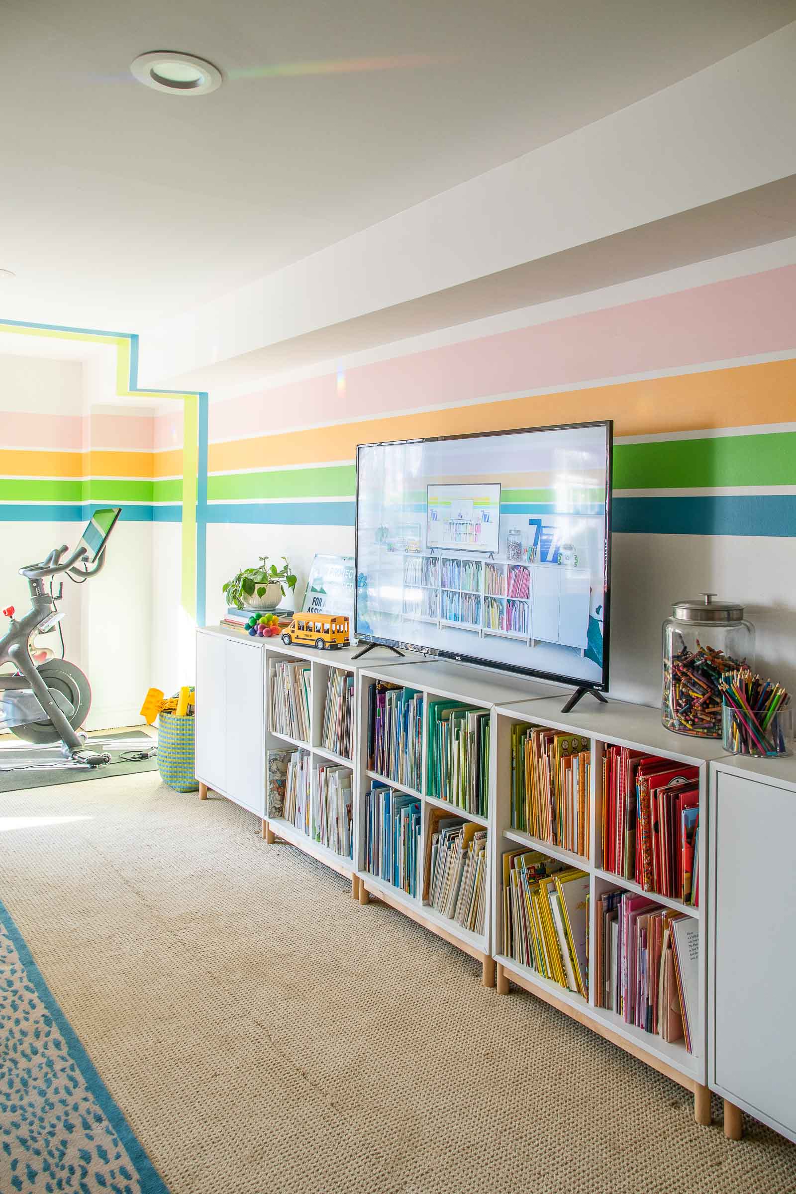
In our basement playroom, I used BEHR ULTRA Scuff Defense in Whisper White. This is a bit cooler and was one of their 2022 color’s of the year. The stripes are also BEHR paint: Pink- Cupcake Pink, Orange- Mango Nectar, Light Citron Green (vertical stripe)- Carolina Parakeet, Blue- Explorer Blue, Darker Green- Apple Orchard.
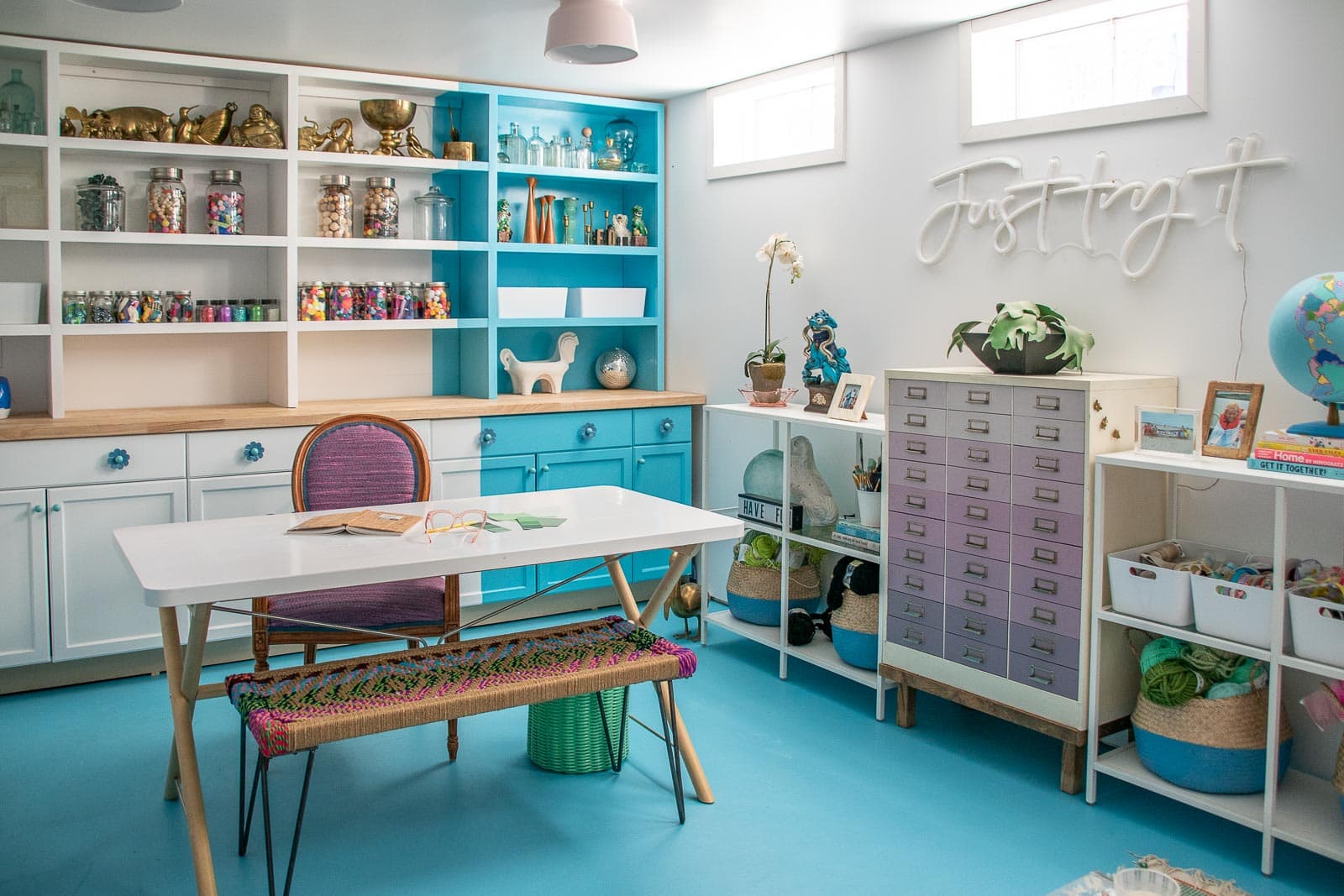
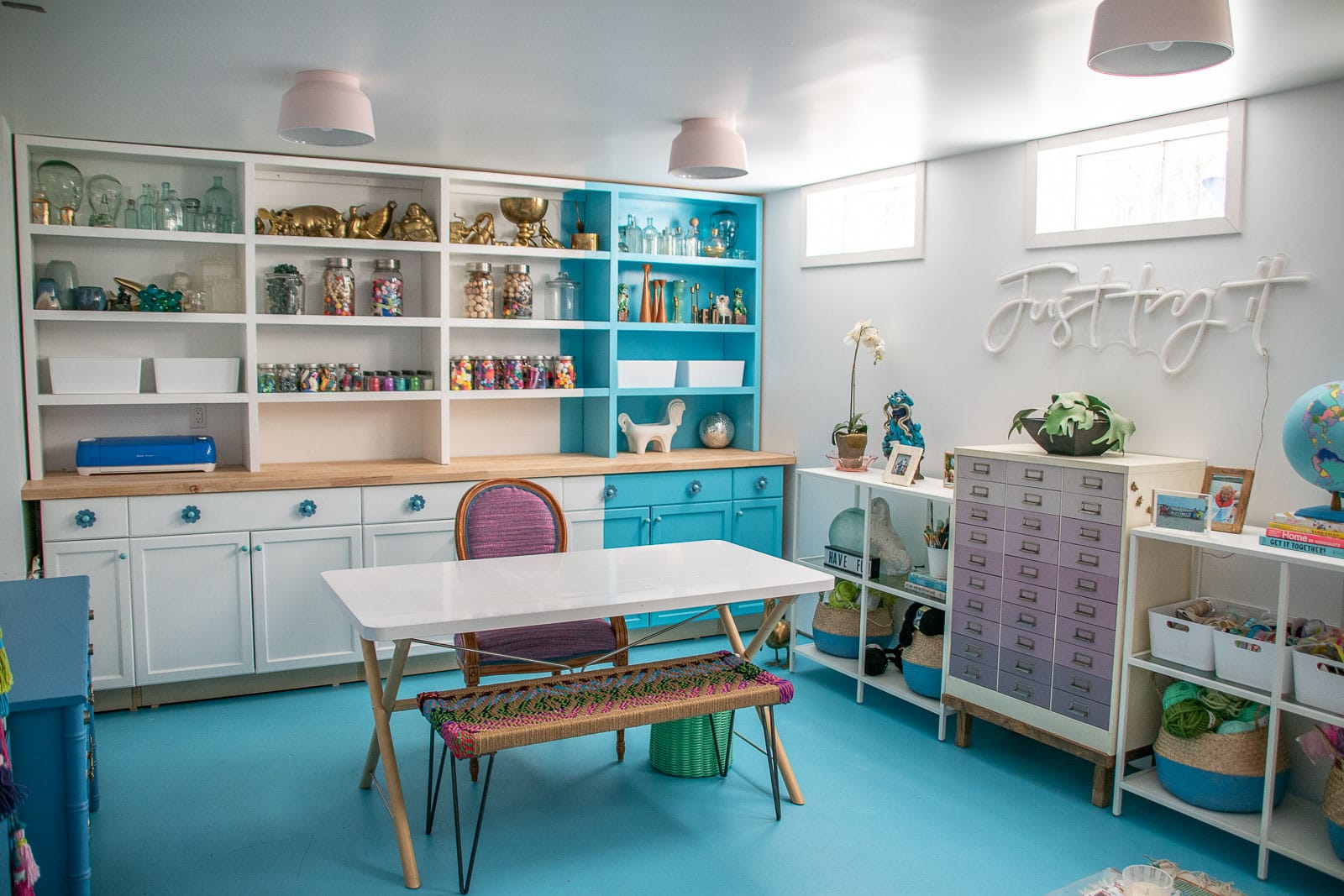
Other places I’ve used Whisper White? My office shelves.
 Bolder Colors:
 Bolder Colors:
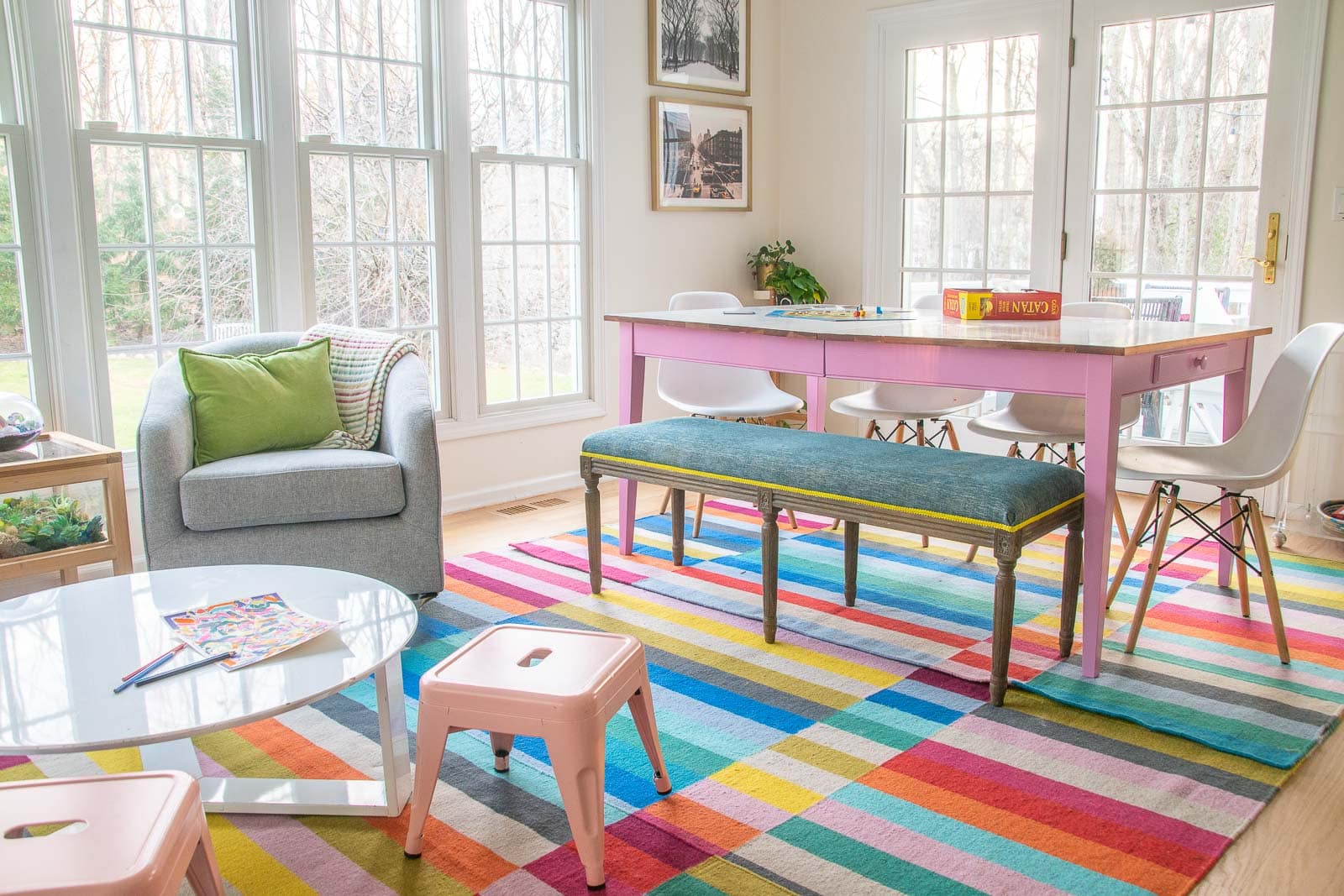
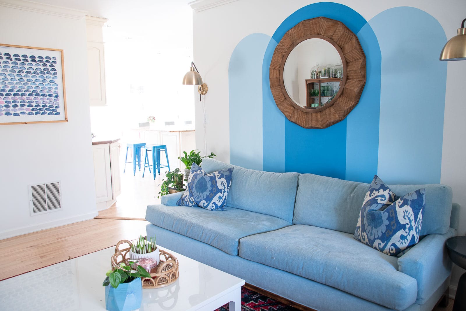
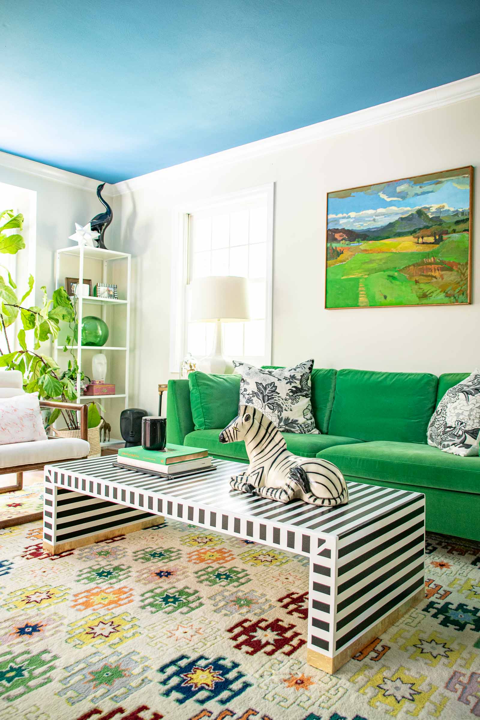
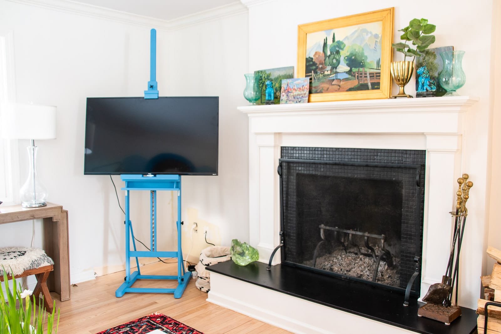
I didn’t repaint the living room walls so I’m not sure what color they are, but I DID add a fun pop of blue paint to the ceiling and it’s one of my favorite blues: BEHR Jet Ski. It’s here in the living room and also the accent wall in my Frogtape Paintover Challenge space shown below also.
Finally, I used it here on this DIY TV easel:
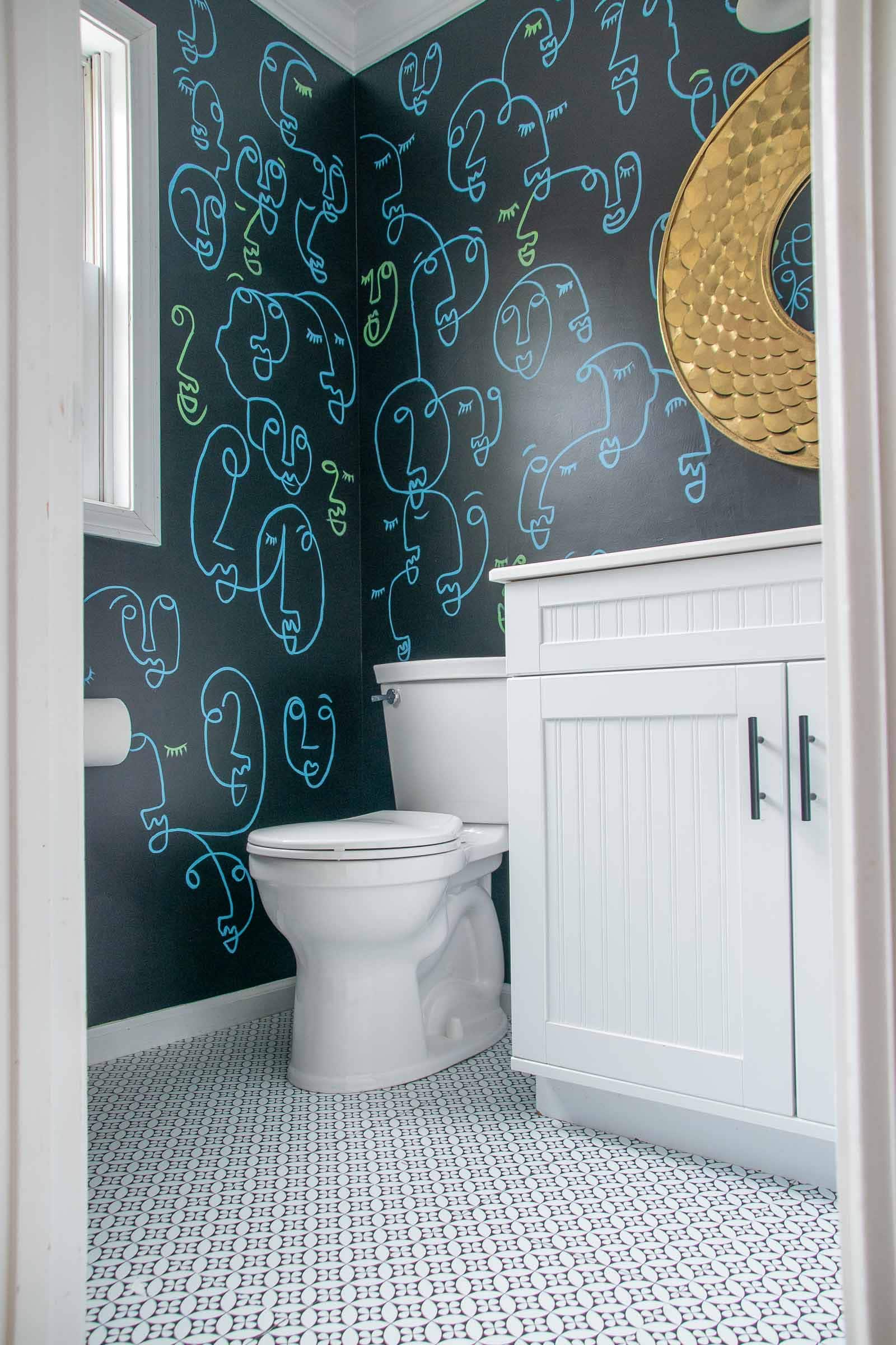
I don’t have a ton of black in this house, but I do have one room- our downstairs powder room. Here I used BEHR Limousine Leather. The blue and green faces were leftover paint from our outdoor playground.
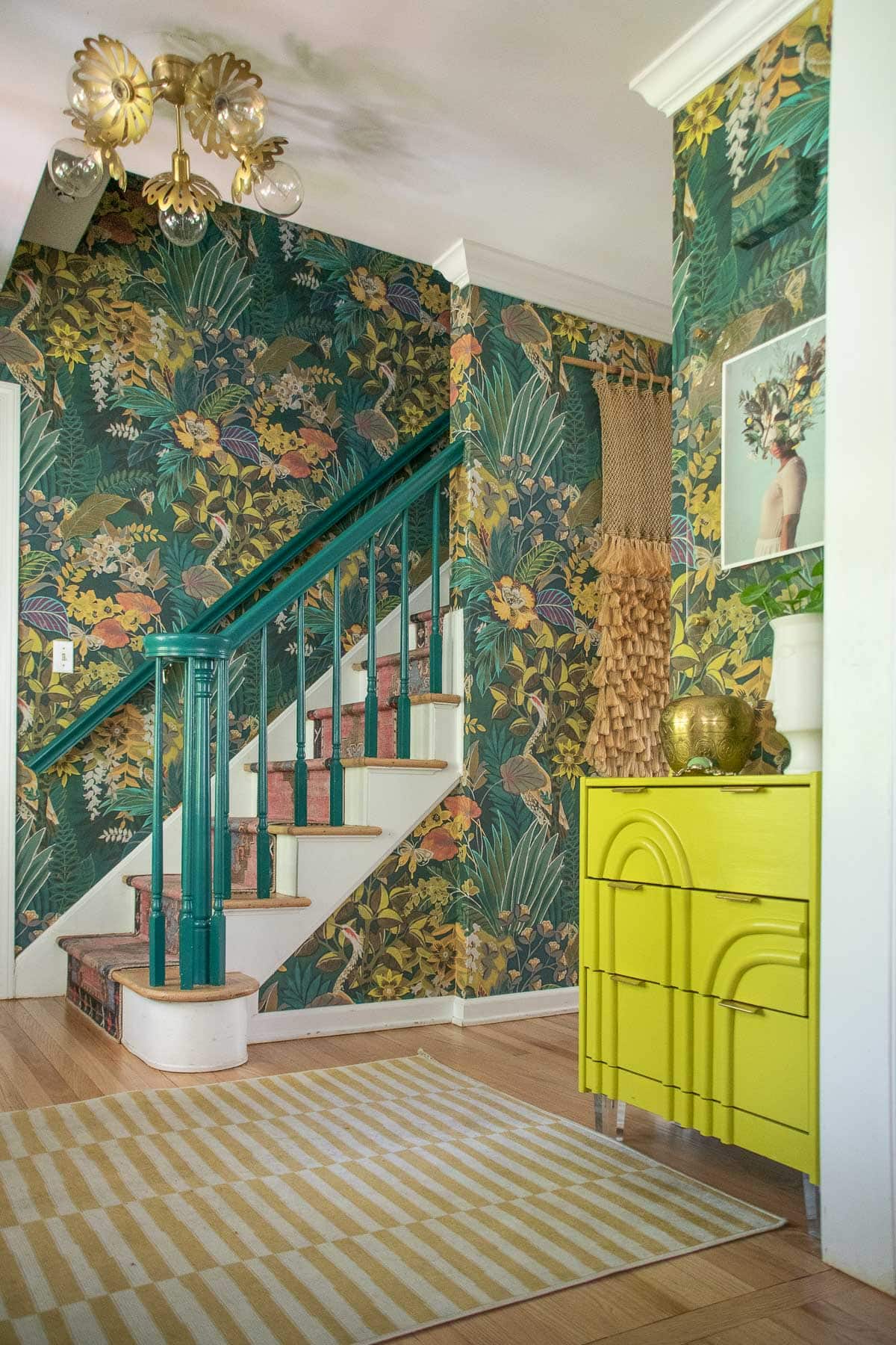
I painted our stair railings to match the new foyer design and it’s not a a huge focal point for the space but it’s also a lovely color: BEHR Beta Fish. I’m often asked what color that foyer table is and sadly…. it’s a custom mixture. The base color is BEHR Luscious Lime if that helps.
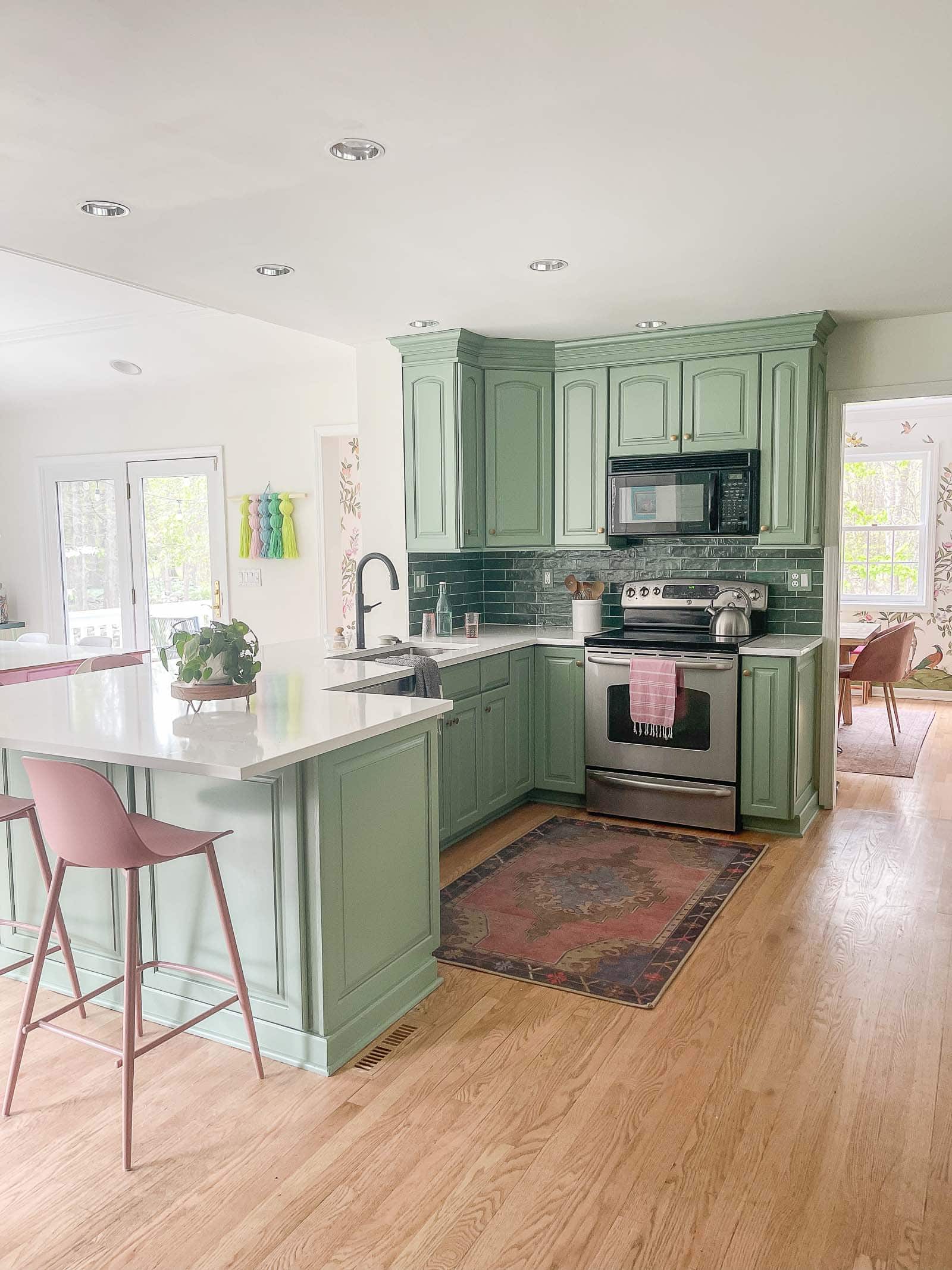
The final space downstairs that might just be the most awaited green in our house is… our kitchen cabinets. After sample after sample, I decided on Benjamin Moore’s Summers Day. I pulled almost 2 dozen samples for this space and even still it’s not exactly what I envisioned. Don’t get me wrong… I LOVE the color, but my vision was actually for a slightly darker, more saturated, shade. I was actually worried this green would be too dark which just goes to show how 2 foot sample can still be deceiving.
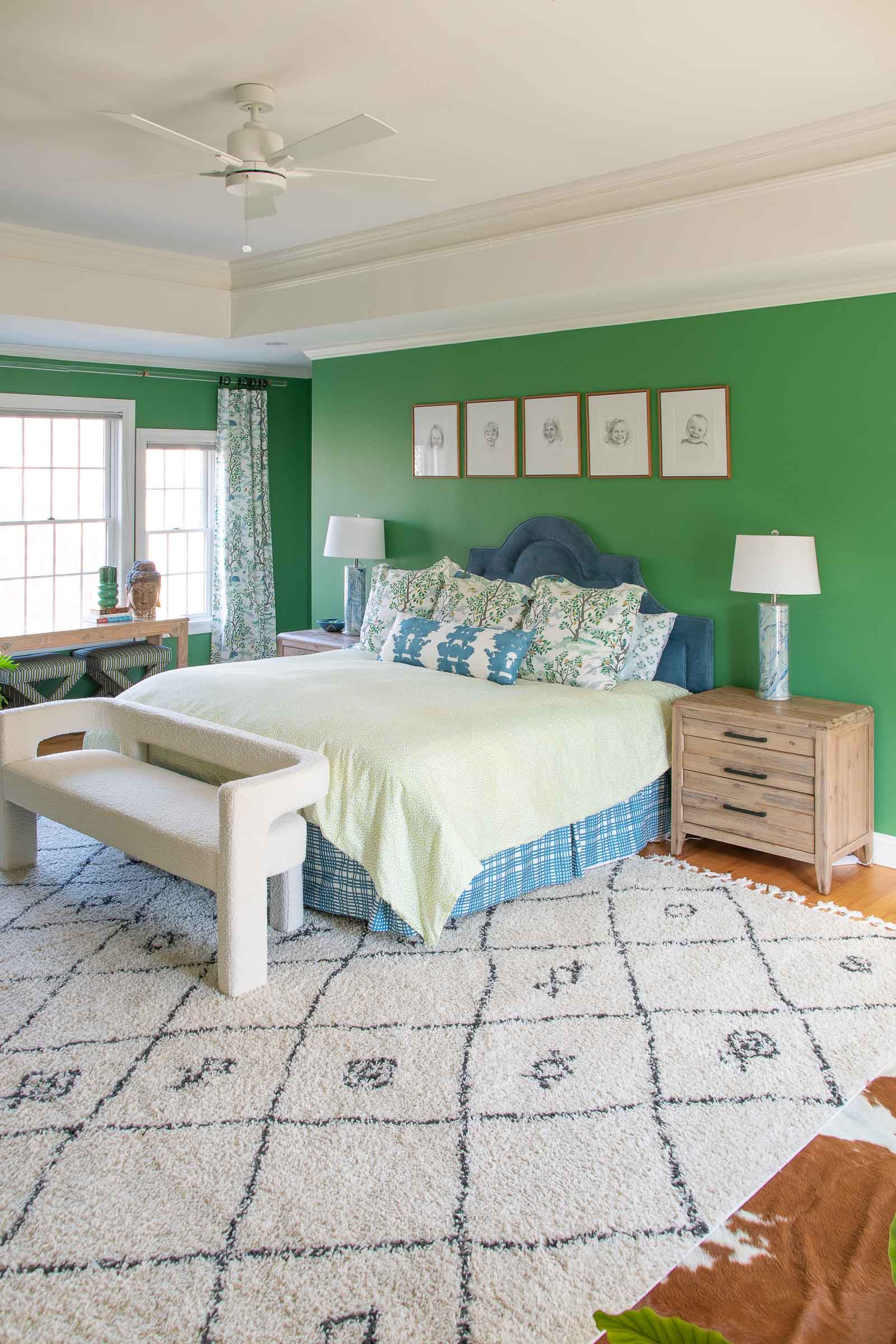
Another rich saturated green in our house is in our primary bedroom. I fell in love with Clare Paint’s Matcha Latte and went against all of my own advice and just ordered it. This color in particular is so complex and changes depending upon the light… at times more vibrant and at others more somber. But I love it and it made this really large room feel a bit cozier and more intimate.
Next to our bedroom is our primary bathroom where I had another wrestling match with paint trying to find the right pink for those stripes. I wanted something pink but not too pink. Bright but not too bright. I painted these stripes a few different times and finally settled on one color pink for the inside of the stripe and then a darker shade for the outside edges. The darker shade is BEHR Pink Elephant and the lighter inside shade is Pink Elephant mixed with White Dove from the walls.
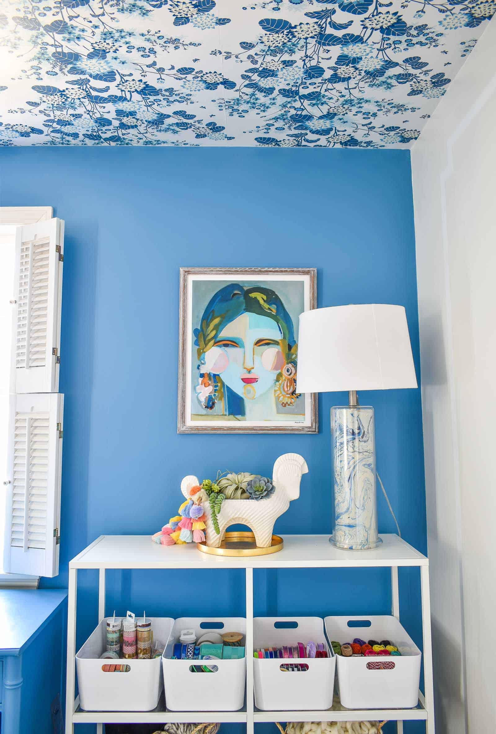
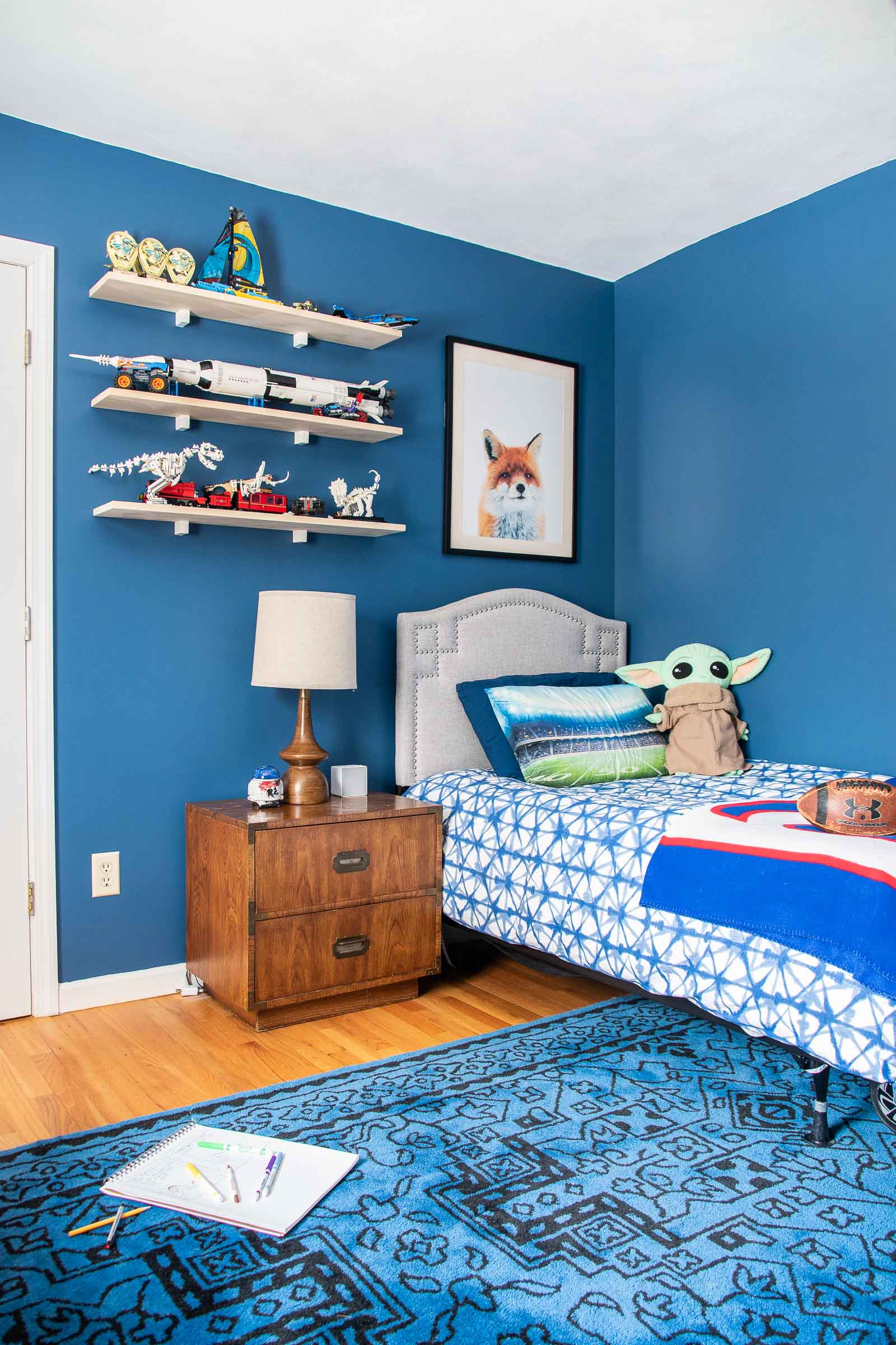
Another color you won’t see very often is the navy blue in Oliver’s Room, Clare Paint’s Hyperlink. It’s a dark rich navy but still full of saturation which I love.
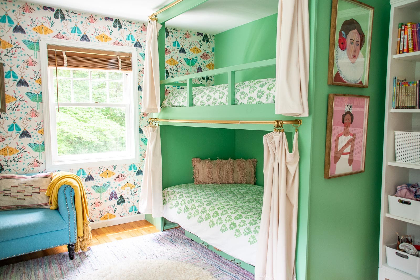
Last but not least… the sweet green I used for the girls’ bunkbeds is BEHR Garden Swing. I wanted to pull the green from the wallpaper and this is the perfect match.
My latest color selection is the blue I color drenched the girls’ shared bedroom. That’s Benjamin Moore’s Slate Blue. It’s the perfect shade of blue for the girls to grow with.
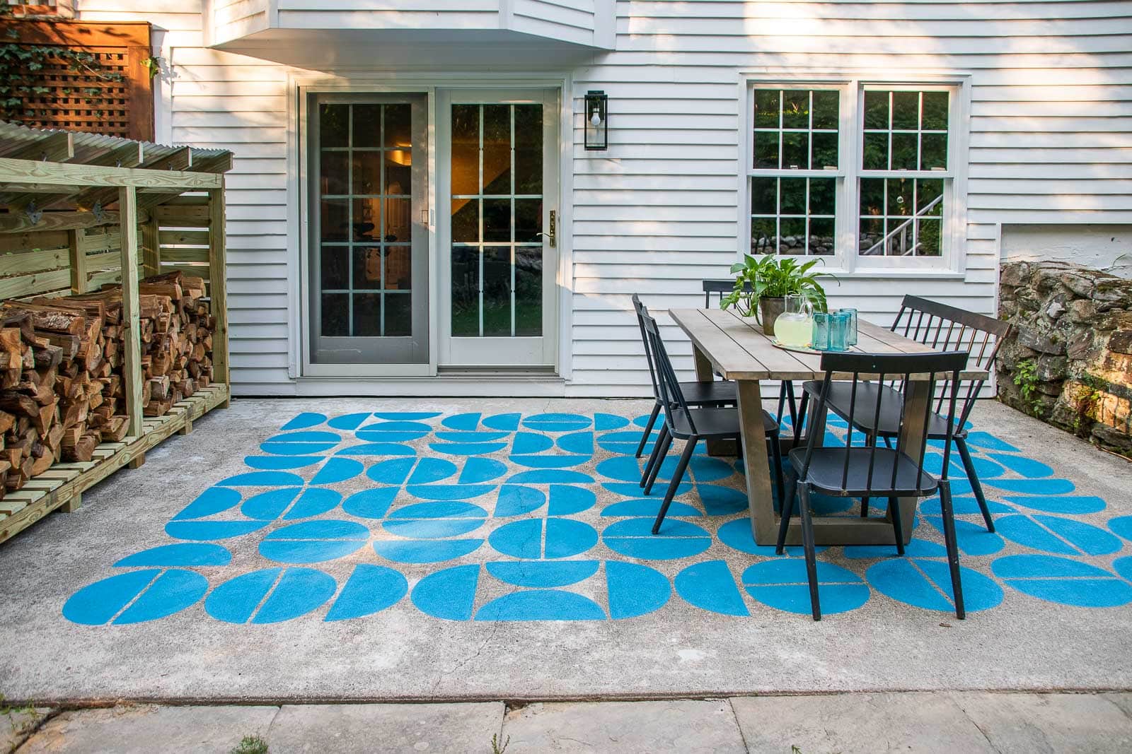
We don’t have any fun colors outside really, except for this painted patio which is BEHR Valley of the Glaciers.
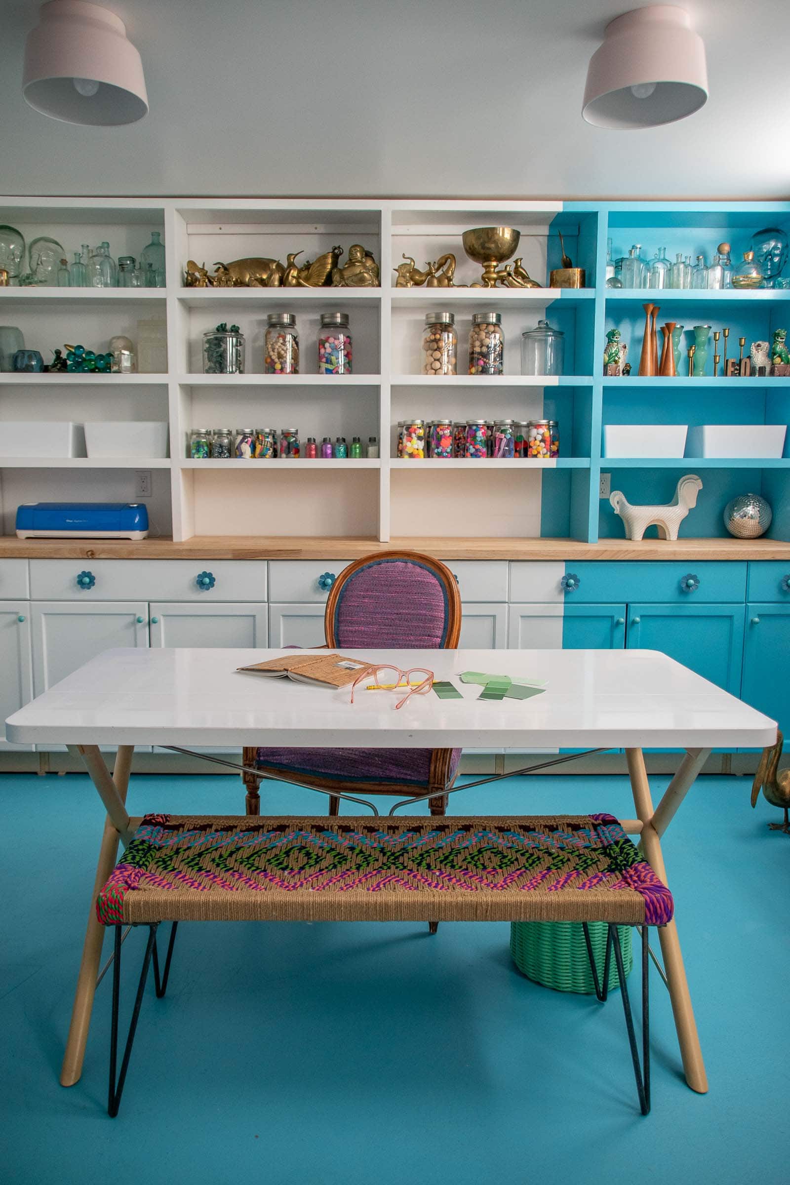
I thought about skipping this color because I mixed in a small amount of Valley of the Glaciers leftover from the patio to tone it down a bit, but the base color for my office floors and the stripe on the bookshelf is BEHR High Dive. Without mixing in Valley of the Glaciers I was worried it would be a bit too aqua, but toned down I love it!
If I make any other paint choices in this house, I’ll try to update them here. For any accent colors, click on the link to each room and hopefully I’ve shared the full array there, but please leave me a comment if there are any colors I skipped here!

Don’t Miss Out
Become An Insider!
Signup for exclusive tips, and tricks from Charlotte’s House!
Let’s chat!
I love comments from you, so feel free to leave your thoughts and ideas below! And don’t forget to follow me on Instagram for even more!