CURRENT HOME TOUR
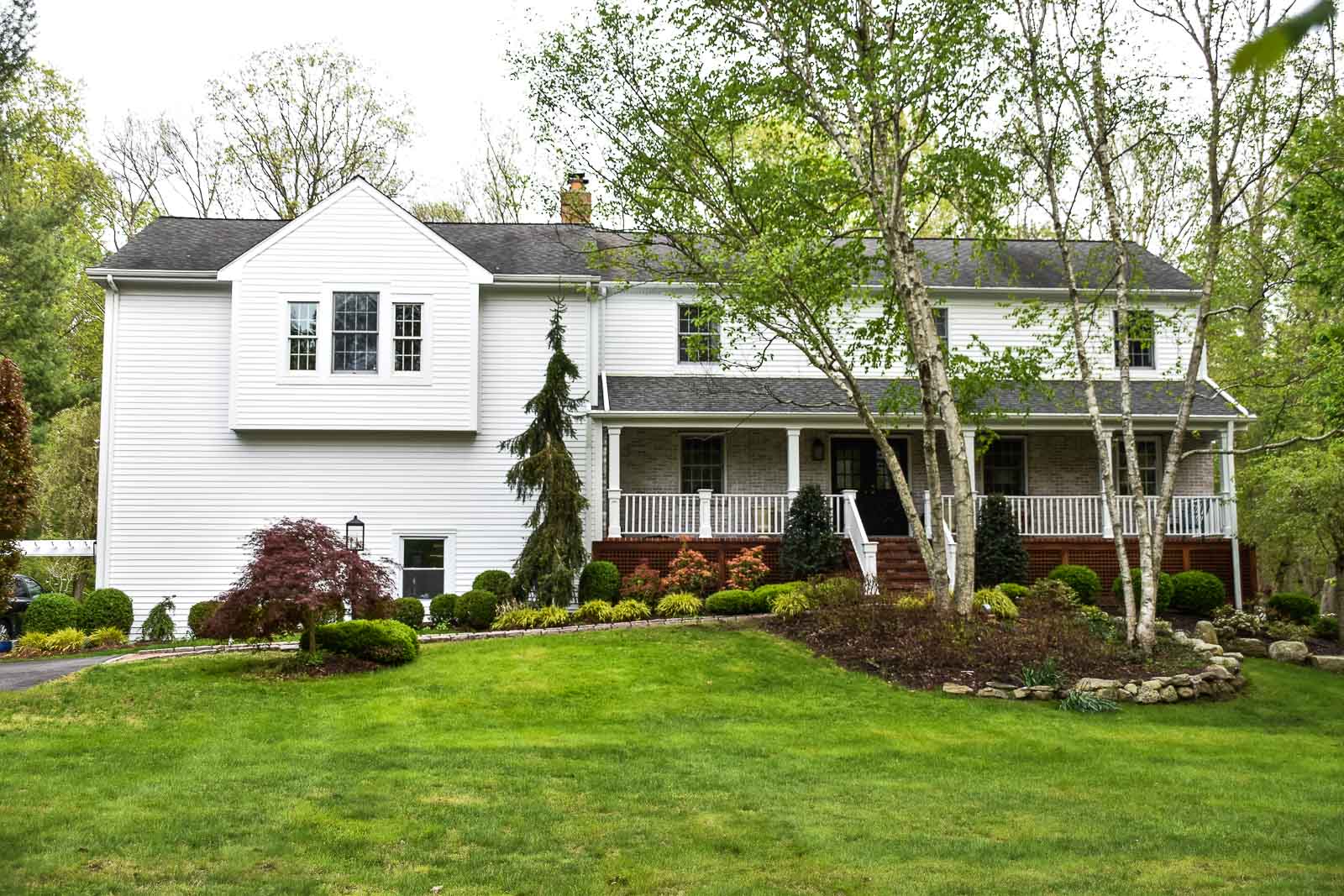
In the Fall of 2020 we moved into a new home. Here she is!
The year is 2020. After being told that our landlord at the Rental Home was putting the house on the market, we scrambled and miraculously found a house that not only fit our family but also our budget. Shout out to the previous potential buyer who walked away because I’m sure that’s one of the only ways we were able to make this happen. We moved in the day after Thanksgiving and I’ve been adding color and fun to each room ever since!
Exterior
Paint was the biggest update to the exterior and it makes such a wonderful difference. I’ve replaced the exterior lights as well and the new more modern sconces are also a huge improvement. I have some brackets to be installed below the bump-out so tune back in to see how those look.
 Front Foyer
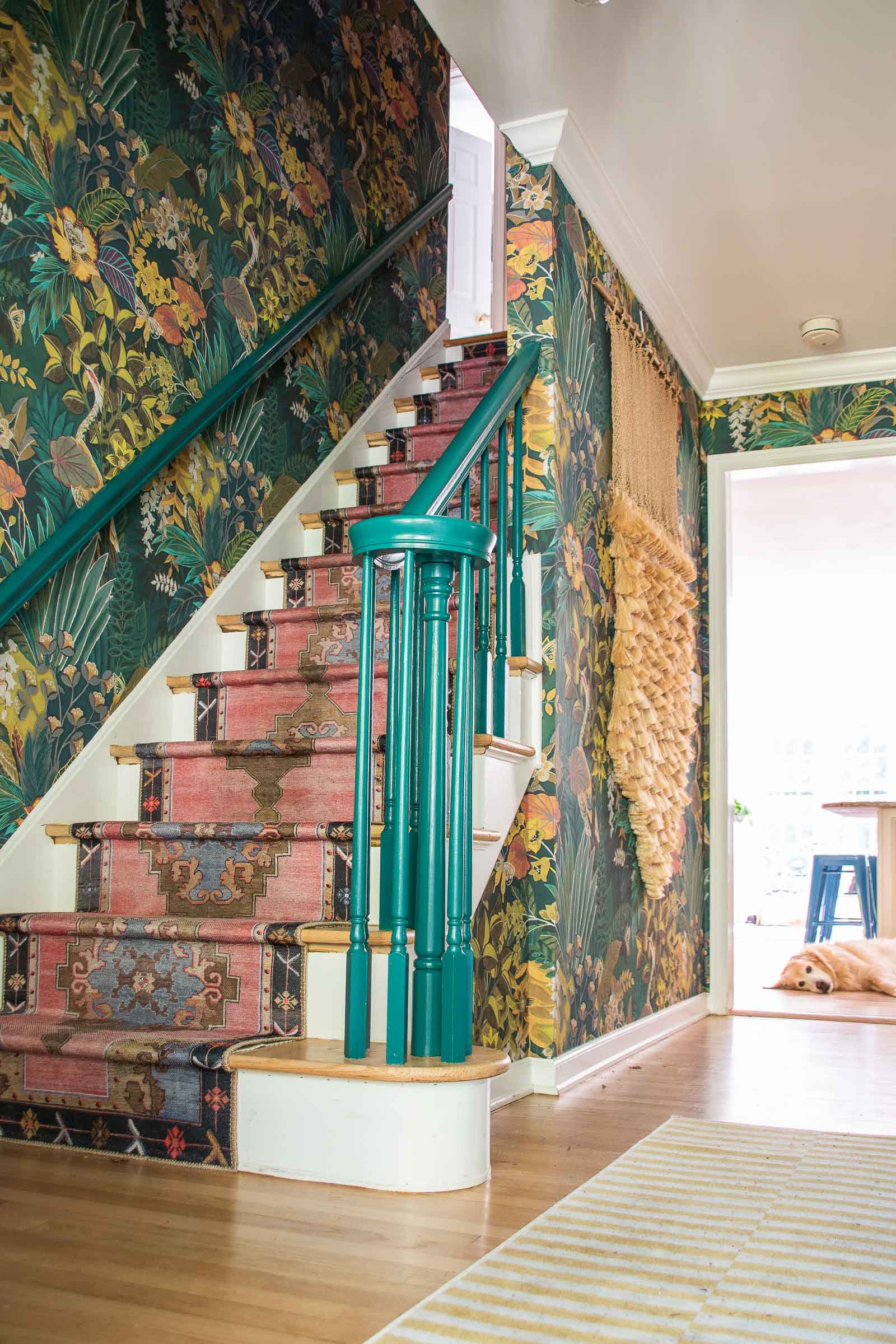
This foyer is small but she will be mighty. I replaced the foyer light, hung a floating acrylic frame over that Ikea hack dresser and then added a stair runner. Still to come? WALLPAPER. It’s going to be good. Very very good. Update… as you can see in the photo below, we have wallpaper! Click the link for sources!
Living Room
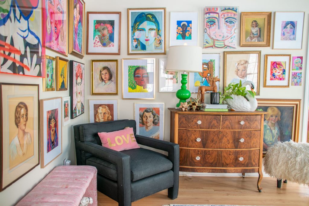
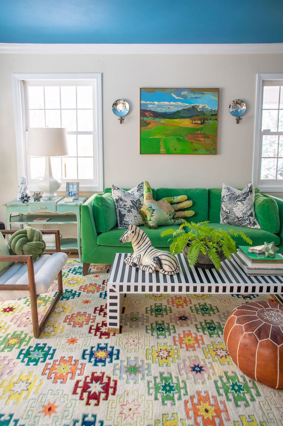
There were a few rooms in our house that came to me right away. I knew I wanted an epic gallery wall filled with my favorite portraits, and I also knew I wanted a painted ceiling (Behr Jet Ski). We had most of this furniture already, including my favorite $40 refinished dresser.
I ended up building this coffee table and adding some of my other quirky DIYs (like this DIY sheep!) and it’s my favorite room in the house… mostly because it’s usually clean without any socks on the floor. I also reached out to my friend who is magazine stylist and asked him to share some tips for styling.
Kitchen
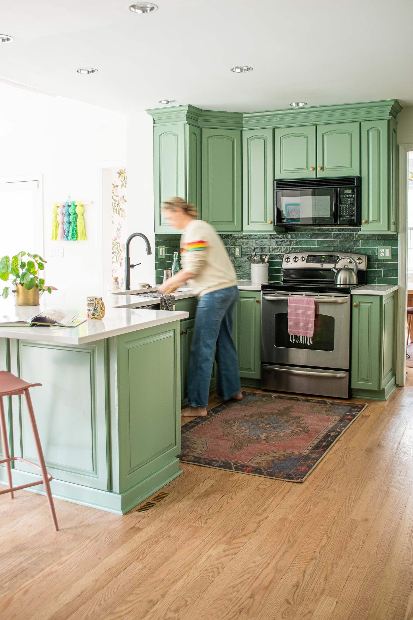
The kitchen was the most dated space in the house when we bought it. Dreary beige tiles, aggressive ivory cabinets, and an awful brown granite counter. We didn’t have the budget to demo the whole space so we tackled it was best we could cosmetically. New counters, a new grown-up sized sink, painted cabinets and the space feels entirely new for a fraction of the cost!
Dining Room
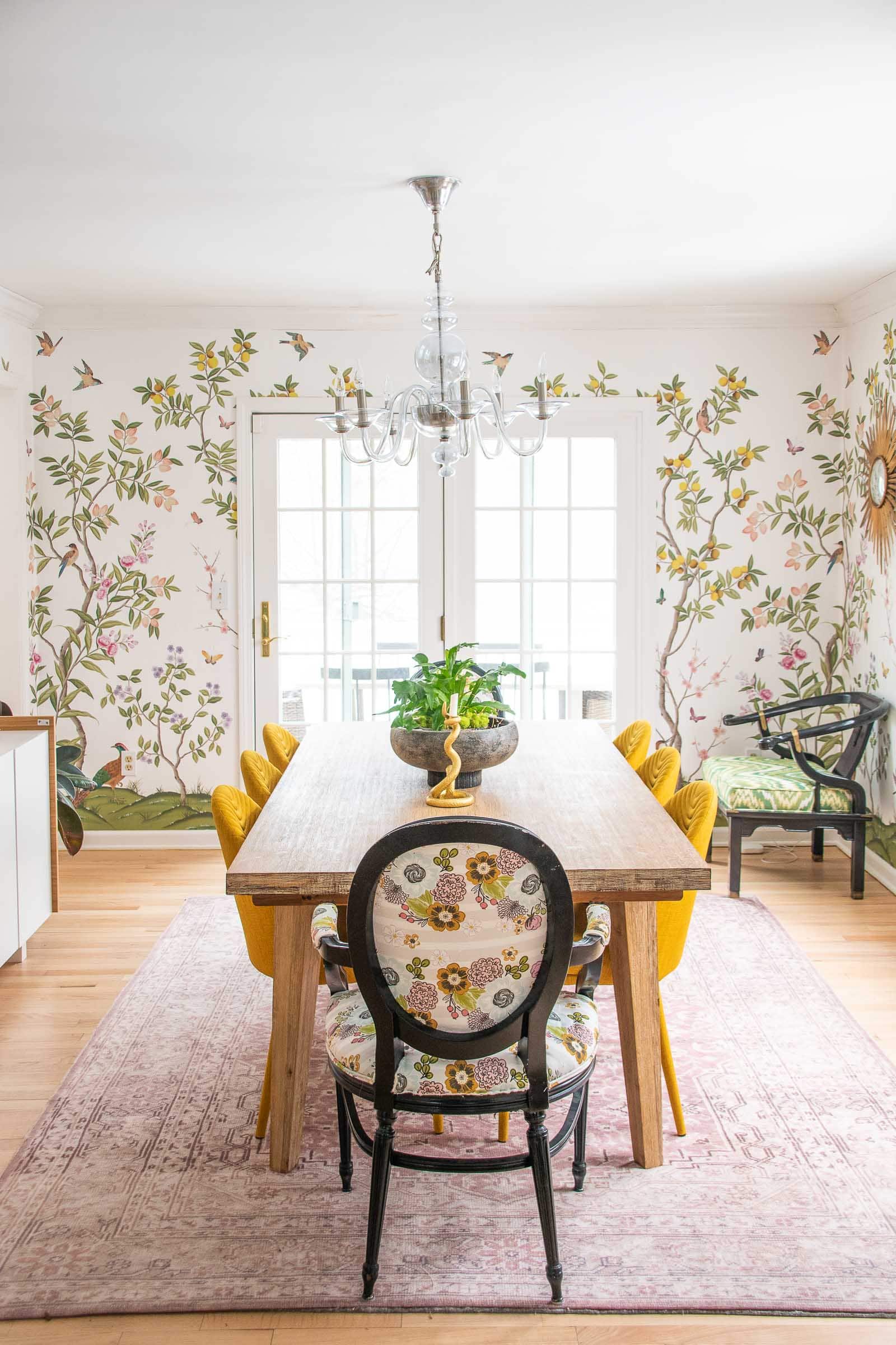
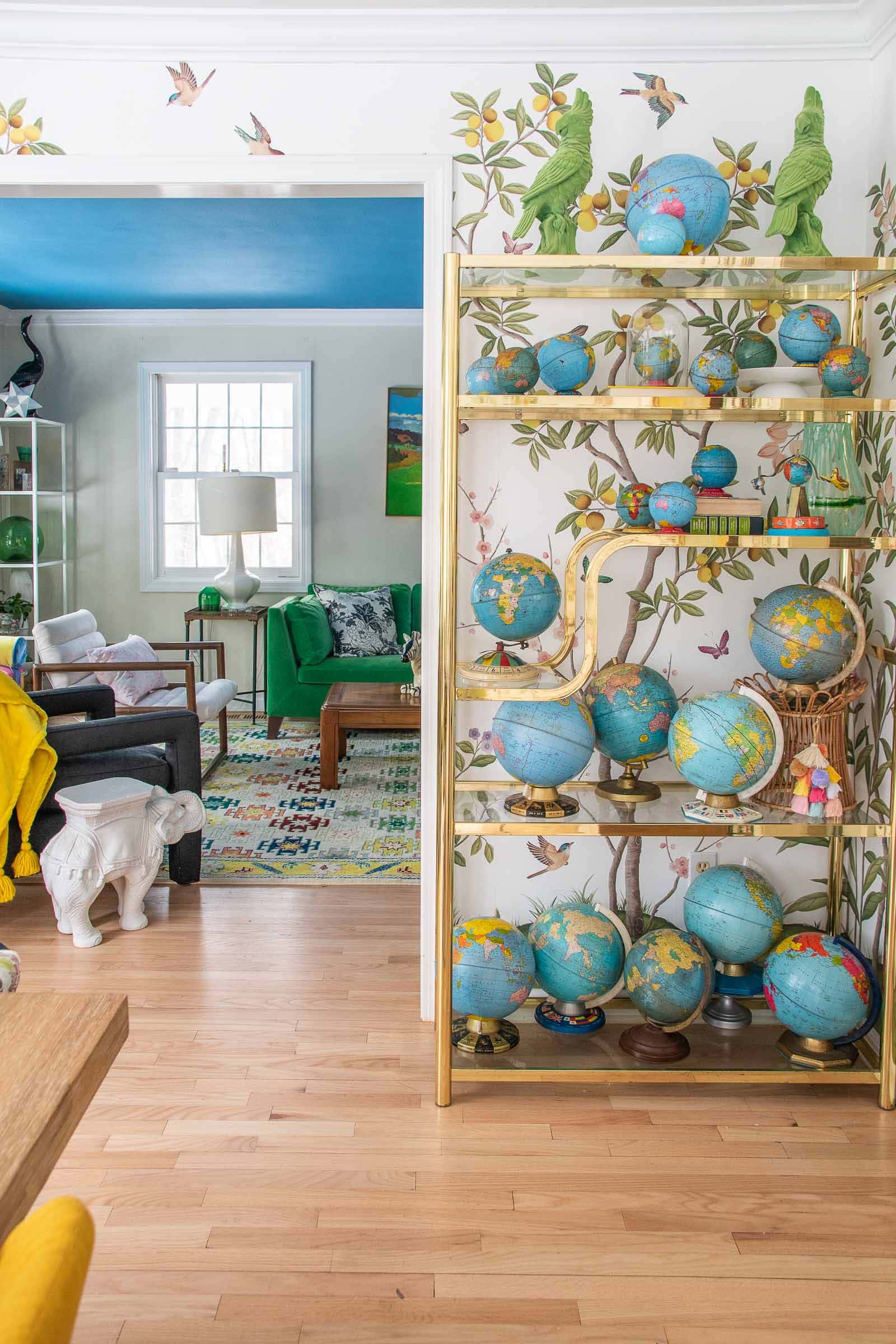
This dining room didn’t need much, but turns out a gorgeous wall treatment is enough to push it over the edge. I hung the incomparable Diane Hill’s chinoiserie mural by Rebel Walls and I could not love it more. Lots of this furniture was linked in my One Room Challenge post at the old house from when I was a featured designer, but there’s also a smattering of flea market/ thrift store love with the black side chairs, the brass etagere and my vintage globe collection.
Family Room
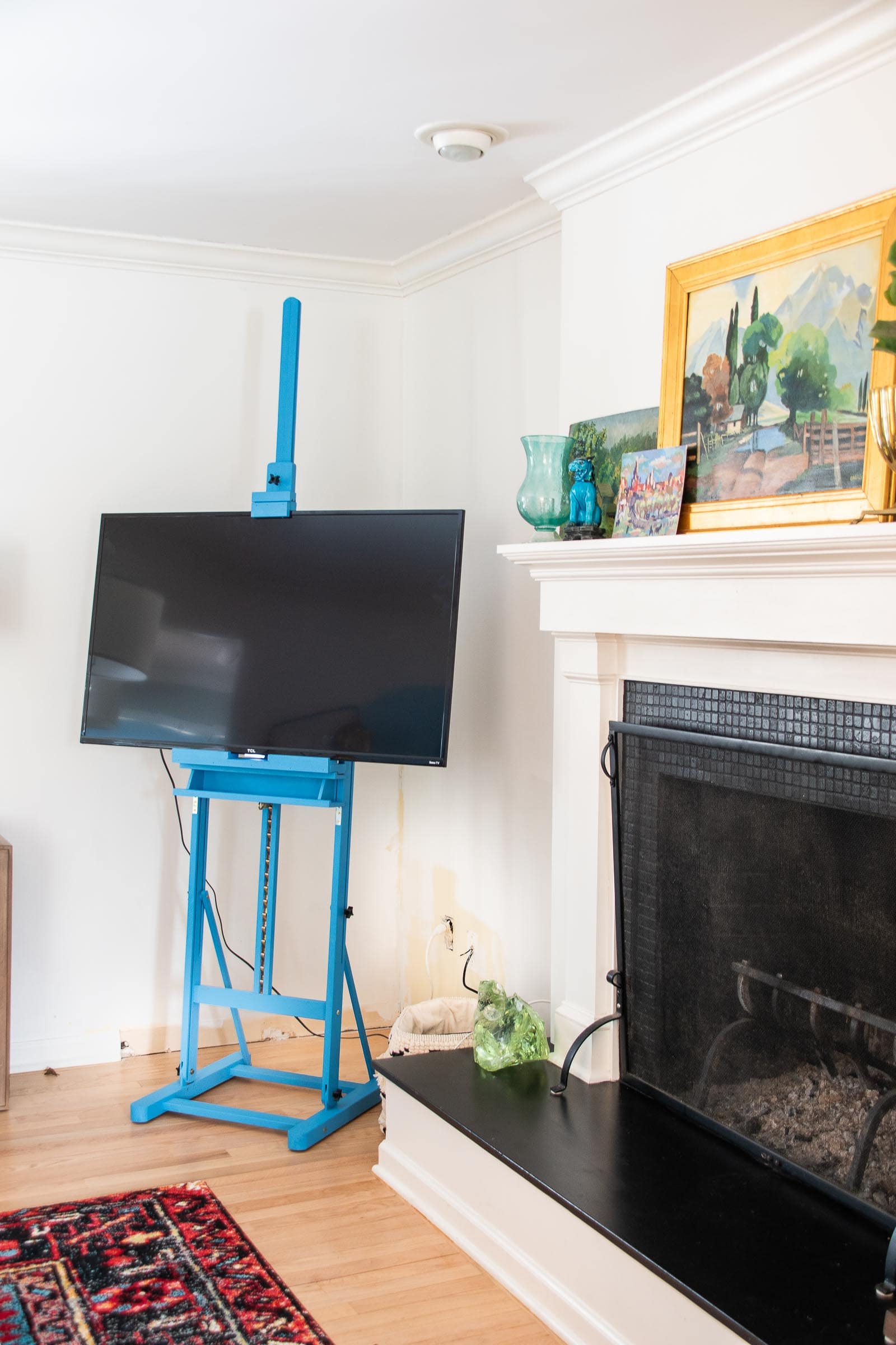
This space gets a TON of action because both our television and our fireplace are in here. It’s one of the smaller rooms in the house, but it’s cozy and colorful and I’ve been able to pull it together with a few simple projects. The first project in the space was this painted inexpensive art easel that I turned into a colorful TV easel.
Next, I painted the tiles around the fireplace here which made a huge difference for the bargain price of $15, and I added removable wallpaper to the fireplace surround last year. I can’t believe what a big impact it made. I’ve since swapped out the wallpaper AND added a little more fun to both the mantel and the tiles so this is how it looks today!
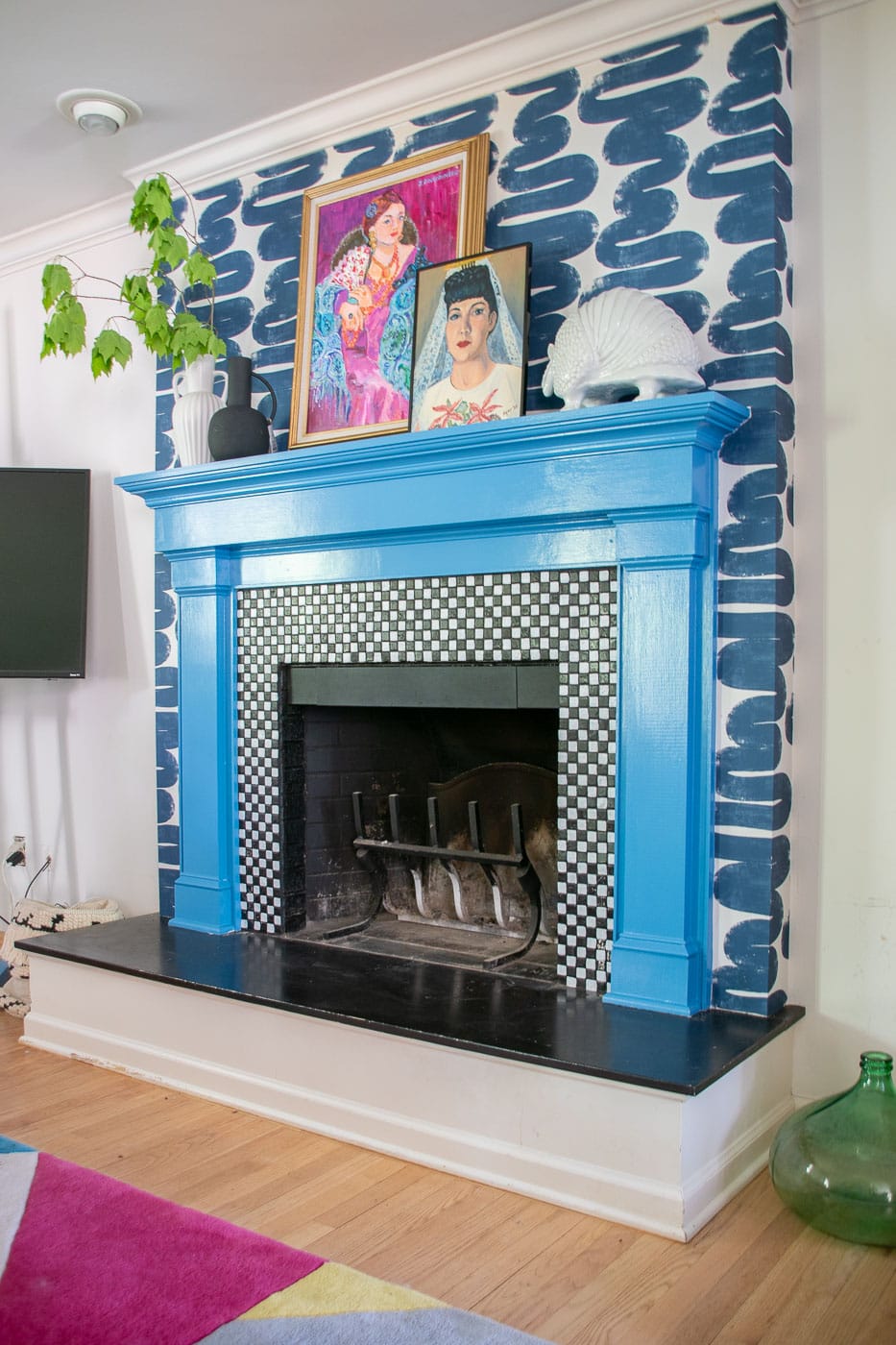
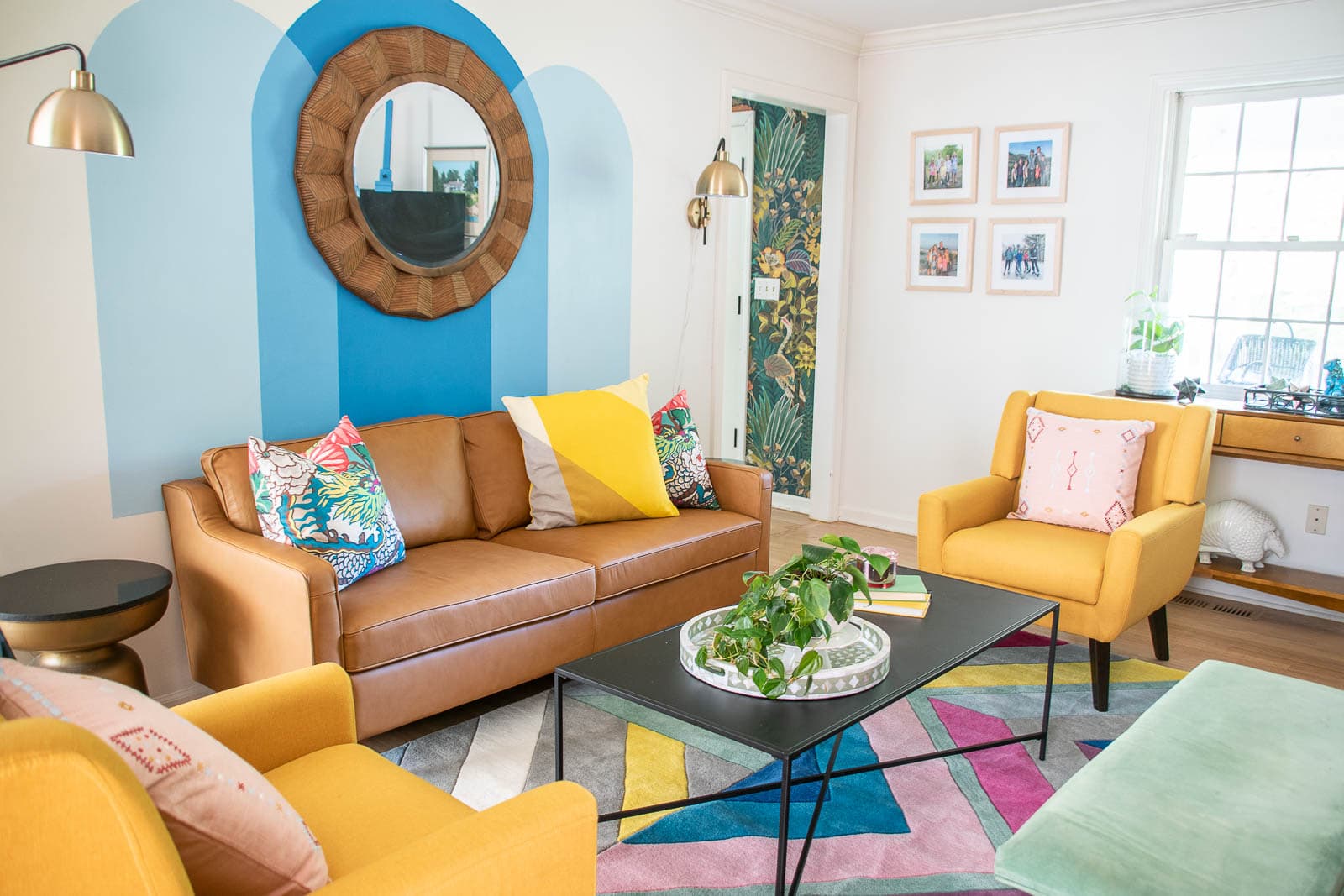
Because I couldn’t help myself, I painted a fun blue mural over the couch.
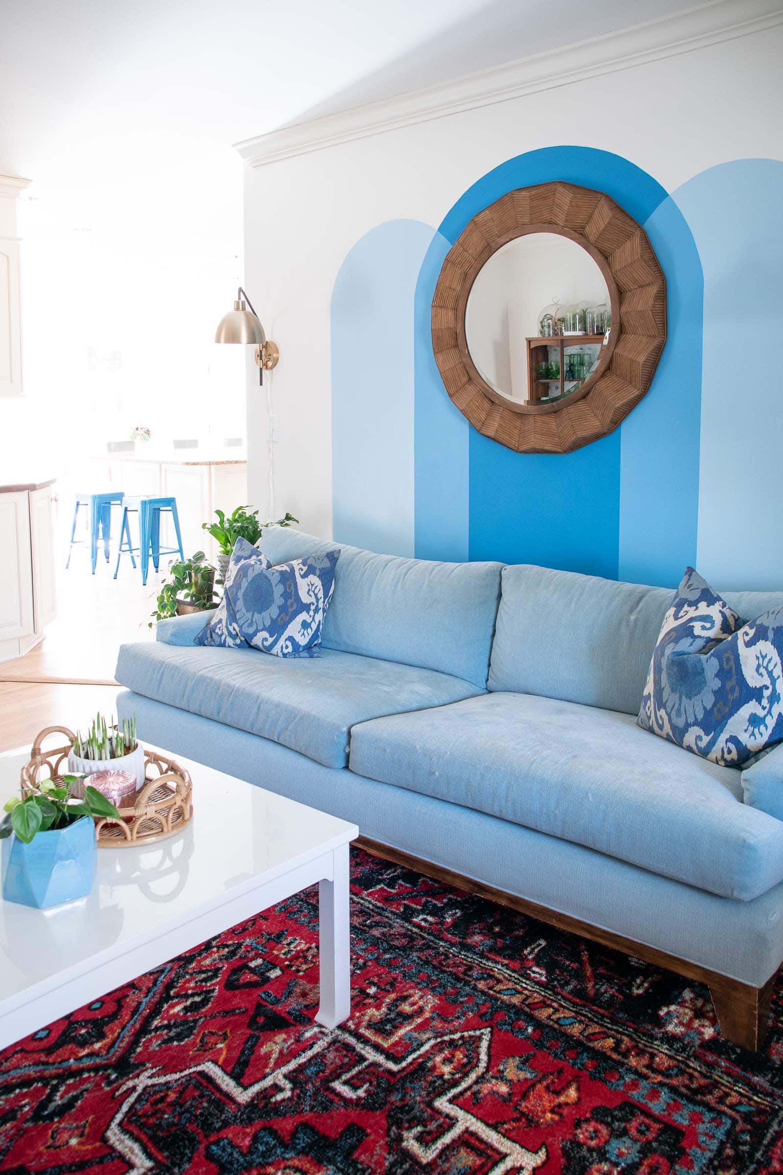
In the fall of 2022, the family room got another makeover and this is the most current look. I wanted to bring some more cohesive color and one day I’lll have the courage to add built-ins on either side of the fireplace!
Powder Room
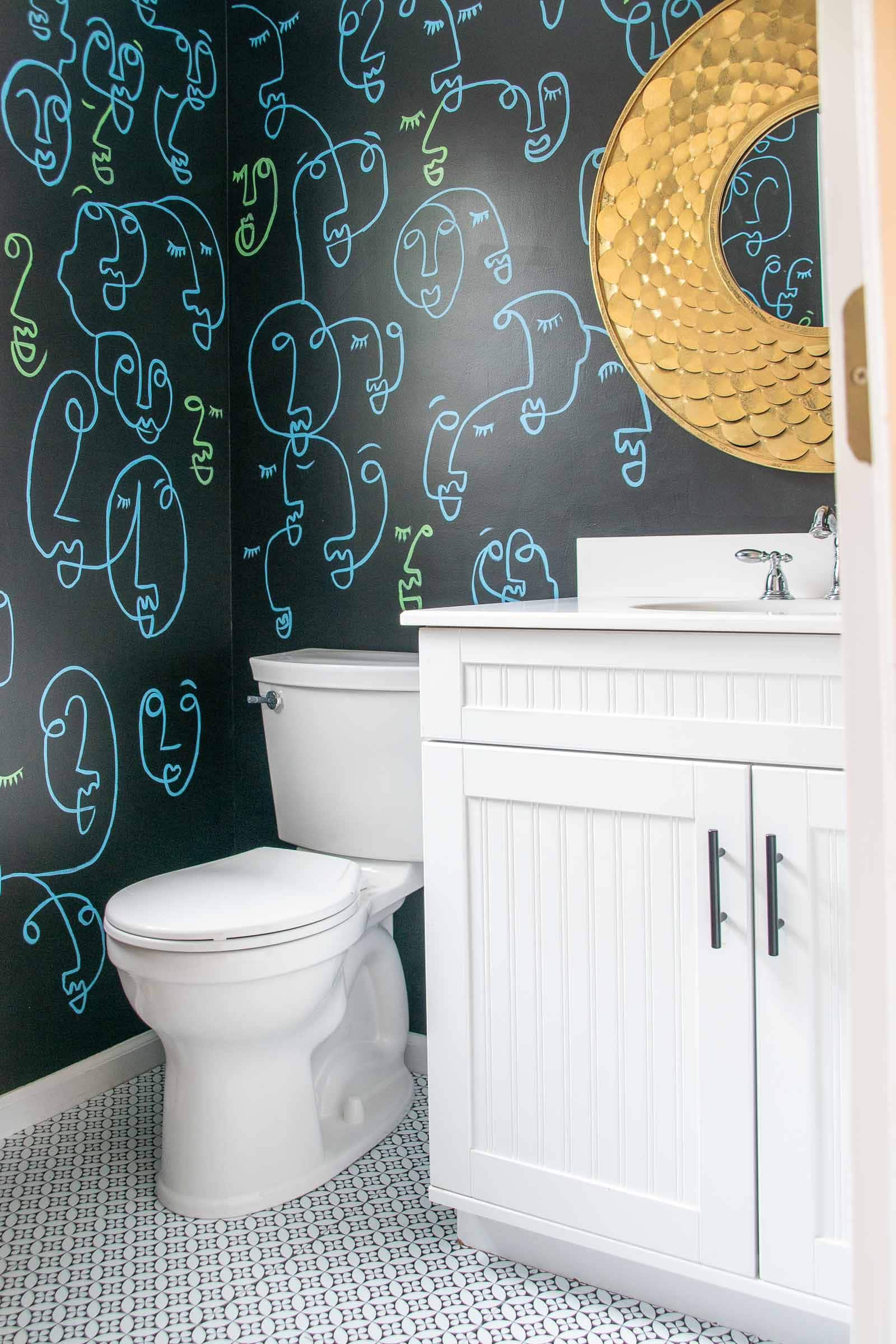
Originally I was going to wallpaper this room but then I partnered with FloorPops to cover the old tile floor with graphic adhesive floor tiles. To make the floors look nicer, I gave the walls an update that turned out to be cooler than I imaged. I painted them black and then hand drew a continuous line drawing in blue and green paint. A new mirror and new lighting finished the space beautifully.
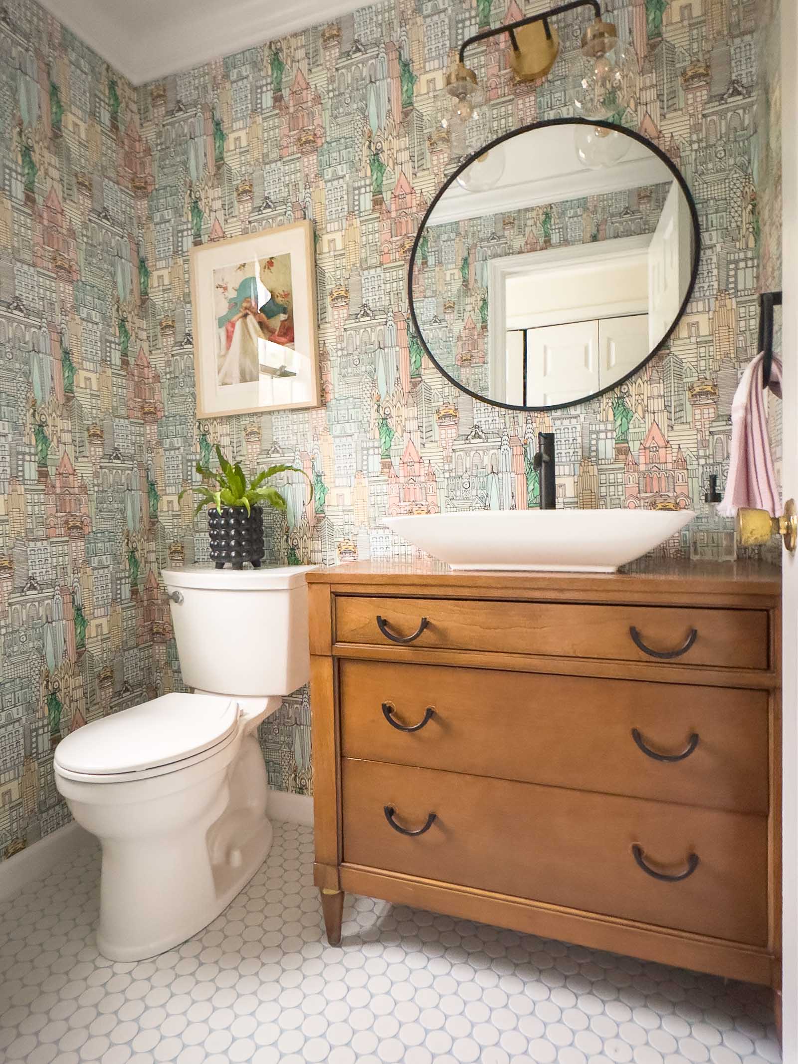
In the spring of winter of 2023, I decided to tackle this powder room again and give it the full makeover that I’d envisioned all along… new wallpaper, demo and retile the floor, new vanity…. I LOVE it.
Arthur’s Room
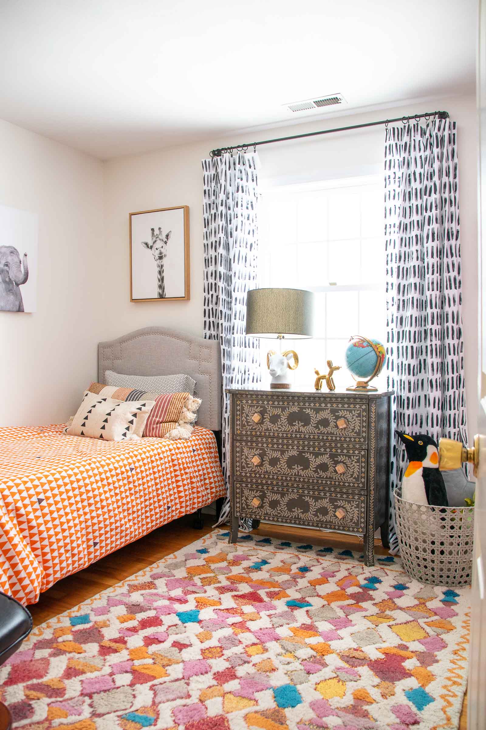
Arthur’s room is the smallest bedroom for the kids so the easiest to bring some love to. He requested a recliner and then I came in with white paint for the walls and a budget friendly DIY for the curtains. He loves it.
As most seven year olds are like to do, Arthur decided he wanted a loft bed so what’s a DIY mom to do but… make one. We added some wallpaper and colorful new bedding and he loves his new and improved bedroom!

Oliver’s Room
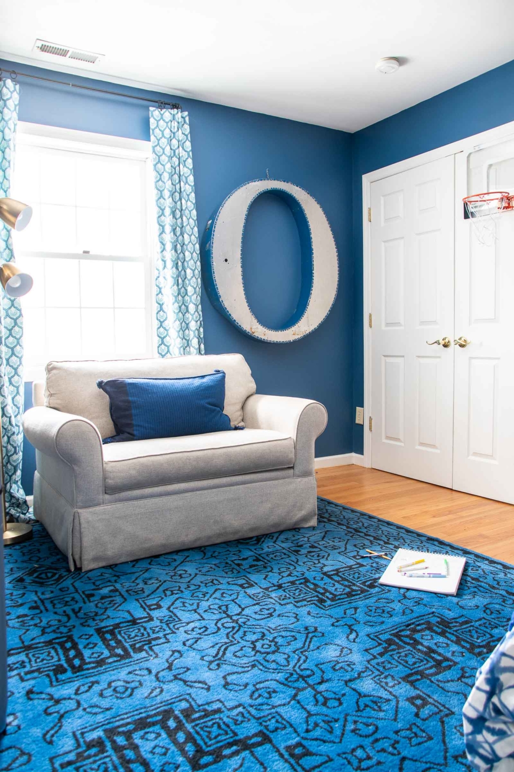
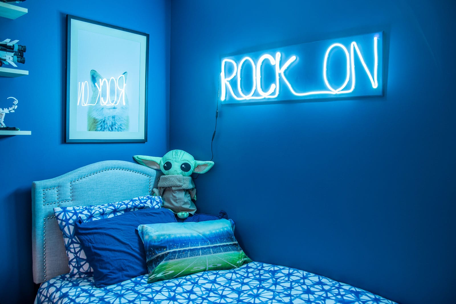
Oliver’s wishlist was pretty small too: navy blue walls. I partnered with Clare paint and took care of that for him in addition to hanging some floating shelves for his lego collection. I’m still very VERY tempted to paint the trim in this space as I think it will look really great so check back in for updates on that.
He also requested a neon sign and I’m cheap so I made my own.
Shared Girls Room
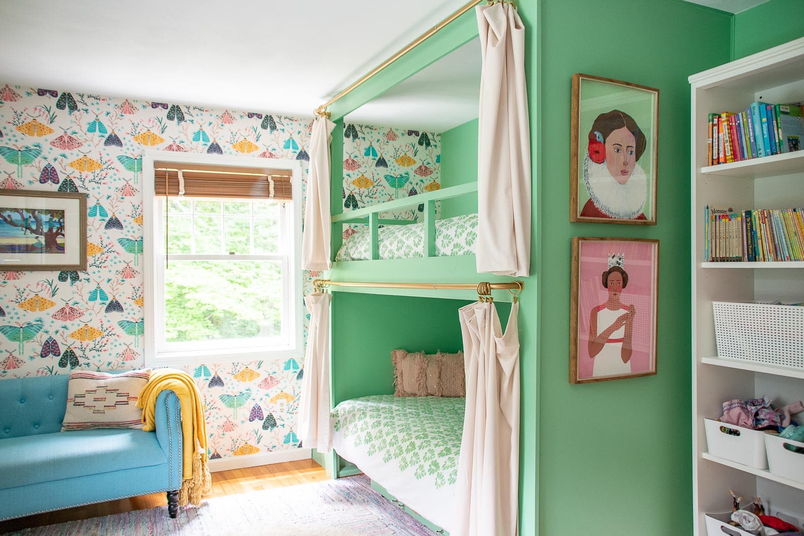
My middle daughters have to share a room in this house. In theory it’s fine and a good learning experience, but in reality both of them wish they had a bit more space to themselves. I suggested built in bunk beds as a possible project a while ago and they leapt at the offer. The addition of curtains and little storage nooks in each of their beds and they were thrilled. I also took the opportunity to add wallpaper and take care of their closets and they seem pleased as punch.
Blue Shared Tween Room
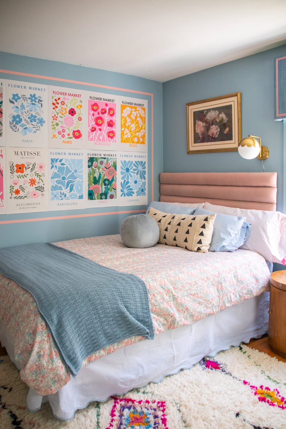
My oldest daughter is in boarding school- so she’s not here during the school year- and my middle daughter moves into this room. She is however home for the holidays so this space needed to essentially work for both girls. The layout was the trickiest thing, but I was able to add a custom closet, build some desk storage and generally update the space to suit both their tastes.
Girls’ Bathroom
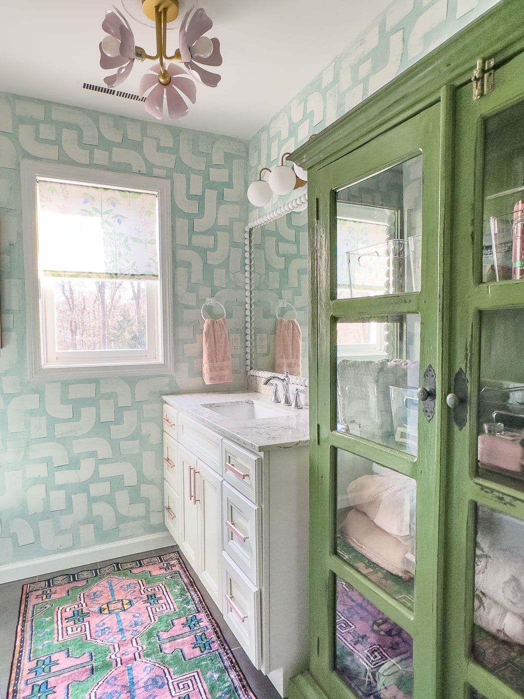
My most recent room makeover was actually my girls bathroom. I wanted to add some color and some storage but… I didn’t want to demo. So we’re talking paint, storage, fabric, lighting and hardware.
Laundry Room
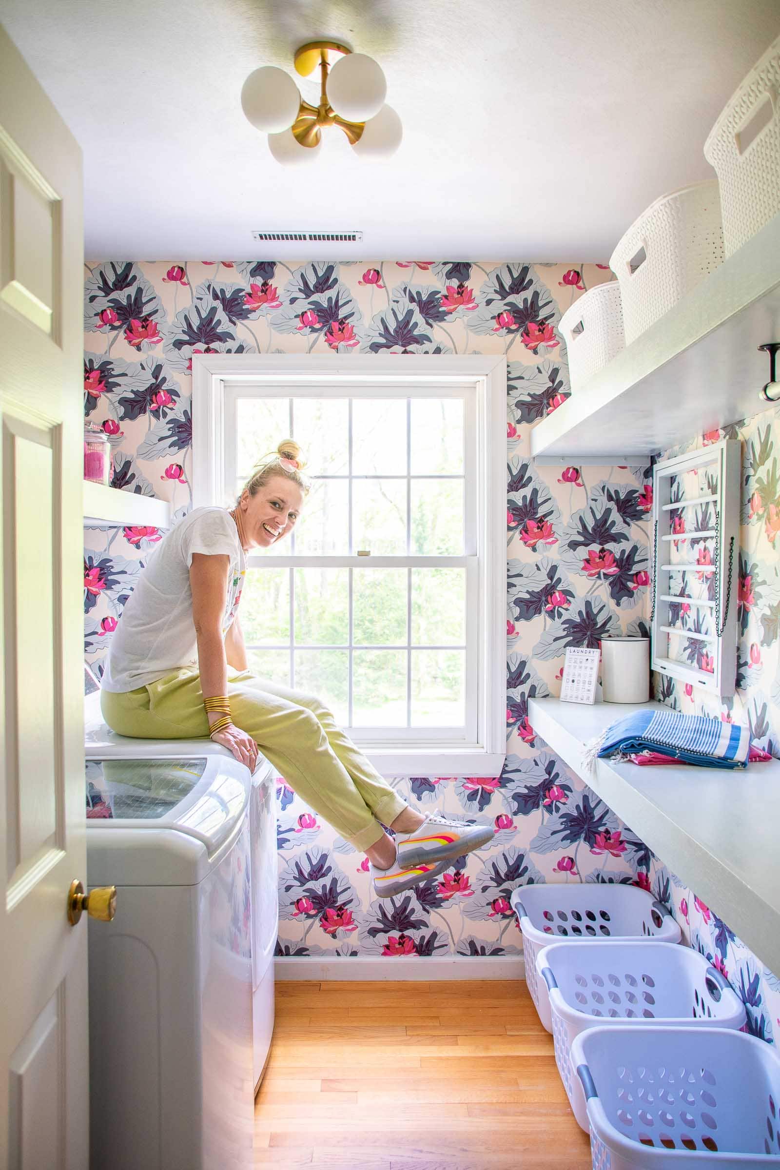
Ahhhhh, the laundry room. This space was boring and chalk full of metal shelves that were all half falling out of the wall. I build new sturdy floating shelves, wallpapered and added a DIY laundry rack. Oh yeah… TikTok has strong opinions about this wallpaper but I could not love it more.
Primary Bedroom
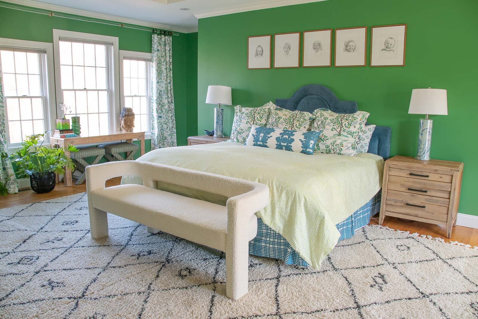
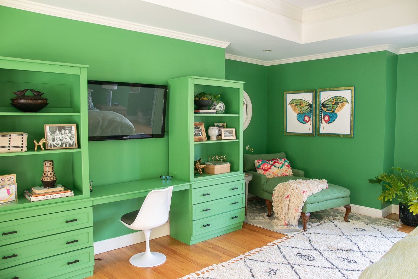
Our primary bedroom is so my goal was to make it feel a bit less cavernous. The furniture layout was the first challenge and then I painted it green (Clare paint Matcha Latte). To fill the one wall, I retrofitted a pair of old thrifted cabinets to look like a built-in entertainment center situation. I know the color is BOLD but I love how cozy the space feels with the darker walls. The color matches a Ralph Lauren tweed chaise I picked up on Facebook marketplace so it all kind of feels like it was meant to be.
Walk In Closet
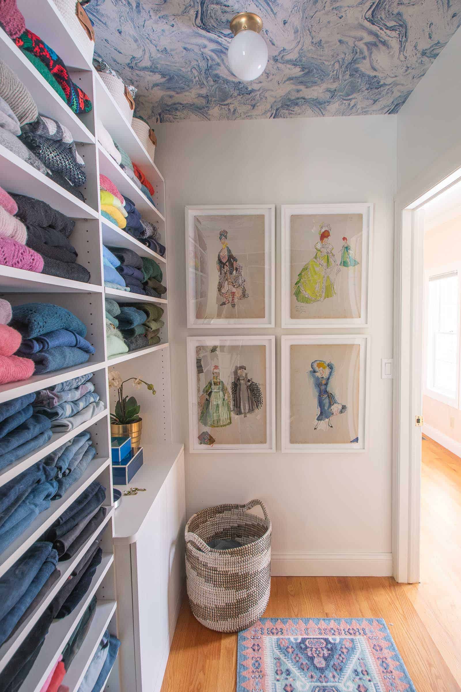
The closet in our bedroom was the first room makeover in the new house. I wasn’t planning on starting here, but the space was filled (filled!) with those rickety metal shelves. So so many. Rather than unpack everything and then negotiate the shelves, we paid to have a local closet company come in immediately and add shelves/ drawers. I took care of demo and paint and then added this removable adhesive wallpaper to the ceiling to add some color and interest to the space. The rest is… clothing.
 Primary Bathroom
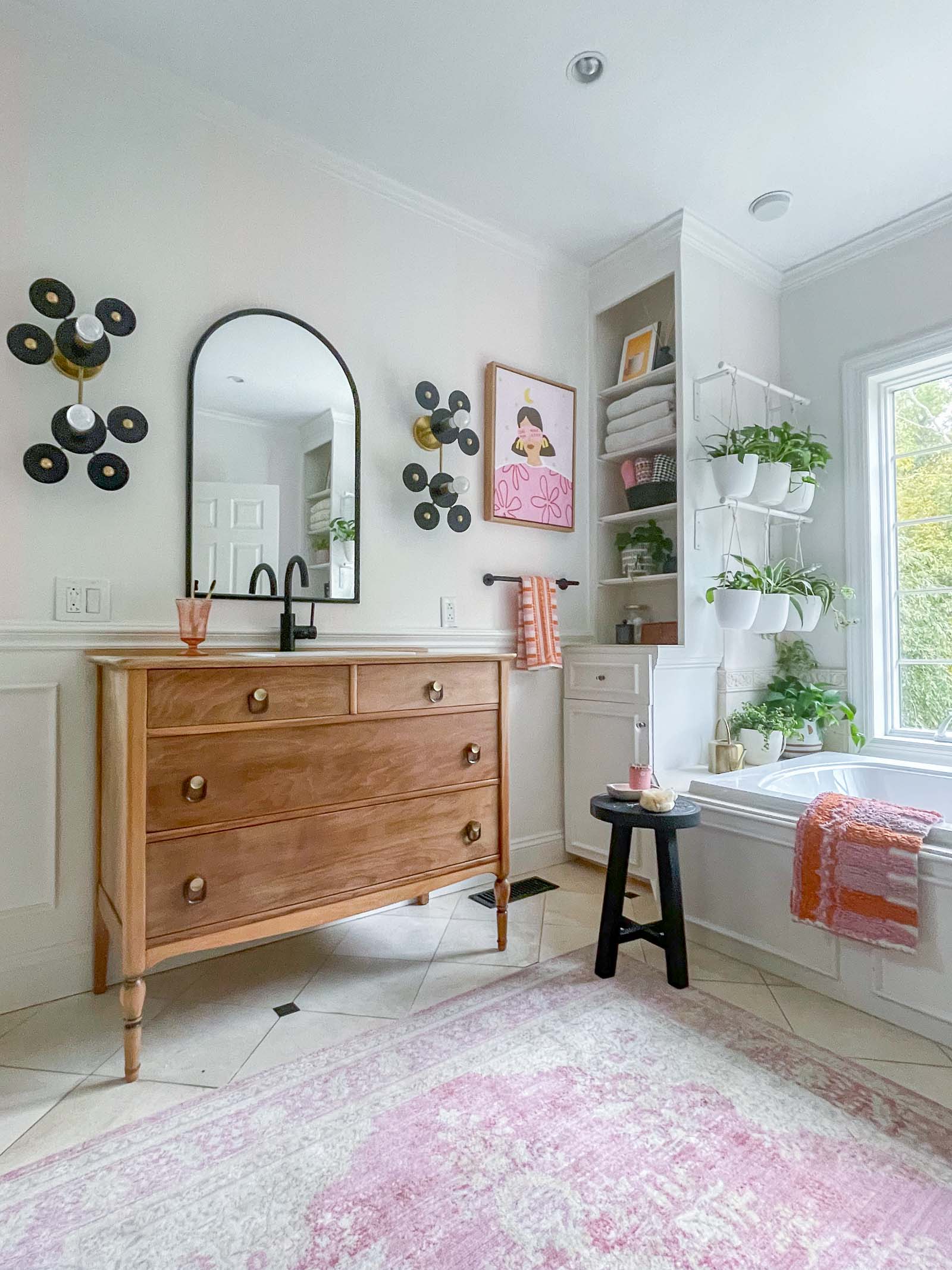
This space was a little dated and drab mostly due to beige travertine looking tiles. I didn’t have the budget to rip up all the tiles, but I was able to make a new vanity, paint and add some other details so the space is now SO much better!!
Basement Playroom
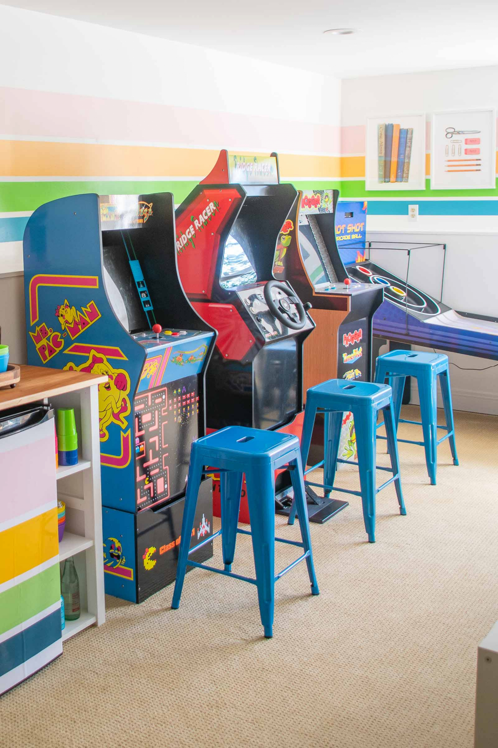
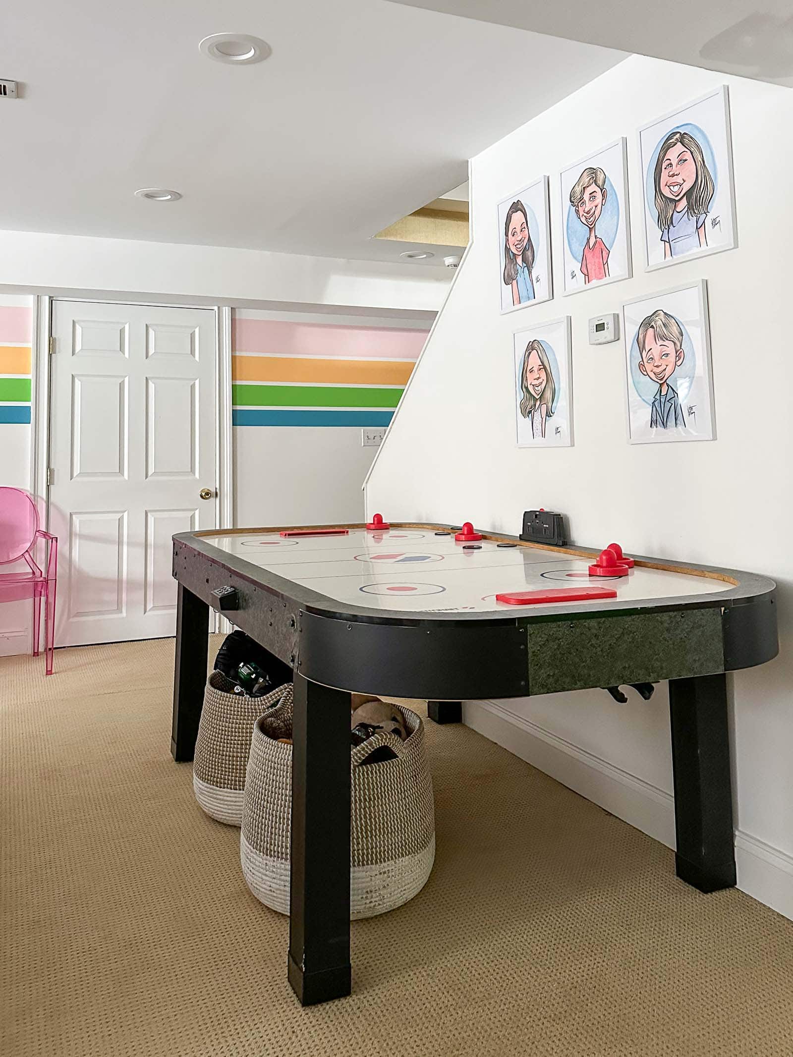
The finished walk out basement was one of the spaces in this house that my kids were most excited about! They use it for hanging out, sleepovers, movie nights, etc. As the five children have gotten older I’ve had to adjust what activities and fun details are most interesting for them… this playroom/ guest room fits the bill!
‘At Charlotte’s House’ Office Space
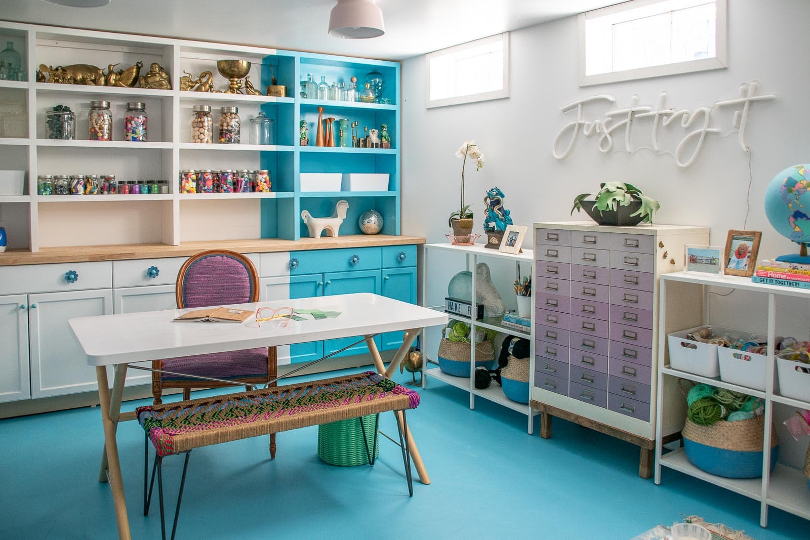
This room in our basement was literally a concrete space with plywood shelves at one end when we looked at this house. I knew right away that it would make for an incredible before/ after and… I was right! I paid to have the space framed and drywalled and then I took over with paint on the walls and the floor, new lighting, built in shelves and furniture. I love having a quiet space for all my projects and escape down there whenever I can!
Garage
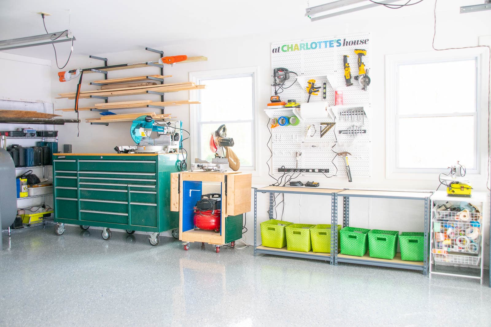
Last but not least (for now)… our garage. This spring, I pulled everything out and painted the floor with RustOleum’s Rock Solid Garage Floor Coating. Not only does this create a durable finish for the floor, but it also just brightened and update the space overall. I have a full tutorial on my blog as well as a YouTube video (linked in the blog post). I added some cool organizational features so click over to the post for links to the various products I used.
Back Patio/ Side Porch
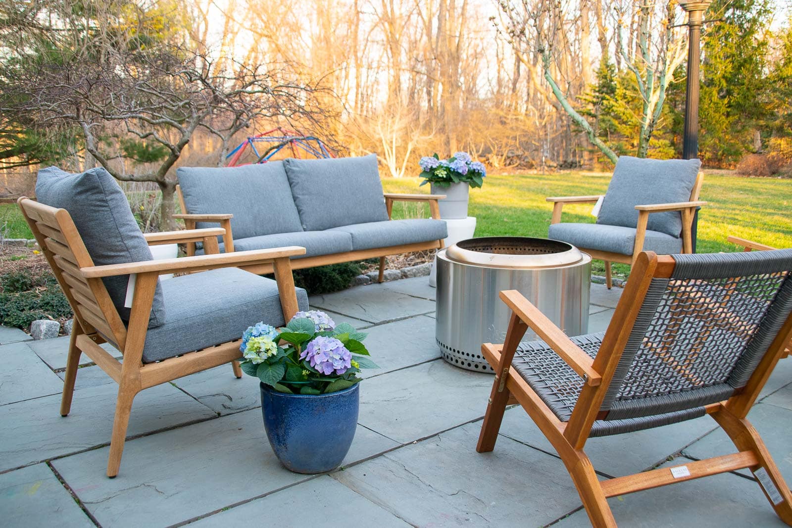
Right as the weather was warming up, I was lucky enough to partner with Home Depot to take on our side deck and the back patio. I refinished the deck and brought in some sleek new furniture and then added a wonderful firepit area to the patio. All materials are linked in the blog post, but this space has been a favorite hangout for everyone this summer!
Backyard Playground
Our kids have outgrown the classic backyard playground but we have these amazing woods and I love encouraging the kids to go back there and play and make believe as often as possible. To make the woods a bit more inviting, I took advantage of the trees back there and built them a simple but effective (hopefully!) backyard woodland playground.
Side Patio
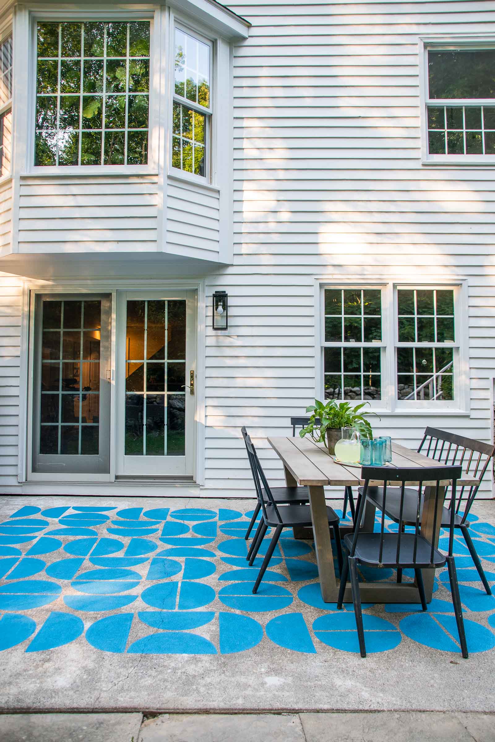
This space came together in one weekend and it all started with a DIY Firewood shed. Once I added that, the rest of the side patio looked a little dull so I used one can of porch and patio paint to give this spot a mega makeover. I love the unexpected punch of color and pattern out there!
To be continued….
 Primary Bathroom